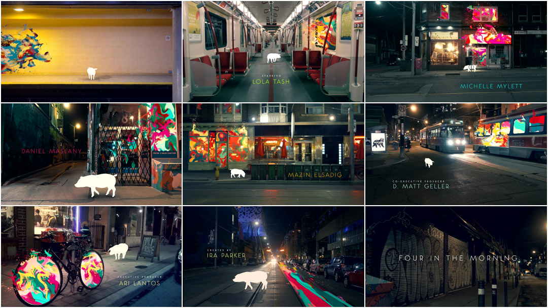
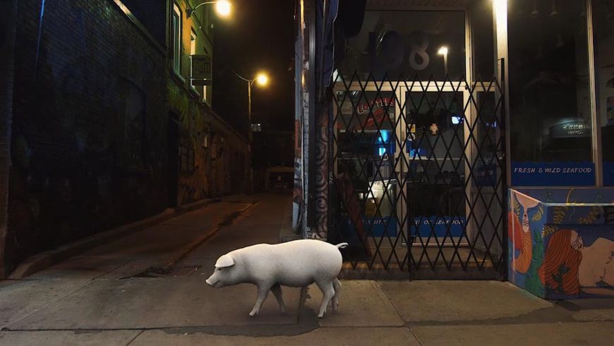
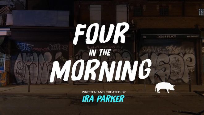
It’s 4:00 a.m. and a talking pig named Buzz (or was it Albert?) wanders through the streets of Toronto’s West End. From the Annex to Chinatown, through Kensington Market, along Queen West, and up Ossington he goes, sniffing and snorting, his path filled with possibility.
Studio Feather’s pulsing, porcine opening to Four in the Morning – a new CBC comedy series – is a reminder that there’s no place quite like the city at night, especially when you’re young. The series follows four twenty-something friends as they roam those same streets and neighbourhoods in the hours between last call and first light, talking and fighting, wishing and regretting. It’s that dreamy, buzzy time of night when friendships are formed over good conversation or hurt by a stupid argument, when the long, lonely ride home provides ample opportunity for self-reflection or denial, and the hour when mistakes – the good kind and the bad – are usually made. It’s magic out there in the darkness, if you stay up late enough to find it.
A discussion with Title Designer JULIAN VAN MIL of Studio Feather.
Give us a little background on yourself and your company, Studio Feather.
Julian: I’m Julian van Mil, and I founded Studio Feather in early 2015 after a decade of freelancing in motion graphics and VFX. The main idea behind Studio Feather is to unify production, design, editorial, sound, and VFX to create a singular creative process, rather than a segmented one. I believe that as creators our job is to protect a vision and make the strongest possible version of it. Moving a project between studios was always a weak point. So Studio Feather is a small team of very talented people in each discipline who work closely together under one roof.
How did Studio Feather get involved in this project?
Julian: Our producer, Pete Soltesz, had previously worked with one of the show’s producers and got us in the door very early on for VFX work. We were contracted to complete a few effects for the show – the talking pig and chest cavity replacement – and used our early involvement to pitch the opening sequence. A title sequence was not originally in the show, so we had to work to convince them that they needed one. It was basically us saying, “We love title sequences, let us show you what we can do.” And the showrunners and CBC gave us the opportunity.
Ira Parker, the show’s writer, had included in each episode a clever way to work the title directly into an opening shot. You can still see that in the first episode. Right as the camera pushes past the diner’s counter, a clock flips to display the title.
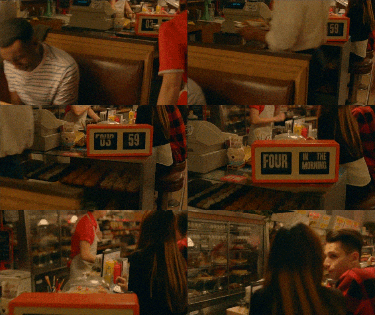
Julian: If the opener hadn’t been approved, each episode would have had one of those ‘title moments’.
So what did you pitch? What was your concept?
Julian: We pitched four totally separate concepts. One with nighttime city street scenes sort of ‘cracking open’ with these bright neon colours spilling out.
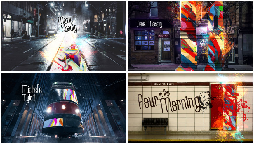
Image set: "Cracking Open" styleframes
Julian: We also pitched a 100 percent illustrated Hitchcock/Saul Bass-style opener that followed a pig throughout the city.
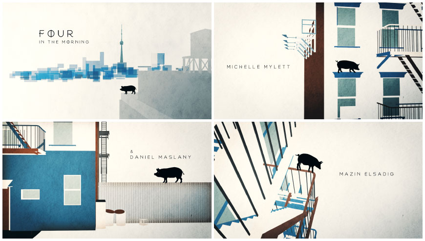
Image set: "Hitchcock/Bass" styleframes
Julian: Ari Lantos, the executive producer, looked at both and said “use the cracking open concept and put the pig in it.” That was it – the others were dropped entirely.
What were the next steps? Did you storyboard or just hit the streets?
Julian: Right after the client’s greenlight on the concept, we pushed forward into full production. There was no approval process. The thinking was: this is our baby and we want creative control, so we’re going to present the best version possible. We decided to show an essentially finished product as our first pass. It was a risky move because you have to convince the client to wait a month before seeing anything. During that time you build up a lot of expectations. If the client doesn’t like what you present, you’ve wasted a bunch of resources and have to pivot late in the process. You might have to do something different with much less time and money. We got lucky. It remains the only time in my entire career when there were no creative notes. Full approval from the show and network. Our first pass went straight to QC and legal. The only changes ended up being credit-related.
Four in the Morning title sequence rough edit
Julian: Regarding storyboards, we didn’t make any – just the original style-frames. The concept was pretty strong and relied heavily on the footage we were able to get. So we spent two nights shooting as much as possible. I think we ended up with around two hours of footage that got cut down to 40 seconds.
Also, an amazing thing did come out of the styleframes. There’s a great site with free stock images: unsplash.com. We used a couple shots for our styleframes from there. It turns out that one of our artists is friends with the photographer who originally took the shots, Patrick Tomasso. We reached out to Patrick to shoot the opener for us. It was serendipitous. He did a great job and we’ve worked with him a couple more times since.
What was the late night shoot in Toronto like? Why did you choose the spots you did?
Julian: We chose the spots that we did because that’s where we all live and go out. When I think of after hours Toronto I think of the West End: Dundas, Bloor, Ossington, College, and Kensington. I’ve lived in the West End forever and that’s just my experience. I suspect that it’s a niche experience and won’t be immediately nostalgic for everyone, especially nationally. But I do think it conveys the right feeling.
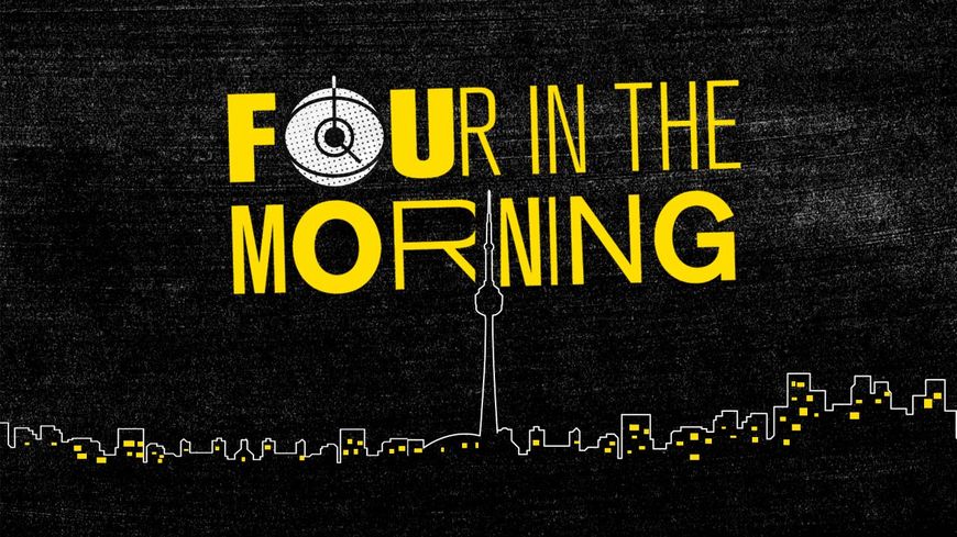
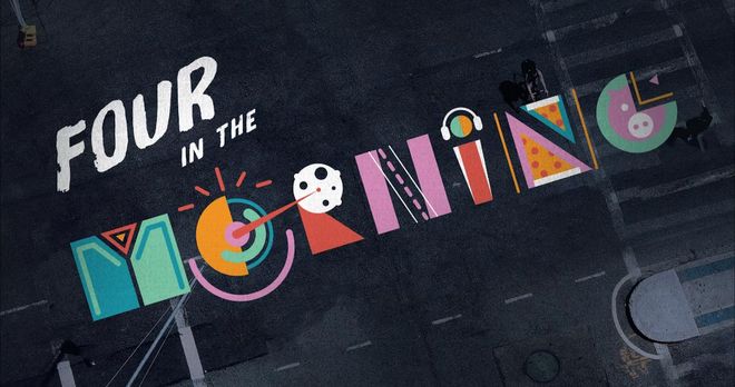
Unused title card concept
Did you have to get permits to shoot on the TTC (Toronto Transit Commission)?
Julian: No, we didn’t have any permits for the TTC. We didn’t want to be noticed, so on the streets it was just Patrick Tomasso shooting and Ian Flaig, one of our artists, there for creative direction. They shot together over two nights, riding all around Toronto on their bikes. There was actually a discussion of whether or not we should include the TTC at all because it shuts down at 2:00 a.m. and logically didn’t fit the timeframe. We decided we could get away with it because the opener is more about the ‘pig’s journey’ than only moments at 4:00 a.m.
And the typography? How did you work with that?
Julian: When we started I really believed that a grungy colourful treatment was the way to go – and we went as far as to have one of our artists, Josephine Guan, cel animate all of the credits for the entire opening.
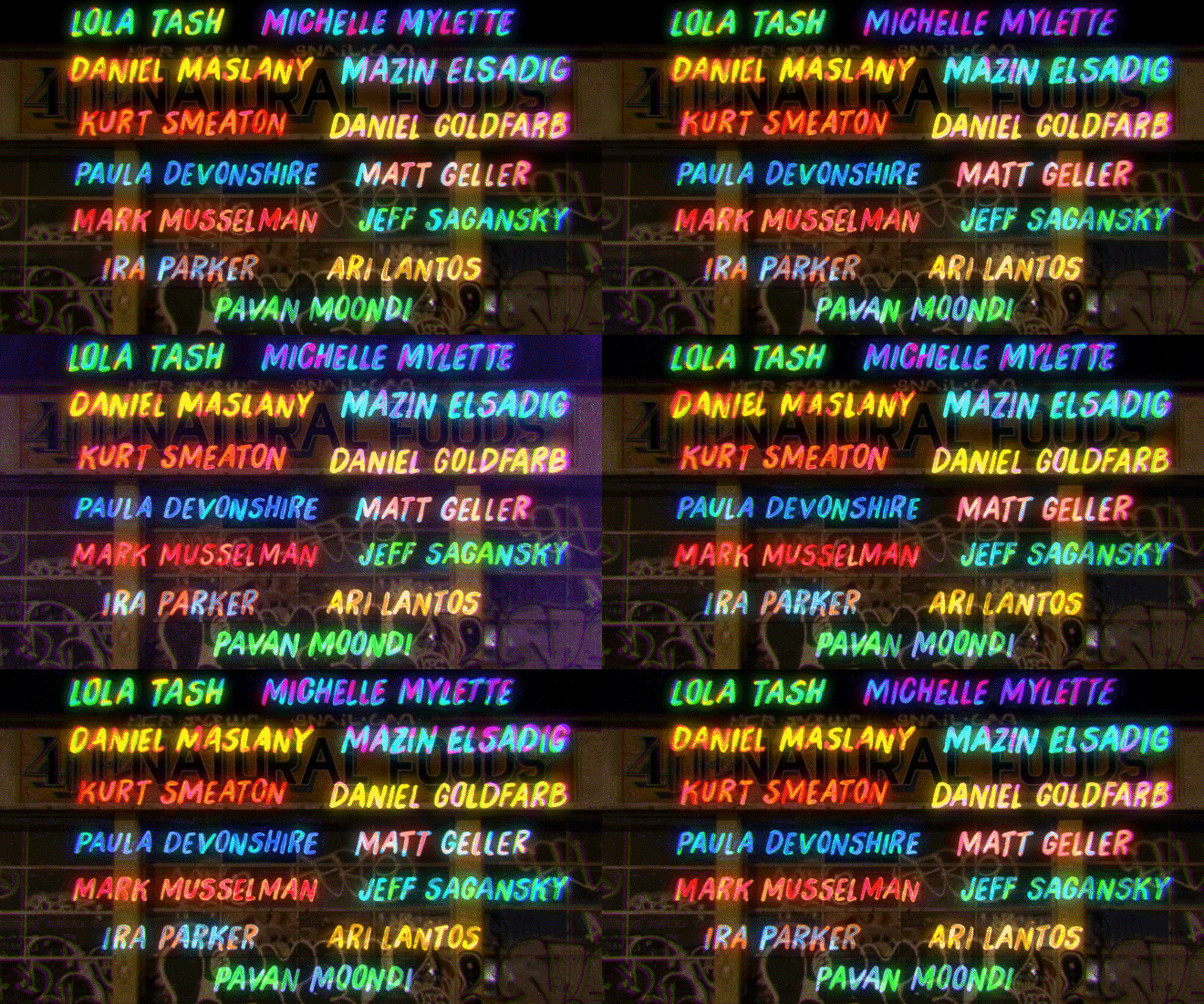
Julian: Gaycation, as well as the fantastic titles for Scott Pilgrim vs. The World [were an inspiration]. They were both great work. I think we wanted to try the paint effect for ourselves, but a little less ‘party’ and more dark and introspective, at a slower pace. Once we integrated it with the colourful effects and the pig, it was just too much.
Four in the Morning title sequence colour edit
Julian: You didn’t know where to look. So we did a 180 and decided to use a clean font. That incredibly laborious cel animation process never saw the light of day – sorry Jo! – not even the clients saw it. But that’s the way it goes sometimes.
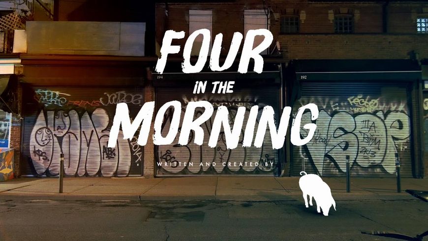
The eventual choice was “Toronto Subway” by the foundry Quadrat based on the real TTC font. It’s a font with its own fascinating history. It’s such a subtle touch but I think that people who live and work in Toronto will have an immediate subconscious connection to it.
The theme music is great! Did you have that to work with from the beginning?
Julian: No, the first time we heard the music was on the broadcast premiere. Originally we were cutting to “Sorry You’re Sick” by Ted Hawkins, and that give it a totally different vibe. Then we were told we had to select a Canadian artist, so we chose “Hot Dreams” by Timber Timbre.
Version of the title sequence featuring "Hot Dreams" by Timber Timbre.
Julian: We fell in love with that track and were very sad to see it not used. While the show ultimately didn’t license a track, they did have the composers for the show create an original piece that works nicely. But there was something special about “Hot Dreams” that I miss.
What can you tell us about animating your porcine star?
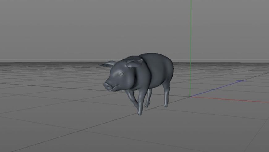
Julian: It’s an element that we could have gotten away with doing very simply in 2D and animated with a puppet tool or some crude AE rig. But we opted to to a full CG rig, and got Vanessa Arsen on board to finesse it and give it life.
Pig animation and render tests
Julian: The small details of how the pig moves realistically – even though its treatment is hyper-stylized – adds a lot.
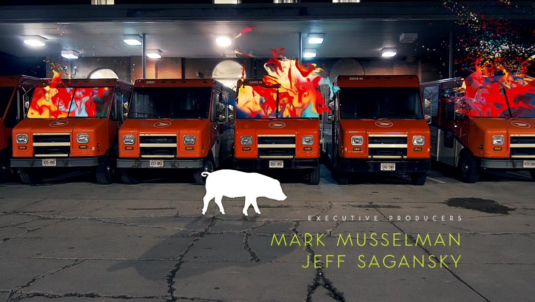
The ‘colour flame’ effect I believe is truly unique and developed naturally. We didn’t have it nailed down at the pitch stage. It’s just slow-motion footage of fire and water luma masking 2D coloured patterns. Very simple and quick renders. It’s still surprising to me how far a little detail in the comp will go.
What did you learn about pigs while working on this project?
Julian: I learned that like most animal actors, they don’t stand still when you want them to.
Four in the Morning "pig blocking" edit
Which tools and software did you use to put it all together?
Julian: Patrick shot the footage on his Panasonic GH4. Ian Flaig edited the opener in Adobe Premiere Pro to the temp music. Once he got a cut that was working, we moved it over to The Foundry’s Nuke Studio for comping. We ended up adjusting the cut and swapping out a couple shots directly in Nuke Studio, so the fine cut was completed in Nuke Studio.
Very late in the process we dropped a few shots that were fully completed because they just weren’t sitting right. The pig was animated by the talented Vanessa Arsen in Autodesk’s Maya. She exported alembic sequences that we rendered directly in Nuke using their new RayRender. I created all of the colourful flames and their interactions in Nuke. Once comping was complete we did a final assembly and colour correction in Blackmagic’s DaVinci Resolve. At the time we had just renovated our studio and built a new 4K finishing suite – this was the first project to go through the new colour pipeline and it got extra attention because of that.
What are some of your personal favourite title sequences, whether classic or contemporary?
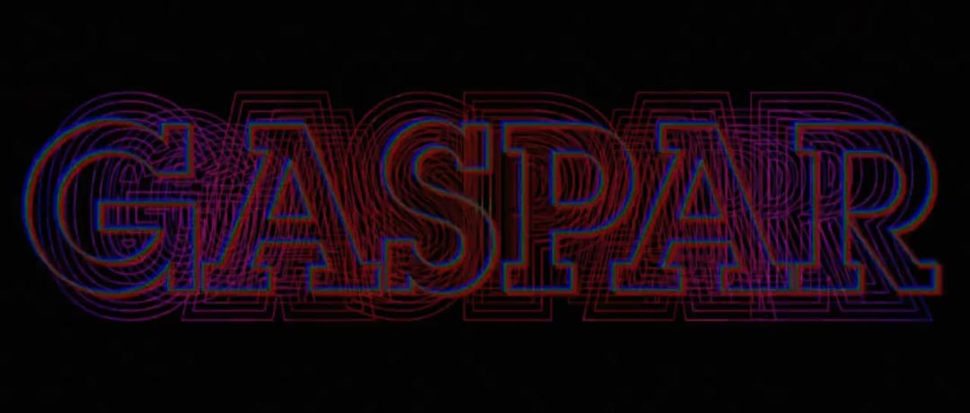
Julian: I’m still in love with the titles for Gaspar Noe’s Enter the Void. It’s very difficult to make something truly new in the title design world and that one is special. Love it or hate it, it was undeniably original, and I think, trendsetting. Its boldness and tempo have influenced me.
Enter the Void (2009 main titles, designed by Tom Kan
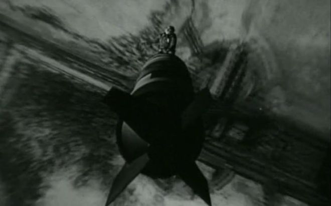
Julian: Classically, I think the original trailer for Dr. Strangelove has the best, most forward-thinking title design of all time.
Dr. Strangelove or: How I Learned to Stop Worrying and Love the Bomb (1964) theatrical trailer, designed and edited by Pablo Ferro
What have you seen or watched lately that’s been exciting to you?
Julian: I just finished watching HBO’s The Night Of. I’m a sucker for crime stories and going into the micro details of all the characters’ lives was interesting and different. Plus I’ll watch anything with John Turturro. I also really like its opening titles. Such great attention to detail. I love that the opening sequence tells the whole story and as you watch the series you understand more and more details from it.
What’s next for you and Studio Feather?
Julian: Based off Four in the Morning, CBC has hired us to create the opening titles for Kim’s Convenience, premiering this October. We’re very excited about working on it. It’s a much bigger show, so the expectations are higher and it’ll have a wider audience. We’re also pushing hard into the world of sound design. Sound is 50 percent of the final piece and is often overlooked in our industry. With our recent completion of a 5.1 mixing room and the colour suite, I feel like we’re now filling our mission of bringing the whole creative process under one roof. The team is really gelling, and I’m excited to be firing on all cylinders. Studio Feather is young, but I believe we’ve got a lot to bring to the scene. I know you’ll be seeing more from us shortly.

