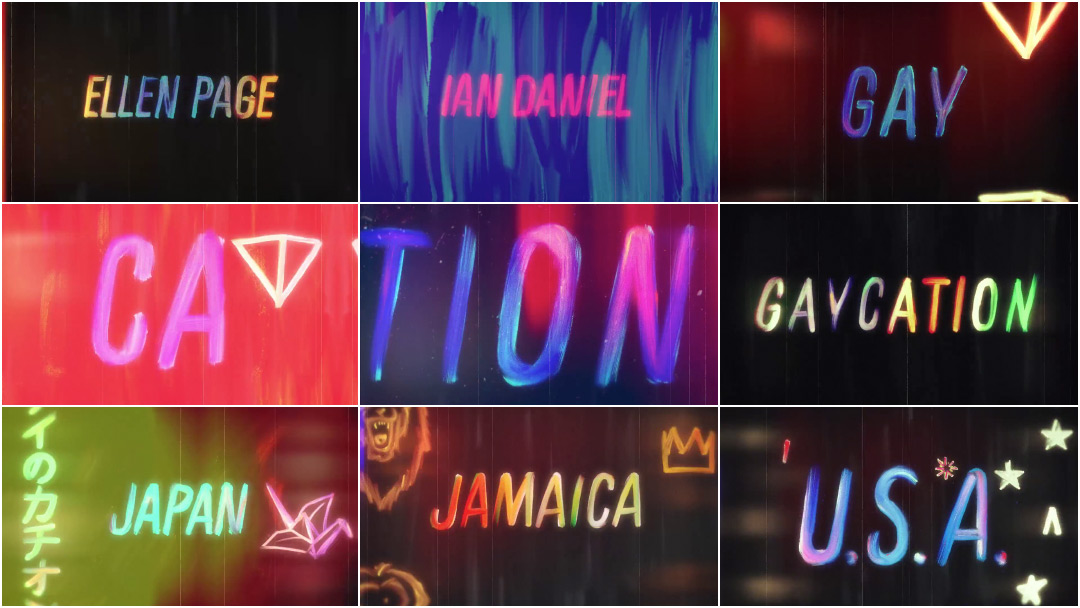
The brief but vibrant opening titles at the head of every episode of Gaycation are a rainbow-tinted shock to the system.
The acclaimed VICELAND travel series, hosted by actress/advocate Ellen Page and her best friend Ian Daniel, explores LGBTQ cultures and communities around the world with heart and a whole lot of guts. In the show’s inaugural season, Page and Daniel travel the globe, highlighting the struggles of local gay, lesbian, bisexual, and transgender people and examining cultural attitudes at large. What is it like to live as a gay person in a deeply conservative society like Japan? What about the American Bible Belt? What about countries with rampant homophobia, like Jamaica and Brazil – places where people regularly face the prospect of deadly violence? It’s a fascinating, funny, and often gut-wrenching journey that purposefully belies the show’s peppy title.
For Gaycation’s opening titles, the challenge for VICELAND’s design team was to introduce the show’s overarching concept – a gay travel show with a desire to both explore and educate – and to evoke the spirit of the people and cultures featured in each episode. The sequence, powered by band CSS’s thumping theme song, achieves both goals – all while being cognizant of the dark and sometimes deeply upsetting subject matter the series investigates. Using a scratchy, celluloid aesthetic and animation reminiscent of Shynola’s Scott Pilgrim vs. The World or Central Station’s 24 Hour Party People, the title sequence combines iconography associated with gay culture as well as symbols relating to the locations to create an energetic and defiant statement for every episode.
A discussion with Designer MAGNUS ATOM, Creative Director MATT SCHOEN, and Art Directors ANNIE ROSEN and GABRIEL TICK of Vice Media, Inc.
Gaycation is one of VICELAND’s flagship shows, but it’s also a little different from most of the channel’s offerings – particularly in its opening titles. What was the first meeting you had to discuss the show’s opening like?
Matt: We were given the brief for Gaycation and we worked with the showrunner William Fairman, the executive producers, and Ellen Page from the very beginning on the project.
We originally created something that was more of a travelogue style intro and everyone loved it, but then Spike Jonze – our Creative Director – and Ellen saw it, and they felt that it was too slick. It was funny because we had established this TV motion graphics catalogue where we wanted to do everything with slick animations, but this was really helpful for us because we wanted to get something that felt more personal and raw for this show. I know that term “raw” is used way too much, but that’s how we kind of ended up on this solution for Gaycation. It had more of a hand-drawn feel to it, but it still had that travel vibe – that sort of 8mm film feel from old travelogues.
Gaycation (2016) trailer
So after the false start, how did the team arrive at that new vision for the opening?
Matt: One of the challenges we had was that it’s a show that handles a lot of different ranges – from the very serious to the celebrational – all in the same show. So we were really mindful of that. We wanted to be really respectful of the varying content that was being covered; it wasn’t just all fun and happiness. We’re covering things like closeted cultures in Jamaica and Brazil – there’s massive violence in Brazil – but also big celebrations in places like Japan. So we wanted to have something that could work and operate on both ends of that spectrum.

Image set: Stills from the original version of the Gaycation opening
Matt: We wanted to really find a nuanced approach while still showing that human and personal touch. You’ll notice there is a subtle rainbow colour to the typography without being too obvious or stereotypical.
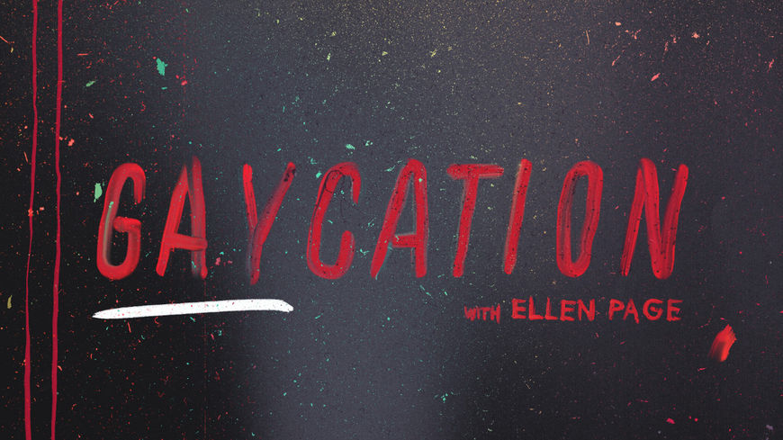
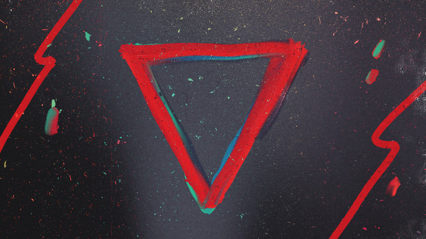
Gaycation styleframes
The iconography used in the sequence changes from episode to episode. What was the thinking behind that decision?
Annie: It was important for the showrunners to include the location of each episode in the titles. There are only four episodes in season one, so we really think of it as Gaycation Japan, Gaycation Jamaica, and so on. Each episode we’d look at the culture of where they were going and tried to find some way to bring that culture into the title sequence.
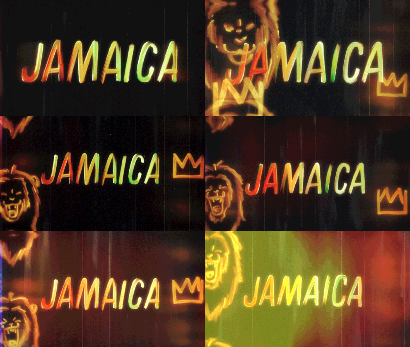
Gaycation Jamaica title card featuring location-specific symbols
Gabriel: So we ended up doing custom titles for each episode. It is a travel show, so we just wanted to give it some flair for every place that we’re going. We wanted to highlight something that happened in that episode or something that felt germane for that specific location.
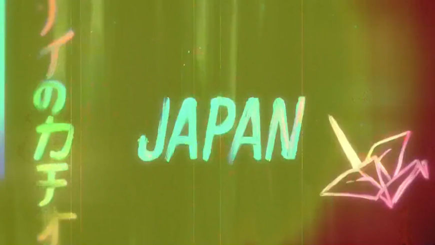
Magnus: Yeah, we have a little locator icon or graphic that represents each location, but that only happens at the beginning of the intro and the end of the intro. When we started we were just trying to have a little bit of fun with it. One of the original designs for Japan had a Godzilla figure in the Tokyo cityscape, but then they were like “Well, maybe we should tone this back.” From there we ended up going with the hiragana and the paper crane animation.
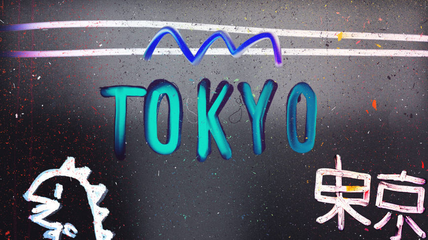
Unused "Godzilla" styleframe
Annie: Yeah, when we started the tone of it was a little bit more playful, but since the show has such a range of emotions and tones we wanted to make sure that it didn’t come off too fun and playful, but have a little harder edge.
The sequence is fascinating because it’s animated, but it also looks painted and has celluloid qualities to it. There’s a lot going on. How did the film aesthetic come into play?
Magnus: Originally we were trying to figure out a way to transition from the footage of the show into the intro and then back into the show. What we decided on was this technique where we blend the footage as it’s scrolling through like a projector would be if it were projecting film. It would kind of blend like an oil painting would, into the intro and out of the intro.
Gabriel: Basically it all started with that one styleframe of “Gaycation” in that paint, and then the challenge was to make that work with film.
Gaycation Japan main titles
Gabriel: The structure of each show that we do is a cold open that introduces the characters and the location, then we do a transition to the title and then we go back to the show. So we had to make our paintings work for that structure, which helped us develop this process of going to film, to oil painting, back to film, all using the 8mm aesthetic as a device to get between the two.
Magnus: There was a lot of research and development that went into making it feel real without actually doing it by hand. We definitely spent a lot of time trying to mimic that oil painting feel. At some points we use that wash brush and watercolour brush to make it feel as realistic as possible.
Gabriel: Yeah, despite using digital tools we wanted it to feel as analogue as possible. We looked at a lot of old film just to watch how the picture was distorting, how light leaks happen, and things like that. Even though we’re starting from a digital place you want your footage to look the same way.
Annie: We also looked at a lot of great painting references, like Wayne Thiebaud paintings where the colours blend into one another. His work is on display at the new Whitney and we referenced the way his brushstrokes blend numerous bright colours together.
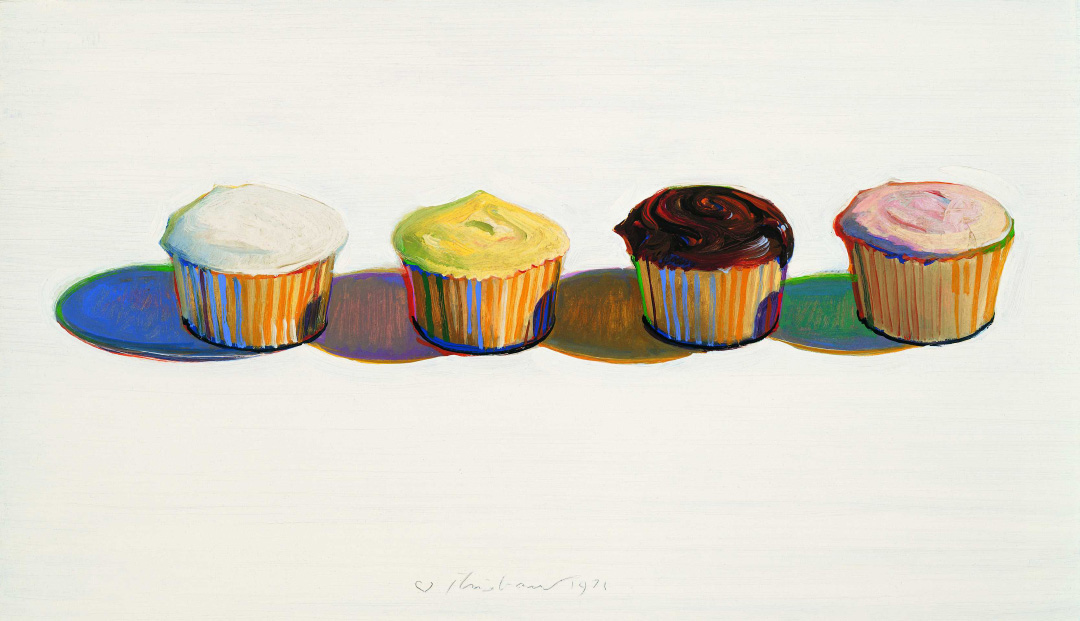
Image set: Food-themed paintings by artist Wayne Thiebaud
What were some of your other inspirations for the sequence?
Magnus: We took a lot of inspiration from the Scott Pilgrim vs. The World title sequence and the stuff that Shynola has been doing. That was definitely a jumping off point for a lot of us, but we kind of wanted to take it a bit farther and see where we could go in terms of making that style fit a travel show [like this].
Gabriel: I think everyone in our animation department is just really stoked about cel animation in general. We absolutely loved the opportunity to play around and use that technique.
Let’s talk about the theme song. You’ve got an awesome composition by the band CSS!
Magnus: Yeah! That was actually produced custom for this.
Annie: Ellen is friends with the band, so we got that through that nice connect. [laughs]
And at what point in the process did they get involved?
Gabriel: It was decided pretty early on. The scratch track that we made our first animation with was “Dynamite” by CSS. We made this 30-second piece using that song and everyone loved it, but we couldn’t use the song.
Audio: "Dynamite" by CSS sample
Gabriel: Thankfully Ellen was friends with the band, so we were able to work with them collaboratively on a piece that had the same energy but was made specifically for the show.
It’s a perfect fit. So how big was the production team on this project?
Gabriel: Just our small team! We’re just four people. [laughs] Everyone just got really stoked on it. Magnus is the designer and the rest of us played our part on the different parts of the sequence to make it sing.
Annie: Yeah, we all just started on this project in the past year. This is actually the first show that we worked on, so it’s been really interesting. At VICE all the production teams are in-house, so if we want feedback or meetings, everyone is right next door. We can call a meeting and everyone who’s working on it is just feet away.
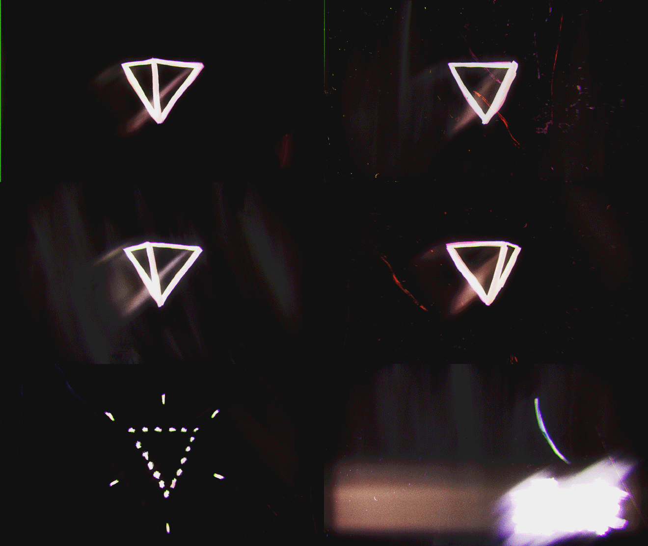
Animated "Triangle" paint test
Magnus: At one point since we needed so many small icons and symbols we were actually asking the animators we had on staff if they could animate a little thing in Photoshop – and some of them had never animated anything in Photoshop. [laughs]
Gabriel: We were like “Hey, if you have any downtime can you just draw us a little square that spins around?” Anything that we could add so we could really bring it for the title sequence. Everyone was really excited about working with this technique for sure!
It sounds like a real team effort!
Magnus: Yeah, it was definitely a learning process for us.
So what tools or software were you using to put this together?
Magnus: A lot of the animation was Photoshop. Originally we wanted to do it by hand, but because there were so many different iterations that we would have to do and the time constraints, we decided the best way to do it would be to paint everything in Photoshop. Once we had the groundwork for that - the titles and the background painted - that’s when we were able to take it into After Effects and really grunge it up. Giving it that grungy aesthetic is where Gabe and Annie really played a huge part in this.

Image set: Animating the Gaycation title sequence elements in Photoshop
Was there anything that took you by surprise when working on this sequence?
Annie: This was a challenging show to develop ideas for…
Gabriel: Yeah, the subject is a really difficult one to portray accurately. It’s a fine line.
Magnus: It was definitely hard to try to find that perfect mix between the seriousness and the playfulness that the show has. To try to make a title sequence with rainbows and triangles, but also keep it appropriate for the show was definitely the hardest part of developing it.
Gabriel: Another challenge stemmed from VICELAND as a channel being brand new. We were still developing our entire identity, so when we did that first round with that nice slick animation we quickly realized that as a brand that just wasn’t appropriate. So this being the first show we were making motion graphics for we were still kind of finding our overall voice.
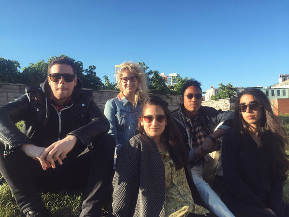
The VICELAND TV Graphics Team – Left to right: Gabriel Tick, Mieka Jewett, Annie Rosen, Magnus Atom, Marina Cacciapuoti. (not pictured: Matt Schoen)
How does Gaycation compare to some of the other VICELAND shows you've branded for the new channel?
Annie: We worked on the network branding as well over the past year with Gretel. What’s great about the branding is that it is so dark and straightforward that it really lets the content come forward and lets the content be the star. The show graphics really get to be a part of the show. I think it’s a nice balance between the stark black and white of the network branding and the fun that we can have within all the different shows. Our team of four people were making all the show graphics for all the shows, so it’s been a lot of work but it’s been a lot of fun. [laughs]
What element(s) of this sequence are you most happy with?
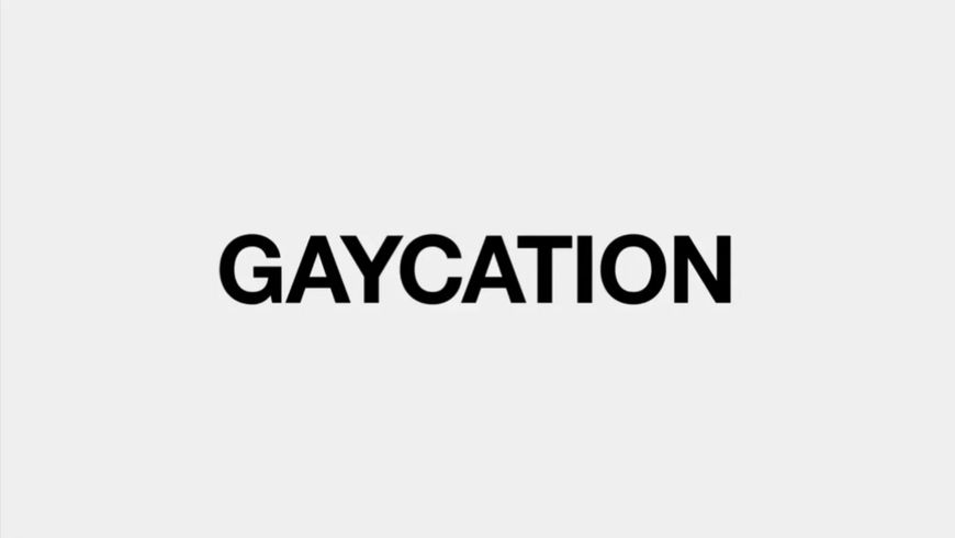
Magnus: I personally love the Gaycation logo. We spent a lot of time trying to get the rainbow in there. I’m a huge fan of colour, so the idea of mixing like six or seven different colours on one frame and making it look good was really hard. It was a lot of work so I was really happy with the way it came out in the end.
Gabriel: Yeah, that was a real challenge to take a full spectrum and not make it look muddy.
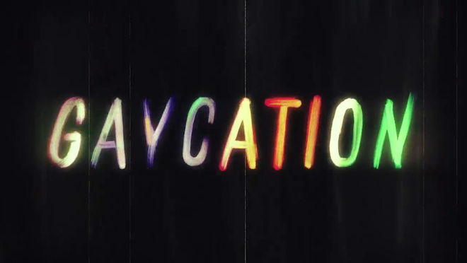
Gaycation logotype
Gabriel: I’m just really excited about the whole design of the animation and keeping the integrity of the oil painting look throughout.
Annie: Um… There’s not many parts left. [laughs] But I like the beginning part where we’re coming in from the live action footage. The audience doesn’t really expect it, so it feels like this fun little adventure, that we’re bringing you into this painterly world.
I wanted to ask you about title design more generally. What are some of your favourite title sequences? Whether it’s classic or contemporary, what do you guys like?
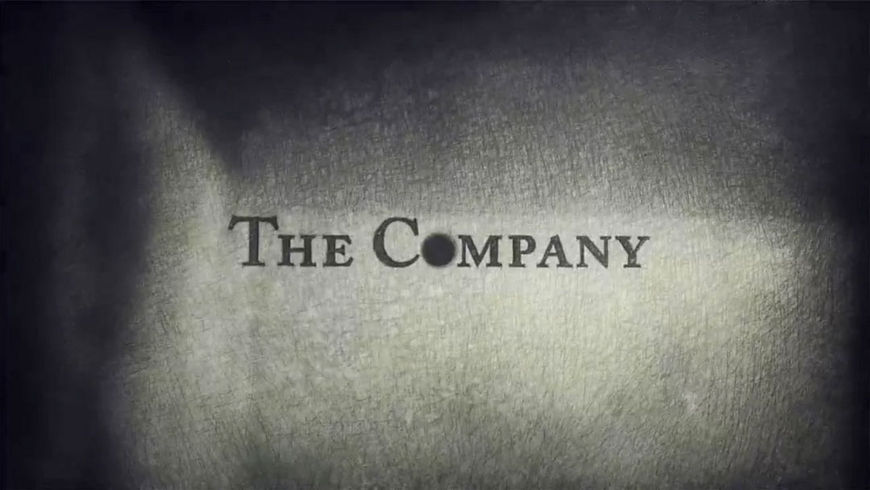
Gabriel: Digital Kitchen did one with the rabbits that I loved a couple years ago, The Company. It’s all hand done, it’s black and white with these rabbits jumping around and into a hole. That’s been one of my favourites since I got into the industry. Dexter is also a classic. It’s just such a smart execution and exercise in storytelling.
The Company (2007) main titles, designed by Digital Kitchen
Gabriel: But yeah pretty much anything that Prologue or Shynola does is a pretty big inspiration over here. Anything that tries to keep the integrity of cinema in mind.
Magnus: Yeah, we definitely love how Shynola do title sequences for big names without getting too digital. They go against the grain. Try to do it old school!
One big inspiration for me this year – in terms of colour, pacing, and composition – are the FITC Tokyo 2015 titles. I really like that one.
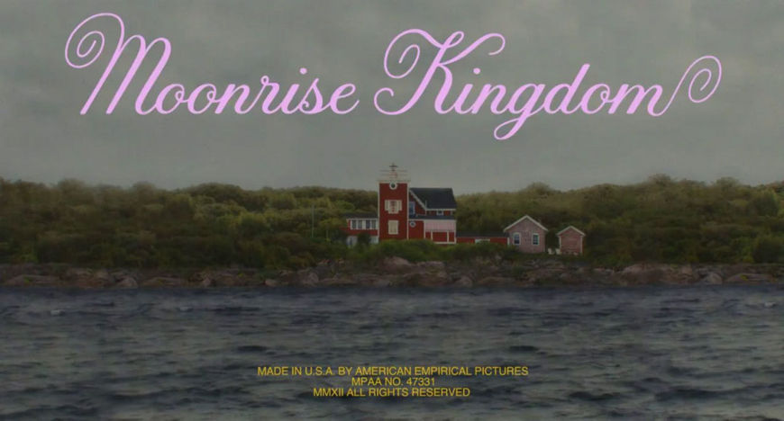
Annie: One of my favourites is the Moonrise Kingdom titles. It's playful, but also a bit dangerous, setting up an intimate family portrait. It reminds me of my childhood growing up by the beach in New England. And the typography is so classic. I'm a sucker for beautiful type, especially if it has a feeling a nostalgia.
Moonrise Kingdom (2012) main titles, designed by Jessica Hische
What have you seen or watched lately that’s been exciting to you?
Annie: I saw Wendy Whelan’s final performance with the New York City Ballet in October. The way she moves is incredible: both vulnerable and purposeful. And witnessing that final show was filled with intensity and immediacy.
Gabriel: There’s a new show on HBO called Animals that I’m loving, but my biggest animation inspiration this year is probably Don Hertzfeldt's World of Tomorrow. The storytelling relevance and irreverence is juxtaposed with his simplistic style. It’s a brilliant dystopian view from our current stasis.
Magnus: I’m actually a huge fan of music videos. The stuff that Flying Lotus was doing for a while with Kendrick Lamar. There was that one music video "Coronus, The Terminator" which was seriously beautifully, in terms of cinematography, in terms of dancing, abstract music and storytelling, while also tackling these grand themes of death and life. It’s been inspirational to me over the last couple of months.
Flying Lotus - "Coronus, The Terminator" (2015) music video

