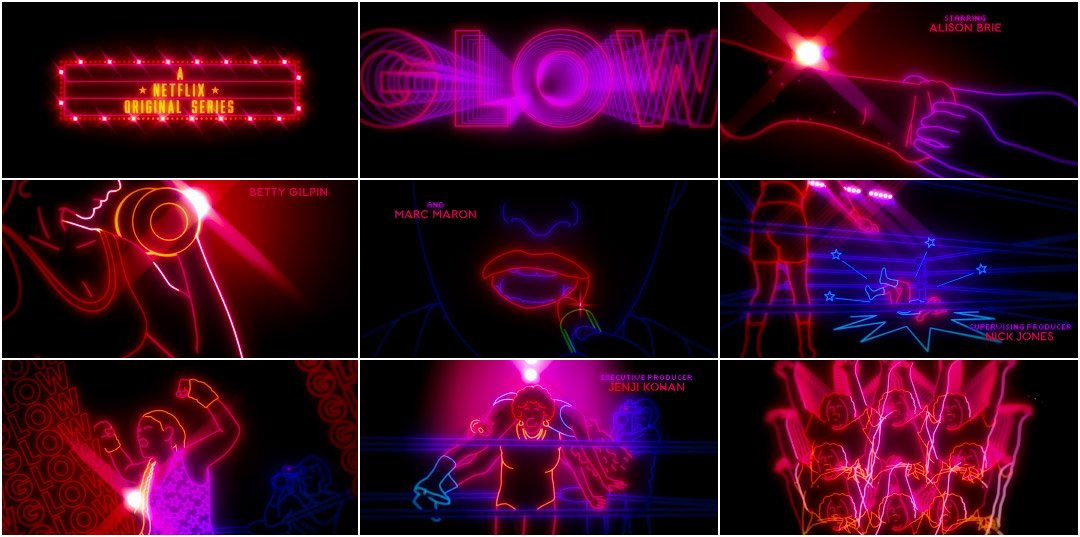
A cavalcade of neon-outlined combatants warm up before facing off inside the squared circle, mixing free weights and stretches with liberal amounts of hairspray and lipstick. The bell rings and these luminous warriors take each other to the mat, leg dropping, suplexing, and performing all manner of highflying top rope takedowns for the crowd.
This is G.L.O.W – the Gorgeous Ladies of Wrestling – or at least a stylized representation of the upstart wrestling promotion that debuted in 1985. The organization, which is the backdrop for Netflix’s new comedy-drama GLOW, combines the visceral thrills and athletic feats of its male-dominated counterpart with all the glitz and glamour (and exploitation) of Hollywood.
G.L.O.W. (1985) pilot episode introduction
The real-life G.L.O.W. was as weird and hilarious as it sounds, but it was also highly problematic by today's standards, playing up racial stereotypes for laughs and objectifying many of its performers with barely there costumes or worse. For the series’ opening title sequence (which only appears in full in the opening minutes of the first episode), co-creators Liz Flahive and Carly Mensch wanted to balance the tension between the series’ two central themes: exploitation and empowerment.
To execute the opening, the producers turned to UK outfit Shynola. Channeling their inner wrestlers for the project, the simple concept used by the studio disguises the complex techniques required to bring it to life. Rotoscoped footage of actual wrestlers gives the neon figures a vibrancy and realism that traditional animation could never hope to match, while graphic trails and geometric flourishes evoke motion design trends specific to the time period. Paired with Patty Smyth’s triumphant rock ballad “The Warrior” and the result is both a gleeful throwback to a bygone era of wrestling and a celebration of the colourful personalities that made 1980s sports entertainment so much fun.
A discussion with GLOW co-creators LIZ FLAHIVE and CARLY MENSCH, and Title Designer RICHARD "KENNY" KENWORTHY of Shynola.
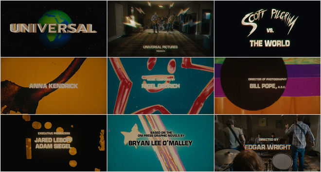
So we last spoke in 2011 about your work on the Scott Pilgrim vs The World main titles. What’s Shynola been up to since then?
Richard: Well, since we last spoke I suppose we’ve mostly been trying to get our film projects and a couple of TV projects off the ground. Beyond that, like most directors, you sort of slog away at making commercials to pay for your children’s clothes. [laughs] That’s the harsh reality. We’d all like to be auteurs, but it’s not always financially possible. But there is a large gap between when we last spoke and now because we don’t really do many title sequences. Not by choice, but it’s just really about whatever lands in our lap I suppose.
You’ve produced a ton of music videos and commercials over the past decade. Would you like to be doing more title sequences?
Richard: Yeah! Titles are really interesting projects for us. With commercials often they come to you with a script that’s already formed, it’s already been through countless revisions, market research, and horrific meetings with the client. So by the time you get on board there’s not really much to do other than to make a silk purse out of what you’re given. Music videos are the polar opposite. You’re just given the song and if you don’t come up with an idea that the band likes, you don’t get the job. If you do come up with the idea they like, you’re making your crazy idea. [laughs]
Scott Pilgrim vs the World (2011) main titles
Richard: Titles sort of fall between the two extremes of that. You’ve got a very specific task to achieve like a commercial, but you’re given creative freedom to actually come up with something, to contribute an idea. So they’re sort of perfect because it usually comes with a challenge – it has to achieve this in a very short amount of time – but there’s no idea being enforced upon you. So what I’m trying to say is that it’s a very positive and really enjoyable process to make a title sequence.
So let’s talk about GLOW. How did Shynola – a London-based outfit – get involved with a show about women’s wrestling set and shot in Los Angeles?
Richard: I have no idea!
Carly: We reached out to a bunch of companies and asked them to pitch us ideas. Shynola was actually one of the smaller underdog companies we went to.
Richard: We certainly didn’t go knocking on people’s doors like “Oh, have you got any title sequences for us to do?” They probably saw The IT Crowd or Scott Pilgrim – it’s usually our Coldplay video or something that someone’s seen – and then it’s here’s a blank piece of paper, pitch us your ideas. It’s great for us, but daunting of course. [laughs] Each project that we do is stylistically different and we try not to repeat ourselves. We’re weirdos to most people. [laughs] You get commissioned on the basis of your past work but we’re the guys who do something sort of weird and different each time. What we’re hoping for is for people to come to us and say “Hey, I’ve got a creative problem to solve. You guys always come up with an interesting idea: what’s your interesting idea?” That’s it. That was the case with GLOW. The show was already written and they were about to start filming when they got in contact with us.
GLOW (2017) trailer
Richard: The first thing that they sent over was the documentary that was the inspiration for the producers. It’s a primer for what the show was and it catches up with the original stars now. It’s slightly bittersweet because it’s like, what do you do post wrestling? It’s much like The Wrestler with Mickey Rourke. There’s this pathos to it. But at the same time the camaraderie between the characters and the fun of the show is quite infectious. But we immediately.watched the documentary and it’s kind of so obvious. It’s set in such a specific period with such a particular style that the ideas weren’t too hard to come to.
Liz and Carly, what were your original ideas for the opening and what were some of your inspirations?
Liz: We started with themes – mainly the tension between exploitation and empowerment at the heart of our show. We also sent Shynola some images and the pilot script. We knew we wanted the titles to introduce people to our world but not rehash things that were already in the show.
So tell us about the first meeting for this project.
—Liz FlahiveWe started with themes — mainly the tension between exploitation and empowerment at the heart of our show.
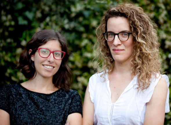
GLOW (2017) showrunners Carly Mensch and Liz Flahive
Liz: They showed us three very different concepts, including an early version of the one we chose. It was based on graphics from actual televised sporting events in the 1980s. We hadn't thought of going in such an animated retro direction, but immediately responded to it. It puts the viewer right in the 80's and harkens sports and strength and hits a nostalgic nerve without being too on the nose.
Richard: It was entirely conceptual to start off. We came up with three stylistic approaches more than anything else.
The first one is the one that you see – that was our first instinct and the one we ended up actually making. The thing that we did that convinced us all to go this route was this compilation of graphic sequences from around that time and a little earlier, late ‘70s and early ‘80s. A whole bunch of network idents and actual shows that had this weird glam, neon, over glittery style. There was one in particular, a pro bowling series that must have run in the US. In the UK ten pin bowling doesn’t have quite the same importance, so it’s slightly crazy to us that you have this Saturday night TV bowling! This is what you sit down for in terms of entertainment.
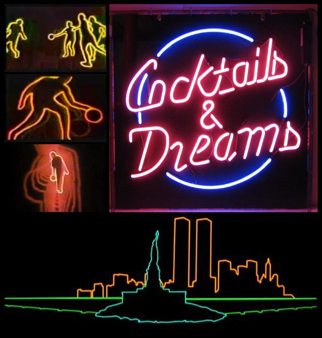
GLOW (2017) neon approach references
But they way they did the title sequence was all razmataz “Wow! It’s bowling time!” I thought it was fitting and in fact the way I pitched it to the producers was to try to make a title sequence that could have come from the original show.
What were the other approaches?
Richard: The second was a more painterly approach, very similar but in big smears of neon paint. It was a way of framing the wrestling in this sort of artistic style rather than through footage. Something strange happens when you rotoscope live action; it really concentrates your attention to exactly what the characters are doing and gives more importance than just seeing the live action.
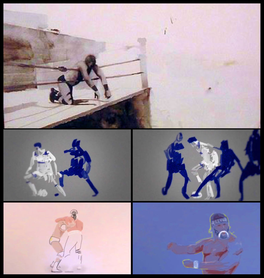
GLOW (2017) painterly approach references
Richard: There was also a third idea which was a completely different angle. I’d read about this crazy fanbase that the original GLOW series had, particularly with children and grown men [laughs] I use the term “grown” loosely. But it had this absolutely devoted fan base, so that concept was more along the lines of presenting a scrapbook. You were going through a scrapbook full of stickers and torn out, cut-out pictures of the stars they admired, and that would have been the cast. Flyers and this sort of thing.
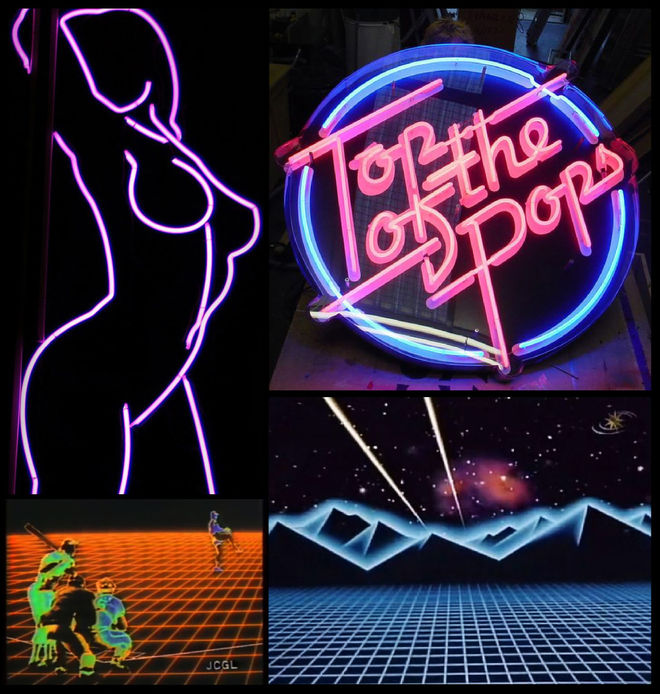
GLOW (2017) neon approach references
Carly: We also talked a lot about porn and how cool it would be to take the typical neon sign of say a woman's leg and apply the same look to real women's bodies. To rotoscope a real woman's body into a neon sign and see what emotional effect that would have.
Liz: A lot of our impulses from that first meeting ended up in the sequence.
Richard: It was a very creative conversation where we talked about ideas. The main question I asked them was “By the end of the title sequence, what do you want the viewer to feel?” To me the best title sequences prime you. My favourite title sequence in that regard is Cheers. Cheers is not a very good title sequence in terms of how it looks. It looks incredibly cheap and I don’t imagine it took very long to make. However, the song and the vintage photographs have this feeling so that by the end of the title sequence you feel like you’re going into your local bar to meet your old friends. You’re like one of the regulars in the bar – that’s how it makes you feel. So that was the big question. I think the answer was that they wanted to the viewer to be waiting to see some asskicking. [laughs]
GLOW (2017) animation references
Richard: This needed to feel like it was born from that time in the same way that the actual show itself does. It’s a sophisticated version of what the 1980s was like. There’s some tacky outfits and stuff, but it’s not over-the-top and crazy. It’s not just about that. There’s a sophistication to it. It’s shot in 4K not on VHS! So our titles needed to have that. We toyed with the idea of completely derezzing it and putting it down to VHS and back up, but that was too much. It had to feel like a modern version of something, like being teleported through time almost. It’s your memory of the ‘80s but not a caricature of the ‘80s.
Rotoscoping an animation technique used by animators to trace over motion picture footage, frame by frame, when realistic action is required.
Rotoscoping is a famously time-consuming as a technique. Walk us through the process of creating a shot. You take live action footage and basically trace over it, right?
Richard: I can explain it in two words: fucking awful. [laughs]
The first thing we did was make a full edit of the sequence using actual shots, revised that, and refined the edit. Once that was locked it was “You do this shot, I’ll do that shot,” get that done and then on to the next one. Rotoscoping is kind of laborious and time-consuming no matter what. You put a lot of effort into each frame for it to fly past in the blink of an eye. This one in particular was much harder than we thought because it was very difficult to draw each frame with constant line thickness. That actually proved to be quite a challenge to do that technically. We had to devise our own bespoke way of making it which was fucking convoluted.
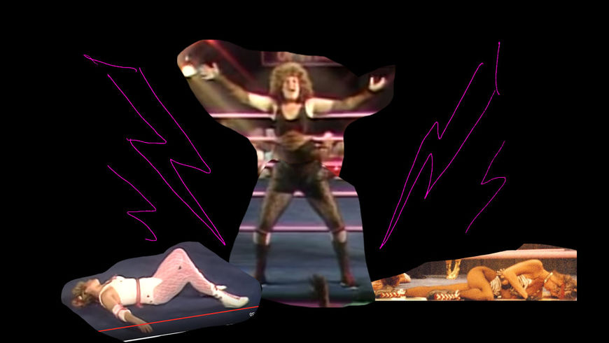
—Richard "Kenny" KenworthyI can explain it in two words: fucking awful.
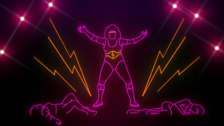
GLOW (2017) rotoscope mockup before and after
Richard: The solution became to basically rotoscope the whole thing with splines and beziers. To do one picture is not too bad – once you start figuring out where the lines for the fingers and hair are going to go. You’ve got to simplify the image that you’re looking at. You can’t put every detail in. But if you’ve got to be that selective with the details, you’ve then got to be that selective of every subsequent frame in a consistent manner. Hair in particular is a nightmare!
'80s hair especially!
Richard: Yeah! Then you’ve got the additional problem of arm and leg shapes passing in front of one another, even though it’s just an outline the one in front has to be filled so it can occlude the one behind. There’s one shot in particular where one of the characters from the show is doing a Helicopter – she’s got Betty Gilpin over her shoulders like a sack and she’s spinning around. So you’ve got the arms and legs of two characters over a series of frames all passing in front of each other. It was so hideously complicated! [laughs] It doesn’t look like anything when you watch the finished thing – it looks cool but you can’t see the work that went into it. I think we even convinced ourselves that it was a simplistic technique that we were pitching.
GLOW (2017) rotoscoping process
Richard: The added difficulty was that we’d said we were going to have all these amazing trails – that was such an effect of the time. It’s something that you wouldn’t dare put on your modern production, but it was great fun for us. All sorts of awful flares and echoes and stuff on there! But if you consider that every one of those little echoes had to come from somewhere, we had to devise a way where we could generate those echoes and have it be correct. It’s much more complicated that it actually looks.
Were there any other approaches in terms of what the characters were doing in the sequence? Was it always pure wrestling?
Richard: There was a short period where we were looking at a version where the girls were doing more mundane tasks instead of wrestling. Tasks like household chores and errands, but in the neon style. It’s a funny idea, but actually doesn’t make for a very dynamic title sequence.
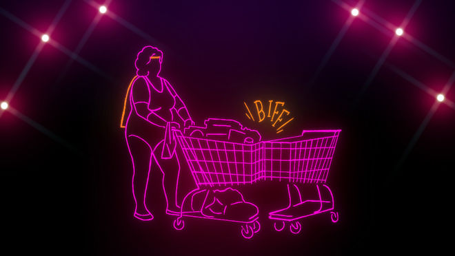
GLOW (2017) mockup for abandoned concept
Richard: You’re basically telling the viewer “Hey, look! These guys are wrestlers but they also got to do their washing.” The show does that already and you don’t have to point that out to the audience. What that does for me is that it gives the title sequence a point of view, like an author’s voice. I’m saying this to you! Whereas we thought it was much purer to somehow transplant this '80s title sequence into 4K. It’s showtime!
And where did you get the source material from? Did the production provide you with the clips from the show?
Richard: We watched an unhealthy amount of wrestling trying to find specific moves. [laughs] A title sequence from the time, for a show like that and certainly for the pro bowling show, you have a compilation of the best moves. It’s kind of like with Magnum P.I. or T. J. Hooker where you get the best shots from the entire series in the title sequence. So it was all about finding the best moves, scouring literally days worth of footage looking for shots.
Also, a lot of the footage was in 4:3 and was cropped and framed so badly that we had to reposition it on the canvas and make sure there was room for the credits. What we were often having to do was extend limbs and extend bits of the ring to fill in this massive void. Add it to the pile or awful things we had to deal with on this. There’s no trick to it other than hard labour!
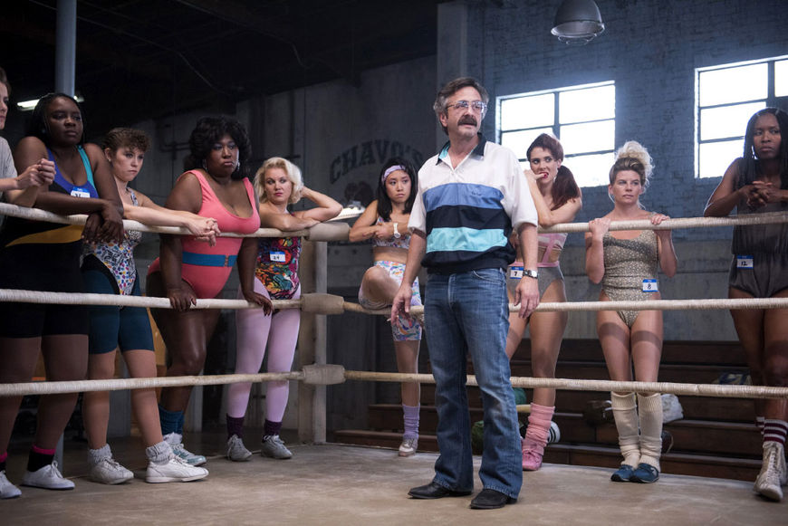
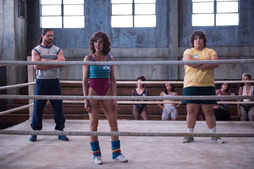
GLOW (2017) production stills
Richard: Part way through the process Liz and Carly were keen to feature some of the people from the show as well, so some of the shots are actually from episodes. We were given rushes of some of the more interesting fights from the series. You can recognize some of the stars in there, but with stuff like the putting on of the boots, that was just ourselves doing that. You can’t animate those things in a realistic manner. There’s some strange alchemy that happens when you rotoscope live action, even with the simplest of lines you can tell that it’s from live action. The brain knows, especially when there’s a camera move or perspective moves on the ring. You can’t possibly hope to do that as animation from scratch. We had to find the footage.
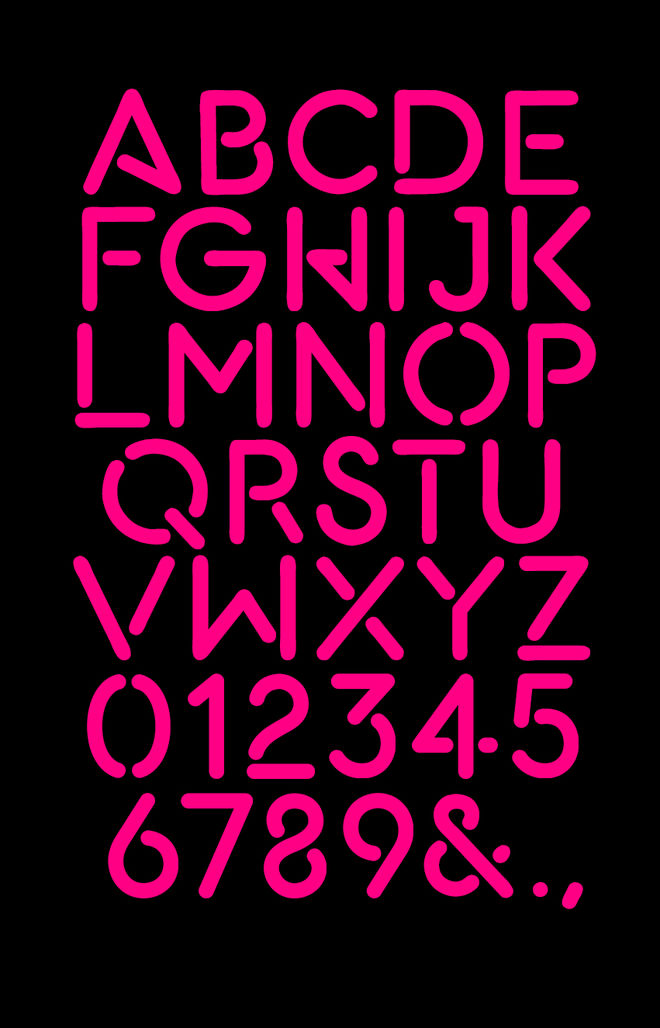
GLOW (2017) typeface
Was there a lot of back and forth between the production and Shynola once work began on the sequence?
Richard: The actual main titles didn’t really change that much. When we were halfway through production I said “Oh, we’ve still got to do the main title.” And they were like “What are you going to do to that?” They already liked the animatic so much that they really didn’t want us to change it. But it wasn’t high quality enough for broadcast at that point. Really all that changed was adding some members of the cast. They were quite particular that we reflect the diversity of the cast, not just in terms of race but body shapes too. In a lot of the post-GLOW wrestling and contemporary wrestling the bodies all become very samey. They’re all very fit, athletic and tall women, whereas GLOW is quite unique wherein the cast of GLOW was literally pulled in off the street. It was a diverse ensemble of characters, so it was important to reflect that.
Let’s talk about the music. It’s so perfect for the opening and the show. Did you consider other options first?
Liz: We considered a bunch of other options, ranging from Joan Jett to purely instrumental synth beats. We learned that tempo and drive was really key, so we started there. It was a delicate balance – we knew we wanted to send the audience into the show with tons of energy, but also honour the fact that our world is pretty grounded and real.
Richard: We were working to a completely different song at first, and then a scratch track that a composer wrote. It’s not really an ideal situation, but fairly common with this kind of project. It’s not indication of any sort of disorganization, it’s just phenomenally difficult to work through contracts and pin down a song. So we just chose a tempo we were going to work to.
Carly: Once we landed on Patty Smyth, we couldn't get it out of our head. It's a really sticky song that makes you smile. Her voice carries tons of emotion while feeling raw and strong.
—Carly MenschWe couldn’t get it out of our head. It’s a really sticky song that makes you smile.
Music video for "The Warrior" by Scandal featuring Patty Smyth
Richard: The wrong song choice can just destroy a title sequence. It’s such a fast-paced cut that you can kind of stick it with anything and it’ll pair it pretty well, but I think it’s great. We didn’t see the finished sequence for quite a long time, but we’d already heard the song as one of the options. I think my favourite was a track by the Eurythmics, “Grown Up Girls”. It was a wicked song, but that’s sometimes how it works. There was a few really good choices. We also looked at "Invincible" by Pat Benatar. Personally, I would have chosen Bikini Kill's "Rebel Girl", but they really had their heads screwed on when it came to the music. There’s some great music on the show!
How big was the production team?
Richard: Just three. It was just the three of us. We bring in freelancers occasionally and perhaps we should have done that on this job. [laughs] You tell me this now, but it’s too late mate! There wasn’t a lot of time to make this sequence ,so it amounted to a lot of very late nights. We made the whole thing in something like six weeks. It’s basically all hands at the pump. We’ve been doing this a long time, so we’re quite adept at working together.
Which tools and software did you use to put it all together?
Richard: We did the whole thing in After Effects, but as I said we had to work out our own bananas way of doing it using splines. We also found that you can’t really animate it at 4K resolution. That was the beauty of the splines – a spline is virtual, it’s not pixels. So we had to work out a way of working at a smaller scale and then blowing up the splines to be 4K so we could actually render it out and not lose any of that fidelity.
What elements of this sequence are you most happy with?
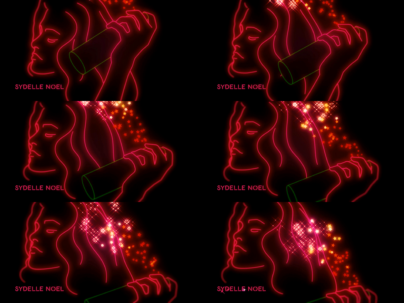
Liz: Every detail, honestly. We're in love with the entire sequence. But probably the little added 3D trails and shadow effects – like the stars coming out of the hair spray bottle.
What about you, Kenny?
Richard: For a long time, in fact even after we delivered it, it had a slightly different ending. It kind of just faded out into a wet fart. It kind of blurred out into nothing, almost like a bokeh effect. It felt fine, but there was always something nagging me about it. Then the producer turned around and said “Meh, it’s a bit of a wet fart!” When something is nagging you and someone actually vocalizes it as well then you know it’s true. It’s not your own psychotic mind worrying about petty details. They were like “Can’t we just do something that’s a bit more BOOM at the end?” So we went back and did the crazy wipe where she splits into a dozen copies of herself. When I watch the sequence now, I’m actually expecting the old ending. But I get this ending now that we added at the last minute. Aw yeah! [laughs] It works more for me than anyone else on the planet. Yeah, you have the chance to go back and tweak something and make it far better. The fade to black is a crap way to end. When they had an assembly of the first episode they were like “OK, we need a punch at the end!”
What are some of your personal favourite title sequences, whether classic or contemporary?
Carly: Rosie Perez dancing in Do the Right Thing. Billy Elliot. To Live and Die in L.A.
Do the Right Thing (1989) main titles, directed by Spike Lee and designed by Balsmeyer & Everett, Inc.
Liz: Weeds. Orange is the New Black. Freaks & Geeks. 30 Rock. Taxi.
Richard: Well, there’s Cheers as I mentioned, but beyond that – and with the greatest respect to your website – I tend not to look at other title sequences.
Cheers (1982) main titles, designed by Castle/Bryant/Johnsen, Inc.
Richard: Certainly not for inspiration because that’s basically inbreeding. You’re not going to have any original ideas for a title sequence if you’re looking at a title sequence. What are you gonna do? I’ve often got absolutely no idea what’s going on in music videos either. I don’t want to know deliberately, you know? I’d rather find inspiration in a painting or a book.

