From the first notes of the synthesizer in the opening gun barrel sequence, a sense of smooth suspense takes hold. The barrel sequence is familiar and yet different. Shinier than before. Brighter, faster, and on the move. Its target as always is James Bond, but this is 007 as we’d never seen him before.
When GoldenEye was released in 1995, it had been six years since audiences had looked down this barrel at James Bond. After a slew of legal difficulties between distributor MGM and production company Eon, the departures of actor Timothy Dalton and director John Glen, and the death of title designer Maurice Binder in 1991, the franchise was on shaky ground. At the same time, Albert R. "Cubby" Broccoli, co-founder of Eon Productions and producer on the Bond films for 40 years, stepped down from his duties due to health problems and tapped his daughter Barbara Broccoli to succeed him. Some critics speculated that it was time to throw in the towel, suggesting as The Sunday Times’ Tom Shone did in 1992 that it was “time to junk Bond.”
But GoldenEye, the 17th film in the series, saw James Bond return a new man. Director Martin Campbell was enlisted to helm the picture (he'd later return to direct 2006's Casino Royale), Pierce Brosnan became the face of Bond for this and the next three entries, and Barbara Broccoli set about breathing new life into the franchise.
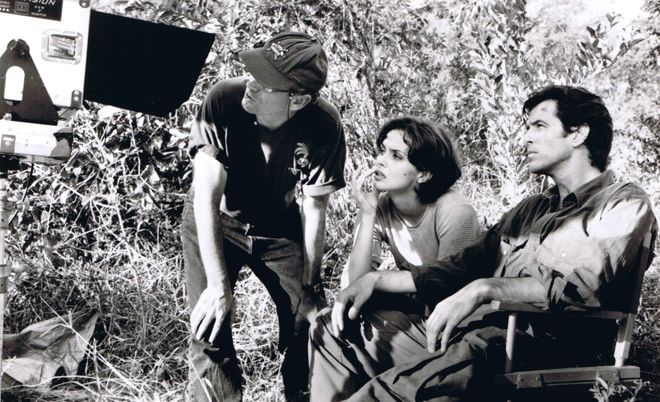
Director Martin Campbell with actors Izabella Scorupco and Pierce Brosnan on the set of GoldenEye
Realizing the need to bring the suave superspy into the digital era, she and co-producer Michael G. Wilson turned to music video director Daniel Kleinman to carry the Bond title design standard forward. Throughout the 1980s, Kleinman had directed more than 100 music videos, experimenting with montage, special effects, and surreal, dream-like sequences. With technology changing in leaps and bounds in the late ’80s and into the ’90s, pushing the franchise's graphic sensibility into the modern era was crucial.
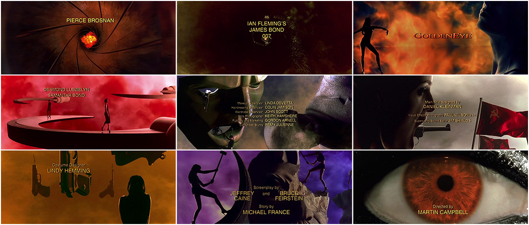
Kleinman's first task was to update the iconic gun barrel sequence in which Bond turns and shoots, a staple of the series since Binder created it for 1962's Dr. No. The barrel is jogged out of its static form and recreated digitally, following Bond as he walks across the screen. After the conventional pre-title sequence, a second gun barrel appears. One explosion begets another, and suddenly we are blasting down the barrel, traveling through the cylinder alongside a bullet. This barrel is a departure from the first, with photorealistic reflections, shadows, and movement, ushering in what would become a new effects-laden visual language for the franchise. As Tina Turner sings about reflections and darkness in depths, fire engulfs the screen and women dance, languidly and in silhouette. More scantily clad women wield sledgehammers, demolishing giant Communist statues and symbols against vibrant full-colour screens in a sequence that implies the passage of time as well as the fall of the Soviet Union. With this combination of elements, Kleinman acknowledges the title design tradition of Bond – girls, guns, and glamour – while leading it into the future through new techniques and expanded narrative possibilities.
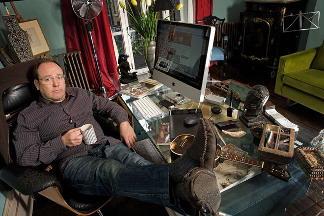
Title Designer and Director Daniel Kleinman
Hiring Kleinman proved a savvy choice, as Binder described his own title sequences for Bond as "the forerunners of today’s pop videos." Indeed, Kleinman's work reinforced the connection between music and image, using lyrical and aural cues to inform the narratives, visuals, and editing, ultimately giving rise to a new generation of Bond power ballads that were intimately linked with the films. Though it had only been six years since 007’s last jaunt, the world and the means of telling screen-based stories had changed dramatically. GoldenEye’s updated gun barrel and slick main title sequence announced the return of James Bond and reclaimed his status as a sophisticated, seductive, and cutting-edge character. The titles also gave the franchise a strong foothold in the Hollywood spotlight, ensuring Bond’s continued relevance as the world revolved toward a mysterious and increasingly digital new millennium.
A discussion with GoldenEye title sequence director DANIEL KLEINMAN.
So, GoldenEye came out in 1995. This was your first foray into title design. Before GoldenEye, you had primarily worked as a music video and commercial director. What was that transition like for you?
DK: Oddly, it was not that difficult. Because of my graphics background, I was quite interested in special effects and creating images that were not just caught in camera but montages. I was quite used to working to a music track. Normally, doing music videos, you had to have the band in the video and I didn’t need to include the band in the title sequence! So the transition wasn’t too bad. It was very difficult for the film optical house, but that’s another question!
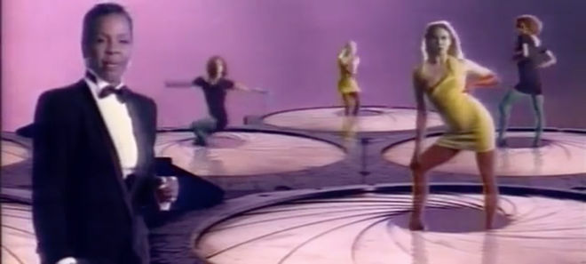
And you’d already kind of dipped your toe in the waters of Bond with your video for Gladys Knight, right?
DK: Yes! I’d done a few music videos which linked into feature films. Music on TV was really big at the time. A lot of movies were using MTV as a promotional tool so the music video wasn’t only for the band – it would include clips of the movie. I think that was the reason I got asked to do the one for Gladys Knight, for “Licence to Kill”, which I really enjoyed because I was a big fan and a James Bond fan.
Gladys Knight – "Licence to Kill" music video (1989), directed by Daniel Kleinman
DK: I did it as a kind of primitive homage to Maurice Binder. The [GoldenEye] producers remembered that I’d done that.
I remember going in to meet the big producers, Michael Wilson and Barbara Broccoli. I remember Michael asking me, “Do you think we should keep the girls? Should we have guns in it?” There’d been some question – now that Maurice had sadly died – whether the style should carry on or whether it should change. My answer was that we should keep all the visual tropes that Maurice had set up and kind of update it. That was the answer they wanted to hear, so I did get the job.
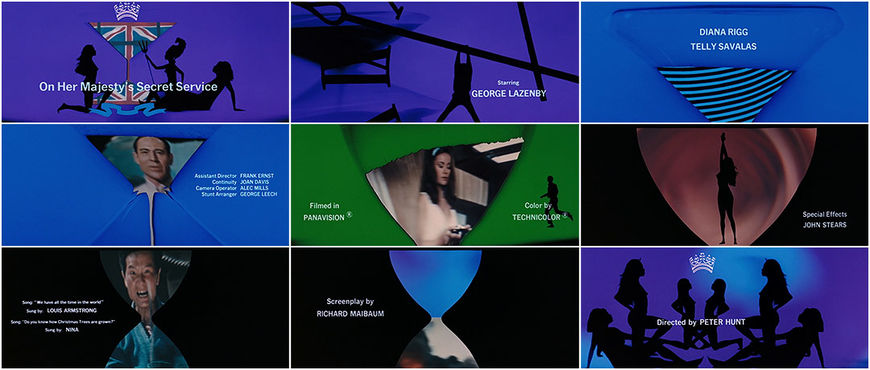
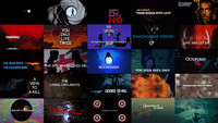
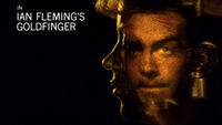
On Her Majesty's Secret Service (1969) main titles, designed by Maurice Binder
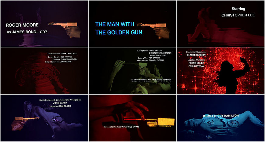
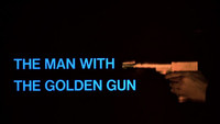
The Man with the Golden Gun (1974) main titles, designed by Maurice Binder
So there were questions about the formula for the titles? It was a relaunch of Bond in many respects.
DK: It was never really spoken. They just asked me what I would do. But I think you’re right. It was a new Bond, a new actor... it had been a six-year lull between the last film. It had gone through a lot of legal wranglings behind the scenes with copyrights. It was something that was on their minds – how much it should change and how much it should modernize. I wanted to make it more contemporary to that time but hang on to the original feeling that Maurice Binder had. That made everybody feel okay. If I’d come in and said, “You know, you should trash everything Maurice has done and I’m going to reinvent the whole thing!” [laughs] maybe I wouldn’t have gotten the job. He was such a clever bloke and he had created such a worldwide famous visual language which was very potent. To radically change it and not build on the strengths of that would’ve been silly.
—Daniel KleinmanWhen I look back to GoldenEye, I look back quite fondly ’cause it came out quite close to how I’d imagined it.
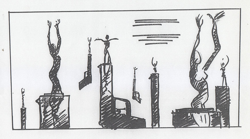
Sketch by Daniel Kleinman depicting women on gun barrels
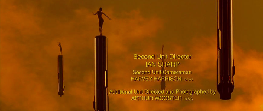
Still from the GoldenEye main titles
What sort of direction did you get from the director, Martin Campbell? Had you seen a rough cut?
DK: I saw nothing! I think I read the script and I probably had, you know, one meeting with Martin just to say hello. The thing with the Bond titles are that… by the time I get involved with it, it’s usually just before they’re going into production. I read the script, I have a meet, and I tell everybody what my ideas are, and then usually the directors are off filming the main film. Martin just left me to it.
What were your initial concepts for the sequence?
DK: I had a very strong idea that I wanted it to be a sequence of time passing. The pre-title sequence happens in one time period and the post-title sequence happens many years later, so the most interesting thing to do was to make a sequence that says, Time is passing and these are the events that happened during that time. The most important event that happened during that time was the fall of the Soviet Union. So, once I was thinking of images of the fall of the Soviet Union, it came to me that it was all sort of Western values embodied by women in lingerie smashing the sickle and hammer statues to pieces. [laughs] It linked in with the story as well, so it had an edge of humour and an edge of sexiness and all the things that make up a Bond title sequence.
—Daniel KleinmanIt came to me that it was all sort of Western values embodied by women in lingerie smashing the sickle and hammer statues to pieces.
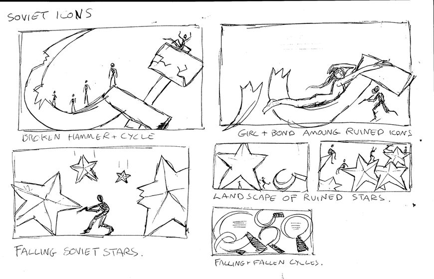

Early sketches for scenes featuring broken Soviet statues, symbols, Bond, and women
It’s a funny idea, really! This notion of using scantily clad women as the representation of the fall of Communism and the Soviet Union.
DK: Well [laughs] it’s absurd in one sense but it’s also rather true in another! At the time, if you wanted to get anything in Russia or have a good time or get money, what you would do is smuggle in jeans and Western clothes, because they couldn’t get them. So things like Western lingerie, cosmetics, goods, Western values – the sort of sexiness of Western culture – eventually caused the cracking up of the austere Soviet ideal. So even though it was kind of tongue-in-cheek there was a truth about it.
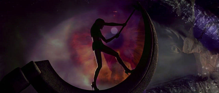
The sequence begins and ends with a look down a gun barrel. There’s also the classic gun barrel that originated with Maurice Binder’s work. How did you approach updating that?
DK: Right. There’s the one where Bond walks across and turns and fires at the screen which is like the logo gun barrel, and then I put in another gun barrel in the beginning of the title sequence. The one where Bond walks across was the real classic Binder image of Bond, framed in the gun barrel. I obviously had to remake it. Binder had effectively taken a still and panned it across the screen – he just didn’t have the technology to create something in three dimensions. So I made it a three-dimensional object and gave it some parallax. I made it a bit shinier and a bit less ’60s.
—Daniel KleinmanIt was my first foray into Bond and I really wanted to leap straight in with all the classic images.
Bond barrel sequence designed by Daniel Kleinman from GoldenEye
DK: Then likewise with the gun barrel at the very beginning of the title sequence, I felt – I just had this idea of coming into it through a tube, which is the gun barrel, and having the bullet fire at you. It was my first foray into Bond and I really wanted to leap straight in with all the classic images.
You often work with storyboards and draw out the scenes. What was your process for creating this? Can you take me through it, step-by-step?
DK: GoldenEye was probably the only title sequence I’ve done with this particular technique. I was used to using analog video effects in an online suite. I had done a storyboard and worked out the story I wanted and the transition of images.
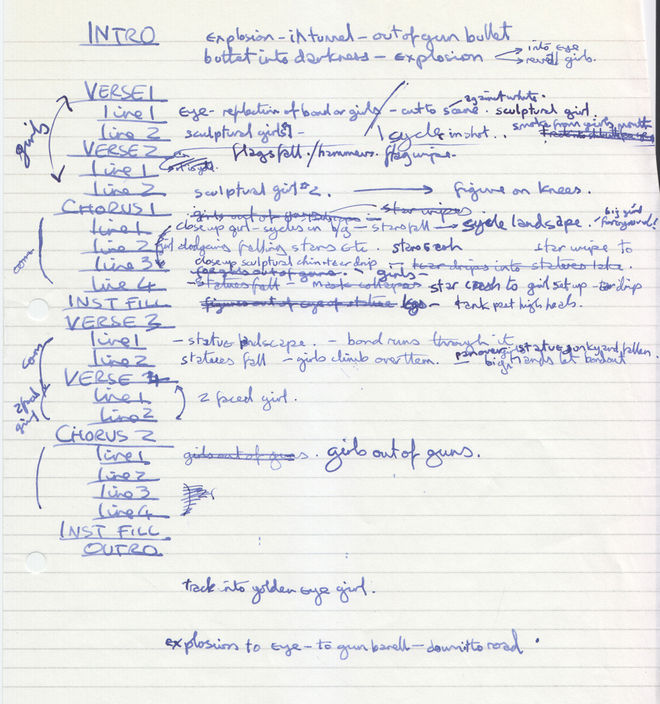
Draft of a shot list by Daniel Kleinman for the GoldenEye title sequence
DK: Then I went and filmed all the stuff with the girls and made the props batches and filmed them in the studio. I had a guy called Eddie Kidd, who was a stunt double for Pierce Brosnan, come in and do some filming. All the elements that I needed to create the sequence, I filmed on film. That film then got transferred onto video tape. Then I used the videotape in an analog online suite. This is before digital stuff, before Henrys and Harrys and Flame and Inferno and all those machines. You could key, you could move things around, spin things around, make them smaller and larger, and it all happens in real time. So if you imagine: I’ve got a picture of a lady, and I’ve got a picture of a statue; I can shrink the lady, and I’ve got a little joystick and I can move it over and place the lady on top of the statue.
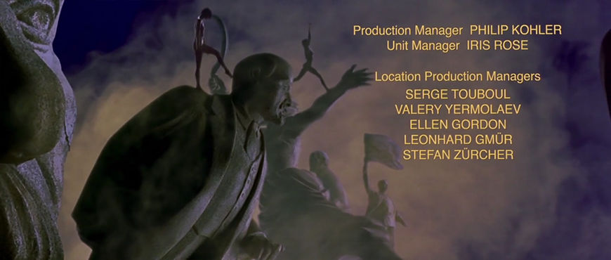
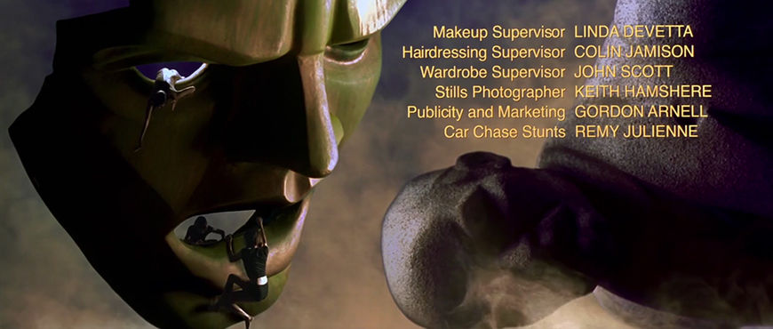
DK: It’s a very easy way for me to see what I’m doing and build up the pictures. So I created the whole sequence in that way. But! Big, big problem with it is that it was only video, not film, so it was very low resolution. What that means is it’s no good for the movie, because the movie has to be in full, high-res film projected resolution, which I think they shot anamorphic so it’s very, very high resolution! But because the sequence I’ve created is on video, it had to be recreated – but on film! This was all starting to be done on the big digital machines but they were very slow. They were set up for doing opticals on shots that were maybe one or two seconds long and what I had to do was take my three- or three-and-a-half-minute sequence and re-create the sequence that I made on video. I had a whole other team which had to copy by eye – they had the sequence I’d created on video on a screen in front of them and they had to recreate that frame-by-frame in these massive, very slow computers. It would take maybe 24 hours to do twelve frames. And there was no way of watching what you were doing as you were doing it! It chugged all the way through.
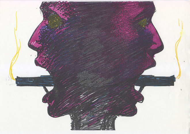
Sketch by Daniel Kleinman depicting the two-faced woman with gun barrels in her mouth
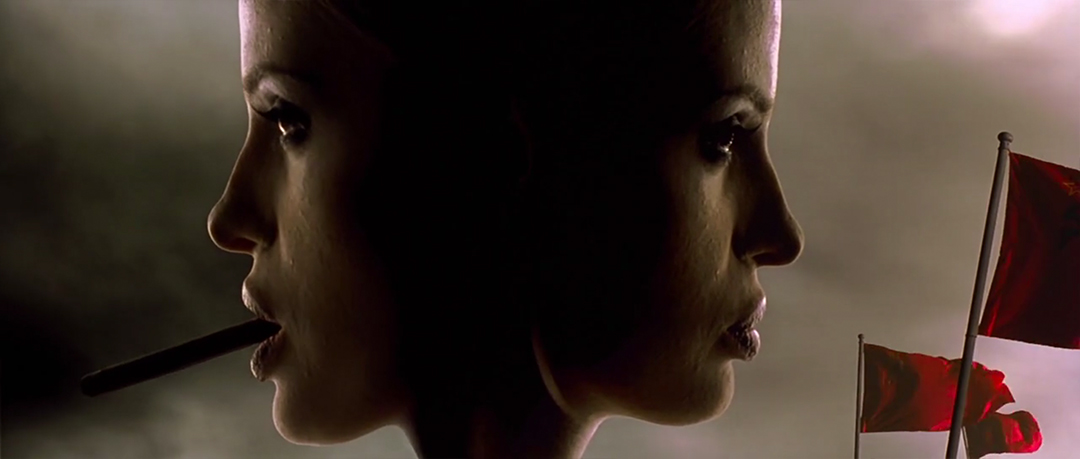
DK: When it finished you could run it but not in real time – you could sort of jog through the frames and you could see whether it had come out right. It’s a bit like putting a pot in the kiln – you don’t really know until it’s finished whether it has got a crack in it or not! [laughs] So it was a very laborious process. Really difficult. The actual creation of it, for me, designing it and putting the images together was very easy, but translating the video at TV resolution into film resolution, that was really difficult. It drove everybody around the bend. It just took so long. And as you’re copying it by eye, mistakes were made, and I’d get cross because something I wanted wasn’t there, and somebody forgot to do something or didn’t put it in the right place... But for the next film, which was … what was the next one? The World Is Not Enough, was it?
It was Tomorrow Never Dies, that was ’97.
DK: Yeah. The post house that I was using said, “Look, it was far too difficult last time. You’re going to have to work directly…”
Was this Framestore?
DK: Yeah, Framestore. They said it’s just not practical. You can’t create the sequence and then re-create it. It’s like doing the whole thing twice. These aren’t enormous budget things. So I had to work directly on the next generation of machines which were still very slow, very clunky. So for the next process after GoldenEye, I found it terribly difficult. It wasn’t intuitive. I had to spend days and days – weeks, in fact.
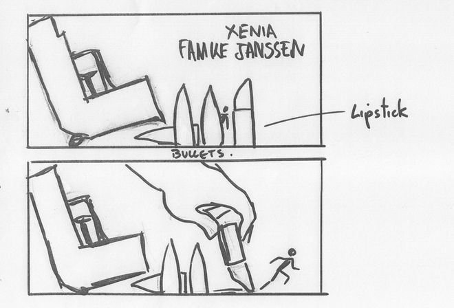
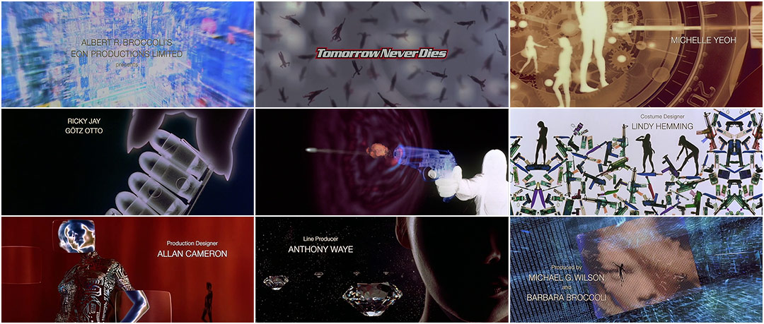
Sketch for GoldenEye by Daniel Kleinman featuring a hand in close-up with bullets. This idea ended up being recycled for use in the main titles to Tomorrow Never Dies.
Tomorrow Never Dies (1997) main titles, designed by Daniel Kleinman

Unused early sketch for GoldenEye depicting golden eyes in the sky and a landscape of eyes
How much of the GoldenEye sequence did you actually shoot? Was anything pre-existing?
DK: I shot most of the elements. I definitely shot a lot of smoke and fire. There was one explosion that I didn’t film. It might have come from one of the special effects units on the movie. The opening explosion, which I kind of made to look like it was in the gun barrel. That was slightly too enormous for me to create! But most of the other things I actually shot in-camera. Like when the bullet whizzes away from the camera, I filmed – I had a wire with a little piece of burning rope rigged on it on a sort of spring-type thing and it flew down the wire and left a trail of smoke. I tried to do as much of it in-camera as I could.
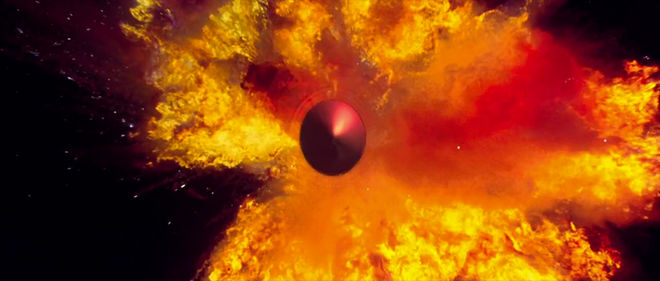
DK: The Bond character – he sort of walks in and he’s like a stoic James Bond – that was Eddie Kidd. All the ladies I cast… a couple of them were friends, some were models and dancers. It was like a normal film casting.
Tell me about those statues. Those are real models, right?
DK: Yeah. We did spend a bit of money making the gun barrel, the inside of the gun barrel digitally but that was just about the age of technology at the time. So all the things like statues, big mask things, giant stone hammer and sickle, they were all big props, actually. The statues were twelve, fifteen, twenty-foot high and made out of polystyrene and painted to look like stone.
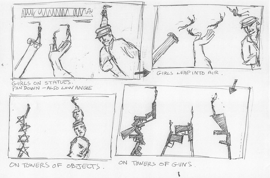
Storyboard sketch by Daniel Kleinman depicting women on statues and towers of objects
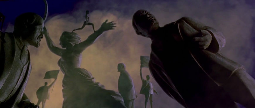
Still from the GoldenEye title sequence featuring women on statues
DK: They were all shot against bluescreen or greenscreen. The sickle was probably about two- or three-foot wide, and so was the hammer. The statues were quite big, but because they were polystyrene you couldn’t stand on them. I had to shrink the ladies down. I was interested in the illusion of trying to make them feel like they were there so they cast shadows and reflections, which at the time was difficult to do. Most people didn’t bother with it, but I matched the lighting and the angles to make it feel like they were really standing on the statue or dancing on the sickle.
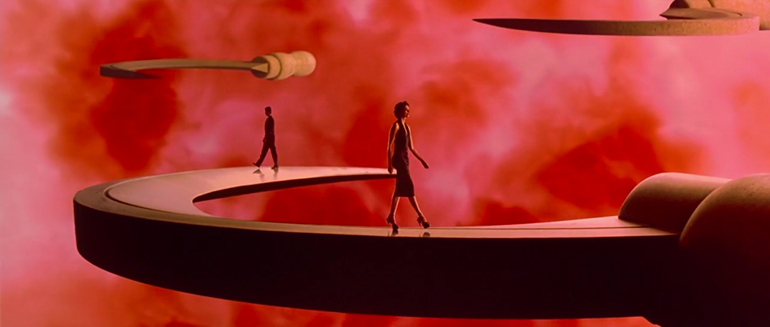
Many past Bond sequences tend to rely heavily on black as a backdrop, but your GoldenEye sequence features a lot of purple, gold, red, full-colour screens. Can you talk about that a little, your use of lighting and colour?
DK: Well, my background was – I went to art school, I thought I was going to be a painter. I always loved colour as painters always like colour. I’m interested in creating images like surrealist paintings. Like a dream sequence. Maurice was probably limited with his colour palette, because there was no way of using gradations of colour. The technical way that those opticals were done, you can’t put in a colour filter. Quite often you’d use high contrast images because that was easier to key with. He was actually using the technical limitations in an aesthetic way. I didn’t have those limitations.
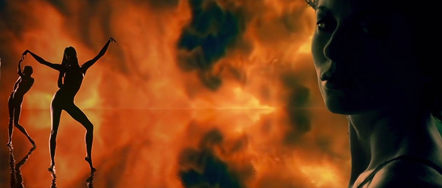
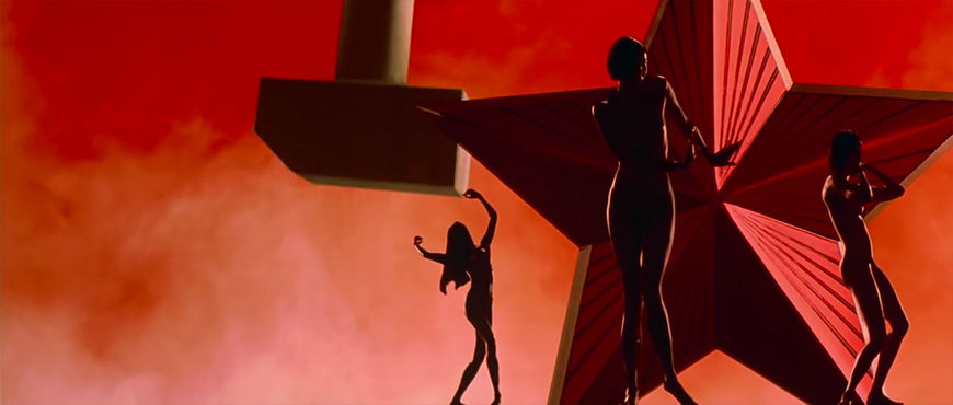
DK: I wanted to move it on, I wanted it to look more contemporary and not so ’60s even though I love that ’60s graphic look. Just trying to make it more lush and more exciting. I didn’t want to just copy what Maurice did but use his heritage and create these luxurious colours. I think colour, in post-production and the way I was using it at the time, was something I was quite interested in. A way of using colour to create emotion…
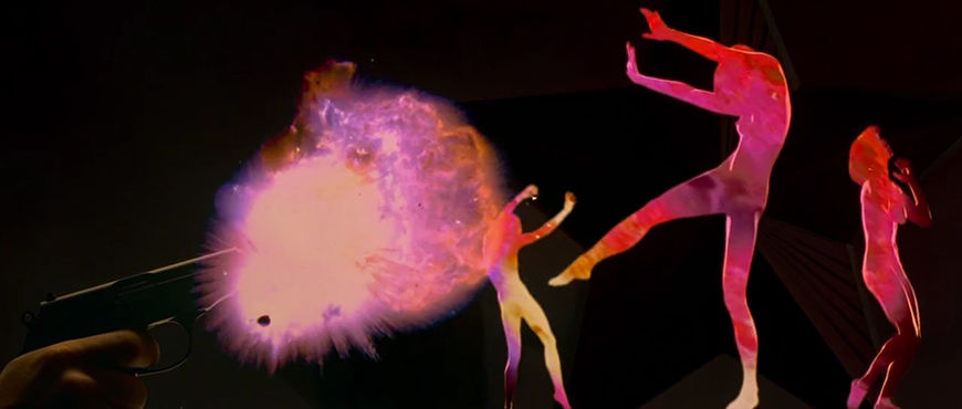
How did you work with the theme sung by Tina Turner? Did you get that early on or did you get that later and have to rework?
DK: In that instance, I got a demo track, which was like five-six minutes long. It was somebody else singing, a studio artist… but I couldn’t wait for Tina Turner to go in and record it. I had to start. I guessed where they might do cuts, what bits might lead in, what lyrics might be in it. I guessed completely wrongly! [laughs] When I got the final track, it was shorter than I imagined, the lyrics had changed. It was hairy, but I had time to tweak things and add in elements that made it fit reasonably well. That’s always the wrong way around. I should get the music first and then do the pictures, but I had to do the pictures and cross my fingers!
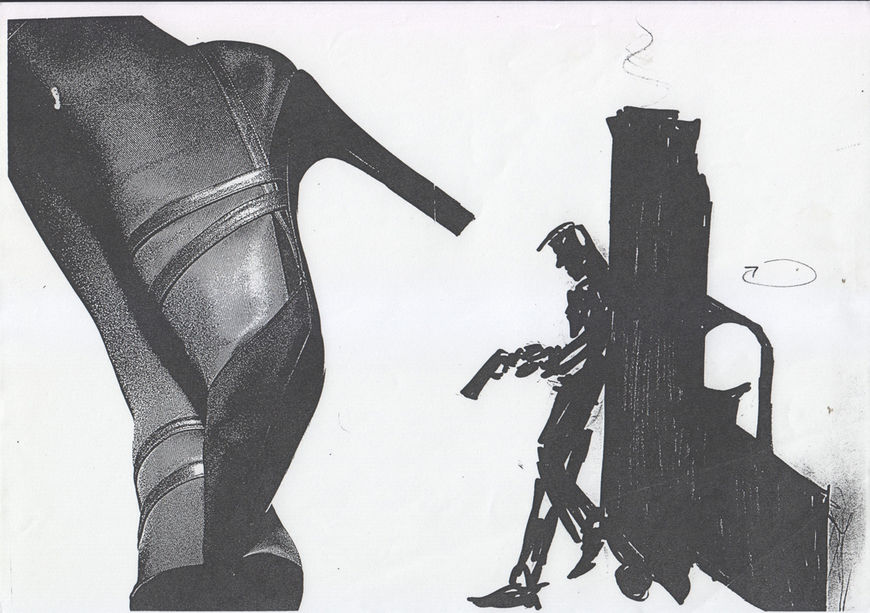
Sketch by Daniel Kleinman depicting a xeroxed image of feet in high heels and a Bond figure leaning on a gun
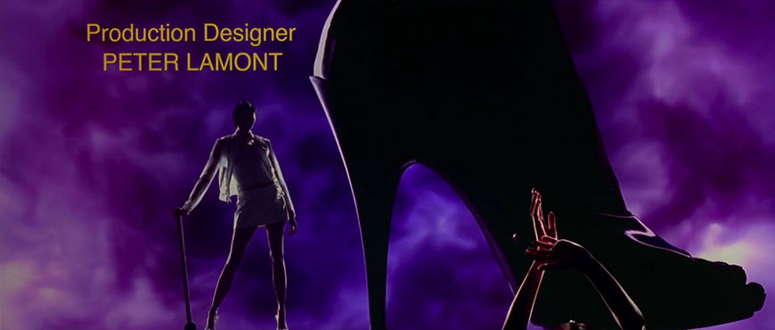
Still from the GoldenEye sequence featuring a large high heel and a smaller figure alongside
How big was your production team on this? It seems like it’s bigger than most people would assume.
DK: It is bigger! It’s like a full film crew. It’s like filming a TV program or a scene in a movie. A big, elaborate music video. I treat it in exactly the same way. You have to hire a studio. You have actors, you have your camera team, you have the art department, production team, I have an assistant director… there’s make up, there’s hair, lighting, electricians, people that push the dolly. That’s just the film part of it. Then it goes to the editing, the post-production people... I’m sure that there are lots of title sequence creators who perhaps these days can do it with a much smaller team or sit and do it on a laptop – especially if it’s animation – but that’s not the way I approach it.
When I look back to GoldenEye, I look back quite fondly ’cause it came out quite close to how I’d imagined it. Some of the later sequences, when technology had moved on, they were more difficult for me to work on. I was less happy with the end results. I felt I never actually got it – it was like wading through technology. It was like threading a needle with boxing gloves on.
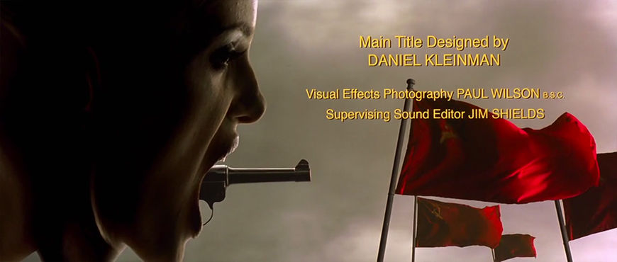
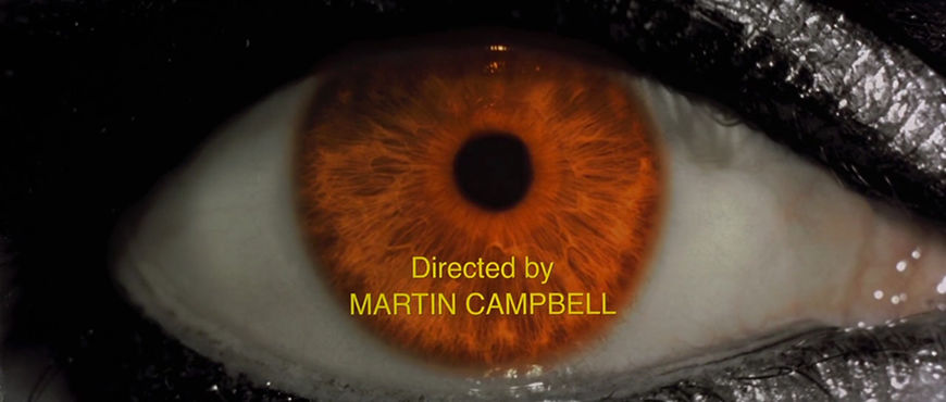
I also wanted to ask really quickly about the typography and your choices there. It seems like with the credits, you go back to the type style that Binder had used.
DK: Yeah. I’m not sure if the face has stayed the same all the time. I made my best stab at making it seem similar. But basically, I’m not a title sequence director. The only title sequences I do are James Bond. I’m not sure how other title sequences work, but on the Bond films, things like the sizes of names are a legal matter. So I work everything out from the height of the main title card, then the lead actors would be, say, 79% as big, and then you go down the crew and names get smaller. That’s all legally contracted. So I can’t do anything too snazzy like have wiggling type, because I can’t prove that that is legally 50% of the size of the main title, if you see what I mean? I have my hands tied a little bit. GoldenEye, the logo as it appears in the posters and all that stuff, is given to me. I don’t design that at all, because that’s part of their promotion.
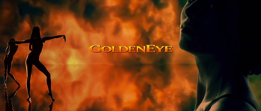
GoldenEye (1995) main title card
So that logotype already exists before you come in.
DK: Right. Exactly. The logos are given to me as a fait accompli to use and I just slap ‘em on! [laughs] I’ve never been in love with typography or typefaces so I just try to keep it as absolutely simple as possible. As long as it’s legible and doesn’t distract, I don’t mind. I apologize! I’d have no names on it at all if it was up to me! But then there’d be no point in the sequence whatsoever! [laughs]
I think of doing the Bond titles as like a big music video. It’s a strange thing to do but I must say I really enjoy it. Partly because it’s Bond and partly because it’s probably the most famous title sequences of all time. It’s an iconic thing and it’s a responsibility but it’s great fun to do. I’m lucky to carry on the heritage of that. And it’s rather nice when you go to the opening of the movie and it’s an enormous cinema and you see your work projected hundreds of feet across. It’s quite a buzz.

