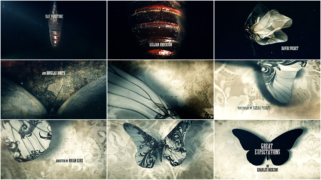
The Emmy-winning title sequence for BBC’s sumptuous adaptation of the Charles Dickens classic Great Expectations takes entomological allegory to new heights. A pulsating pupa cracks wide to birth an ever so delicate creature amidst utter decay — the young and impressionable Pip. Wings unfurl as motes of dust dance in the air, soft chitin and moldy old lace intermingling in the muted sunlight. Fluttering blindly, the newborn butterfly begins to transform, its virginal wings inked with an ornate and corrupting design. Soon the insect is completely overwhelmed by the filigree, spasming under the weight of possibility, withering away until it becomes a mere spectre of its former self.
A discussion with Creative Director NIC BENNS of MOMOCO.
What was the first meeting about this sequence like?
My partner Miki and I met with the show’s team in October 2011. I'd previously created the Luther titles for Director Brian Kirk but this was still a pitch – a level playing field – as the producer, George Ormond, had recently worked with the other studios bidding.
He showed us part of reel one – a stark and haunting opening few minutes. We were impressed with the level of detail in the production, Gillian Anderson's ethereal performance, and the bleak marsh landscape that was captured beautifully. It was contemporary Dickens and the grading was quite modern – it had a kind of teal hue. Brian often composes in a bold, graphic way, using negative space to striking effect and we tried to reflect that in the storyboards so there's stylistic fluidity into the director's world.
How was the concept for the sequence developed? Where there other concepts aside from the butterfly?
Brian noted that the house seemed to be a character in itself and my initial boards explored the environment, eerily shifting through time… the melancholy details of a wedding cake, a banquet decades old... backgammon half-played... beautiful pearlescent webs being woven.
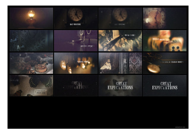
Concept board #1, plus variation
Another of our boards was a study of the dress: the intricate lacework being taken over by darkness. That white shroud unable to conceal the sad corruption of Miss Havisham's soul. We'd end on a white rose consumed by the black. It's really quite gothic.
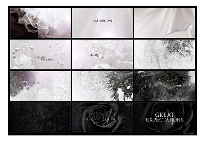
Concept board #2
Later, in the finished piece, this idea kind of re-surfaced – the wall textures shifting, breathing, bleeding the lacework of the wedding dress. I was always drawn to the butterfly case and the creature's frozen beauty. It reflects Miss Havisham locked in time – the jilted lover trapped in a moment, reliving that day. She's like a ghost.
The concept note was simple: we follow the birth and death of a butterfly. As the sequence progresses, intricate filigrees tattoo the wings, growing like creeping ivy. Eventually the tattoos envelop the entire wingspan, patterns over patterns until the creature is blacked out to an eerie silhouette.

Progression of concepts
The sequence parallels the lead character's evolution – Pip's fascination with Miss Havisham's otherness and wealth before his realisation that all is not as it seems and that this wealth is bringing self destruction.
Can you talk about the process for developing the visuals? Was it all done digitally or were there analog elements?
We initially shot beetles in my living room. They were large, shiny and not for the squeamish.
They were also dead and weren't going to get better. We improvised ways to articulate limbs so we could use them for the butterfly legs bursting out. The abdomen would achieve the look for the cocoon. We also had some exquisite black-veined butterflies shipped in but the preservation process had caused the wings to be too stiff, unmalleable. Miki made a rig for them that countered my creaky floorboards and we captured some alluring textures. The patterns are so ephemeral, you could brush them off. The hero now rests entombed in a cardboard crypt: a mini Rice Krispies box somewhere.

Behind the scenes beetle shots and butterfly reference
Tom, the producer, heartily volunteered to puppeteer the beetle abdomens. The specimens were brittle, quite mummified and upon applying too much pressure, the butt exploded in his face. I'm sure it's on video somewhere. I kept finding beetle parts – mostly legs, for they have many – in my living room for weeks after.
Our titles shoots are often lo-fi and lateral when not working with actors. The Fades, Copelia, 30 Days of Night were practically budgetless but you can create worlds out of biological elements with macro-photography.
Live-action reference footage
Was there anything that took you by surprise during the process?
We shot simply, on a 7D and composited the elements in AE. On review, the first round just looked terrifying. The cocoon rupturing with the legs clawing out... it was for a horror movie! We tried lightening the mood but the elements were too visceral.
We had a group meeting and decided to produce the whole thing in CG. I had blown the tiny budget on the shoot so the rest of the journey, with Momoco paying for it, had to be a piece that was a unique addition to the reel. From that point, having total control, the digital process was less surprising and prone to happy accidents.
Early sequence edit
How big was the production team?
At the peak of production, it was four. The total timeframe from boards to delivery was a month.
Which tools and software did you use to put it all together?
3D Studio Max and AE. The 3D artist, Rodi Kaya, created a 'hero' butterfly that could elegantly carry the piece; it had to have a certain level of painterly realism and there also needed to be a sense of mystery, particularly in the way the ornaments flood the wings. Rodi spent a lot of time texturing, getting that delicate powdery feel to the wings while building a sense of maturity, the wings subtly becoming less translucent as the sequences progresses. Our favourite shot to work on was the unravelling of the wings... there's a pivotal moment of freedom and hope.
3D butterfly model test
Is there anything you would have done differently, looking back?
If I could bypass the executive producers' notes which I look forward to every day at Momoco, I'd like to bring back the pin. It was going to be revealed at the end, after the close-ups, that the butterfly was trapped all along, its fate sealed by a pin. The pin would cast a dark shadow like an hour hand – it's in the boards – but some thought the image of a pin through the thorax was cruel. What a superb word: THORAX.
What did it mean to you to win an Emmy Award for this sequence?
It was an awesome privilege and I was truly humbled. Just being there was a fine experience... seeing old friends and my former boss Garson Yu, who hasn't aged in 12 years.
I had a good feeling about the piece. It doesn't really push creative or technical boundaries but it had emotion and a touching fragility. The music was the soul; the score is half the film.
It was a good year for the BBC at the Emmys and I'm sorry Director Brian Kirk didn't get the recognition he deserved.
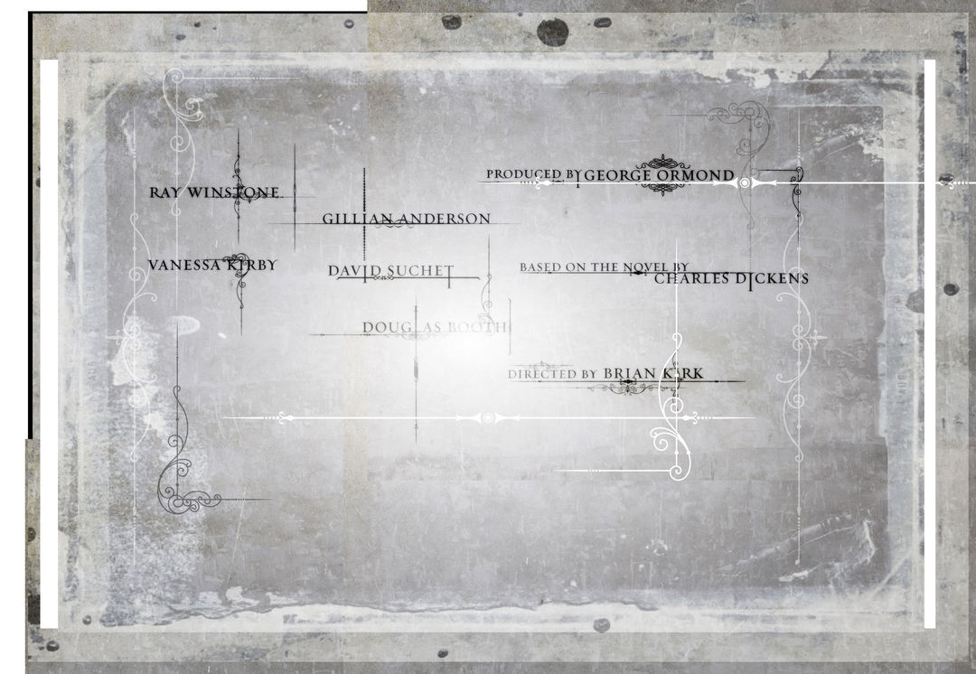
Unused type style board
What has changed for you as a team, post-Emmy win?
It has emboldened us to reach out and pitch on work in other countries! More film producers from the US have called this year. Not sure if it's because of the Emmy exposure, UK tax breaks or just that we're gathering momentum as a studio. We're trying to produce the best work we can as a tiny team within ever decreasing budgets and timeframes.
How would you feel about a possible Best Title Design category at the Oscars?
It should happen! The title sequence goes far beyond giving credit. As you know, it's the branding – the visual identity, a storytelling device for the director, it sets up the world, just as much as a theme song can do. If an original theme song can land an Oscar, so should an original title sequence.
It was unfortunate BAFTA cut the main titles design category a couple of years ago for the flimsy reason of the ceremony being overlong. We have SXSW now, though, which crosses many media platforms and promotes fresh talent at the same time.
Support for Art of the Title comes from


