“It was absolute madness to make this series,” said Guillermo del Toro about Cabinet of Curiosities, his horror anthology series for Netflix.
The filmmaker behind The Devil’s Backbone (2001), Pan’s Labyrinth (2006) and Crimson Peak (2015) said that, aside from being a fascinating new project to helm, the series is his means of uplifting a new generation of genre filmmakers. "Look, I’m 58 and I have a 30 year career," del Toro told Indiewire. "It’s a miracle that you can last three decades as a storyteller. If I can do something to usher in a variation of the genre, I like it."
The collection of spooky stories features a slew of handpicked directors including Ana Lily Amirpour (A Girl Walks Home Alone at Night), Jennifer Kent (The Babadook) and Vincenzo Natali (Splice). Very much in the vein of the 1950s CBS series Alfred Hitchcock Presents or The Twilight Zone, each of the show’s eight episodes has a preamble featuring del Toro himself, dressed in a suit and addressing the audience to introduce the tale at hand.
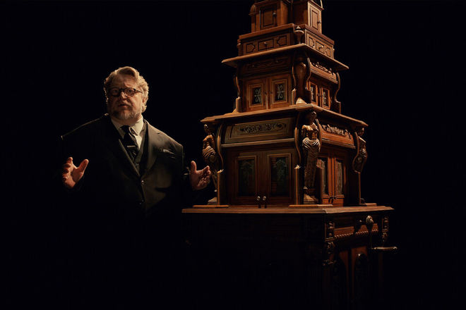
Guillermo del Toro and the titular cabinet from the opening scenes of Cabinet of Curiosities.
Every introduction sees del Toro opening a different section of a large wooden cabinet, removing an item thematically related to the episode, and placing it on a table next to a statuette depicting the director du jour.
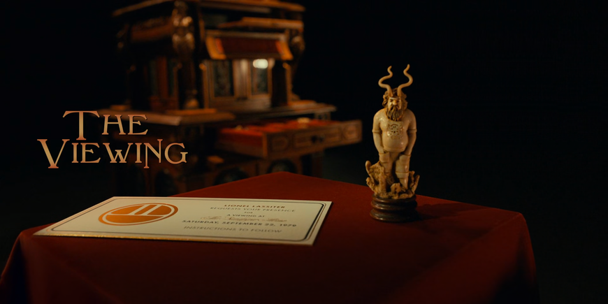
Episode title card from Cabinet of Curiosities episode seven, The Viewing, directed by Panos Cosmatos, featuring the episode's thematic object and statuette
These statuettes were a surprise to the episode directors who learned of them after the show had wrapped production and they received them in the mail.
Alfred Hitchcock Presents (Season 1, Episode 1, entitled "Revenge") main titles
Original air date October 2, 1955
"The fact that he mentioned the director’s name – let alone made a statue of the director! It’s nothing Alfred Hitchcock ever did," said Vincenzo Natali, the director of episode two, Graveyard Rats, speaking with Den of Geek. David Prior, director of episode three, The Autopsy, said in an interview with ScreenRant that he had no idea what the statuette was until he saw it used in the show and thought it was wonderful. "I love his intros, I think they’re great...," he said. "I love the prop that they built, the cabinet is gorgeous, it’s a wonderful bit of filigree that I think elevates the whole series."
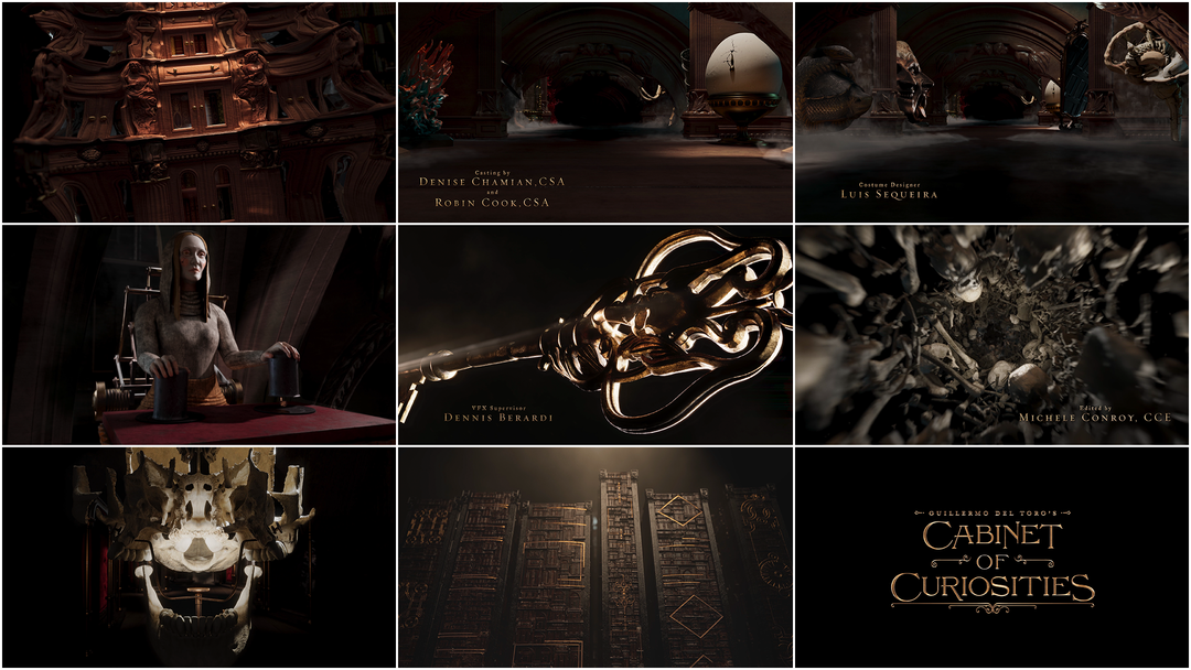
Between these spoken introductions and the various realms of the episodes, there is a gateway, a space of strange possibility that must be traversed. The journey into Guillermo del Toro’s Cabinet of Curiosities is encapsulated by a title sequence of shifting proportions, a curated cascade of once-creatures, spent spells and mystical imaginings.
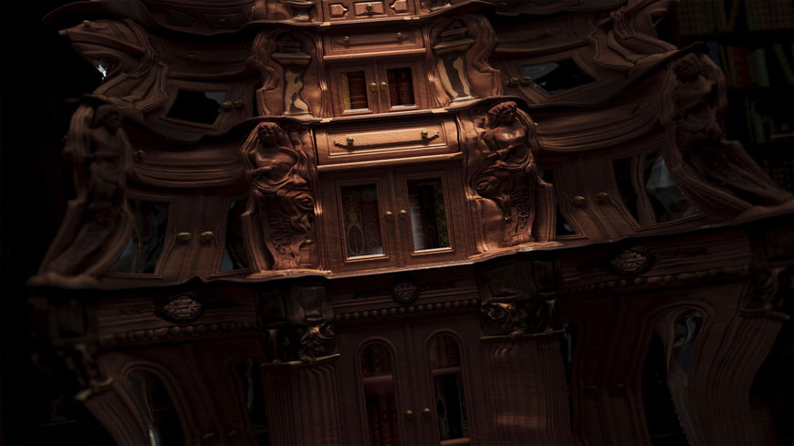
Still from the title sequence of Guillermo del Toro's Cabinet of Curiosities showing the cabinet curving and unfolding
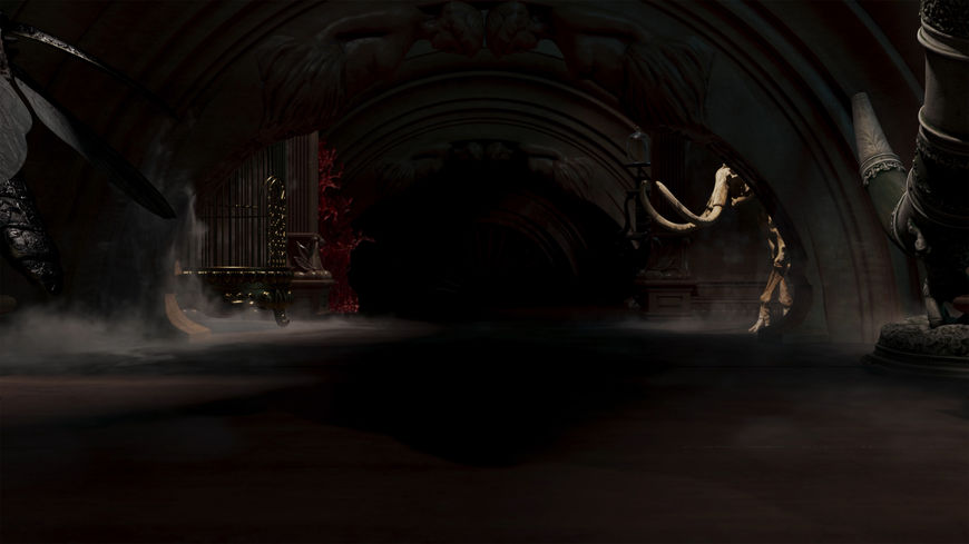
Still from the title sequence of Guillermo del Toro’s Cabinet of Curiosities showing the hallway lined with curios
A set of doors swings open and a wave of cabinetry engulfs the viewer, revealing a twilit hallway lined with curios. Thrones of coral and eggs of gold, sneering faces and mirrors holding worlds unknown. There are automatons and gilded keys, an ossiferous vortex and a mechanical skull, a hideous mermaid and a hand reaching from the depths of the dead.
“Del Toro’s so open with his sources and what matters to him, so we knew what would vibe with him,” says creative director Chet Hirsch of The Mill, the production studio behind the opening title sequence. The team at The Mill also knew that the show would be adapting two Lovecraft stories. “Pickman’s Model and Dreams in the Witch House I’d read as a kid,” says Hirsch.
“During the pitch I started researching these cabinets – what they used to be,” says designer Akshay Tiwari. “I gravitated toward this idea of how wealthier people would travel and collect these curiosities in one place. A combination of luxurious, exotic-looking things placed with more macabre-looking stuff.”
The Mill team was instructed not to give away any of the show’s frights in the titles. “We came up with all these different things which allude to what’s in the series but it’s still not spoiling anything,” says Tiwari. “That was kind of challenging.”
“We started picking up speed when we started thinking, well, all these worlds contain shifting pathways to other worlds; it’s not really a scale thing, it’s a connection and coexistence thing," says Hirsch. "The old cabinets of curiosity would be dark and cruel but behind this scientific remove. That tone became our guide. We got a picture from the Museum of Natural History of some kind of rodent that had been flayed and split down the middle. We were all like, [whispers] ‘Oh, that’s creepy.’ When we showed it to the Cabinet folks, the EP and everyone was like, ‘Yeahhhh.’ Like, darkness but held within this idea of pretension, this curatorial aspect.”
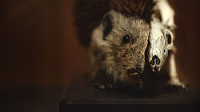
"This flayed rat photo was a key early creepshow that everyone could agree on," says Creative Director Chet Hirsch. "It sort of set the precedent for darkness and savagery but with that clinical sense of remove that characterized the old cabinets."
The majority of the sequence was created using 3D animation software Houdini. Smaller elements and the title typography were created in Cinema 4D and then composited in After Effects. “I sculpted a lot in Zbrush and did a lot of exploration in Houdini,” says Tiwari, who built many of the elements in the sequence alongside art director David Rowley. As The Mill progressed, del Toro’s team sent over a 3D model of the cabinet and Rowley used it to begin experimenting.
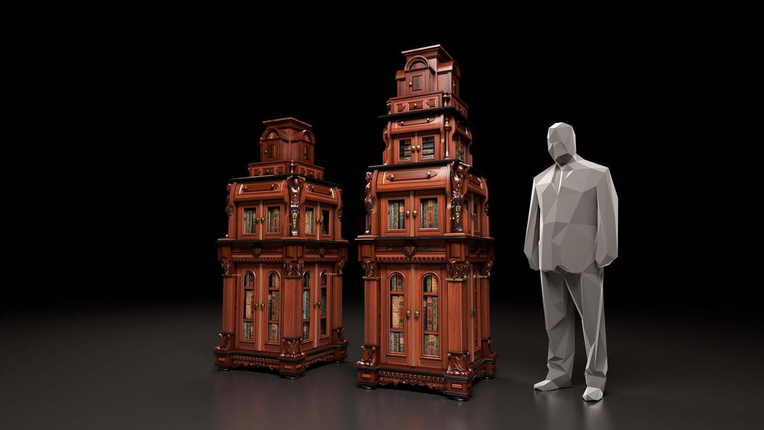
Early renders of the cabinet built for the opening of Cabinet of Curiosities
Cabinet unfolding early render by David Rowley
“We had some extra time between the initial pitch and the follow-up to play around in Houdini,” says Rowley. “So I thought I’d rework the model and prepare it for a cloth simulation. I started allowing the cabinet to unfurl, as if it was cloth, so that led to that opening shot, the cabinet engulfing you and bringing you into the rest of the world.”
The title lettering for the series was created by Hirsch, who found inspiration for the letterforms in Italian poetry chapbooks from the 1800s. “It’s all great letterpress stuff on super-old yellow pages and that became our guide for authenticity,” says Hirsch. “That one and the cast and crew type was based on that older style, and trying to bring in those flourishes and filigrees in that older work.”
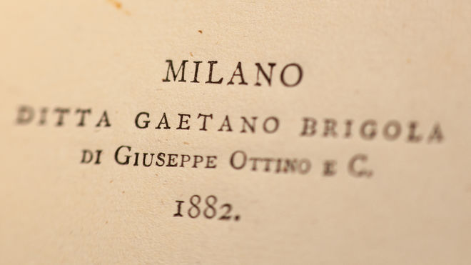
Lettering reference photo
Title card for Guillermo del Toro's Cabinet of Curiosities
The titles for each episode, the individual episode titles and credits, were created separately, by the show’s crew.
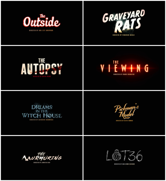
IMAGE SET: Graphics for episode titles that appear at the end of Episode 1, "Lot 36", and in marketing materials
The journey into each episode kicks off with a glide through a hallway holding a complex collection of curiosities. I ask the team at The Mill to detail these items.
First, I’m seeing a woolly mammoth skeleton, is that right?
Chet Hirsch: Oh yeah! In the hallway. Yes.
And across from the mammoth, there’s a red, tree-like structure, or is that coral?
Akshay Tiwari: That’s a coral throne that we were concepting, right at the beginning.
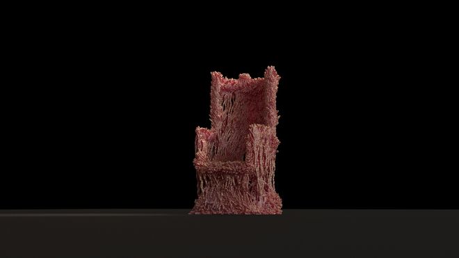
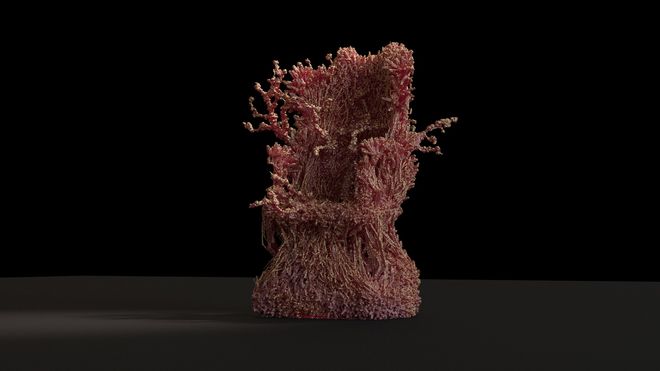
David Rowley: There are so many things like that in this piece. We wanted to get so much complexity into it. To fill the hallway, we needed so many things, we started looking at creative commons scans from museums around the world. A lot of museums post scans of their pieces.
When you say scans, you mean 3D mapping?
David: Yeah, exactly. We had to bring them in and clean them up and re-texture them but yeah, they’re public domain 3D scans. So a handful of those are in this hallway.
What’s across the hall from that big horn? It looks like something with wings?
Chet: Oh! We have the bird cage and then the horn and then a giant insect. [laughs] We wanted to feature that more originally. It’s like a moth.
David: We wanted to have an insect in there somewhere. We wanted to create confusion about scale so you wonder: are you in a huge place, are you in a tiny place? Is everything enormous? It was just creepy and curious.
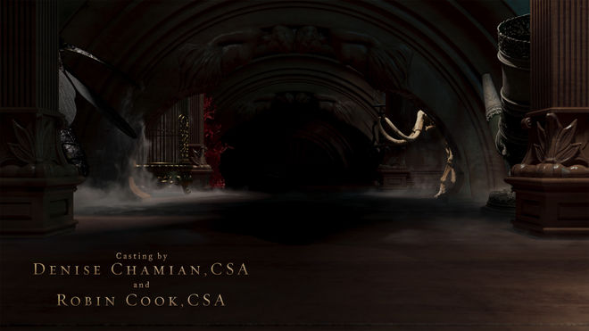
Still from the title sequence showing the hallway with an insect-type figure visible on the left and a mammoth skeleton and large horn on the right
Across from the oozing, cracked egg, is that more coral?
David: More coral! It was a popular thing to collect at the time. I modeled that egg and kit-bashed it together.
Chet: Coral was precious and super-hard to get. That was another part of the brief from del Toro, to feature some red coral, because it’s a common thing you’d see in cabinets from the era.
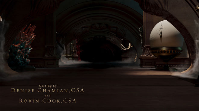
Still from the title sequence showing the hallway with a coral structure visible on the left and an oozing, cracking egg on the right
David: Every element that I built this hallway out of comes from the cabinet itself. The arch is repeated from a feature towards the top of the main cabinet, a little decorative thing. The sculptures of the women are prominently featured on the cabinet and sort of repeated here. I tried to be disciplined about making sure I didn’t model anything in this hallway from scratch.
So it’s almost as if the cabinet is this shape-shifting piece that can adapt to any size.
Chet: Exactly. Yeah, that was our overarching theme. That was the only way all these stories could coexist together, if they all live together in that kind of space.
Akshay: Chet also had a few masks at his place… [laughs]
Right, those grimacing faces, how many are there? Three? You have that in your home, Chet?
Chet: I do! [laughs] It’s on the wall in my kitchen. The mask that we scanned. I think my kids have nightmares. That one and the black one that features right at the tail-end of this shot, the black, Eyes Wide Shut-looking mask on the right, they’ve been spawning nightmares for years!
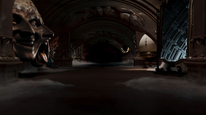
Still from the title sequence showing the hallway with a three-headed mask visible on the left and a mirror on the right
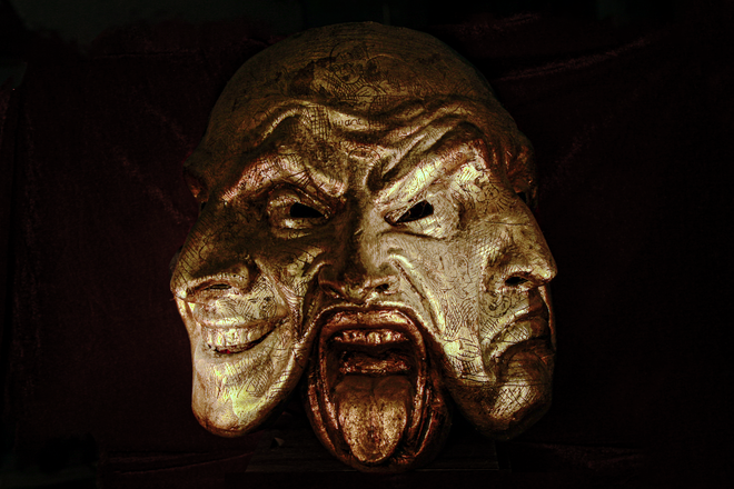
Photogrammetry scan created from photographs of masks
David: Chet took a hundred photos of the masks from different angles and sent a big folder to me. I loaded that in and created a photogrammetry scan. There’s an open source software called Meshroom that processes images. You just take a hundred images of something from many angles and it creates it for you.
We’ve also got this mirror that seems to be reflecting a different space.
David: That is one of the things that I love about this spot. We had so many elements that ended up on the cutting room floor from our initial pitch but almost all of them actually made it in some way. So this is a recursive subdivided grid system that I developed but we never featured prominently. I tried to work it in in this mirror. As we start passing it these cabinet doors start to shift in an odd, impossible way. It’s supposed to be a magical, curious thing.
As we continue to move backward, is that a human brain on the right?
Chet: Yeah, a brain from the bad old times of vivisection and early anatomical knowledge. A really old medical model that we found a scan of. Those creepy waxworks, they get so gross.
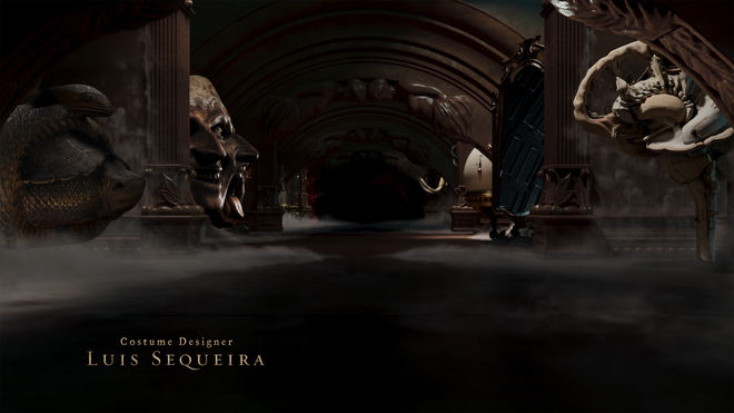
Still from the title sequence showing the hallway with a scaled vessel on the left and an anatomical model of a human brain on the right
You never expected someone would make you go through each element like this, did you?
Chet: No. [laughs] It’s fun, though! We also wanted to drench everything in fog. They actually asked for less fog.
Well, as everyone knows, there’s nothing more mysterious than fog. Tell me about this figure holding the cups.
Chet: That came from del Toro and his production designer. He wanted an automaton and this was the rendering they chose. We reinterpreted it into our world. We had a form, a sketch, when our modelers created this one. It’s like an old-timey shell game.
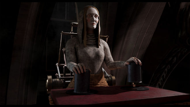
Still from the title sequence showing an automaton with a cup in each hand
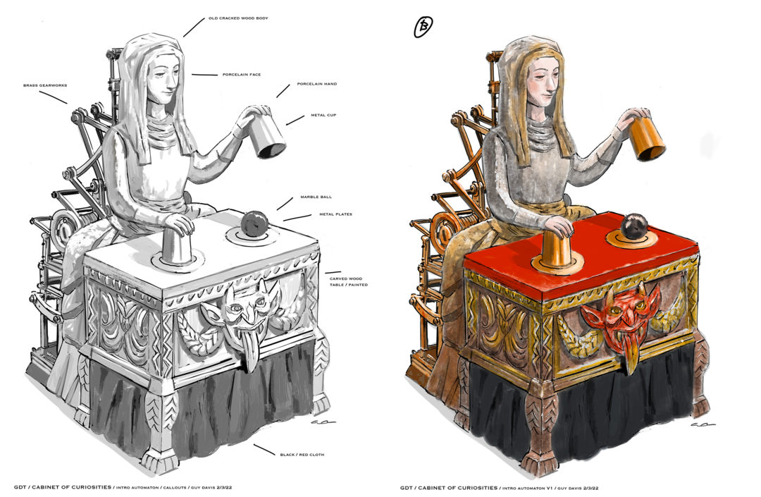
Sketches for the automaton figure by creature concept designer Guy Davis
Early hallway and automaton render
One of the only elements in the title sequence that recurs in the series is the key but even then, the opening’s key is far different than the one that appears in the first episode, Lot 36. As the sequence transitions from this hallway sequence, the wooden doors sweep away like cloth – like a curtain, a nod to the initial curving cabinet. These flowing transitions as well as the architectural aspects of the sequence were primarily created by Rowley.
This otherworldly movement has echoes throughout the sequence, perhaps most notably in the vortex of bones which can be seen as a reference to episode two, Graveyard Rats. “We were always talking about thresholds,” says Hirsch. “We were vibing on Andy Goldsworthy’s sculpture portals. A common thread in all the stories is when someone does something they’re not supposed to – they cross a line. We were looking at the Goldsworthy examples as portals made of natural materials leaping out of an otherwise mundane scene. That’s where Dave came up with the first bone portal render.”
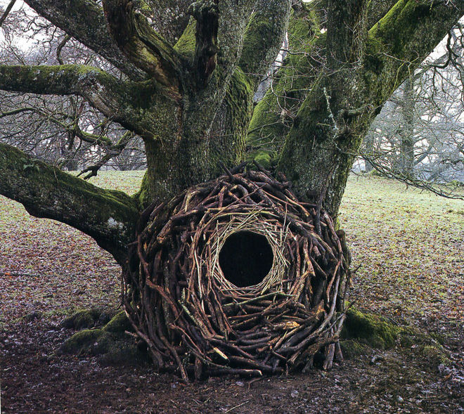
Land art created by artist Andy Goldsworthy
Bone portal early render
The viewer is then swallowed up by a mechanical skull. “That’s another period-correct reference,” says Hirsch. “Dave, what was the exact term for that? The exploded skull quality?”
“I believe it is ‘exploded skull,’” Rowley laughs. “This was a combination of some hand-modeled elements and a purchased model.”
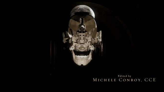
Still from the title sequence showing the mechanical skull
“You could get animatic skulls that you would turn wheels to cause features of them to open or explode and reveal things, they had mechanisms in them,” explains Hirsch.
The second major space in the sequence is a darker hallway with red wall fabrics. In the center of the hallway, barely visible, stands a statue that Tiwari explains is an écorché model, an anatomically correct human figure shown without skin, often used for medical students or artist reference, with a golden heart structure inside.
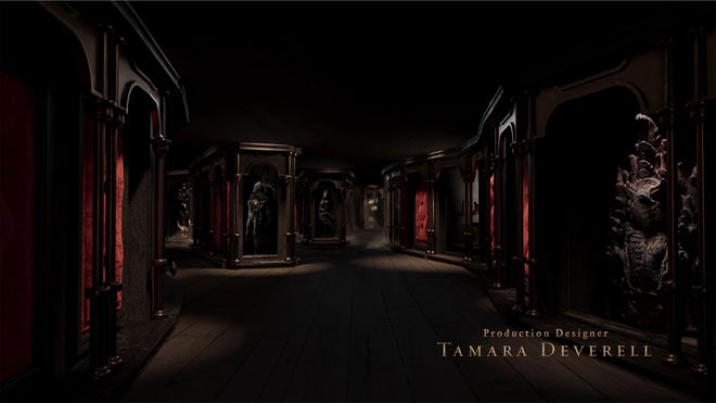
Still from the title sequence showing the second museum-like space, the écorché figure visible in the middle
Along with the écorché statue, the procedural modeling like the mummy hand and the deconstructed clock – what Hirsch calls "the real star modeling" – was handled by Tiwari.
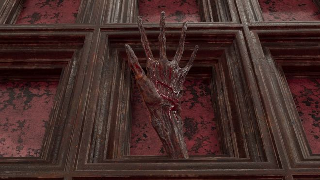
Look dev for mummy hand
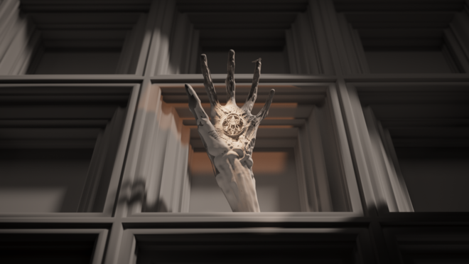
Early render of the mummy hand
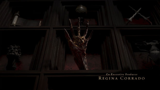
Still from the title sequence showing the mummified hand
Inside the mummified hand is an alchemical symbol, hinting toward themes of creation, reincarnation and death. “Alchemy is about combining elements to make gold,” says Tiwari. “So the mechanical heart of the hand is infecting it with golden tendrils.”
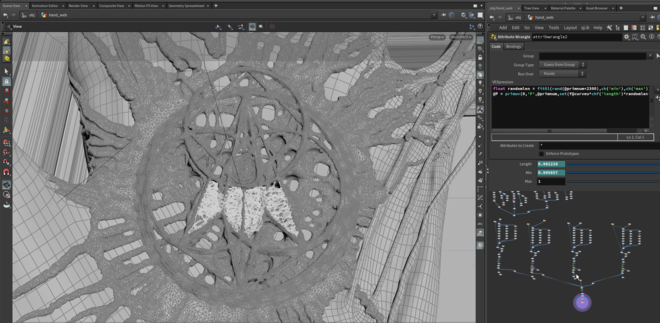
Screenshot from Houdini showing the model of the mummified hand
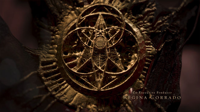
Still from the title sequence showing the alchemical works inside the mummified hand
Some ideas, of course, came from del Toro himself, like the mermaid. “He said, ‘We need a Fiji mermaid!’” Hirsch laughs. “We were like, what is a Fiji mermaid? We gradually figured out how to make it.” Fiji mermaids (or Feejee mermaids) were a hoax sideshow promoted by circus owner P. T. Barnum, who exhibited the half-monkey, half-fish composite in New York in the early 1840s.
“We took references of multiple Fiji mermaids and Photoshopped them together and used that as reference for a modeler to create it from scratch, so it’s a true Fiji mermaid,” explains Rowley.
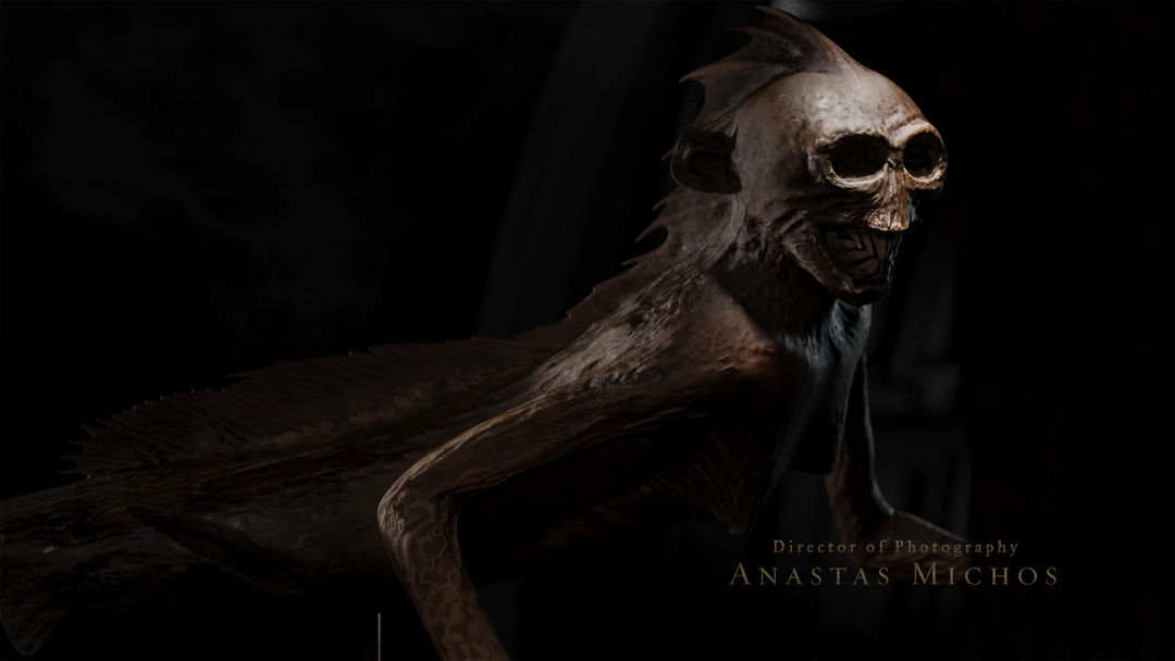
Still from the title sequence showing the Fiji mermaid
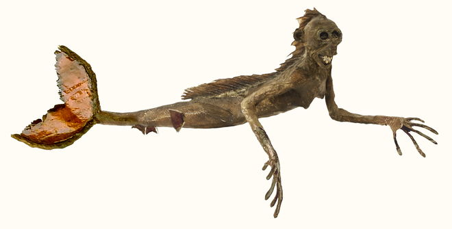
Look development of mermaid figure
At the end of the hallway, atop an altar scrawled with symbols, sits a bizarre skeletal form. “Our chimera,” says Hirsch. “This was our ritual space. We’re trying to speak to a reanimation or life-against-death dark magic. At this point the environments are warped and billowed and more intestinal, the surfaces are more scorched. The character of the fog has changed as well. The tentacle mouth and the shapes call out the Lovecraft ideas.”
Early chimera sequence render
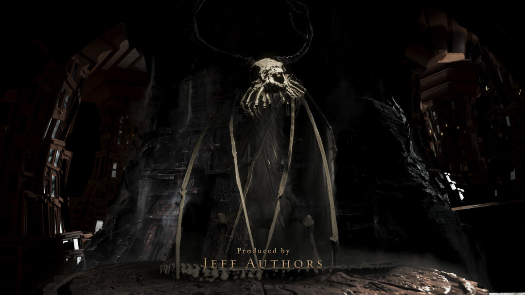
Still from the title sequence showing the chimera creature on the altar
Early chimera render
Thereafter, the sequence descends into a swirling abyss, as if the doors of the cabinet have melded to form a mysterious mass of a library. Rowley created the shot but that doesn’t mean he totally understands it. “I was never completely sure what it was,” he says. “Del Toro wanted a nautilus shell pattern somewhere in the piece. It’s hard to see because it’s so darkly lit but this is based on a nautilus shell and I filled it in with those recursively subdivided and oddly shaped cabinets.”
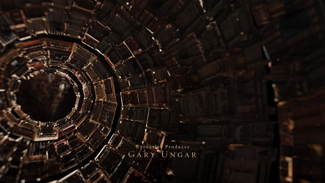
Still from the Cabinet of Curiosities title sequence showing the cabinet spiraling in the shape of a nautilus shell
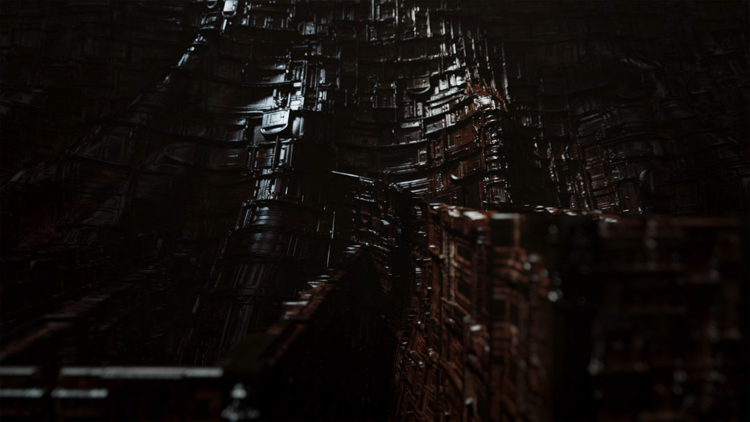
Behind-the-scenes video of how the recursive cabinet structure and nautilus-shaped spiral was created by The Mill
“It’s a space that holds all the stories but it’s also a space made of the stories,” says Hirsch. “There’s a tension at the end, like, did we observe this and walk away or are we in the collection now?”
It’s a transition befitting the unpredictable nature of each episode – a climactic yet enigmatic release into the unknown. Rowley sees the structures as an extension of the cabinet which then swallow up the viewer. “These things that felt vast, like canyons, all of a sudden they’re just books. I like to imagine it as the cabinet pretending that it’s books, like it’s trying to trick you. The shell story was that we begin as an observer but we end as an object in the collection. The scale shift tells you what happened: we’re in there and we’re not leaving."
Production: The Mill
Director: Chet Hirsch
Executive Creative Director: Mike Schaeffer
Senior Producer: Tanya Ferguson
Associate Producer: Claire Stiefel
VFX: The Mill
Creative Director: Chet Hirsch
Art Director: David Rowley
Concept Designer: Chet Hirsch
Designers: Akshay Tiwari, Chris Szeto, Michelle Mayer
Lead Animator: David Rowley
Modelers: Akshay Tiwari, Rakesh Maruthi Pujari, Sandeep Kumar Yadav
Music: Holly Amber Church “Cabinet of Curiosities Main Title”
Client: Netflix
Executive Creative Producer: Guillermo del Toro
Executive Producer: J. Miles Dale
Post Producer: Julie Lawrence

