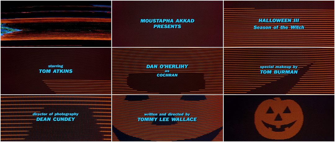
A staticky hiss, the squeal of a synth, and a television signal struggling to resolve itself. Noticeably absent is that iconic Carpenterian theme, indicating that this will be no ordinary Halloween.
Pixelated rows of orange slowly fill in a cathodic void, the lines progressing from the bottom up with a steady electronic breedle. As the raster scan unnervingly carves out shapes in the flickering fuzz, a baleful pulse hints at something truly foul, an analog anathema.
You are a child sitting too close to the TV, at first seeing the rendered image as only a scattering of brightly colored dots. Sit back, boys and girls, and put on your masks! It's the cruel smile of the jack-o'-lantern flashing in the darkness.
Main title designer and VFX veteran JOHN WASH revisits the opening title sequence, as well as his work on Escape from New York, The Thing and Brainstorm.
When did you begin working on effects for films?
The mid-'70s I guess. I suppose if you count Dark Star, since Dan O’Bannon and I did a bunch of downshooter* work to complete the effects for that film. That was released in ’74.
*Downshooting is similar to animation stand work.
How did you get involved in Halloween III and Director Tommy Lee Wallace?
Tommy and I knew each other from USC, and since we had both worked with John Carpenter previously, we were familiar with each other’s work.
Was Halloween III your first title sequence?
Yes, I’d say so. In this case, it was more about creating the background for the titles than the titles themselves. I did a few simple title sequences for student projects while I was at USC, but Halloween III was the first feature.
Where did the concept for those titles come from?
Tommy came up with the idea of the reveal of the jack-o’-lantern logo. It was a pervasive image in television commercials featured in the film – they have a horrific effect on children watching them. What we wanted to do was a gradual reveal of the jack-o'-lantern, starting as just an abstract pattern of scan lines. We wanted to get the feeling of watching the process of the design and building of this flashing pumpkin logo by someone as-yet-unknown, but who, eventually, we find out is quite a monstrous villain.
What was the technical process like? How did you create the digital animation for the jack-o’-lantern?
Well, I had just done a little sequence for Carpenter’s remake of The Thing. For that, he asked me to do a primitive-looking computer animation that the scientists in Antarctica would be viewing. He distinctly asked for a simplistic look for the graphic style, to help sell the idea that there was a team out in the middle of the Antarctic frontier with few and meager resources. Originally, I experimented with some downshooter animation. I was after a blocky pixel look, and actually glued four Scrabble boards together and tried some animation with painted Scrabble tiles moving under the animation camera. However, it was a little too blocky to represent the alien and canine cells.
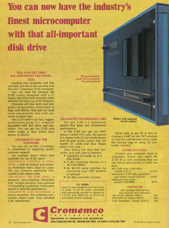
Original Cromemco Computer Z-2D ad
I mean, up to this point in my career, I had specialized in creating animation that looked like it was computer generated. What I actually used were animation cameras, lithographic negatives, colored gels, etc to create the effect of computer animation. However, for this project, I did it for real – I made the decision to actually use a computer to generate the animation. So I purchased my first graphics machine, a Z-2D system made by Cromemco*, and entered the world of digital animation.
*The Cromemco Z-2 computer was a Z80 CPU, S-100 bus motherboard-based microcomputer system produced in the middle to late 1970s.
The Halloween III animation was fairly simple. I enlarged the logo that production used for their TV spots and had it printed out on a grid. That made it simple to manually generate X and Y data for the logo. The program that animated the reveal of the scan lines was written in Fortran*. I could control the speed of the lines as they animated onto the screen, and did several detail animations of different parts of the logo, as well as the entire pumpkin.
*Fortran is a general-purpose, imperative programming language that is especially suited to numeric computation and scientific computing.
The animation was basic enough that we could shoot it off the display monitor in real time. My friend and later business partner Greg McMurry helped us sync up the monitor to the film camera.
One interesting aspect of shooting the graphic was that Tommy wanted some occasional static and video breakup to it. This posed a problem, since the monitor we were using was being fed directly from the computer, and it produced a consistent, stable image no matter what we tried. What we ended up doing was piping the video through the wireless link of a Steadicam monitor system. We added video glitches by messing with the antenna system on the unit!
How was the music integrated?
I think the music was composed by Alan Howarth to fit the animation, along with the little sound effects – the “pings” that bring on the scan lines one by one.
I like to call what I came up with “visual jazz,” as it was equal parts controlled design and improvisation.
What were some challenges that came about during the making of this sequence? What were some of your favourite moments?
The main challenge was in adding that video glitching that I described earlier. That, and writing the program tight enough that it would fit in 48k of memory and run fast enough that it could be shot in real time. As always, the favorite moment for me is seeing my work finished and up on the screen with the support of the soundtrack.
How long did the project take from the first meeting to the final execution?
I think about three to four weeks.
You mentioned working with John Carpenter. Can you talk about your relationship with him and your graphics work on Escape from New York and The Thing?
John and I met while at film school at USC. While he and Dan O’Bannon were working on Dark Star, a student short film which was later “liberated” from the cinema department, I got involved, animating a series of overlays and computer displays used in it. Once Dark Star picked up additional funding to be completed and expanded to feature length, I worked with them again to create additional effects shots.
In John’s subsequent films, he often called upon me to create graphic animations that would explain some plot point to the audience. In Escape from New York, for example, I animated a prologue sequence that graphically supports the narrator’s explanation of the transformation of Manhattan into a penal colony.
Escape from New York - opening prologue animaton
I also worked on the display animations for Snake Plissken’s glider as it makes its way to land on the rooftop of one of the World Trade Center towers. What Carpenter wanted were multiple views of a wireframe POV as the glider flew into Manhattan. Mark Stetson and I worked together to build two sets of models for that. One was a 4’ by 8’ model of the island of Manhattan. The buildings were made of white plexiglass that we cut to size, painted black, and then routed the edges to reveal a white line on each edge.
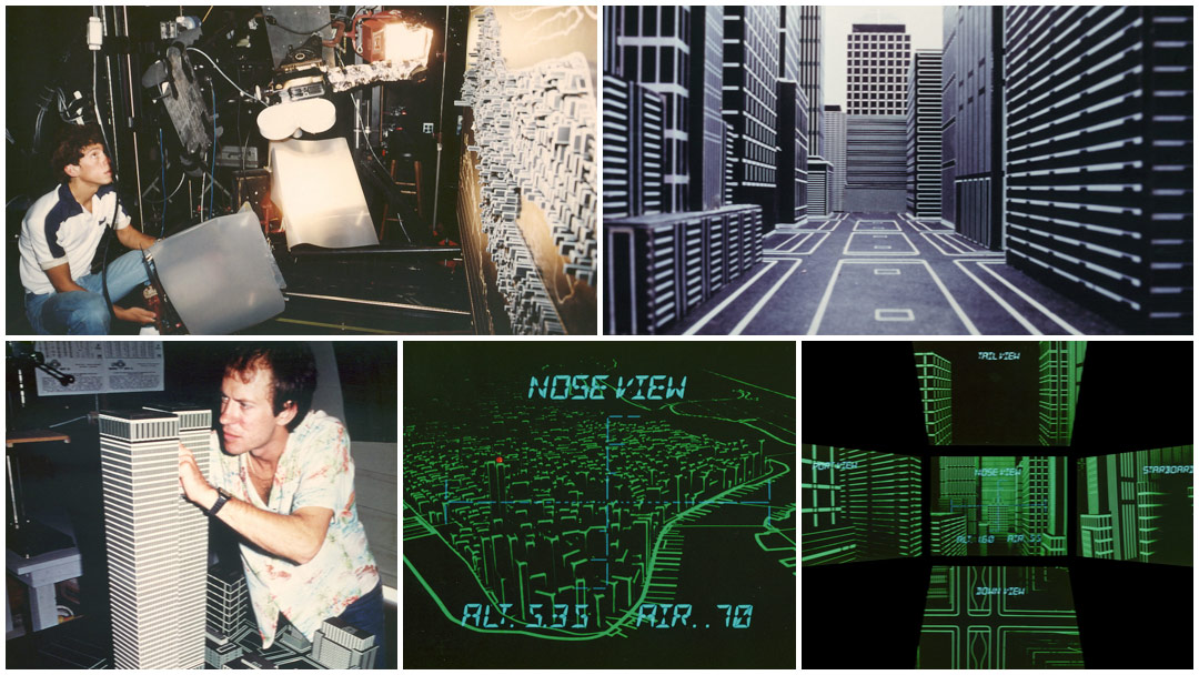
Escape from New York glider displays - Manhattan model building, shooting and composites
The other set of models involved larger scale buildings, about 24 to 36 inches high, so that we could fly a motion-control camera with a snorkel lens between rows of these graphic skyscrapers. These larger models were made of wood, with high-contrast lithographic line art glued onto them. The models were shot at the original Dreamquest facility, which at that time was in the garage of a ’50s ranch-style house just south of Santa Monica.
One interesting aspect of shooting the large models was that we wanted completely flat lighting, to get the graphic look we were after. Almost every angle worked great, until we shot straight down on our model of the World Trade tower. No matter how it was lit, we kept getting a big kick of light off of the roof of the model! I finally resorted to swapping out the lithographic print for the roof with a piece of black felt paper and white chart tape for the graphics. The felt worked as a light trap and solved our reflection problem. Once we had shot all the models on high-contrast film, the footage was then colored and combined with graphic overlays at Modern Film, an optical effects house in Hollywood.
Escape from New York — glider sequence
And what about The Thing? What techniques did you use for that?
Well, once I had my Cromemco fired up, I got to work on the animation for the sequence. I created two general block pixel “characters” for the sequence. The normal dog cells were rounded shapes that were blue, and the alien cells were red, three-pointed, spiky shapes. The action for the scene was very simple. Much as most cancers work, the alien cell attacks a normal dog cell, infecting it and causing it to mutate into a new alien cell. To shoot the sequence, I set up an animation camera in a light-tight box, shooting directly at the screen of a black and white high-resolution monitor. Since the computer ran too slowly to render the frames in real time, I set up the animation program to instruct the computer to render a frame, and then send a signal out a serial port – think old-time USB – that would trigger the animation camera to shoot a frame. I could then start the program and leave the computer to do its work, finishing hours later. The color was achieved by placing filters in front of the animation camera. Each scene was exposed three times: once for the blue cells, once for the red, alien cells, and a third time, for white text overlays.
The Thing - virus computer simulation
Are there any moments from that production that particularly stand out for you?
The most rewarding moment was when, after toiling for hours into the night, pounding on the keyboard and thrashing through the Fortran manual, I actually got the computer to output a cell character that I could move from point A to point B! I said to myself, “I think this computer animation just might work!”
You also worked on the titles for Douglas Trumbull's Brainstorm. Can you describe that for us?
Again, my work was the imagery that went behind the titles. Doug hired me to head the animation department at his company, Entertainment Effects Group, in Culver City, California, for the visual effects he was doing for Ridley Scott’s Blade Runner. I stayed with EEG on his second directorial project, which was Brainstorm. Towards the end of that production, we went to work on the main titles. Most productions would contract an outside designer or title company to do this kind of work, but since EEG had both a wealth of talent and equipment, and since Doug has a strong design sense and knew exactly what he wanted, he decided to do the titles in-house.
So, the film is based on the story of a team of technologists that create a machine capable of connecting to a person’s brain, with the ability to record and playback their experience of reality. As the film opens, the machine is on the verge of working properly, but still has some problems. The subject is looking at a special “test pattern slate” that was designed specially for the film.
Brainstorm — opening title sequence
Doug wanted the film to open with a POV of that slate – initially distorted, then popping into perfect clarity as the team made adjustments. And this distorted view of the slate formed the background for the main titles. It was all generated from multiple exposures of backlit artwork that I manipulated under EEG’s 70mm animation camera. I like to call what I came up with “visual jazz,” as it was equal parts controlled design and improvisation. I would run the film through the animation camera multiple times, interrupting and distorting the individual elements of the test slate in different ways, using moiré art, liquids overlaying the artwork that I would agitate, trick effects filters, almost anything I could think of. We ended up with a lot of raw footage from which I picked the most interesting elements. Then those elements were combined by EEG’s optical department.
Finally, the titles themselves were added. They were physical, three-dimensional plastic letters mounted on glass, shot with an extreme fisheye lens, both frontlit and backlit, to create a matte to superimpose the titles over the background. One consistent element to the background was a stately clockwise rotation of all the elements, which, when combined with the non-rotating title cards, gives the sequence an effect of vertigo.
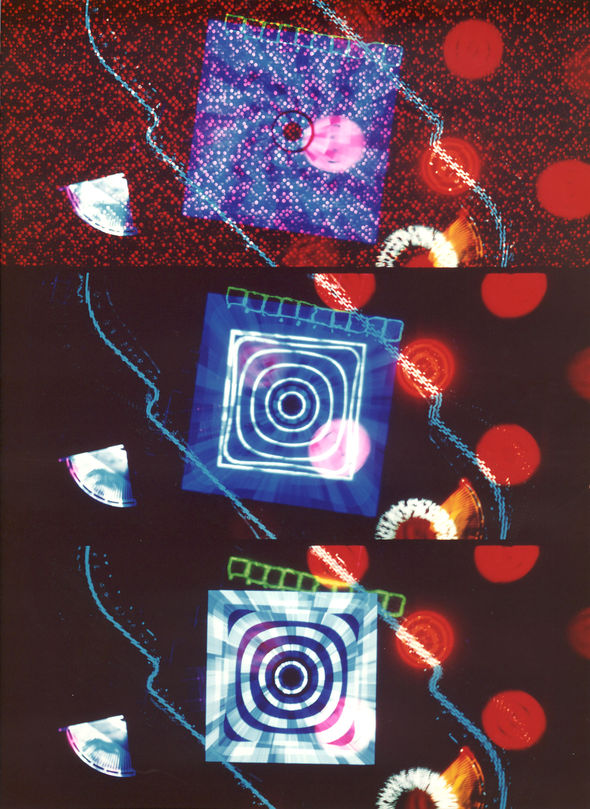
Background sequence frames from Brainstorm
Moving over to titles generally... what role do you think a title sequence plays in a feature film?
I think it depends on the sensibilities of the director and producer. Woody Allen most often uses a series of title cards – white type on a black screen – which I think is fine. Title sequences have a basic job to do: credit the major contributors to a film’s production, so that must be foremost in a designer’s work. Beyond that, a title sequence should artfully introduce the audience to the main motifs in the film, much as a well-composed operatic overture would do, in introducing the major musical themes used in the body of the opera.
Do you have a favorite?
Among my favorites are Vertigo and North by Northwest. Saul Bass was an incredible genius.
Also, I think the earlier Bond films have fantastic title sequences, introducing the idea of a visual language that would be common to all the films in the franchise. Images like the view down the barrel of the revolver framing Bond’s image not only tied the title sequence to the film but one Bond film to another.
Have any contemporary title sequences stuck out for you?
Obviously, the big budget shows support some great visuals in their main titles. The Batman and Spider-Man franchises have spawned some amazing graphics. The most impressive main title I've seen lately was the one for The Girl with the Dragon Tattoo.
What are your feelings on how title sequences have changed over the last 20 years?
A lot of title sequences merely fulfill the director’s and producer's economic vision of the production. Obviously, a big budget, VFX-driven film must have a big budget, high concept title sequence – a calling card. At times, the film that follows is undeserving of – or unrelated to – its calling card. I'm of the mind that a designed title sequence is meant to prepare the audience for what will follow, and not to be an end unto itself.
It seems like you’ve moved away from working in titles specifically. Have you ever wanted to return to that? Do you think you will?
I’d never say never. I’ve always loved working with graphics and film, and would love to mix some old school techniques with contemporary technology in a title sequence.
What are you working on currently? What kinds of things do you want to work on?
Currently I’m a visual effects supervisor on the set of Vampire Diaries, a weekly series on the WB network. Our most interesting work has been in what I’d call "digital MUFX” – compositing blood veins and desiccated skin tone onto actors, using light reference and tracking markers. Television production has little time for the application and removal of effects make-up, and we achieve economies of expense and time by applying these effects digitally. Our goal is always to make our effects so transparent that the audience will accept them as reality. There are other interesting effects that we’re developing for it, but I can’t reveal them yet. You'll just have to watch and wonder if what you’re seeing is real or CG!
LIKE THIS SITE?


