An idea can be a violent thing. Birthed out of nothingness, forcing its way into the world with a stroke of luck, a flash of inspiration, and sometimes, the push of a button.
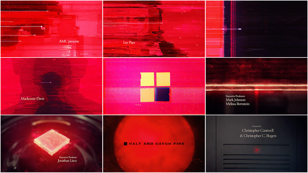
In the opening to AMC’s new period drama Halt and Catch Fire, a spark blazes a trail through sheer red, scorching an idea into existence. Zeroes become ones. Input becomes output. The characters’ faces, nothing more than glitchy approximations, are barely recognizable in the vermillion void.
Set against the backdrop of the 1980s tech industry, the series details the conception and rise of the personal computer. The sequence is our gateway into this system, the interface through which we enter a simpler age of bytes and bauds, when fear, uncertainty, and doubt ruled and code was king. Propelled by the pulsating synths of Trentemøller, the idea is executed. It cannot be stopped.
Nominated for a 2015 Emmy in Outstanding Main Title Design.
A discussion with Director PATRICK CLAIR and Lead Animator RAOUL MARKS.
Give us a little background on yourself, your agency Antibody and your current position at Elastic.
Patrick: Recently, I've been on the ground in LA working with the production team at Elastic, and its sister companies A52 and Rock Paper Scissors. Traditionally, we've done the production on our jobs with my team at Antibody, in Sydney. Working with Elastic is allowing us to take Antibody's creative direction to the next level – watch for upcoming projects for Ubisoft, Playstation, Wired.
What was your role and who worked on this with you?
Patrick: I directed. Raoul was lead animator. Art direction was provided by the amazing Eddy Herringson. Jennifer Sofio Hall was the executive producer. Typographic consultation came from Jennifer Walsh.
What was the first meeting about this sequence like?
Patrick: We had a number of great calls with the showrunners and producers early in the process. They had a clear idea of their story and we got lost a few times in long discussions on the characters and themes. Lots of stuff about the effect of ego, ambition, self-determination. We discussed gestation and the symbolism around creativity and creation. It was enormously helpful from a creative development point of view. Also, big questions about what it means to become an entrepreneur – imagine Steve Jobs before Apple's success. What is it like to be that person, looking for the next big thing, when you might be heading into oblivion? This gave us a really rich vein to mine for design concepts.
Once we'd seen the pilot, we also had a number of great discussions on tone, style, setting, colour, timelines, and era. So many contemporary depictions of that time come from a kitsch perspective – but there was a real austerity to the business world in the ’80s.
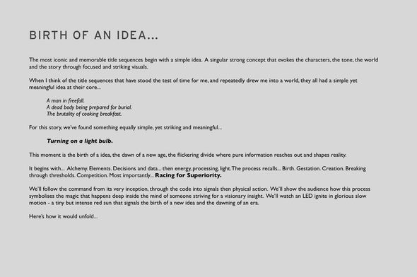
“Birth of an idea” written pitch concept
So, how did you start? What were your initial concepts?
Raoul: From the outset we had a few core concepts that were set in stone for us.
Patrick: What was important to me was to find the core. The show is all about ideas, incubation, inspiration – about people struggling to become visionaries. We went back to the most classic – cliché? – symbol for an idea: the humble light bulb.
So the idea was simple – let's turn on a light bulb. There was a very challenging but exciting task at the core of this – make a sequence about the computer era that was about people, not machines. Daunting.
Raoul: With that in mind, we boarded out a sequence. In essence these boards depicted the birth of a 'signal' and its journey to fire up a light. This was at the machine code level, an idea represented by simple graphic forms slowly evolving as it gathers pace.
Patrick: To place the era, we used a computer indicator LED instead of a normal bulb. We turned to Raoul to envision an LED bulb flickering to life at ultraslow motion at intense macro scale.
We had a very long storyboarding process – much more extensive and iterative than usual. We created stacks and stacks of boards. Our amazing art director Eddy Herringson played with geometric shapes inspired by everything from Saul Bass to retro video games to sex ed videos. We bounced between digital sperm to missile command and back – all in 8-bit.
We were constantly haunted by the ghost of Tron. I LOVE Tron. But it was wrong to imitate it here, so we kept trying to avoid that sense of a city/grid/chip landscape.
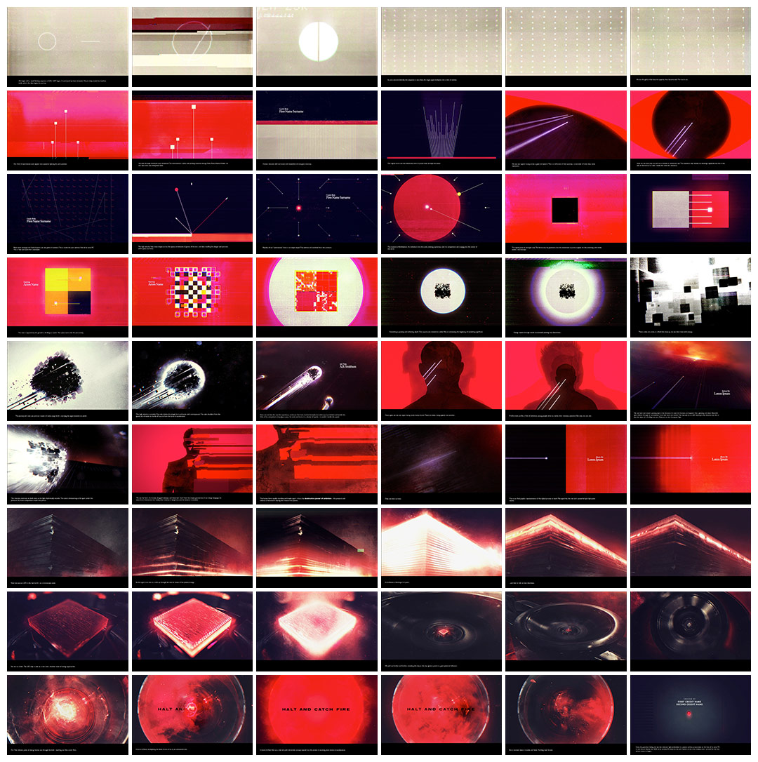
Storyboard from initial pitch
Raoul: Eddy did some amazing boards that fully fleshed out a sequence from machine code to digital dividing cells. We also had a far more elaborate sequence showing the signal lighting up the LED. At one stage we moved entirely over to a light bulb-like structure with a more conventional filament lighting up as in old valve electronics. This swung back around to the LED, though, in further iterations.
—Raoul MarksI just hope people's older televisions sets don't give up when they receive the show’s signal.
At this point – in the original pitch – we had other "competitor" signals. They were either burning up and disintegrating as they travelled too fast, or not keeping up and being left behind. We had to pare back a lot of the narrative for a simpler story, but there are still elements of this in the final piece. With only 30 seconds, it’s very important to not over-complicate the message. It was important to get our ideas rock solid instead of diving straight into animation.
Patrick: Eventually, with a set of boards that we were all happy with, we moved into production. In execution, we delved into much greater complexity. We also took some artistic license with how electrical and digital signals might look in this space.
Raoul: Unlike True Detective, which had non-connecting shots, Halt had a constantly flowing signal that needed to move from shot to shot. This meant the edit, movement speed, and timing was crucial. So instead of getting caught up on visual detail, I focused on the signal animation and cut timings.
Usually we work to a boardomatic but with this we needed to get to an animatic far earlier in the process to ensure the elements would flow correctly. It was then a methodical process of working up each shot and then tweaking in consideration of its surroundings shots.
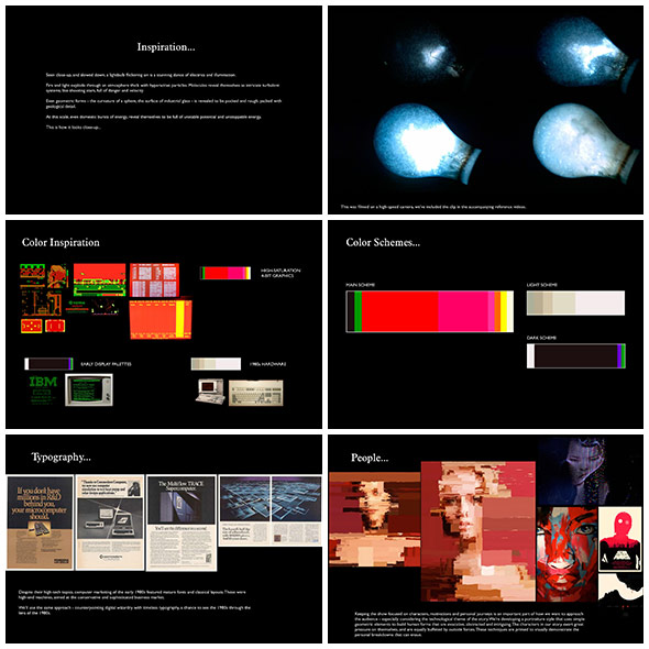
Reference and inspiration images
We also took notes from the more conservative home personal computing advertising of the era that predated the "hi-tech" style that was soon to follow. This included serif fonts and classic layout design. Patrick had some brilliant ideas on the colour palette: an iridescent red that never peaked beyond hot magenta. A lot of time went into fine tuning the colour grading. Maintaining the red/magenta and the images' readability was a very fine balancing act. I just hope people's older televisions sets don't give up when they receive the show’s signal.
Patrick: Keeping a sense of credibility and authenticity was crucial – colour, camera, angles are all very bold, strong, dominant elements of the show's filmic language. This set us on a path where we felt we could make daring colour – red plus magenta? What a nightmare! – and use bold and simple geometric forms.
As we iterated on design frames, my team would bring me great-looking boards and I would send them away, saying, "If it doesn't make your eyes bleed, then it needs more saturation."
—Patrick ClairWe experimented with many techniques to give it a feeling of constant flux and energy.
Haha. How did you decide on the depiction of the cast’s faces – the glitchy treatment?
Raoul: We knew we didn't want to go down the road of clearly depicting the cast but needed to maintain a human element.
Patrick: It was important to both us and the show's creators that the titles have a human component. We were all wary of creating a sequence that was just beauty shots of the cast – the showrunners and the network wanted this to be an abstract and symbolic sequence. This was tricky – how do we plug people into a fuzzing red magenta digital void?
The show is really the story of people putting pressure on themselves, and risking self-destruction through their own ambition. It made sense to see them decaying, breaking under the pressure of velocity and self-destruction.
Raoul: From an aesthetic standpoint, glitch imagery and a show about the dawn of the computing age go hand in hand.
Boardamatic for 'Stage 2' design phase
So how did you make that work? What was the process for that glitchy, digital decay look?
Patrick: We took photos of the cast and then manually "de-rezzed" them. Raoul painstakingly treated each portrait, dialing in just enough geometric disruption so the cast were barely visible. This was mainly done to the underlying artwork, but some basic particle work augmented the layouts at this stage too.
Raoul: I really wanted to steer clear of the more overused tricks that are associated with the style. The general idea was to show these characters undergoing great pressure, as if re-entering the atmosphere from orbit but in a digital world. Detail should shake and rip across the screen, smearing as it goes. It needed to maintain a tactile quality but introduce the underlying order that digital artefacts often carry. Debris and facial details could be torn across the screen but they'd only ever move along straight lines – never an angle.
Patrick: We experimented with many techniques to give it a feeling of constant flux and energy – textures, grain, undulating light flares to make the red/magenta feel electric and alive, never flat.
Raoul: I actually used a very simple Photoshop process to "digitize" the characters’ faces. This was as simple as making a rectangular selection on a facial region and then hitting “average” to flatten out the colour. Done bit-by-bit over an entire image, you're left with an interesting facial approximation. I get a kick out of it because it's such a simple method but with a great outcome – just takes patience!
Patrick: After that, we took them into 3D and began building basic geometry of the actor’s faces. This gave us a physical framework for the design imagery, and we could plan basic cameras and start building environments. The goal was to have something in between the two worlds – never a fully immersive 3D scene, but more depth than just a graphic.
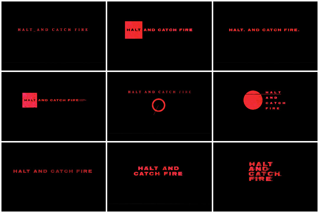
Logo exploarations
Was there anything that took you by surprise when working on this sequence?
Patrick: That anyone would ever allow me to put this mix of red and magenta on the air! I should have been stopped. I'm glad we were allowed to go this extreme.
We're genuinely delighted with the results. The title sequence gives the show a very distinctive and appropriate visual identity.
What element(s) of this sequence are you most happy with?
Raoul: In addition to that Eddy’s styleframes that lead to the signal dividing the cell are just straight up beautiful.
Can you talk about the music track by Trentemøller?
Raoul: We actually only got to the music very late in the game but it worked beautifully with the visuals. It straddles the line between contemporary electronica and more retro-analog sounds beautifully. It’s great when production goes the extra mile to get great talent like that.
Are there other title sequences or references that inspired this sequence?
Raoul: David Lewandowski's stellar work on the Tron: Legacy opening titles served as inspiration for the animation phase and was a good jumping off point. I also found the simplicity of Prologue’s main-on-end for X-Men: First Class was a great source of inspiration.
X-Men: First Class (2011) main-on-end title sequence, designed by Prologue
What are some of your personal favorite title sequences, either classic or contemporary?
Raoul: Unsurprisingly, pretty much anything Danny Yount puts his mind to turns out great: Oblivion, Iron Man, Semi-Permanent and many others.
In addition to that, Enter the Void is an utter trip, Alien, and Zhestkov's work on TOCA ME 2012.
What excites you outside of design?
Patrick: Good but simple food. Tasty beer. Rugged landscapes.
Raoul: My partner, Annika, works in the arts and is constantly exposing me to the amazing creativity and fringe thinking coming out of contemporary arts. That keeps me inspired.
Tim Sweeney's radio show Beats in Space comes out of New York late every Tuesday – that keeps me going.
--
SUPPLEMENTARY: Halt and Catch Fire (2014) S03E05 main titles, featuring new theme music.
Support for Art of the Title comes from

CINEMA 4D BY MAXON
Featuring an Unmatched Live 3D Pipeline with Adobe After Effects CC.

