Title Designer RICHARD MORRISON:
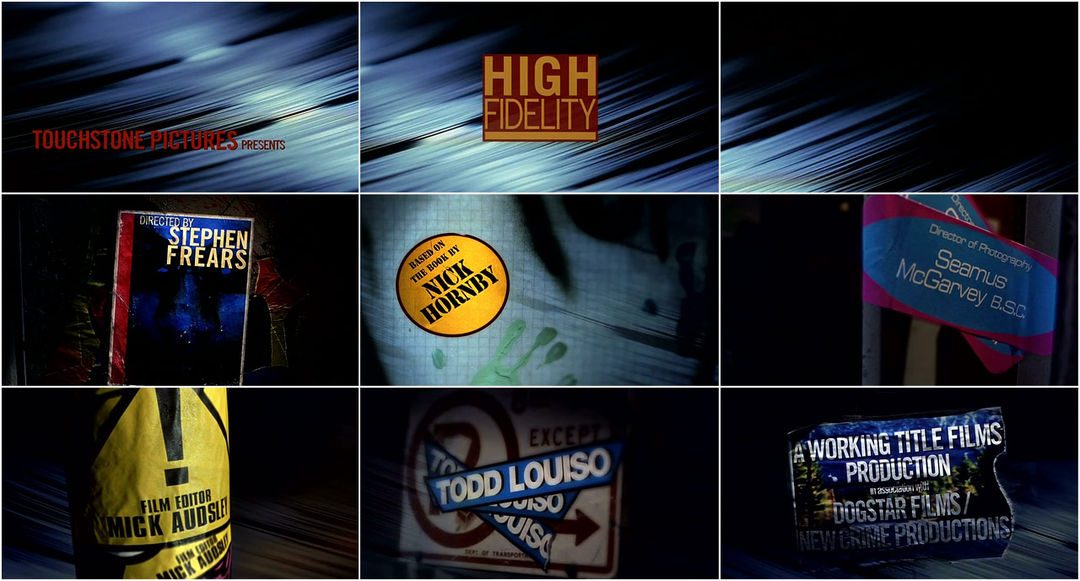
When working on this sequence I kept three notions in mind: make it original, simple, and distinctive enough. I believed simple content would be the answer to a finely tuned piece of work. Hence, the sequence abounds in this somewhat old-fashioned vintage style ‘brand identity’ approach with a titled logotype centrally set in a 3D background movement.
I knew the film would be humorously philosophical. So I thought it was perfectly natural to create some kind of a retro feel to reflect some of the older classic films, but also keep it feeling fresh and contemporary at the same time. Understanding where the film sat in its surroundings was absolutely vital. Although it is a short piece, the level of difficulty was naturally quite high – timing being one of the main reasons. Many creatives will tell you that short pieces are the most difficult ones because you need to ensure that you make the most of every single second, graphically and visually.
Title Designer: Richard Morrison


