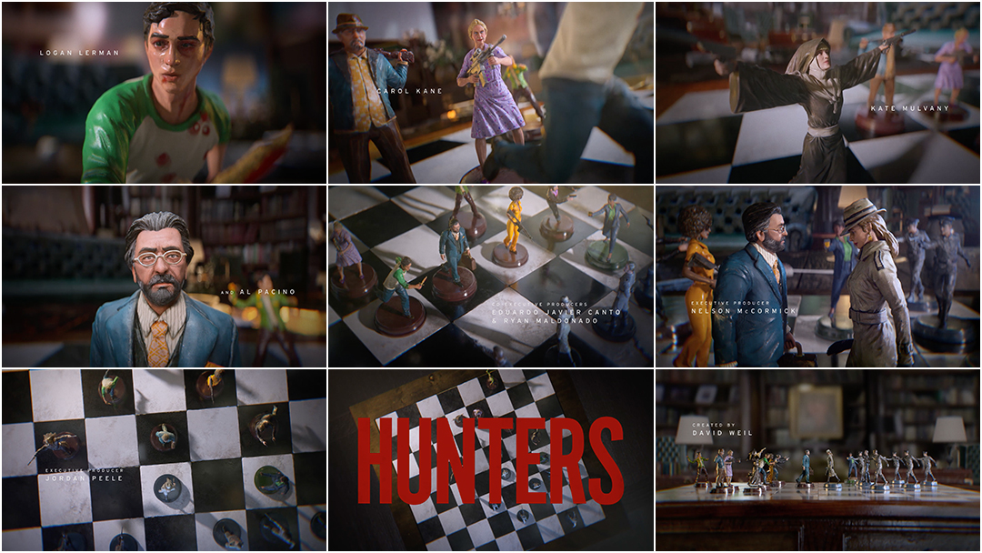
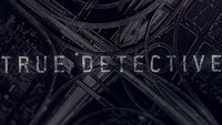
Hunters is a TV series filled with strategy and symbolism. Legacy, superheroism, and the battle between good and evil – and the moral gray area in-between – are a few of the themes explored in its first season.
The most integral element of the Amazon Prime production, though, is the study of strategy. The cat-and-mouse tactics employed by Meyer Offerman’s (Al Pacino) Nazi hunters and their fascist counterparts ensure that neither side has the upper hand for long and only adds to the tension as the season progresses. It’s apt, then, that a 3D-animated game of chess was chosen for Hunters’ title sequence. The board game offers a glimpse into the show’s strategic nature and basing the main titles on this presents the series’ recurring themes in a digestible manner.
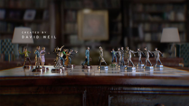
Using chess as a metaphorical exploration of tactical acumen isn’t a new phenomenon in film and TV; The Seventh Seal, 2001: A Space Odyssey and Star Trek are but three classic examples that demonstrate its importance to plot subtexts. Its use in a title sequence, though, distinguishes it from similar miniature- or prop-based main titles.
For Elastic, the studio behind the sequence, the chessboard was one of a number of ideas pitched to show creator David Weil. Jonah Heidalbaum’s (Logan Lerman’s) fascination with superheroes and comic books formed the basis of multiple pitches but, ironically, their similar designs helped the chessboard idea stand out. “We were initially trying to unfold his story into comic book and superhero-related images,” Jeff Han, art director at Elastic, explained. “I worked with director Lisa Bolan and designer Min Shi to design the characters as comic book superheroes."
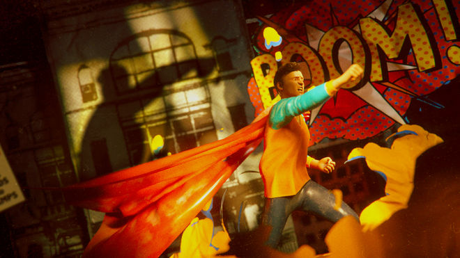
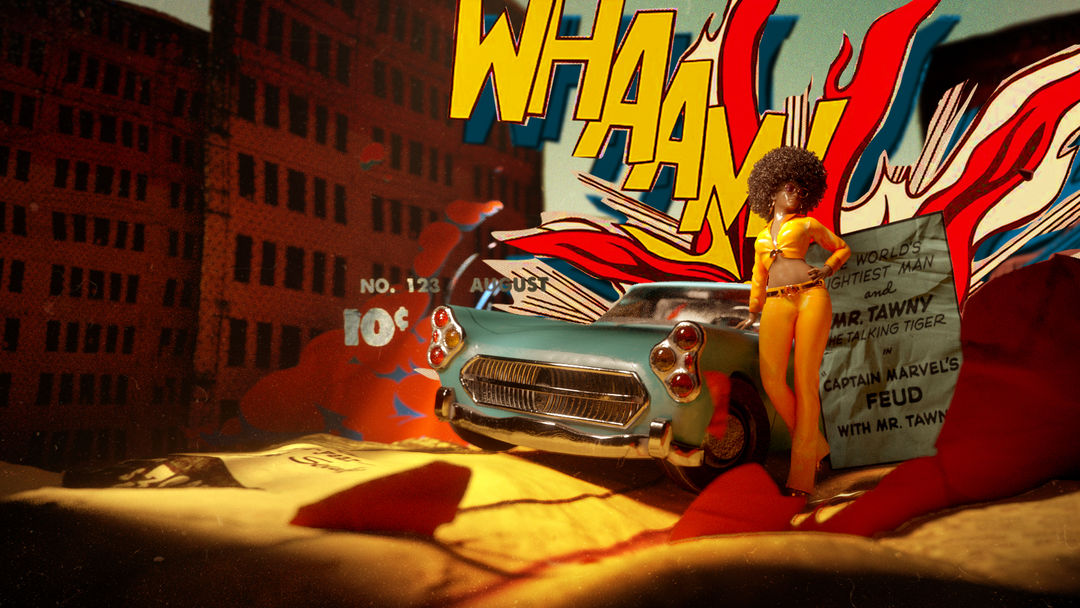
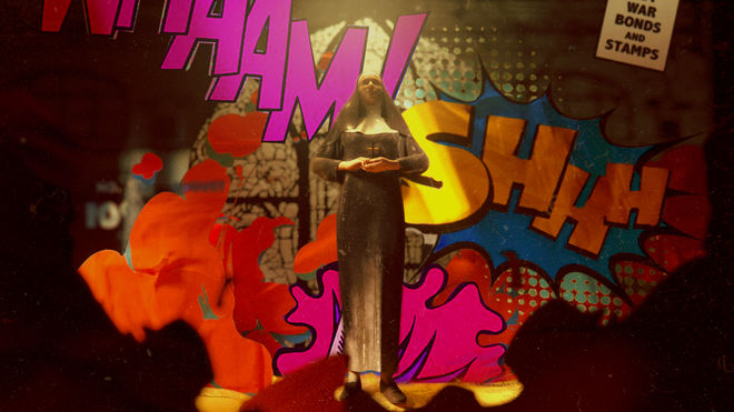
Images from the initial comic book and superhero-related pitch created with director Lisa Bolan and designer Min Shi
"The chessboard, with miniature characters as chess pieces, was originally meant to be a side element but it ended up being the core concept," said Han.
Hunters’ use of miniatures, like its chess-inspired opening, isn’t new either. Going as far back as the 1937 comedy flick Nothing Sacred, models and miniatures have appeared in title sequences. The 1961 adaptation of The Parent Trap, 2010’s Dinner for Schmucks, and 2011’s Herbst are other instances where miniatures – albeit practical models – are employed.
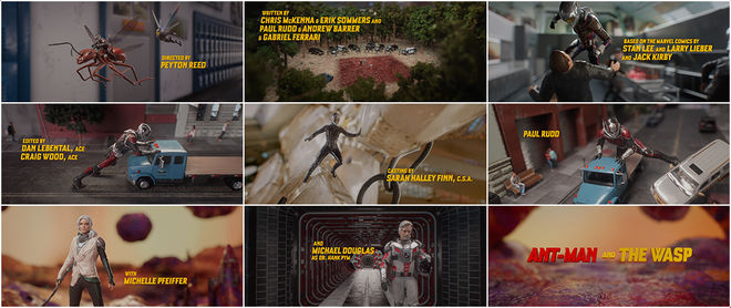
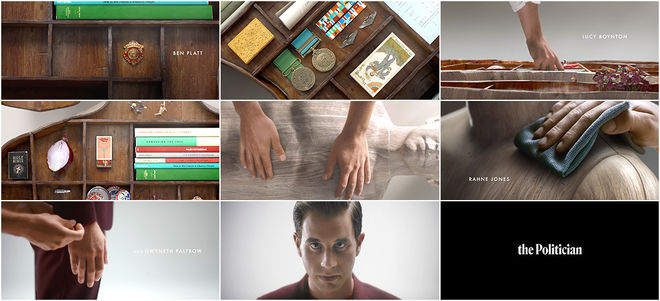
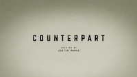
Elastic’s approach for Hunters, however, centered on creating a digital board game sequence. As in the opening to the Starz TV series Counterpart, where the board game Go is used as a metaphor to map out the various moves and permutations we make in daily life, Han’s team used chess as a thematic exploration of the show’s tactical elements. Elastic already had experience in miniature figures due to their work on Marvel Studios’ Ant-Man and the Wasp end credits, while other studio projects – including The Politician – incorporated digital miniatures in some capacity.
Ant-Man and the Wasp (2018) main-on-end titles
The Politician (2019) main titles
Elastic’s expertise with 3D model animation, including the iconic main titles for HBO’s Games of Thrones adaptation, also showed that physical models weren’t a necessity. Taking inspiration from these previous projects, and his own love for chess, Han’s decision to form a pitch based around chess pieces was cemented after watching Hunters’ first two episodes.
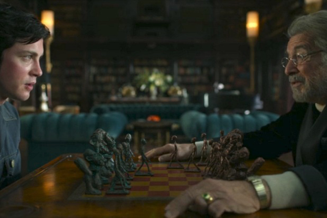
Still from Hunters featuring Jonah Heidalbaum (Logan Lerman) and Meyer Offerman (Al Pacino) playing chess
“There was one scene where [protagonists] Meyer Offerman and Jonah met at Meyer’s house and played chess together,” he said. “I combined these miniature characters with the chess idea and used this scene as our main reference.”
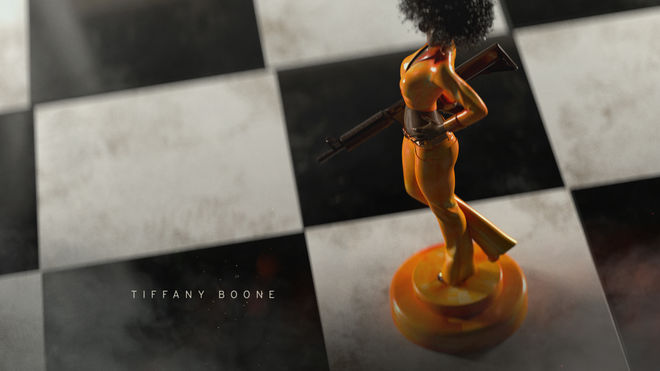
Elastic’s project was greenlit. Assembling a team comprised of Yongsub Song, lead animator, and Lance Slaton, storyboarder, Han and the crew quickly began work to meet the sequence’s tight two-week deadline. Artistic sketches produced by Slaton were used as reference points for each piece’s pose and the weapons they hold.
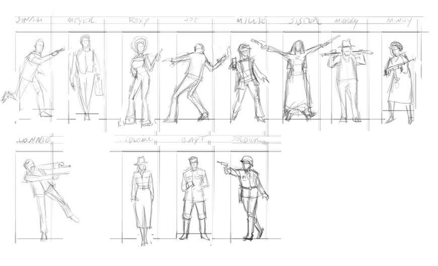
Rough sketches of character chess pieces
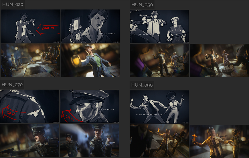
Step one: storyboarding. Deciding which light sources to use – warm glows for the hunters and cold, shadowy hues for the Nazis – and which camera angles would be used needed to be agreed upon, as well as the side of the board for each team. “We decided to place the hunters on the left,” Song said. “They move to the right side, which we felt was the forward direction. Nazi officials are on the right, which we thought made for a repressive atmosphere. We also used low angles and dolly zoom camera moves to make the Nazis threatening, and dutch angles to show that tensions are running high.”
—Jeff HanWe also used low angles and dolly zoom camera moves to make the Nazis threatening, and dutch angles to show that tensions are running high.
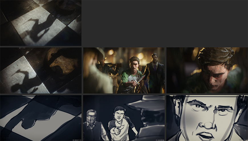
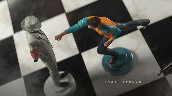
Stances were selected to indicate each character’s role. Jonah’s running posture, complete with his Safta’s golden dagger, signals his hot-headedness and desire to please his crew by taking the fight to the enemy.
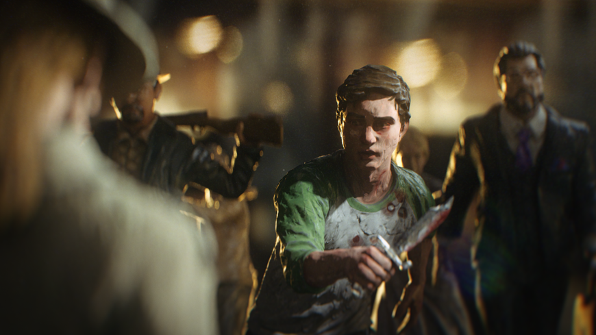
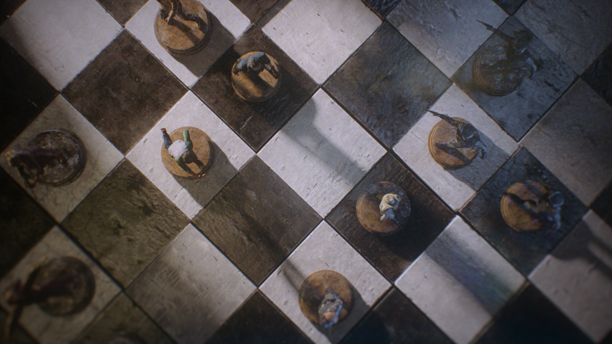
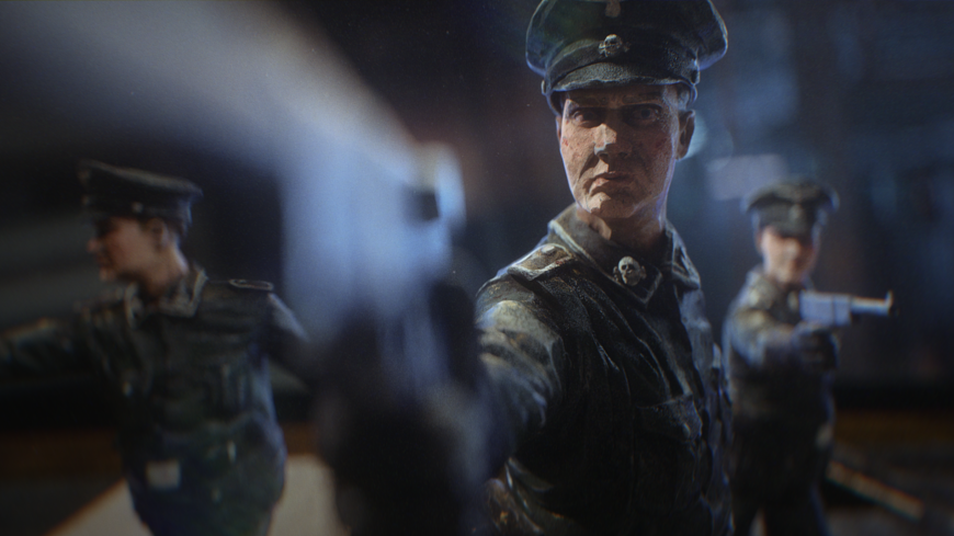
Early renderings of chess pieces featuring the roughed-up, vintage aesthetic
Positioning was another element. As one of the show’s leads, Jonah, for example, had to be front and center despite being the newest member of Offerman’s hunters. “Meyer and the Colonel, the Nazi leader, were intentionally placed in the center,” Han said. “I wanted them to meet in the middle later in the sequence. I wanted Jonah’s character to be next to Meyer since they are the main leads. The rest of the characters were placed, depending on their poses, to provide balance for the wide shot.”
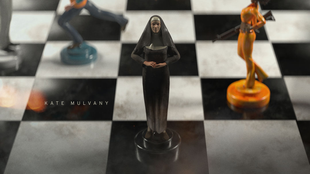
Using the real-life chess board in Offerman’s office as reference for the CGI version, the modeling team built a replica in Maxon Cinema 4D. Then attention turned to each character’s chess piece. Discussions with the showrunners helped the team at Elastic gain insight into each character’s personality traits, weapons of choice, clothing, and facial expressions. Stances were selected to indicate each character’s role. Jonah’s running posture, complete with his Safta’s golden dagger, signals his hot-headedness and desire to please his crew by taking the fight to the enemy. Sister Harriet’s (Kate Mulvany) pose is emblematic of her Catholic belief – arms outstretched in a nod to Christ’s crucifixion – while Murray Markowitz (Saul Rubinek) and Roxy Jones (Tiffany Boone) have their weapons pointed away from their Nazi targets suggesting a reluctance to kill.
Meyer’s and The Colonel’s upmarket clothes set them out as the heads of each faction
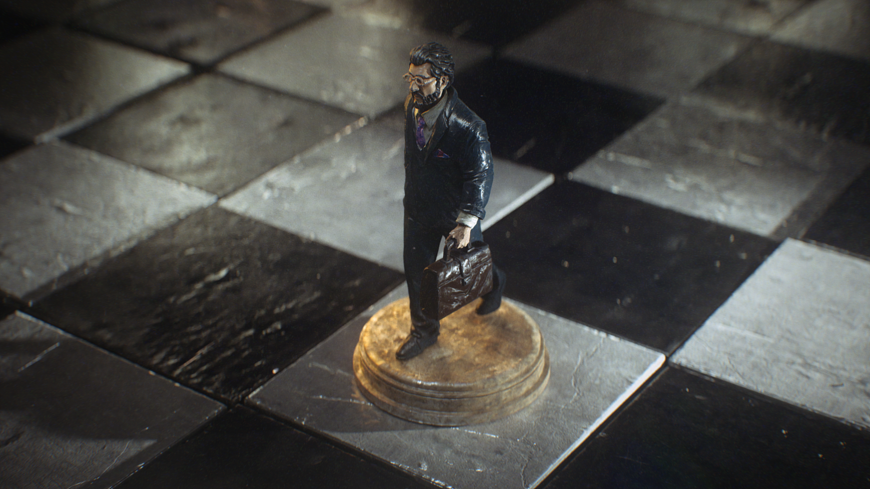
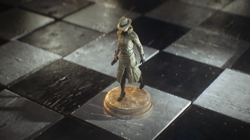
Early renderings of the Meyer Offerman and The Colonel chess pieces featuring the roughed-up, vintage aesthetic
Meyer’s and The Colonel’s upmarket clothes set them out as the heads of each faction and their purposeful strides point towards their inevitable meeting. Their lack of weapons symbolises their outwardly diplomatic personas.
“Our main modelers, Jose Limon and Joe Paniagua, did it fast but with highly detailed facial expressions,” Han said. “They modeled the characters based on a few images from the show. Min then did the texturing.”
With the models assembled, keyframe animation was used to bring them to life. The chess pieces’ shaky-yet-fluid movements, to insinuate the friction between piece and board, was achieved by adding dynamic effects to each animation track. Friction, mass, and force values were also manually tweaked to authentically create resistance between piece and board.
Chess piece movement render test 1
Chess piece movement render test 3
Chess piece movement render test 2
Once the animation sequence was finalised, the lighting for each shot needed examination. Offerman’s office window and chandelier were used as the main light sources. “To stage shots, we added other third light sources,” Song said. “We added low temperatured rim lights to Nazi shots, for instance. We sometimes added extra animated lights to get long shadows.”
Before the sequence could be rendered – each frame took between 10 and 20 minutes to render – the animation had to undergo composition in After Effects. As lead compositor, it was Song’s job to align every shot, animation sequence, special effect, and background plate to ensure the sequence flowed seamlessly.
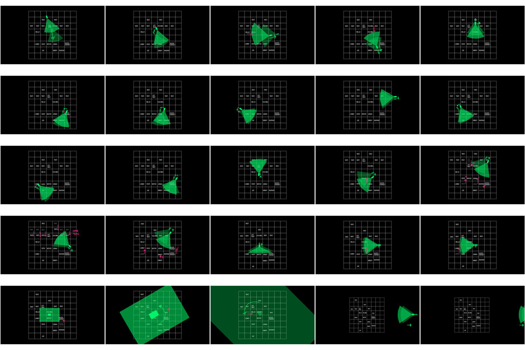
Shot map and camera moves guide
It was the decision to go with a matte finish for the chess pieces rather than a vintage aesthetic that was perhaps the biggest issue. “The vintage 1970s toy direction had lots of bumps, imperfections and scratches, even in the chessboard itself,” Han said. “David wanted to go with a cleaner, new, factory-built matte finish. We had to go back and redo all the characters’ surface modeling, and removing the details is not easy for designers. In the end, we were glad that we went with David’s cleaner direction. Less is more sometimes.”
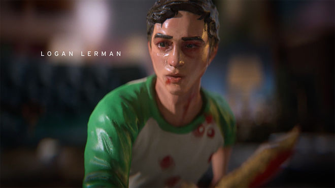
Still from the final Hunters title sequence featuring the Jonah Heidalbaum (Logan Lerman) chess piece
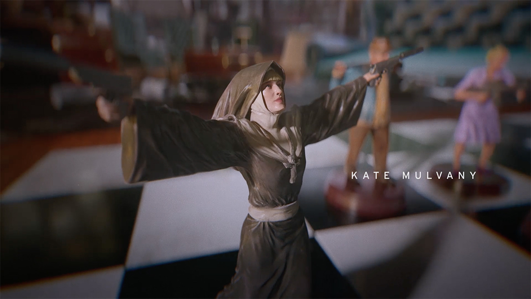
Still from the final Hunters sequence featuring the Sister Harriet (Kate Mulvany) chess piece
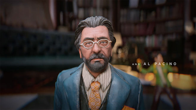
Still from the final Hunters sequence featuring the Meyer Offerman (Al Pacino) chess piece
Its musical score also denotes the show’s sense of foreboding and suspense. Trevor Gureckis’ composition isn’t overbearing but adds tension as battle lines are drawn. The use of strings and allegro tempo builds pressure while the introduction of a solo violin halfway through provides a poignancy that perhaps refers back to the Holocaust, i.e. the show’s chief inspiration. The addition of brass and piano notes towards the end raises the stakes further, signifying the conflict between Meyer and The Colonel later in the season.
There’s something distinctly ornate about physical models, and it would have been interesting to see how Elastic could have tackled building a practical chess board replica. It could be argued that its digital creation, rather than a mix of practical props and CGI, doesn’t provide the same level of charm. The two-week timeline, though, simply wouldn’t have allowed for a hybrid sequence. Regardless, the sequence carries an air of model authenticity with its chess-piece movements and matte-style paint jobs, and provides context to the show’s themes. It’s only a minute long and might be viewed as simply a cool main title by some, but Hunters’ main titles are more than just an episodic entry point. It’s a digital miniature-based animation laced with tactical symbolism which proves that credits can offer hints at a show’s thematics long before they materialise. Its strategic symbolism offers a view at the themes within and, like a chess game, reveals that each member of the hunters and Nazis are just pawns in a bigger contest. Not everyone makes it to the endgame.
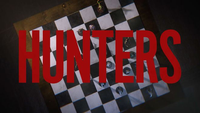
Hunters (2020) title card
Design Studio: Elastic
Creative Director: Jeff Han
Lead Animator/Compositor: Yongsub Song
Designers: Min Shi, Gryun Kim, Jean Hwang
Animators: Gryun Kim, Aziz Dosmetov, Alex Silver
Modelers: Jose Limon, Joe Paniagua, Andrew Wilson, Colton Smrz, Mike Dupree, Christopher Nolan
Editor: Rachel Fowler
Storyboards: Lance LeBlanc
Production Coordinator: Mitchell Fraser
Producer: Michael Ross
Executive Producer: Luke Colson
Head of Production: Kate Berry
Managing Director: Jennifer Sofio Hall
Series Music by: Cristobal Tapia de Veer

