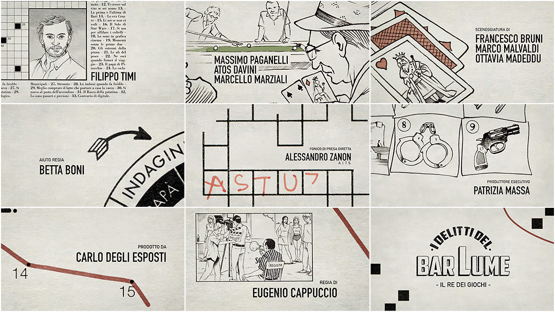
Let’s put our feet up. Let’s have a drink, play some cards. Let’s do the crossword and take delight in diversion with the opening titles to Sky Cinema’s TV miniseries I delitti del BarLume. A two-part narrative based on the works of Italian writer Marco Malvaldi and produced for Italian audiences, the miniseries features a crime mystery laced with comedy.
Its opening titles bear an air of familiarity, a sense of ease. Though it’s meticulously designed with a keen eye for grid structure and typographic order, the illustrations are warm, the colours inviting. The illustrations of course refer to key plot points and characters, but they strike that peculiar balance between straightforward explication and intrigue. The triumph of this sequence lies in that playful middleground – where puzzle as entertainment reigns.
A discussion with Title Designer STEFANO CARUGATI.
Give us a little background on yourself.
After studying video design at Istituto Europeo di Design in Milan, I started collaborating with Sky Italy, first as a designer and then as an art director. My role is to realise opening titles and graphics for various programmes and idents for Sky channels such as Sky Cinema, Sky Uno, and Sky Arte. I work as a freelancer, so I’m always looking for new projects and opportunities for collaboration.
How did you become involved with the title sequence to the miniseries I delitti del BarLume?
Just before summer 2013, the creative director of Sky Cinema, Roberto Amoroso, contacted me asking me if I wanted to realise the title sequence of I delitti del Barlume.
During the first meeting, Roberto explained that Sky Cinema was going to produce a mini-series – two episodes – from the books of Marco Malvaldi. It was meant to be a crime fiction story with a touch of comedy, an element that develops a lot more towards the end of the series. The mysteries, though, are still left to solve…
What were your initial concepts for this sequence?
The series is set in a small town, a beach resort in Tuscany. A typical Italian custom is to bring crosswords, magazines, and the like to the beach, to spend time. This is exactly the essence behind the series: trying to solve puzzles and be amused at the same time. We immediately noticed how this analogy came so easily and how the graphics featured in these types of magazines were perfect. That was the idea!
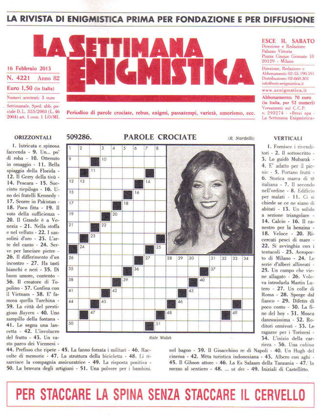
Examples of crossword and puzzle magazines, including La Settimana Enigmistica. Its cover has remained fairly consistent since 1943, included here.
How did you proceed?
First, we researched in-depth the iconography and the style behind these classic magazines. They all follow a rigid grid layout and a very typical illustrative style. We were sure that by adapting and reproducing this kind of style we would make a clear link between the two.
Then, we asked illustrator Simone Antonucci, who collaborates often with us, to work on the illustrations.
And what was the collaboration like, with Simone Antonucci?
At the beginning it was necessary to define the style; it was important not to be too gimmicky or too funny but also not too formal or severe. After selecting the different subjects we wanted to feature, we then moved on to sketching and then the final product.
One of the most delicate parts was to manage the balance between the crosswords and the illustrations. Sometimes, the illustrations refer to elements in the episodes, sometimes just to the lyrics of the song, and in others, they refer to the cast or roles of the people who worked on the series. So, balancing all these elements was crucial to the success of the sequence.
Were there drawings that didn’t make it into the final cut?
Of course, there were a lot of sketches and drafts that haven’t been used. It’s a shame as they were quite cute!
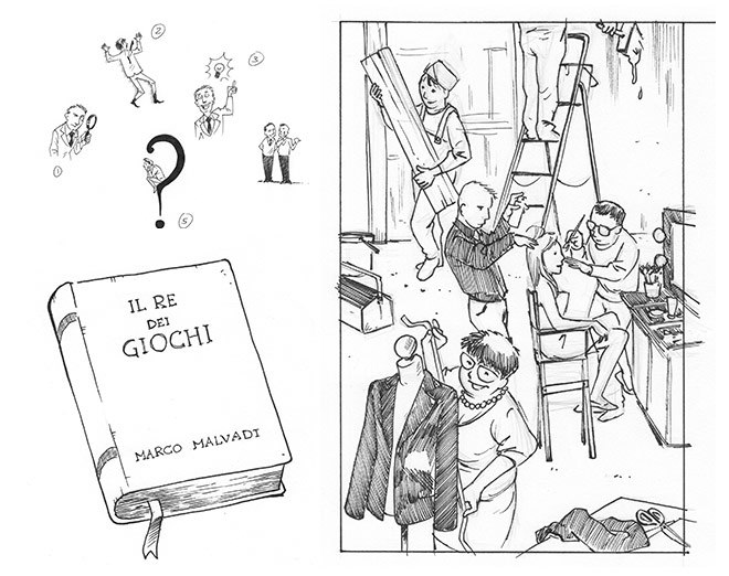
Unused sketches by Simone Antonucci
And the music? Is the theme by Ratchev & Carratello? At what point in the production did it come in?
No, Ratchev & Carratello took care of the original soundtrack. The opening scene track is written by Lilla Fiori and Simona Molinari and features singer Simona Molinari.
We encountered some difficulties at first, as the track was different and it undertook several edits during the development of the movie. But it was all worth it in the end, because the vaguely swing style of the track, evoking the ’30s, gave more strength to the whole thing.
You use DIN pretty heavily throughout the sequence. How did you choose that typeface?
We considered several typefaces. When it started to be more finalised, we were pretty confident with using DIN. Apart from the fact that I personally like the font, it is also a typeface that was born in the ’30s – at the same time as those types of crossword magazines were born. To this very day, these magazines are still very influential in terms of graphics and layout.
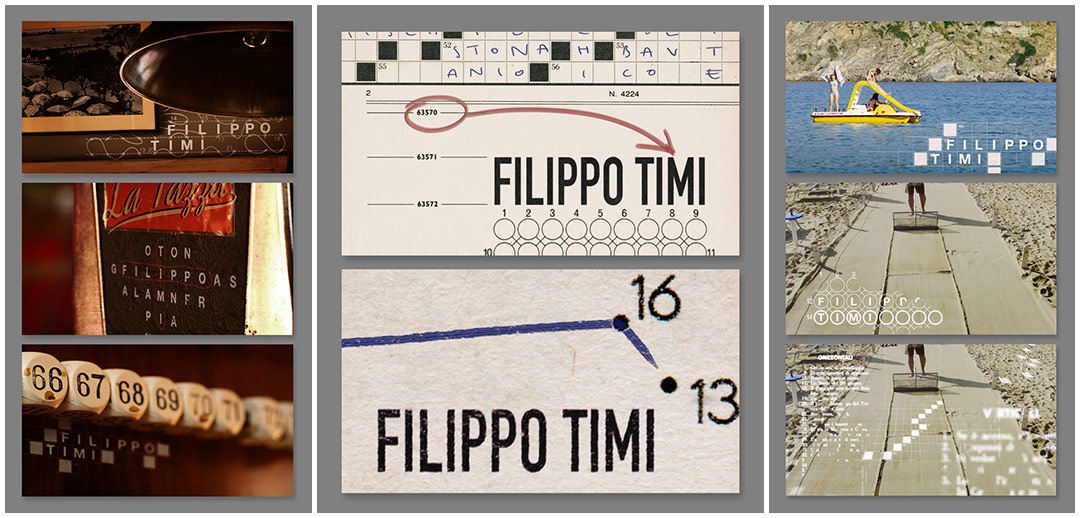
Initial pitch ideas
Which tools and software did you use to put it all together?
Apart from the paper, which was used exclusively by Simone, the rest of the tools we used are the usual ones – Photoshop and After Effects. Then I used Final Cut in the previsualization and animatic phase.
I also used a little Mograph by Maxon Cinema4D to animate the spiral thing that you find at 1:10 in the sequence. That's just because I thought it was faster to do this way – but you can’t really notice it!
Aside from the crossword magazines, what were your influences for this sequence?
There are always a lot of influences – some of which you don’t even realise you are affected by. In title sequences, I’m particularly attached to the Dexter one, because when I made my first steps into this world [of title design], they helped me understand how powerful opening titles can be, either for a series or a movie, and how much character they can give to a show – become an essential part of it.
I even made a reference to it in a work I did few years ago, which is all live action: there is an orange that has been cut in half just like the Dexter one.
Can you recommend us an Italian title sequence that you like, that we may not know about?
It’s hard as you have plenty on your website! But I take the chance to let you know about the opening sequence of Sky Cinema’s series Romanzo Criminale, designed by Ian Cross and Stuart Hilton at FAQ
Romanzo Criminale (2008-2010) TV series opening titles designed by Stuart Hilton and Ian Cross
What are you looking forward to? What excites you outside of design?
I really like photography. In a way, I’d like this passion to become something I can dedicate myself to in a more complete way – even though graphics, design, photography, and film are all similar arts that often contaminate each other. I’d like to cultivate this passion a bit more.
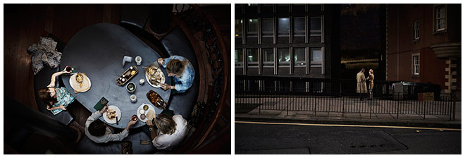
Photographs of Scotland, by Stefano Carugati
Our thanks to Benedetta Sodini for translating this interview.

