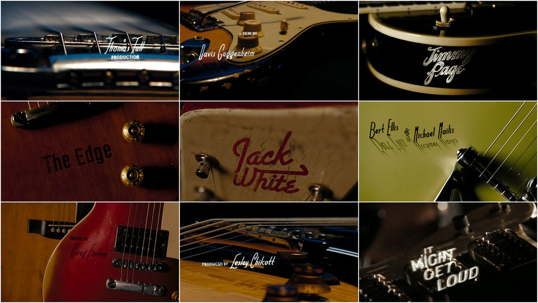
Jack White steadily builds with an upholsterers touch in prelude to the opening title sequence in Davis Guggenheim's It Might Get Loud. It is a turning out of battered axes and the men who wield them, their names embossed or tracking in the grain with the promise of one last caress like some tough poetry.
From the DVD audio commentary with Director Davis Guggenheim, Producer Lesley Chilcott and Producer Thomas Tull:
Davis Guggenheim: The film's editor, Greg Finton, and I fought for months in the editing room as he insist that this scene [the opening with Jack White building an instrument in what feels like real time] be at the beginning of the movie and I told him he was dead wrong. Now it is my favorite scene in the movie and it is perfect and it shows what a huge contribution Greg had in the editing and narrative construction of this movie.
Lesley Chilcott: Jack...came to us with the idea that it is not about how much fancy equipment you can afford to buy. [That] anyone, even if they didn't haven any money, could learn to play an instrument. So the idea was to build this diddley bow. He found this 2x4 and a Coca-Cola bottle and brought some strings and a pickup and literally built it on camera. The scene was originally much longer; one of the funny things that happened was that there were cows on the farm which we did not place in the background. They eventually wandered over to hear what he was doing.
Davis Guggenheim: [I] remember the diddley bow myth that poor blacks in the south would string a piece of barbed wire on a fence because they couldn't afford a guitar. It is how Bo Diddley got his name.
Lesley Chilcott: We were lucky enough to have this great group from New York [Click3x] do our titles and we just supplied them with elements. They were really kind to do this for us. They took a real personal interest. Steve Tozzi and Carson Hood and a whole group of people.
Davis Guggenheim: One of the great ideas [Click3x] had was to have the names on the guitars so Jimmy Page's name is embossed in ivory on the body of his own guitar.
A discussion with Title Designer STEVE TOZZI of Click3x.
How did you become involved?
ST: I actually got a call from Lesley Chilcott, the producer working with It Might Get Loud's director Davis Guggenheim. She said that he saw a film I did with Jonathan Demme about President Carter called Man From Plains, which had a lot of dimensional type work done throughout. We met and started pitching ideas and early rough concepts and also discussed what we would have access to. Having not seen any of the film yet, I asked what it was about and was told it was a story about the electric guitar, these three very different musicians and how they ultimately meet. My initial reaction was that it would be wonderful to get their guitars and maybe shoot everything practically, [to] actually have them engraved with their names. Davis loved that idea, he was really intrigued by it and wanted to try. Ultimately I wanted to treat their titles more like famous guitar manufacturers like Gibson, Gretsch etc. and keep it in that style but also customize each to the artists’ own personality.
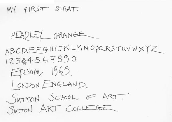
Handwriting samples from Jimmy Page and The Edge
As we we're gearing up and starting to design for the body of the film, we found out that we couldn't do the practical application because basically Jack White's guitar which he is famous for, a Woolworths brand guitar, is essentially made of plastic, therefore making it very hard to do the inlay on. That wasn't going to stop anything; we had the option to create it digitally and track in the typography. Davis shot a series of setups with the guitars with a lot of beautiful motion tracking shots, throwing the guitars in air, all overcranked to base the effect on.
What was Click3X responsible for?
We handled the opening title sequence, the chapter breaks and all the lower third customization.
How did you develop the type treatments used throughout the opening?
Once we saw the film we knew that each title -each logo design- needed to be different because of how different the musicians were from each other. Jimmy Page came very quickly because it felt like earlier versions of the Gibson logo from the 30's where there was some really unique workmanship done to the mark [with] more curves. I liked some of the more bulbous arcs from that and also I took some inspiration from other hand done logo work from the 50s and even from the 70s. It ultimately came together and felt like a guitar company's logo.
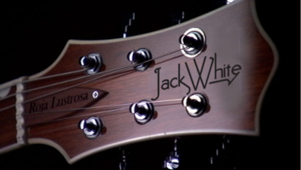
Jack White first draft comp
The second one was Jack White where I looked at the signage from diners strangely enough, and companies like Gretsch as he also plays Gretsch guitars. Anything too close to a real guitar company mark was wrong, so I had to hybrid a lot of design together. The toughest one was The Edge. As Jimmy Page says he's a sonic architect, but early on U2 was a little more pop rock in sound and now they're much more textural, so it was mainly trying to find the bridge between the two and ended up with something that felt more stenciled by a roadie than crafted and decorative. We went through many many versions of that one.
So all the lettering is custom for the three main musicians?
Yes, for Jimmy's I just drew it by hand and then retraced it. The other two were based on typeface we retooled. [For the subsequent credits] I didn't want to go with something standard and clean that might pull the sequence back into a traditional documentary style so when we got down to doing all the production names on the front end of the film I needed to find something that still had a lot of character but didn't take away from the main musician's titles. We ended up with this Little Ricky looking typeface that felt like it was from the 50s but didn't feel too cliché. We then took these elements and tracked them into a 3D space of the shots. We had some camera data but basically just did it hand tracked. The type moves but it is pinned into a place, anchored in space.
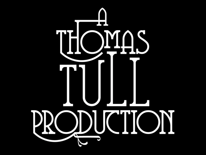
Early design for the "T.Tull Production" tag
Were you able to dictate the live action shots?
Davis and I had a conversation before he shot and he basically asked me what I would like. He had shot some things already, some nice dynamic footage and so I just asked for more of that, with a wider range of guitars, regardless if it was for the main talent or production crew. I wanted a collection, and we ended up getting tons of selects, with the "lazy susan" style shots being the ones that worked best.
Each title in the 9-frame contact sheet is unique, while intercut with film footage.
Davis knew he wanted to start with Jack making the guitar -that was the first image you'd see. Whenever we show the opening sequence, I always start from the beginning to when Jack is playing [the title card]. That idea came late in the production but I asked what if we had the type on each string and worked it into his motion and then just deal with the resonance of the string to have it bring on the title. This had to stand out; the typography was hand done and the production names had their own personality so our film’s title really has to peak.
Jack White uncut film plate

Final main title
You've built to something. The movement of the strings is a different than what's come before. And with Jack playing.
There are a couple shots where he's a little more recognizable where you could see his head, but the close framing worked better. Also on those shots, with that particular guitar, there was dust on it so when he played it really kicked up and we were so overcranked that you got this beautiful motion. With regards to execution we then had to track the type into that with no camera data, so all of it was hand tracked and there was a lot of back and forth to make it work. Even though you're not seeing this naturally it had to look believable and that they're married to the right string and they're bending correctly, so it was interesting to see it come together. You were able to look at it and know it worked.

Final stacked logo
How was the working relationship with Davis and co.?
Well this was definitely a bit of a departure from the work he's done before, this was a little bit more progressive in how much the graphics would talk. I really wanted to push the titles as far as I could. One thing about the creative process on this project was that even the concepts that I pitched for the body of the film that weren’t used -the more involved chapter heads and pieces like that- they were always really well received, we connected really quickly. I try to put a lot in front of directors early on because it builds dialog, then you can get a sense of how far you can go, and then you can even push those ideas further because of trust. Trust needs to be there.
How big was the production team?
I was the designer and the director for the graphics, but we had maybe 3-4 people working on it at any given time, a small crew. The majority of work Click3x does is commercial and broadcast so I actually find this type of production a little easier as you usually have more time conceptualize and execute…they are not as hectic, especially for a documentary. You can really hand craft design and have a healthy back and forth with the director.
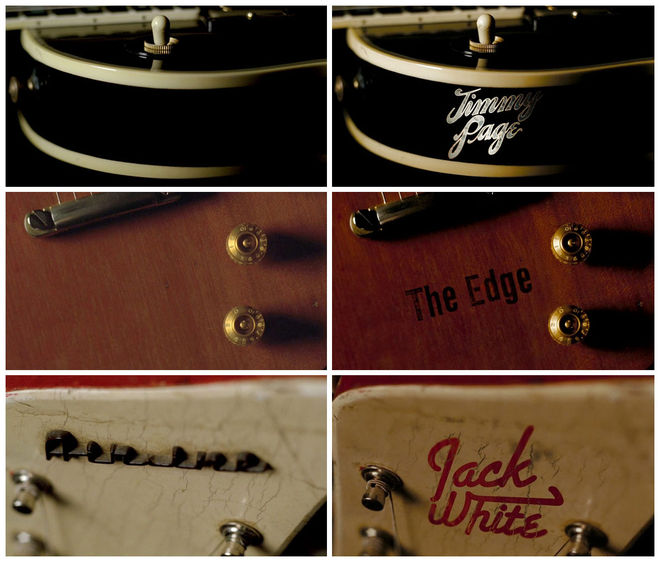
Clean vs Final plates comparison
In terms of technology, what are the applications you are using to put this together?
All the design was done in Illustrator and Photoshop for presentation, comps and final elements. All of the effect work -basically applying it to the film plates we got from Davis - we worked in Autodesk's Flame and Smoke.

