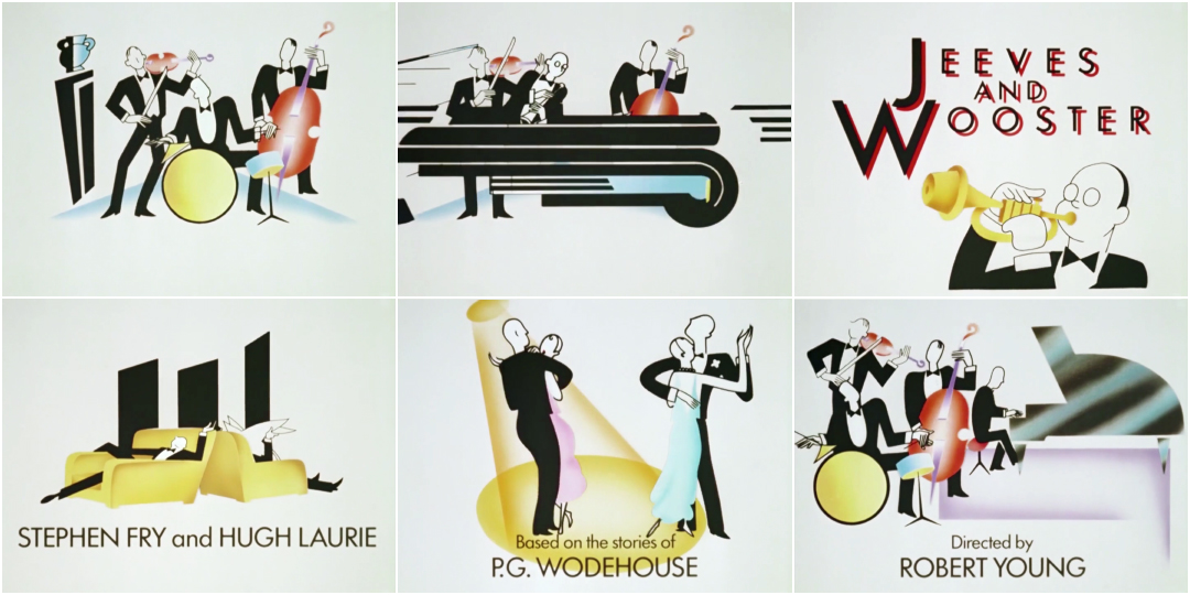
The animated title sequence to Jeeves and Wooster, the British dramedy that aired on ITV between 1990 and 1993, is all style and swing. Propelled by composer Anne Dudley's sophisticated jazz theme, it introduces audiences to the delightful buffoonery of witless millionaire Bertie Wooster (Hugh Laurie) and his stoic valet Reginald Jeeves (Stephen Fry). Based on P.G. Wodehouse’s clever “Jeeves” stories, the show was a much beloved and lauded period piece lampooning the English elite of the 1920s and 1930s.
Its Art Deco opening, created by animation director Derek W. Hayes and studio Animation City, provided a modern and elegant cornerstone, easing audiences into the rhythm and tone of the show. In the first frame, snaps of colour elongate and divide, forming a genteel group of musicians playing in whirligig motion, strumming and beating and breathing into their instruments with jolly vigour.
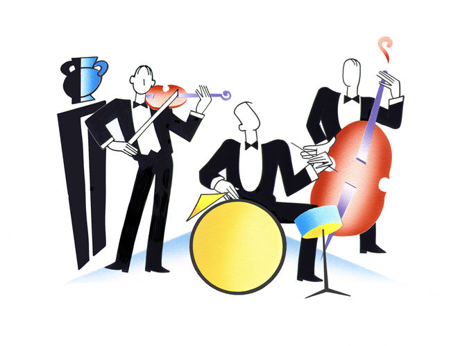
Original animation cel from the opening of Jeeves and Wooster (1990)
Their shapes transpose, spinning in place like great mechanical wheels, into a car, a wine glass, a cocktail shaker. The music is charming and light, exuding luxury as two besuited men laze in large easy chairs. In two shakes they’re replaced by three saxophonists, swaying in time and blowing on sunset-gold horns. Soon, couples are dancing over the credit for P.G. Wodehouse, followed by Clive Exton’s name and a lone piano player. The musicians return to round off the sequence, regrouped and bouncing, nodding to the beat of the airy theme. In 1993, Dudley was nominated for a BAFTA for her original theme music and Hayes won the BAFTA for graphics.
A discussion with Jeeves and Wooster titles animation director DEREK W. HAYES, of Animation City.
Give us a little background on yourself. How did you get into animation, and how did you come to form the studio Animation City?
Derek: I come from a working-class family in the north of England and found early on that I wasn’t much good at anything other than art. Luckily I had supportive parents who were happy to see me go to art school.
We disappeared into the Film Department and refused to come out. No one knew anything about animation and we had to teach ourselves.
While studying sculpture in Sheffield I had a chance meeting with another student, Phil Austin, who turned out to be making an animated film in a little room he’d commandeered. Film was not on the curriculum, but we disappeared into the Film Department and refused to come out. No one knew anything about animation and we had to teach ourselves. This led to a 20-minute film called Custard. We were offered places as the first animation students at the National Film School – National Film and Television School, as it is now – where there were still no animation lecturers and so we made another 20-minute film, Max Beeza and the City in the Sky.
On leaving the NFS, I made a short film for the BBC, Albion, then moved back to London where Phil and I formed Animation City, in order to do cartoon inserts, graphics, titles, and the poster for the Sex Pistols feature film, The Great Rock ‘n’ Roll Swindle.
End title sequence of The Great Rock 'n' Roll Swindle (1980), with animation supervised by Animation City
Animation City worked in many different areas of animation and live-action production including ads for agencies in the UK as well as the USA and the rest of Europe, TV graphics and pop videos for people like Elton John, Madonna, Rod Stewart, and Tom Jones. Phil died in 1990 and I carried on for a few years before going freelance and into feature film projects.
You won the BAFTA in graphics for your Jeeves and Wooster titles in 1993. What was that like?
Derek: Naturally, it was great, especially as we had just missed out on winning a few years previously for the title sequence for Porterhouse Blue.
So how did this project come to you, and what sort of direction did you get from the producers?
Derek: The very wonderful Brian Eastman was the producer at Carnival and we did a number of title sequences for him. He always trusted us to come up with something interesting. He was a great producer, in that he would give you good direction while letting you push things and come up with something different.
In this case he brought along a copy of an illustration by Ernst Dryden, who was a very well-known illustrator of the 1930s, doing covers for magazines and ads in Germany and later ending up as a costume designer in Hollywood. Brian felt it encapsulated the idea of the Drones Club where Bertie Wooster hangs out with his pals, and so I researched Dryden and other illustrators of the period.
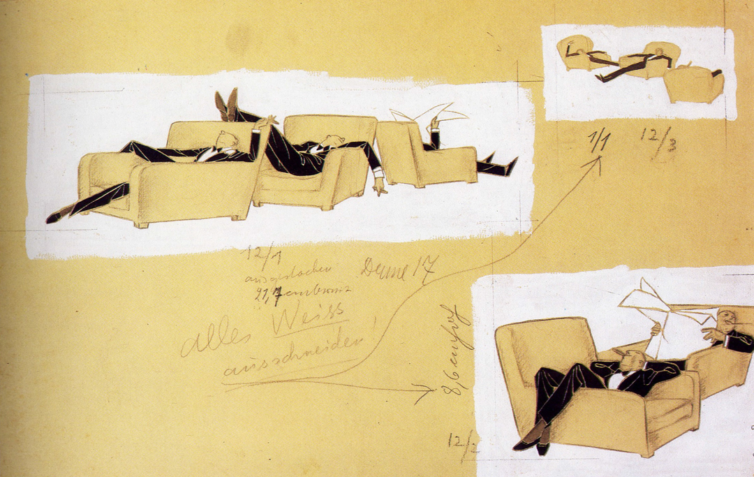
Illustration by Ernst Dryden (AKA Ernst Deutsch-Dryden) created for an article in Die Dame in gouache, ink and pencil on paper, showing istructions to the printer, circa 1928.
Derek: I looked for as much of his work as I could find. I also came across another illustrator called R. Blank, who I’d never heard of and seems to be very hard to track down, even in this Internet age where we expect to find everything online. He had done advertising work with very stylised figures in evening wear that seemed to fit very well with the lounging young men of Dryden’s work.
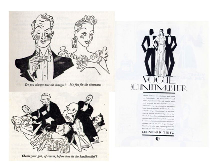
Reference imagery including designs by illustrator R. Blank (right)
Derek: That original [Dryden] image was used pretty straight in the final sequence, though I reduced the chairs from three to two, and I took a cue from it in creating the figures in straight black and white while adding notes of colour in things like the chairs, musical instruments and the ladies’ dresses.
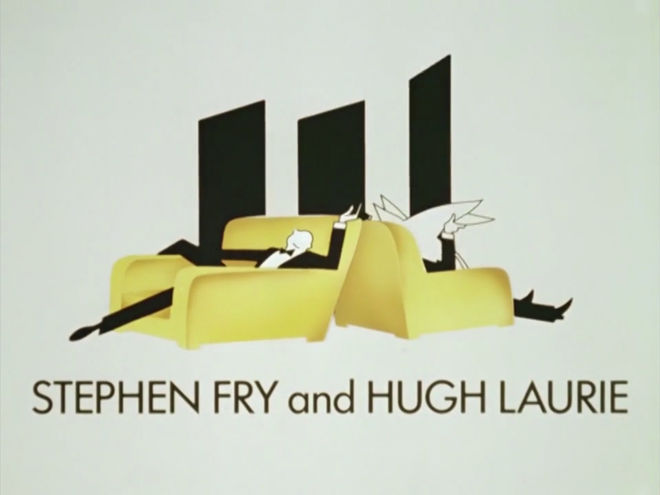
Still from the Jeeves and Wooster title sequence featuring the credit for Stephen Fry and Hugh Laurie and the illustration inspired by Ernst Dryden
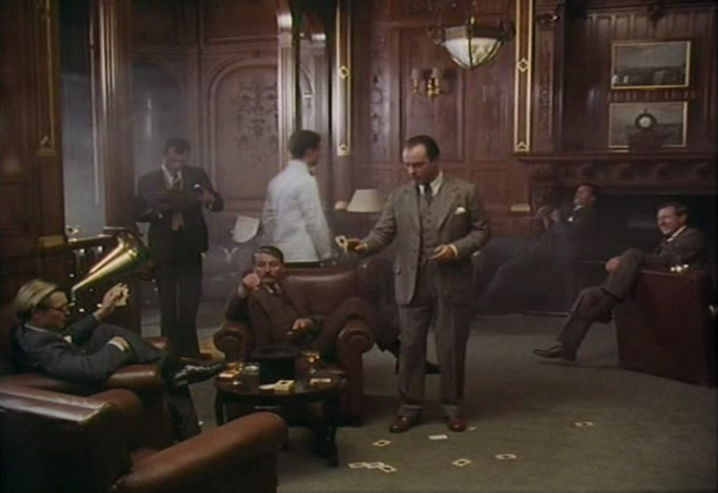
Still from Jeeves and Wooster series 1, episode 1, featuring the Drones Club
Derek: The strength of line and colour just seemed to fit perfectly with the music and the type of show, referencing the strength of Jeeves’ black-and-white formal butler’s attire and the more colourful – and often eccentric – clothing choices of Bertie Wooster.
Did you have Anne Dudley’s theme to start off with?
Derek: Anne was already on board, writing the music for the shows, and she did some fantastic variations on the theme for different situations and setting, so the title music was already there when Brian came along with the picture.
The jazzy, vaudeville feel immediately made me think of the films of the period, the glamorous life permanently lived in top hat and tails. It just cried out for a set of musicians to play it on-screen.
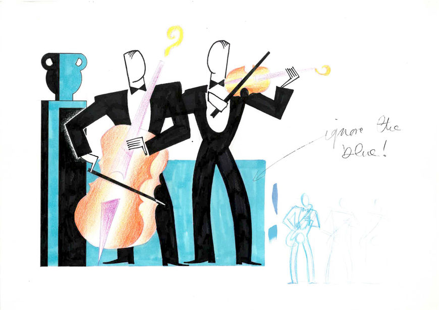
Early sketch by Derek W. Hayes for the titles of Jeeves and Wooster
How did you create all those smooth animations, transforming the figures and instruments?
Derek: Once I’d done the design and storyboarding the next job was to pull in one of my favourite animators, a Canadian guy who I worked with a lot in London, Rick Villeneuve. He did most of the character work and I did the transitions from figures to cars, or chairs to saxophones, etc. These just needed to change in a completely abstract way so were impossible to storyboard and give to anyone else, as storyboarding them would have essentially been doing the thing itself. As long as I knew where I was coming from and going to, it was just something I could get into and enjoy animating. The idea behind them was also to reference the abstract art of the period, the work of the Bauhaus and the Russian Constructivists.
The animation was then given to the trace and paint team, as in the classic Hollywood cartoons, and traced onto separate animation cels before being painted on the reverse side.
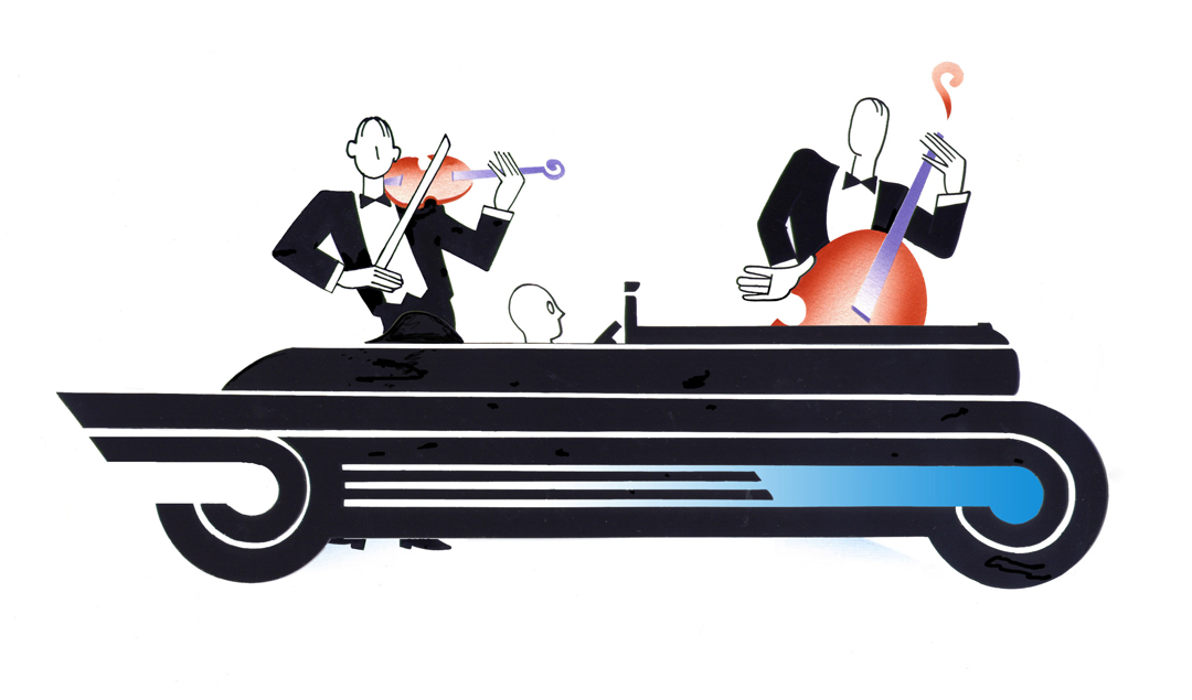
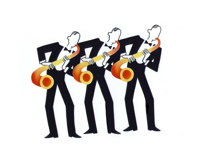
Original animation cels from the opening of Jeeves and Wooster (1990)
The colour looks so soft and diffuse. How did you create that look?
Derek: The colour was done in much the same way that it would have been done for some of the original illustrations, with an airbrush. What we did have however was a colour photocopier so that, having made a set of airbrush illustrations of a trumpet, for example, we could reproduce them and stick them to the cels as the instrument moved.
What were some of your inspirations or reference points?
Derek: The experimental films of people like Len Lye were certainly a big influence.
Art Deco-style ad for Halls Mentholyptus throat sweets by Animation City and Bill Mather, 1980s
We had also done a commercial for Halls Mentholyptus throat sweets with director Bill Mather a couple of years previously where we had drawn on all the Art Deco stylings to depict a sore throat as a kind of steam train journey out of a dark tunnel. That was where we had perfected a lot of the airbrush work that later came along in the Jeeves and Wooster titles.
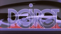
How much of an influence did Poirot have? Those titles also feature an Art Deco look and it had just come out the year prior.
Derek: The intent was to try to do something different to the Poirot titles, so it was rather a counter-influence. We didn’t want to appear to be repeating or copying something. We also found it quite funny that both the Poirot titles and our Halls commercial had "borrowed" A.M. Cassandre’s railway posters for our train wheels. Great minds think alike, no doubt…
Main title sequence for Agatha Christie's Poirot (1989), designed by Pat Gavin
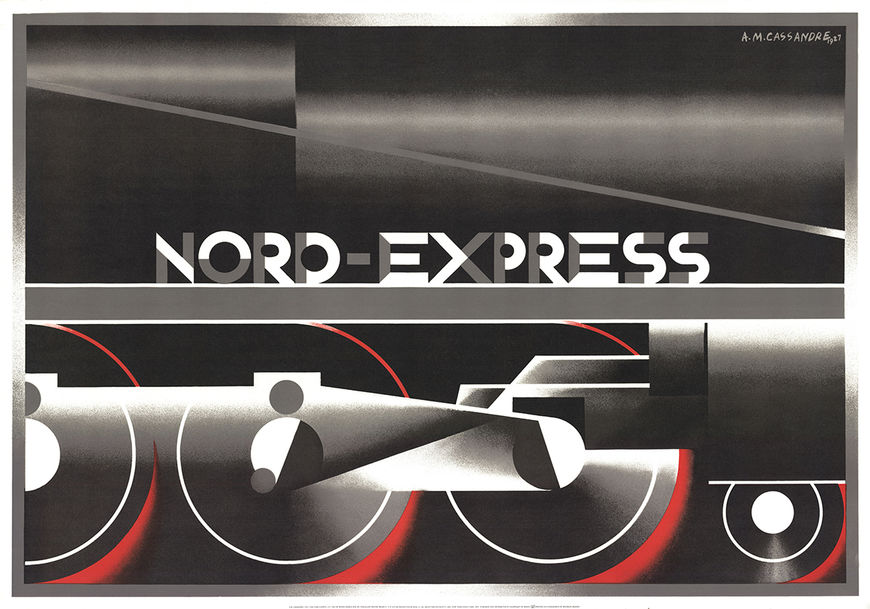
Poster created by A.M. Cassandre for Nord Express, 1927
Did you have assistants working with you as well? How big was the team?
Derek: At the time the studio was very busy with J & W, a TV graphic sequence for Channel 4, a Madonna video and a couple of other projects. So we had a very busy team working away and moving from production to production, as required, with Rick and my producer, Ammie Purcell, and another director, Andy Goff, working away to keep everything going.
When you look back on this sequence now, how do you feel about it?
Derek: I suspect that I’m like most artists or creative people who find they can’t stand their own work until they have put a fair bit of distance between them and its creation, so it should be OK to look back now and say that I like the way it flows and the simplicity of its style. If I had to do it again, I’d improve some of the animation – mainly mine – but despite all the new tools I’d have at my disposal, I’d try to maintain that simplicity.
I’m happy so many people remember it and link it with the program. I’m happy to think that it does what a title sequence should do and makes a proper introduction to the show.

