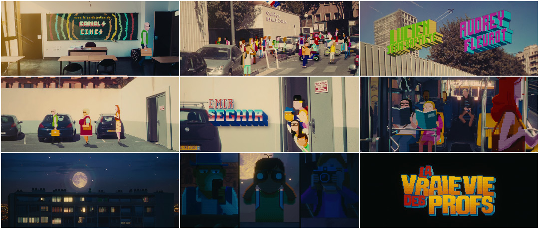
La vraie vie des profs is a French comedy about a band of voyeuristic students who take their jobs at the school paper to extremes, deciding to uncover the real lives of their teachers. While the film itself is live action, its title sequence takes things to a whole other level. As pixel kids sneak about, surreptitiously following their pixel teachers all over town, the line between the two- and three-dimensional is wonderfully blurred. A bouncy electropop tune and an air of playful disobedience flow throughout as the children dig into their teachers’ extracurriculars. In combining pixel art, real-world photography, and a crafty sense of adventure, Alexis Beaumont and Michel “Mitch” Pecqueur hit an altogether delightful note.
A discussion with Title Designers ALEXIS BEAUMONT and MICHEL 'MITCH' PECQUEUR.
How did you both become involved with the film?
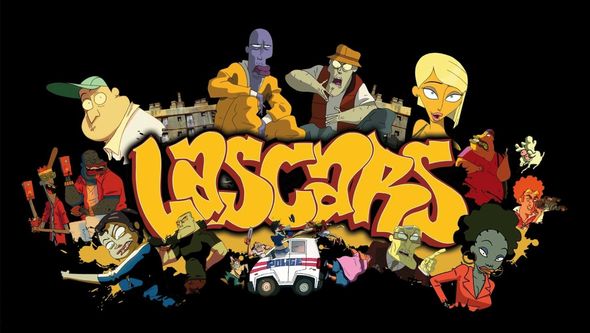
AB: We met the directors, Albert P. Lazaro and Manu Klotz, when we were working on Lascars, which is a French animated comedy from 2009. La vraie vie des profs was their first live-action feature. I guess they were a little anxious about shooting, so they made a rough storyboard of the movie and called me. During the two months of pre-production, they also decided to make an animated sequence for the opening. I was already around, so they asked me to do it.
MP: I was contacted by Albert, whom we both knew from Lascars. I was in charge of CG animation and digital compositing. Before Lascars, I also worked with Albert on an animated short. Alexis and I met on the production of Lascars – we drank a lot, I had the worst hangover ever, and that's how we got to know each other. So, the team re-assembled.
What was the first meeting for La vraie vie like?
MP: I met with Albert and Alexis in the studio where editing of the movie was in progress. Alexis had worked on a storyboard, animatic, and some still concepts but they had yet to shoot some scenes. We mostly spoke about things we liked and discussed the mindset for the sequence.
So, what were some of your initial concepts?
AB: Manu told me he wanted something like the opening of the TV show Misfits, but I didn’t have any precise instructions. They were open, so I proposed different stuff and, one thing leading to another, we went with something very different!
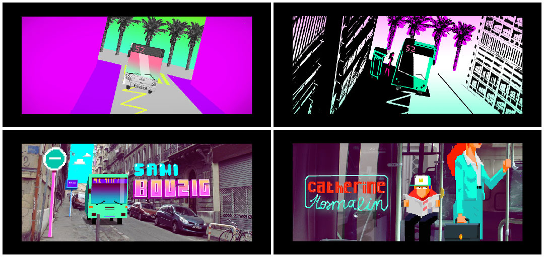
Initial concepts
Lomography is an analog camera movement and community that emerged after a group of Viennese students discovered the Lomo LC-A camera by LOMO of Saint Petersburg, Russia. Typical Lomography cameras are deliberately lo-fi and constructed to be technically simple. Some cameras have multiple lenses and rainbow-colored flashes, or extreme optical distortions and even light leaks.
For more information, visit the Lomography website.
MP: Basically, pixel characters and props "living" within photographed backgrounds, with some sort of Lomography effect on the background. We later improved on this because Albert wanted something more elaborate and artistically controlled for the background colours instead of a straight photograph but the idea was already there. The goal was to to do something playful and nostalgic.
Did you develop the story in the sequence, too?
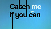
AB: It was the director's wish to show the concept of the film in the opening sequence, which was schoolboys who spy on their teachers' private lives. The title sequence story is like a condensed version of the movie, Catch Me If You Can-style.
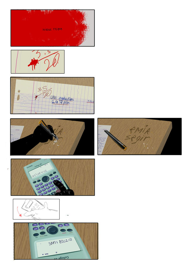
Storyboard ideas
Did you consider other ideas as well?
AB: Not so much! We had to decide quickly. They were starting to shoot so they didn’t have much time to deal with the opening sequence. I remember I proposed something based around the credits, without any characters, where the typography was inlaid in the universe – names engraved on school desks, on a chalkboard, graffiti in school restrooms – but it was not very original. I used that as a base to work on something more narrative.
MP: We discussed incorporating the school newspaper from the movie in the titles but it was already too late; it would have required heavily reworking the storyboards. I also talked about using live footage but Albert was scared of going over budget considering the tight deadline.
AB: He liked the video game aesthetic – it matched the feeling of adolescence and adventure in the movie. The link may not be obvious but we think it brings something to the movie.
MP: I think he trusted us, knowing we’d push as far as we could within the limitations.
So how much creative input did you have?
MP: Albert gave us a lot of freedom. We were able to do a lot of things we liked. I had a lot of fun experimenting. The only thing we really had to be very careful with was the credits' screen time, relative size, and readability. We had a credit list to follow closely but that was pretty much it. It was a very refreshing change compared to what I usually do. I am thankful for the trust he gave us. I really wish every project was so easy and satisfying.
How did you move forward with the video game aesthetic, the pixel characters idea?
AB: I first did an animatic. I was working on it in parallel with the movie storyboard. Then I did some visual research and we chose the idea of a pixel-meets-photo aesthetic. After creating the animatic, I knew what the project needed technically, and I knew that I wasn’t able to do it alone. When Albert told me that Mitch would direct the sequence with me it was a big relief because I knew what he was capable of!
Rough animatic
MP: We chose to develop a specific shot within the sequence as a proof of concept. This is the sunset shot with the boat and the kids riding bikes next to it. This shot contained almost everything we needed and it didn't need any photos shot on location. Alexis was going to shoot all that later, so I could just pick stuff on Google Images and manipulate it. This is also one of the only two shots entirely composited with After Effects.
As a sidenote, the boat in this shot is the Napoléon Bonaparte of the SNCM fleet in Marseille. I chose it because it was the most beautiful ship of the lot. One or two weeks later, though, the ship was damaged while in the port which made it rock to one side and gradually sink... it’s still awaiting repairs. Later, as an Easter egg, I added pixel versions of Kate and Leo at the ship's bow to kind of acknowledge its misfortune.
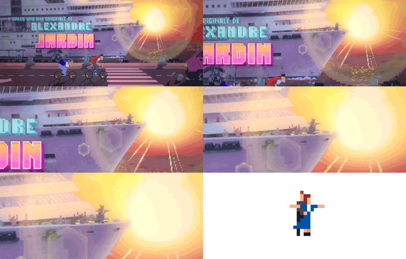
How were the photographic backgrounds captured? Was it 3D camera projection?
AB: The backgrounds are photos. After the animatic was made, I had to prepare all the shots I needed to take. The film takes place in Marseille, so the production gave me a camera and a train ticket and I had one day to shoot all the pictures I needed! I ran around every inch of the city, praying not to forget anything!

Panoramic example
MP: Yes, Alexis went on location to Marseille to shoot what we needed. Most of the pictures were shot at the highest quality possible in RAW and with decent "prosumer" gear – a Nikon D80 and Nikon D200 mostly – but nothing fancier than that. I advised him to stick closely to the storyboard for the framing and angles and only thereafter, if he felt it could help, to shoot some detail photos. This was to keep our assembly work to a minimum and to keep a consistent look. We shot additional stuff later in Paris with older and lower-end equipment, even smartphones in jpg, and I did my best later to make it not too obvious! The film title appears over my own kitchen window, actually.
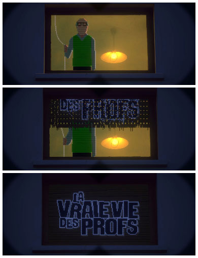
For the boring part, I assembled the pictures, separated the layers, restored the missing parts, and had to "invent" missing stuff, sometimes using CGI. Alexis helped with separating the layers at the end.
Then, I did heavy colour grading over the pictures in the way we would deal with colors on backgrounds on an animated production. Even though it was photographic material, I used a strong hue contrast and saturation like we would in an animation. We had used a similar approach with Albert and Art Director Patrice Suau on Lascars: photography but coloured like backgrounds from an animated movie.
Can you tell us how you used lighting to integrate the pixel elements into the live-action?
MP: Alexis gave me the animation with neutral lighting, but then in compositing I mercilessly adjusted the colors to match the mood of the scene! I added some fake rim lighting, shadows, stuff like that. I matched the lighting on the pixel characters to the background. At first, Alexis was against it because he aimed at a more "raw" approach.
AB: I’m more of an effects minimalist – I wanted something more crude, just solid-coloured pixels on bad quality pictures – but Mitch and Albert convinced me that it would look bad on a big screen. Mitch did an amazing job, and it really brought something to the original idea.
MP: Albert and I liked it better because we thought the coloured backgrounds would give it a more distinctive and refined look.
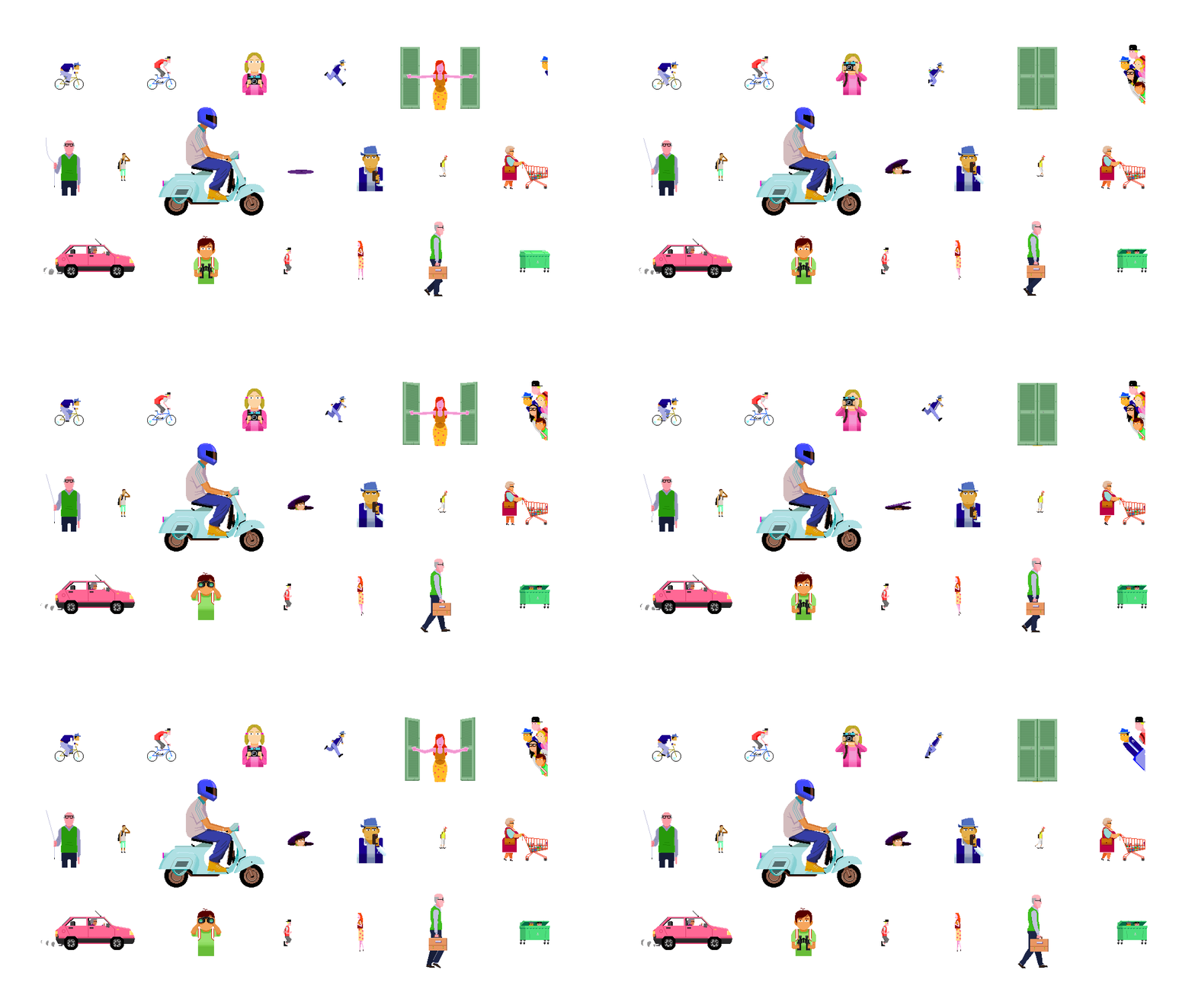
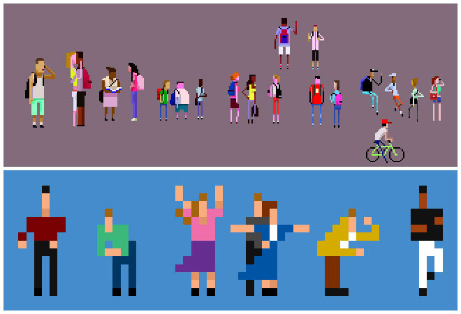
Animated sprites
I did not integrate the credits on purpose to make them pop out from the background and to differentiate them from the rest of the "sprites." Sometimes I faked shadows, reflections, or outlines to make the credits more readable or to add a sense of tri-dimensionality. I used a moderate blur and a scanline or luminophore overlay reminiscent of retro CRT TVs for the "sprite" elements only. To me, this is what "sprites" have always been made of.
A luminophore is a luminescent substance or a group of atoms in a molecule responsible for its luminescence. Examples can be seen in fluorescent lights, television screens, computer monitor screens, organic light-emitting diodes, or even bioluminescent organisms. Which are awesome.
Otherwise, Alexis animated the majority of the characters and designed most of the titles. I animated most of the 2D special effects and titles.
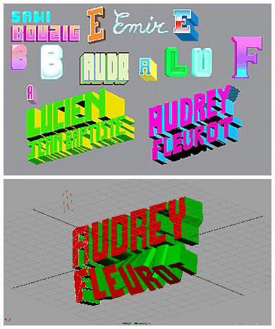
Type examples
How much research did you do before starting to animate the pixel art?
AB: A lot! We took all our old video games to find nice fonts in pixel form. Mitch brought me a lot of reference since he is a big games nerd.
MP: I'm a fan of old school Capcom video games, especially from 1994 to 1999. Particularly Street Fighter Alpha, Street Fighter 3, and Darkstalkers. I am also a fan of Metal Slug games, especially Metal Slug X, which I consider to be the culmination of the series. In the later games, they mostly reused the animations. We also liked more recent retro-inspired stuff like Paul Robertson's works, works by British collective Shynola (Junior Senior, IT Crowd), and the game Sword & Sworcery was definitely a big inspiration.
We were also really impressed by retro FOX TV designs by Punga. And the mad works of the French artist and animator Jérémie Perrin, who did stuff like Trucker's Delight, Spuf, Merci Satan... As a matter of fact, he worked in the same studio as Alexis. I did a bunch of research for the titles animation too, especially ones animated using CGI.
AB: I had never done any pixel animation before, so the hard thing was to get the right software. I called all my friends to ask their advice and everyone's answers were different. I didn’t have time to learn something new and complicated! Finally, I just used the animation tools in Photoshop. It was a bit limited, but in the sequence most of the animations are short cycles, so it was ideal.
Scripted text transition examples
MP: I also created scripts to generate 3D cubes and "vector balls" – similar to Sega’s After Burner – from pixel art and then explode them. The fun thing about pixel art is that you can go over the top with cheesy effects like big, shiny 3D letters, stylized star filters, kitschy lens flares... It's like it is OK to use all these usually outrageous and forbidden tricks! So I tried to be borderline bad taste, in search of the right amount of ugly.
So, the production team was just you two? And aside from Photoshop and cameras, was there anything else you used?
AB: Yes, the team was just the two of us! We had two months to do everything, and not enough money to hire anyone else. And yes, as far as software, I only used Photoshop to animate.
SH028 breakdown
MP: We also used Adobe Flash and After Effects to do animatics and storyboards. I used Photoshop for the matte painting work and then After Effects to create, fix, or do other edits on the pixel animations and the animated titles.
I also used Autodesk Maya to do some of the pixel animations and titles, the most complicated perspective mapping setups, and some CGI elements designed to fit with the photographed elements.
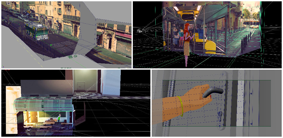
Maya and Nuke layout screenshots
Finally, I used Nuke to do the main compositing work. After completing the first two shots, I decided to switch completely to Nuke for the main compositing work since it is way more practical for perspective mapping and camera work. The native 32 bits workflow of Nuke also helps a lot in achieving good-looking glows, bokeh, and other camera effects.
I used a handful of custom Maya scripts and Nuke gizmos, some of which I made particularly for this project. Though, I kept using After Effects to generate some of the credit "sprite" animations since the timing seemed to work better. In the end, I just rendered the "sprites" with After Effects.
How did you decide on the music? At what point did that come into the production?
MP: The music featured in the alternate version below [Beat Assailant's "Rain or Shine"] is a temporary track that Alexis chose when he did the animatic. Since we like it more than the final music – typical 'temp love' – and we created all the animation with it, we kept it for ourselves as a presentation piece. The final music featured in the actual movie was composed later with slightly different editing and somewhat debatable color grading.
La vraie vie des profs designers' cut title sequence featuring Beat Assailant's "Rain or Shine"
What are some of your personal favorite title sequences, whether classic or contemporary?
AB: The first thing that comes to mind is the opening of the TV show Game of Thrones, not just for its visuals, but also for the concept. It’s the only show opening I still watch after three seasons! I was also really impressed by the opening of Enter the Void. I didn’t think an opening could be that hypnotic. I’m also a big fan of Jared Hess movies [Napoleon Dynamite, Gentleman Broncos]; their openings are always beautiful and intelligent.
I don’t know if you have already seen it but I also enjoy the opening of Lascars.
MP: I must admit I am not a title sequence "connoisseur" even if I do appreciate Saul Bass works, but who doesn't? In about the same vein, I like the work of French compatriots Kuntzel + Deygas for Catch Me If You Can. I also liked titles from Kiss Kiss Bang Bang by Danny Yount. I loved his end titles for the first Iron Man. I guess I like a lot of things this guy made! I liked the end titles of Captain America, it surprised me in a good way, I think it was a really brilliant idea to hijack World War II propaganda illustrations. For a classic title sequence with a terrific score I'd say Richard Donner's Superman – it made quite an impression on me as a kid. I still think it's quite badass today, vintage or not. The director's credit at the end of our sequence is a rather obvious reference to Superman – just with bigger pixels and more rainbows!

