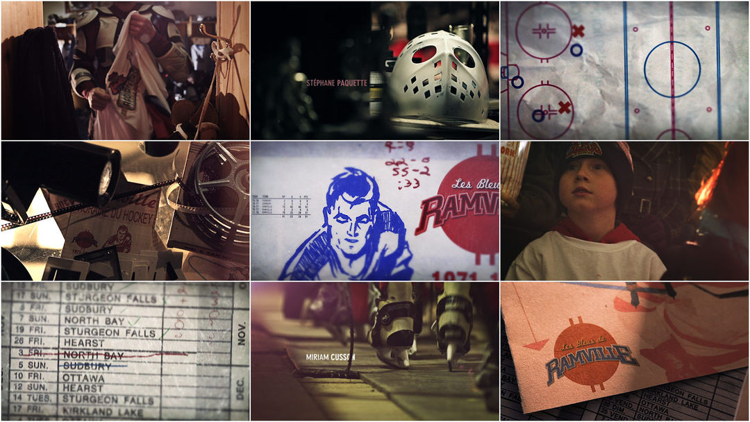
In small towns like Ramville, Ontario, hockey is more than just a sport – it’s a way of life. This tiny hamlet is defined by the fortunes of the local semi-pro club, its collective spirits rising and falling with each triumph and defeat of the team. What is Ramville all about? The sights and sounds and smells of the arena really say it all. It’s about simple things like spilled beer and crisp rink air; the sweet clack of stick on puck; the roar of the crowd and the crash of bodies into boards.
Oily Film Company’s nostalgic title sequence for Télé-Française d'Ontario’s Les Bleus de Ramville perfectly captures the essence of Canada’s national pastime. From the team’s pre-game ritual and the hard numbers of the coaching staff to the basement passions of devoted fans. It’s the good old hockey game.
A discussion with Creative Director JAY BOND at Oily Film Company.
Give us a little background on Oily Film Company.
JB: Oily Film Company Inc. is a duo – myself and James Ransom. While still keeping our day jobs as both an editor and a DP, we decided to pool our combined backgrounds in directing, graphics, photography, music, animation, and fine arts to form a company to do main titles and other short form motion design. Since we were already working full-time in the industry and Oily wasn’t our daily gig, we could afford to put some stipulations in place: 1. only do projects we really wanted to do, 2. make it all about the idea, the process, and the collaboration with the client, and 3. keep the piece rooted in an organic workflow such as macro photography, film, or other analog techniques to keep it interesting.
How did you become involved with the project? What was the initial brief regarding Les Bleus de Ramville?
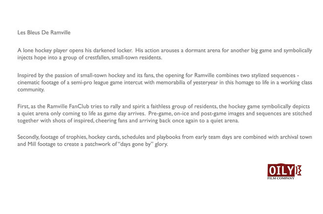
The production company for the series, Carte Blanche Films Inc., is a client we’ve previously created two title sequences for. When their newest drama series was green-lit we made some inquiries about the plot and content of the show and started roughing out concepts. Pretty quickly we had several broad ideas which we finessed down to two pitch-worthy concepts. Immediately, we initiated a meeting and presented one of the two concepts as the preferred option and the other as a backup.
Oily Film's initial pitch
There wasn’t really a brief as usual since we had an established relationship with them and we moved pretty quickly on our own. But we knew that the series was about a small Northern Ontario town with a lot of blue-collar residents and a semi-pro hockey team. Thematically it was about preservation, blue-collar work-ethic, and spirit.
We pitched our main concept to both the series producer and the director and it was very well received. We went in with a paragraph concept and a board of photographs we took at a local arena along with a few references from the web. They knew our style, so we knew we could convey our concept with some basic imagery. Plus, the content of the show didn’t require something CG-heavy.
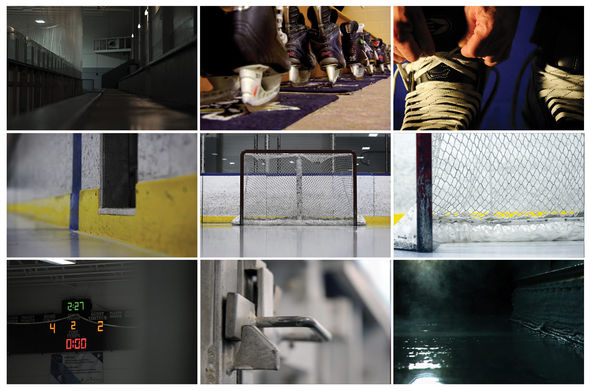
Original process board
How did the mixture of live-action arena, live-action tabletop, and motion graphics come together?
Once we had the go-ahead for the concept we went into pre-production based on the shooting schedule for the first season of the series. We scheduled it that way because we wanted to stay authentic to the show in terms of arena location and interiors. We could have shot in any arena but we wanted everything to be consistent, to have the same look and feel to it.
We broke the live-action into two shooting phases: arena elements would be shot piggy-backed on the production shoot when they were in the arena and the table-top we could start on right away in-studio.
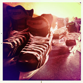
During our brainstorming we had agreed we wanted some motion graphics regardless but we didn’t completely flush out how it would happen. In pre-production, I started to think a lot about the post since I was doing the cutting as well. I knew it would be great to have some transitional material that we could use to go back and forth between the hockey / arena section of images and the table-top, archival stuff. This is where I thought the motion graphics would fit. In trying to keep it organic and not too CG-heavy, it seemed that making the graphic pieces stand-alones would be wiser than laying lots of elements on top of each other.
For the table-top stuff, James art directed and created many of the schedules and archival paper pieces we would use. We collected box-loads of old trophies, ribbons, and memorabilia, and got some of the old equipment from the series’ art department to create a kind of memorabilia room where the team and town is preserved. We shot about two days in-studio with the Canon 5DMKii.
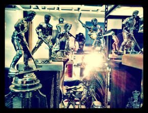
For the arena shots, we actually did two separate shoots. The shoot we had planned for spring of last year fell through because of production days needed on the ice with the actors. Then the ice was removed from the arena for the summer! So we had to pick up in the fall. But during the summer we shot the locker room elements on the RED camera. We spent two days shooting the opening POV shot from inside the “locker” along with a multitude of macro shots of hockey elements, skates walking, etc. and we got on a lift to shoot the arena scoreboard.
The fall shoot included the stuff on the ice and the crowd scenes. This was done in September of last year with great help from the Carte Blanche production team as they facilitated the crowds and the logistics of the shoot for us. We had always planned to do two sequences in ultra slow motion – either a hockey fight or a body check and then fan reaction to a goal where beer and other bits go flying in the air. We looked at using the Phantom camera but settled on the Sony Weisscam for these slo-mo sequences. We rented that for one day using lots of extras and rigging. Ultimately, we got about three shots with it because it stopped working halfway through the day! So we ended up using the RED for most of the extreme slo-mo shots. Despite that little bump, we were pretty happy with the footage we got and the way those sequences turned out.
Behind-the-scenes at the live-action shoot
By this point, the live-action visuals were pretty much wrapped, so I focused on getting the graphics built. We liked the archival elements we dug up such as the little wallet-sized team schedules and the stats sheets. With those as a design starting point, we brought in Julian van Mil who is a talented compositor and designer out of Toronto. We gave him some of those visual assets and he animated some of the existing pieces and created others from scratch. Julian also did the logo animation for us at the end of the piece. We shot the plate during the table-top shoot knowing we were going for a reveal on a piece of the archival paper. He worked with that shot and delivered a great animation.
In post, things came together pretty quickly. I cut a rough picture edit right away and then started to play with the graphic elements I got from Julian to see what worked best in each section.
Can you talk about the type and its interaction with the live-action elements? It seems like a lot of care and thought went into this part.
I struggled with this in the suite when it came time to do the typography. I’ve seen it done before – I’ve done it before as well – and I don’t want to always be doing the same thing. In this case, though, it seemed like making the type interact with the other elements would be a good idea. The way that the fans and the players’ work ethic are so much a part of the game made me think that the text should be a part of it too – it’s all connected. And once I cut the stick-taping sequence near the top it felt like a great place to experiment with the text a little. This was all done in After Effects and I used a couple of plug-ins to just slightly alter the edging of the text and make it a little less in-your-face, blending it in with the footage. It’s hard to apply that kind of thing sparingly enough to make it slick and not go over-the-top with it, but I think it worked out pretty well. It’s still subtle.
What equipment (hardware/software) did you use?
Camera-wise, we shot most of the footage on the RED. We used the Weisscam for a few slo-mo shots including the body check, and we used the Canon 5DMKii for the table-top live-action on a DSLR slider. We also used the 5D in the arena for the puck drop POV and the overhead goal shot. We did both shots remotely with an iPad and a Macbook using onOne Software’s DSLR Remote which worked quite well; however, it doesn’t provide a Bluetooth option so we needed to be tethered to the laptop with a 10ft USB cable. And for good measure there’s one GoPro shot in there too: the POV down at the puck and player approaching the net.
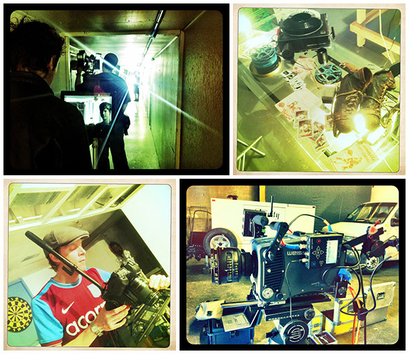
Weisscam and tabletop shooting and setup
The editing was done with Avid Media Composer and the graphics and typography were done in After Effects. For Julian’s part, he built assets with Photoshop and Illustrator and animated in After Effects. He did the end logo animation in Nuke.
How much experimentation went into the piece?
I think it’s safe to say a lot! We experimented quite a bit with blocking and shooting and in post. We strayed from the original concept a little through experimentation but we collaborated closely with the client so we could always let them know what we were doing. Because we had a pretty linear storyline, we had that to fall back on so we could try different variables and still safely stay on course. Also, we always over-shoot. After six years we’re becoming pretty efficient at getting what we need and still having time to experiment. And James comes up with a lot of good camera possibilities on-the-day so we acquire a lot of stuff to play with in post.
When did Serge Côté's music come into play?
It was a little different this time than the last titles we made with Serge. Since we had to move one of the shoots to the fall and I was also cutting the series, it became intensely busy at that point. The broadcaster was eager to use footage for a promo before I had finished building the opening, so they asked for a promo piece of music to use with some footage of the show. Serge and I sat down and I showed him some of the footage and went over our concept in detail and I gave him some ideas to work with. I’d also cut a short promo for a press conference and used a dramatic scratch track, which also set the emotional tone. What Serge came back with for the broadcaster promo ended up being perfect and is basically the final track. There was some additional enhancing applied to it, but Serge is a talented composer and he gave us something fantastic the first time around.
What were the time-frames like? How long did everything take?
As is usually the case, when you start out you think you have a whole whack of time to work with... especially since the first season hadn’t gone to camera yet when the process started. But bump a shoot or two and add the fact that I was editing the series and James is part of the camera department on the series and that makes for a sharp time crunch!
In all, I believe it was five to six days of shooting spread over about five months due to arena ice restrictions. Once all the photography was finished I turned out the final product in under two weeks including experimenting, adding graphics and typography, getting the score, and then mastering.
What elements of this sequence are you most happy with?
Many things! In no particular order, the in-camera lens flares turned out nice and gave the piece a great look. James initiated that during the first arena shoot and we went with it when the sequence felt like it could use one. The stick-taping bit and the text that goes with it is a nice sequence with the flares. During the table-top shoot we discussed creating some particle systems in post as well but chose to do them in-camera with lots of different dust particles. These turned out pretty well too and complemented the lens flares. Even in the hockey sequences, we would get the dust going and flare it out which seemed to give it that archival and small-town arena feel. And the decision to stitch the archival and hockey footage with graphics worked out well and Julian’s stuff looks great.
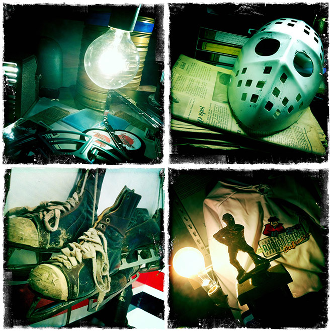
Archival elements
I have an overall satisfaction for the piece, I suppose. Even though we had issues with the Weisscam, it was the improvising and experimenting that got us some nice unplanned bits that became some of the parts people seem to like the most. And that I guess is what we’re most happy with: the fact that with each title sequence we do people seem to be taking notice and we’re getting some nice feedback. And this one so far has been very well received.
What's on the horizon for Oily Film?
We’re in pre-production on an experimental piece at the moment and both still working full-time as an editor and DP but as far as titles go we’re looking for our next project and looking to collaborate!

