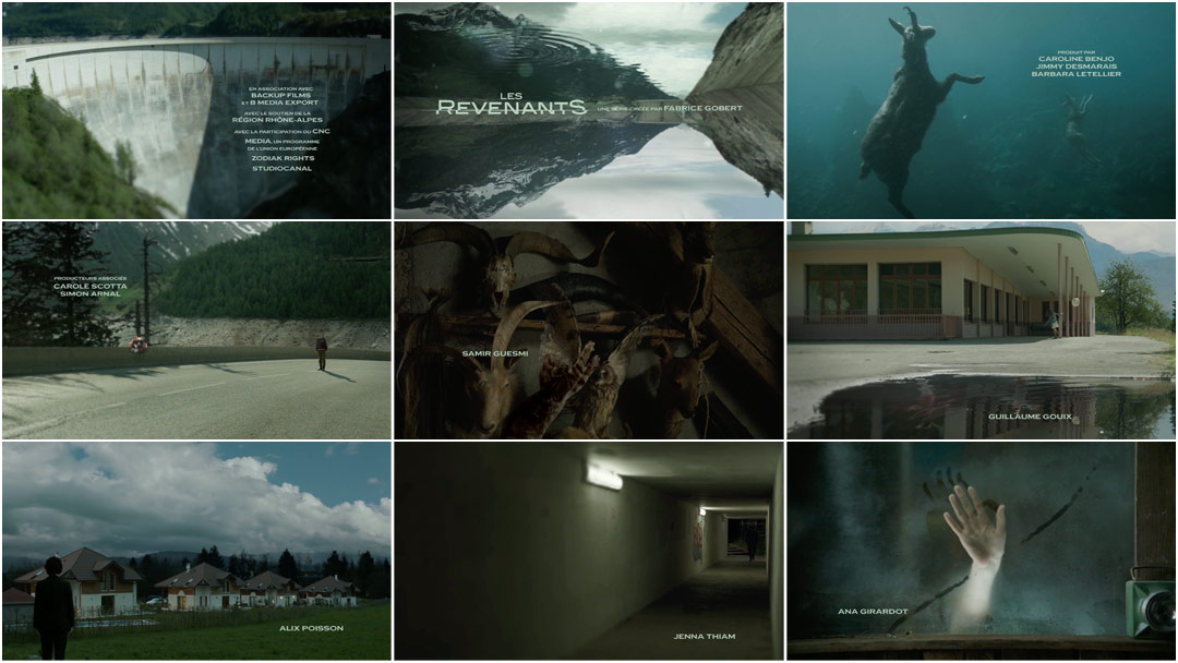
The first thing that captures your attention in the titles for Fabrice Gobert's 2012 television series Les Revenants (The Returned) isn’t the striking mountain setting or the air of melancholy that seems to cling to the valley walls like a fog, it’s Mogwai’s hauntingly delicate theme that draws you in, impelling you to discover the secrets that lie beneath those mountains peaks, in the village below the dam.
Les Revenants’ captivating premise – long-dead inhabitants of a small French town begin to reappear and live their lives as normal – is imaginatively explored in the titles as a contrast between life and death. The title sequence, by French designer Batmanu (also known as Emmanuel Ducruet), is a series of carefully constructed vignettes, planting the newly arisen in locations and situations that connect with their past lives and former selves. Each character is distilled to a moment, with subtle camera, editing and visual effects sleight of hand carefully laying clues throughout for the keen observer to decrypt.
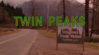
The series is reminiscent of Lynch's Twin Peaks, if it were somehow reimagined by team David Fincher and transplanted in rural France. Each of the eight episodes focuses on one of the undead, slowly revealing the impact their reappearance has on the small community and their connections with the other returned. As with all good title design, the Revenants sequence continues to enlighten and inform with subsequent viewings.
A discussion with Main Title Designer EMMANUEL DUCRUET (aka Batmanu).
Give us a little background on yourself and your design career.
Having studied applied arts and being attracted from an early age by the creative industry, I began working in a communications agency. Very quickly, I found that working on still images was interesting but frustrating. Being involved in the music scene, I met the right people and was lucky enough to be given the opportunity to do what I wanted and make music videos. After that, I began working in the field of special effects, matte painting and title sequences. Building on this experience, I have now created over 40 title sequences for feature length movies.
What was the first meeting about this sequence like?
The series post-production managers got in touch with me on behalf of the Haut et Court production company. As soon as this project was outlined, I felt very excited and started to work immediately on creative routes.
How much of the series did you watch before developing your initial ideas?
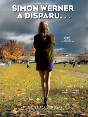
Poster for Fabrice Gobert's debut film Simon Werner a disparu (Lights Out)
The project was already in progress when they got in touch with me and right from the beginning I had access to the synopsis of the first two episodes as well as a few shots since the series was being filmed.
The episodes that followed were only written and were to be shot later on. I based my research on Simon Werner a disparu (Lights Out), the first feature length movie by Fabrice Gobert (the series’ writer and director). I found that this was the best way to explore and experience firsthand the colors and the atmosphere of Fabrice's world. Shortly after, I had access to the various shots filmed for the series.
What were the original concepts for the title sequence? How was it developed?
Right from the initial discussions, the contrast between life and death appeared to me as the principal element and concept that I should develop. I immediately focused all my energy on it and also took inspiration from other words like "bizarre," "surprising" and "atmosphere".
After my first meeting with the post-production team, I created an initial storyboard outlining the atmosphere and the direction I wanted to follow. After several meetings and looking at the rushes to select the shots that could be used for the sequence, a second draft was created followed by a few amendments during the production.
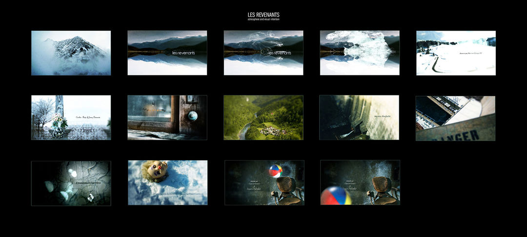
Initial storyboard, development evolution, and final board
I first wrote a few scenes for which I also created some imagery. These can be seen in the sequence, like the image of the “extended hand” (a school) where the little girl moves casually between the columns of the building while a ball is coming towards her, making her look like she is interacting with some people off-screen.
The final editing of the series and the choice of locations (although geographically distant) combine to conjure up a confined atmosphere and the idea of a microcosm. I chose to showcase the emblematic locations of the series, whilst creating a geographic narrative.
How did you choose the hidden meanings for the characters in the sequence?
After talking with Fabrice Gobert and the production team, it was decided to shape the ghosts like characters to be showcased in the sequence. All the characters were delineated by the writing and all their appearances were dictated by each character’s history.
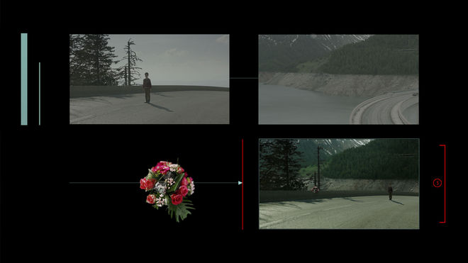
Ghost #1 VFX breakdown
- Ghost #1 (Victor): A little boy walks on the dam, alone, mute and unusual in that he stands bang in the middle of the road. This image generates a feeling of foreboding, of fear; we feel that the boy is in some danger. Here, the life/death contrast is represented by the boy and the dead flowers by the side of the road. The scene was filmed, then I cut out Victor and placed him further away so that he would appear off-center and smaller in the frame, implying more possibilities for the development of this scene. The original background was a blue sky and I had to create the mountain background to establish a more confined atmosphere.
- Ghost #2 (the little girl in the playground with the puddle): Here, the opposition is represented by the girl with no reflection and the two children who only exist through a reflection in the water. The ball links the world of the living and the world of the dead.
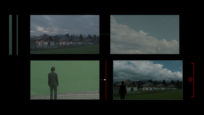
Ghost #3 VFX breakdown
- Ghost #3 (Simon): He is back in the estate where his lover lived before he died. The opposition between life and death is represented by the time lapse effect applied to the set while Simon seems frozen in time. The time lapse was applied during post production and the character was added to an existing shot.
- Ghost #4 (Tony): This character is shown in the tunnel where his psychosis will be revealed in the course of the series. He is intentionally shown as a silhouette in order to highlight how difficult it is to figure him out. There in an interaction with the lights, which go off as he walks past them. The scene ends with him appearing very briefly in the foreground like a predator. This scene is a composite of several shots that were manipulated.
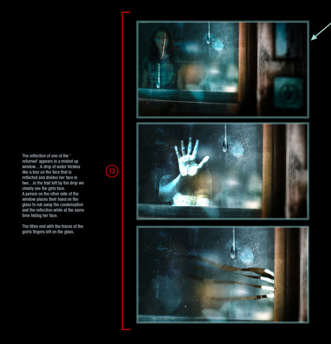
Ghost #5 storyboard example
- Ghost #5 (Camille): Here we show both the similitude and the opposition between Camille and her twin sister, through the reflection and silhouette of this character behind the window, whose hand erases a reflection that could be hers or her sister’s. This is a composite of different shots filmed specifically for this scene.
How involved were you with the filming of the live-action elements?
The shots used in the sequence came from the filming of the series, but all were at least partially manipulated. Some scenes, like "the Extended Hand" or the last one, were filmed from scratch. To that end, a second crew was put at my disposal during the filming of the episodes, and I could make use of the actors in between shots as well as the technical crews (set designers, cameramen etc.). I directed the scenes that needed to be shot on location alongside the filming of the first episodes.
When did the music come into play? How did you work with it?
From the very beginning Fabrice wanted to use Mogwai; their music was already a central part of the series. But since I didn’t have the soundtrack at the beginning, I had to call on another composer in order to develop my first drafts. It was only towards the end of production that I was given the real soundtrack and it fit perfectly with the rhythm, the editing and the atmosphere.
First 'line test' of the opening sequence
What kind of feeling did you want to give the viewer with this title sequence? What did you hope it would do?
It was important for me to convey several impressions: the duality of life and death, the geographic location, the mountains, the elements, and the places. I also wanted to convey an uneasy feeling to the viewer where the images could be interpreted in several ways, certain scenes could at first appear insignificant but later on lead the audience to question everything.
I wanted to immerse the audience in the atmosphere of the series while allowing them to think for themselves. The idea is to keep the audience entertained so that every time the titles roll they discover some small detail that suggest strangeness and tension: the crack in the dam, the cross-like shadow of the character in the otherwise empty square…
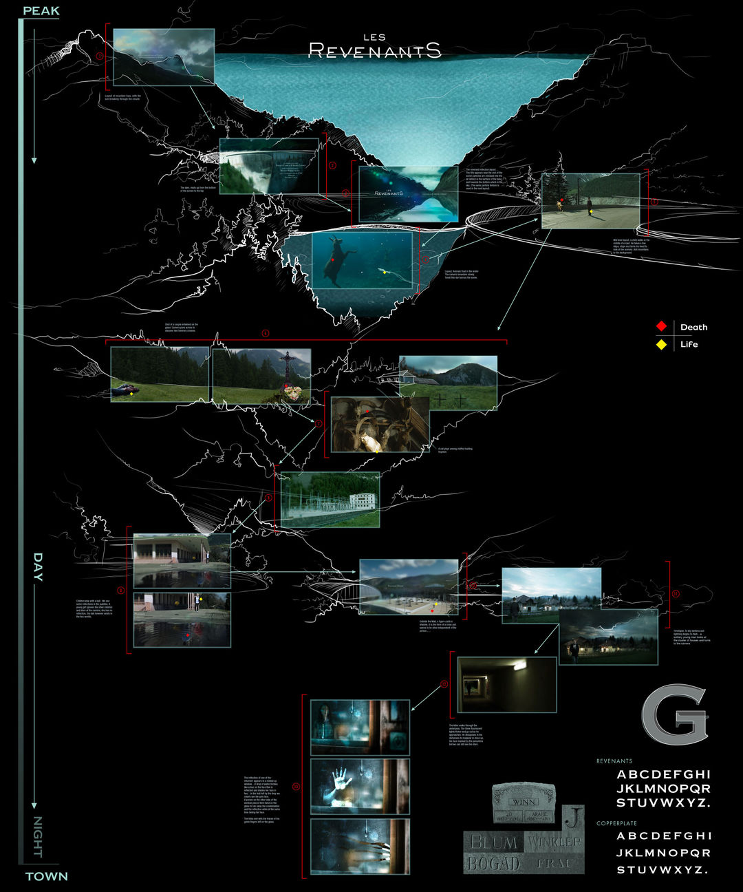
Complete visual breakdown of the sequence
Who did you work with on this title sequence and how big was the production team?
Apart from the film crews placed at my disposal, and my communications with the production team and the writer, I worked on my own.
Which tools and software did you use to put it all together?
Les Revenants Season 2 teaser
I worked mainly with After Effects and Photoshop, with a few 3D elements prepared and executed with Cinema 4D. I also used green screen backgrounds to film the actors, and various other techniques for the rendering certain effects: for example, the condensation was created with a matte spray and a steamer…
Will the titles be updated for series 2?
As is usual for a Canal+ production, the second series will open with the same title sequence.
What are some of your favorite film and television title sequences, whether classic or contemporary?
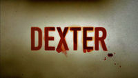
Six Feet Under, Dexter, True Detective etc. Dr Strangelove, Anatomy of a Murder, Delicatessen. Saul Bass, Pablo Ferro. Many things…
LIKE THIS ARTICLE?


