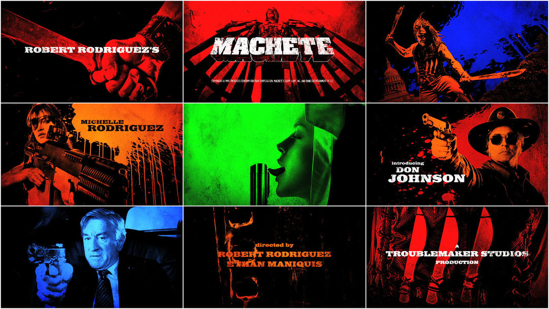
This is the last bit of dialogue before the opening titles to Robert Rodriguez’s throwback exploitation flick Machete and a fitting MO for the unconventional mavericks at Troublemaker Studios. The sequence starts with a flamethrower devouring a Mexican hideout as the roiling smoke and flame quickly degrades into gritty lobby cards corrupted by dust and scratches.
Machete’s title sequence is a colorful parade of sneering villains, vixens, and an arsenal of menacing guns and knives. While the sequence sets the stage for a gory, over-the-top revenge romp, it also succeeds in grounding the entire film in another time and place. As the grainy titles scrape along at 1½ feet per second, the audience is transported back from their reclined seats at present day cineplexes to the nostalgic era of drive-ins and drafthouses.
In this week’s feature, Kurt Volk (art director at Troublemaker Studios) talks with Art of the Title about guacamole guns, the influence of Coke commercials, and the benefits of working under the same roof as producer/director Robert Rodriguez.
A discussion with Troublemaker Studio's in-house designer KURT VOLK.
Give us a little personal backstory to set the stage.
KV: I studied both traditional animation and graphic design at the School of the Art Institute of Chicago. The animation we were doing then was all done by hand and shot on a 16mm Bolex and virtually all the design work was done with rubber cement and X-acto. This was the mid-’90s, but it might as well have been the stone age. It was insanely time-consuming, but it taught me to really think through a project before committing it to paper or celluloid.
While I was in Chicago, I became pretty involved in the indie rock scene. I played in a band and just about everyone I knew played in bands of one form or another, so I ended up doing quite a few show posters, 7" sleeves, and CD covers. Some of it was collage-style cut and paste, but most was pen and ink illustration. You'd be lucky to make $25 per job, but I was more interested in seeing my stuff plastered all over the city than making any real money at it. Working for bands was a great education for me and it really helped to round out the more traditional training I was getting from SAIC.
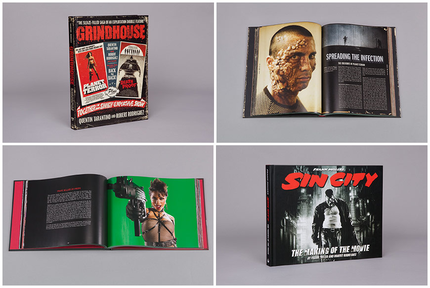
Grindhouse and Sin City tie-in books
I worked for the next couple years doing freelance design work for bands, films, and commercials and eventually landed a job at Troublemaker Studios, doing layout and design work for their visual effects department as well as their burgeoning books division, Troublemaker Publishing. From there, I eventually ended up taking on all the graphics duties of the studio – everything from logo and main title design, to creating the posters, movie tie-in books, and marketing campaigns for the films.
What were your first steps for Machete?
Before Machete was a feature, it was a fake trailer that was included in the Rodriguez/Tarantino double feature, Grindhouse. A lot of Robert's productions begin as short films, actually – a proof of concept before the formal production begins. This lets us test out new techniques and walk away with a short film to show potential actors or distributors. That’s how Sin City happened – the first few minutes with Josh Hartnett and Marley Shelton were shot this way.
Original Machete Grindhouse trailer (NSFW)
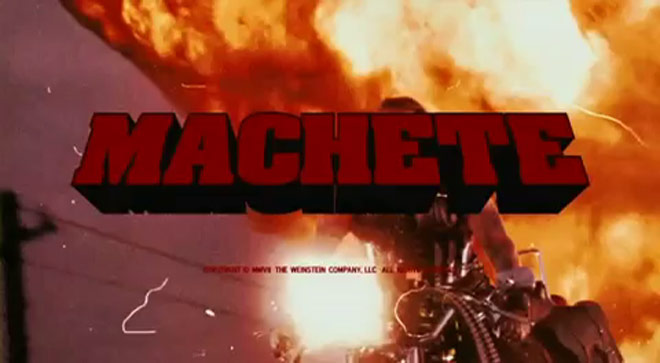
For Grindhouse, the Machete trailer was our test shoot. After the first day of production, Robert gave me some digital stills and asked that I make a set of lobby cards and work up a logo treatment. Lobby cards are basically an outdated form of movie marketing where distributors would print stills onto cardstock and display them in the lobbies of movie theaters. Lobby cards would act as a sort of printed trailer – the key images would tell you what you needed to know about the story and show you just enough sex and violence to get you into the theater. So I worked up a set of 13 lobby cards and went to work on a title treatment.
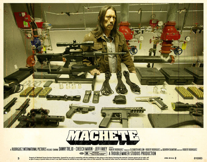
Original Machete lobby cards
For the title, we wanted to stick with pure ’70s exploitation, eventually settling on Aachen Bold – a no-nonsense slab font that looks great with a 2D extrusion applied. Robert ended up liking this treatment so much that he had me use the exact same font, color, and extrusion for Planet Terror. The two logos are absolutely identical.
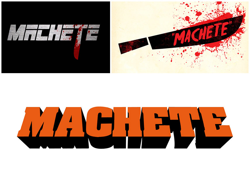
Logo variations
So how did that progress?
Flash forward five years. We were now in production on the feature version of Machete. Robert had a piece of music that he'd chosen for the title sequence, but beyond that he just asked that I make something “explosive.” By this point in production, I'd made a new set of lobby cards that incorporated unit stills from the feature as well as six character posters that used the gallery/poster stills taken by photographer Rico Torres and myself.
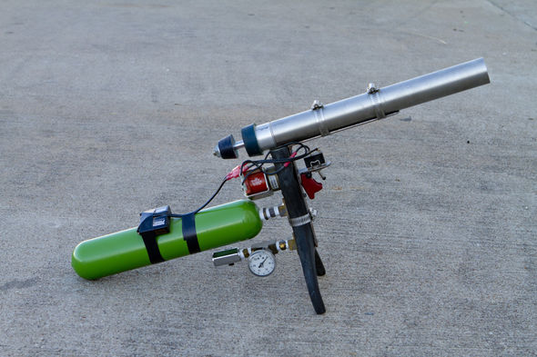
The Guac Gun™
Robert and I discussed the idea of creating "living" lobby cards from these images – stills from the film brought to life by hacking them apart, splattering them with blood and generally mutilating them one way or another.
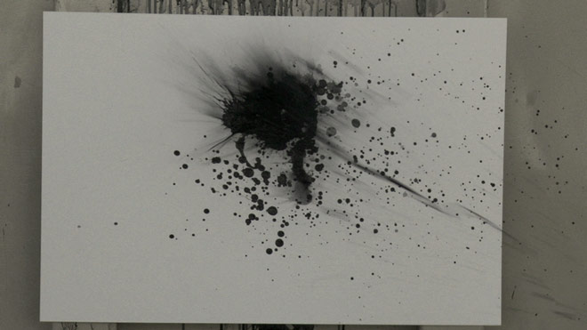
To assist in the mutilation, I called upon one of our production designers, Steve Joyner, to see if he could help me throw massive amounts of fake blood at a high velocity. He gladly sent over his "guacamole gun," a device used to create the illusion of a gunshot on an actor when a squib can't be used, like on foreheads and kneecaps.
The guac gun shoots fake blood at an actor using compressed nitrogen and creates a beautiful splat. So Steve and I grabbed our tireless VFX assistants, Chris Corona and Chris Esquivel, and we created a high-velocity bloodbath on the Troublemaker backlot. The resulting footage would be used as transitions and to add depth and texture to the sequence.
Splatter tests
Since we knew the damage pass would massively affect the overall color, I began working on the damage pass next, before we established a palette to work with. For this, I relied on the collection of damage material I'd been amassing since Grindhouse: old dust jackets, rusted metal, smeared paint, the backs of old movie posters. I worked up a damage pass for each of the images we'd selected for the sequence and sent each one over to Robert for review.
For the title sequence font, I settled on Egyptienne Bold Extended, another lovely slab font, but one that would work well within the wide orientation of the title sequence. The same font was used on the Inglourious Basterds logo. It screams “spaghetti western” and has just the right balance of curves and strength.
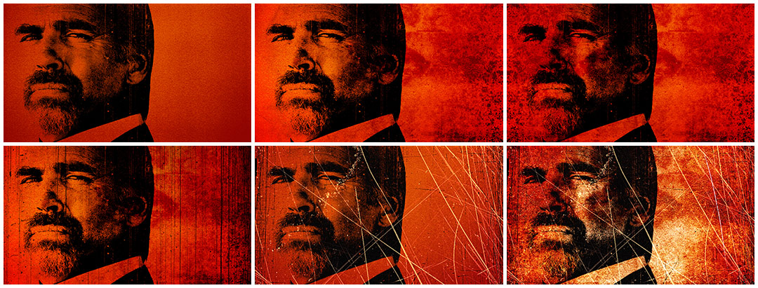
Film damage passes
And where did you pull reference materials from?
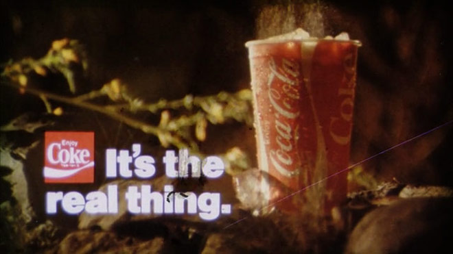
On Grindhouse, Tarantino gave us a lot of old 35mm commercials to use as reference – mostly stuff that was optically printed in the ’60s and ’70s with super-saturated greens, reds, and oranges. There was a Coke ad in particular that had a gorgeous, vignetted ’70s orange hue. I really wanted to capture that look. I'm sure it also goes without saying that Eugenio Lardani's amazing titles for The Good, the Bad and the Ugly and A Fistful of Dollars were another big part of the mix.
Reference Coca Cola commerical
We had also reached out to Tim League at the Alamo Drafthouse. The Drafthouse has a huge collection of 35mm prints and we wanted to see how different types of film stocks would erode over time. Tim graciously pulled together an amazing collection of old trailers, film leader, odds and ends. We scanned everything he gave us and quite a bit of that damage was used in the Machete title sequence. What didn't come from Tim was augmented with stock footage.
It seems like there were a lot of different assets in the sequence – guns, illustrations, film sequences, still photos. How was all of that gathered? Is there a table somewhere in Troublemaker Studios stacked to the ceiling with all of those guns?
We do have a pretty absurd arsenal of weapons at the studio! I remember a day back on Sin City when the front stairwell to my office was blocked by a giant group of cops, decked out in full riot gear – face masks, billy clubs, machine guns. Huge guys! They were waiting to shoot a scene with Mickey Rourke, so I tried the back stairwell and realized it was also blocked, this time by 20 girls dressed in lingerie and S&M gear, holding switchblades, Uzis, and samurai swords. It's a very strange place to work.
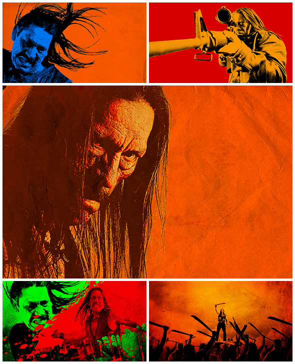
Title card works in progress
Did you have to tap into any hormonal aggression to produce an opening like that?
Haha. Well, I'm a total sissy. I rock out to books on tape in my car.
Does working under the same roof as your director make the process easier or more difficult?
Robert and I were raised on the same movies: Raiders..., Empire..., The Road Warrior, The Thing. It's really hard to talk about images, so being able to rely on a shared visual shorthand is really helpful. I also tend to do a huge number of revisions on his films. I'll send a snapshot to him at the end of every workday, even if it’s incredibly rough, just to make sure I'm headed in the right direction. I know it's a real luxury for a designer to speak directly to a film's director and producer and I don't take it for granted.
Who or what inspires you?
Well, to me, Steve Frankfurt is the gold standard for what I do – someone who was able to oversee a film's graphic identity from trailer to titles to one-sheet. I know you guys are big fans of his titles for To Kill A Mockingbird. Fifty years later and that sequence still feels fresh. His work on Alien, Rosemary's Baby, and Downhill Racer is also really without equal. The industry is so fragmented these days that you very rarely see a single vendor take on all these duties, let alone with such style and restraint.
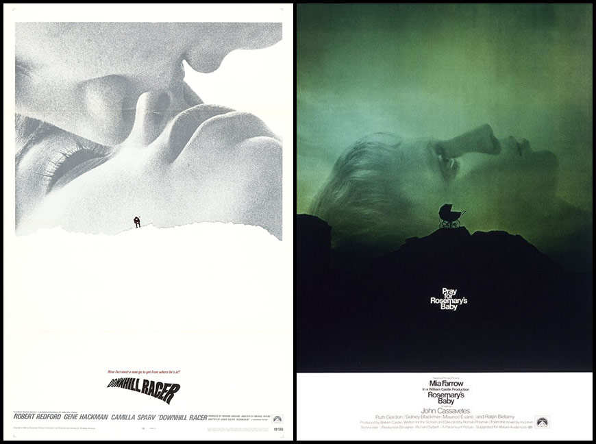
Stephen Frankfurt film poster designs
I'd also be remiss if I didn't mention the poster art of Bill Gold, the single greatest movie poster designer who ever lived. His work speaks for itself and I return to it whenever I need to recharge my batteries. And there are so many others, designers like Danny Yount and Neil Kellerhouse really make me want to pack my bags and go home. Those guys are insanely talented. You can see the care and the excitement they put into everything they do.
I also love to dig in used book stores, libraries, record stores – discovering color combinations and fonts I've never seen before.
Where do you see yourself in the next few years?
With any luck I'll be doing exactly what I'm doing now: designing titles, movie posters, books, and logos. For someone obsessed with movies and graphic design, it doesn't get much better than that.

