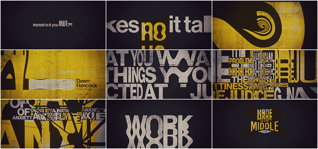
“What is it you want?" asks the voice. "Why do you work? Why do you get up in the morning?”
Strong and commanding and doling out direct questions, the voice tempts us with the strangest secret in the world. The sage advice that follows comes from Earl Nightingale, an American radio host and author of The Strangest Secret, a 1957 motivational book and audio recording. It's also the backbone of designer Ben Radatz’s purely typographic opening titles to conference Made in the Middle, a solidly engaging work that steamrolls and stretches text, moving back and forth between steady restraint and invigorating energy.
Helmed by design and branding studio The Carpenter Collective, Made in the Middle 2018 was a two-day series of events that aims to inspire, educate, and connect a wide array of creators in the American Midwest. Drawing on homegrown talent, the conference tapped Radatz, a partner at MK12, a studio with its roots in Kansas City and a portfolio of title design projects including Stranger Than Fiction (2006) and Bond film Quantum of Solace (2008).
In our conversation below, Radatz discusses building on the conference’s existing branding, his layering process in After Effects, and how and why he makes time for unpaid work.
A discussion with Title Designer BEN RADATZ of MK12.
The last time we featured your work on the site was in 2014, four years ago, with the titles to Semi-Permanent 2014. What has been going on since then?
BR: I’m still a partner at MK12 and that has been going strong. We’ve worked on some film projects, some broadcast projects. Some advertising as well but we have been trying to move out of advertising and focus on broadcast. There’s the documentary we did [titles for], Particle Fever, right around the time that we did the Semi-Permanent titles. We got a lot of good exposure from that.
Every now and then I have an itch to really explore typography and figure out how far I can take it.
Particle Fever (2013) main titles, designed by MK12
We worked on a couple of short films as well, there’s one we finished called Man of Action in 2017. That was a three-year labour of love project for us and we hoped that would be a television series. There was some interest but it didn’t go very far. It was fun to do. And then in fall of last year we decided to slim down and sell the building in Kansas City so we don’t have a physical studio anymore. We just decided to take everything online. It’s worked out pretty well. It’s still the four of us partners and we take jobs as they come in.
How did this project come to you for the conference, Made in the Middle?
BR: I had spoken there two years ago, when I was still in Kansas City, as a representative for MK12. That was their maiden conference, so they were still trying to figure out how to get things off the ground. The festival’s put on by a group called The Carpenter Collective, which is run by Tad Carpenter and his wife Jessica. They’re a graphic design outfit in Kansas City. They organize this conference on the side. Alex Anderson was the one who more or less was on top of doing the design for the conference. They’ve got a lot of people that jump in and help.
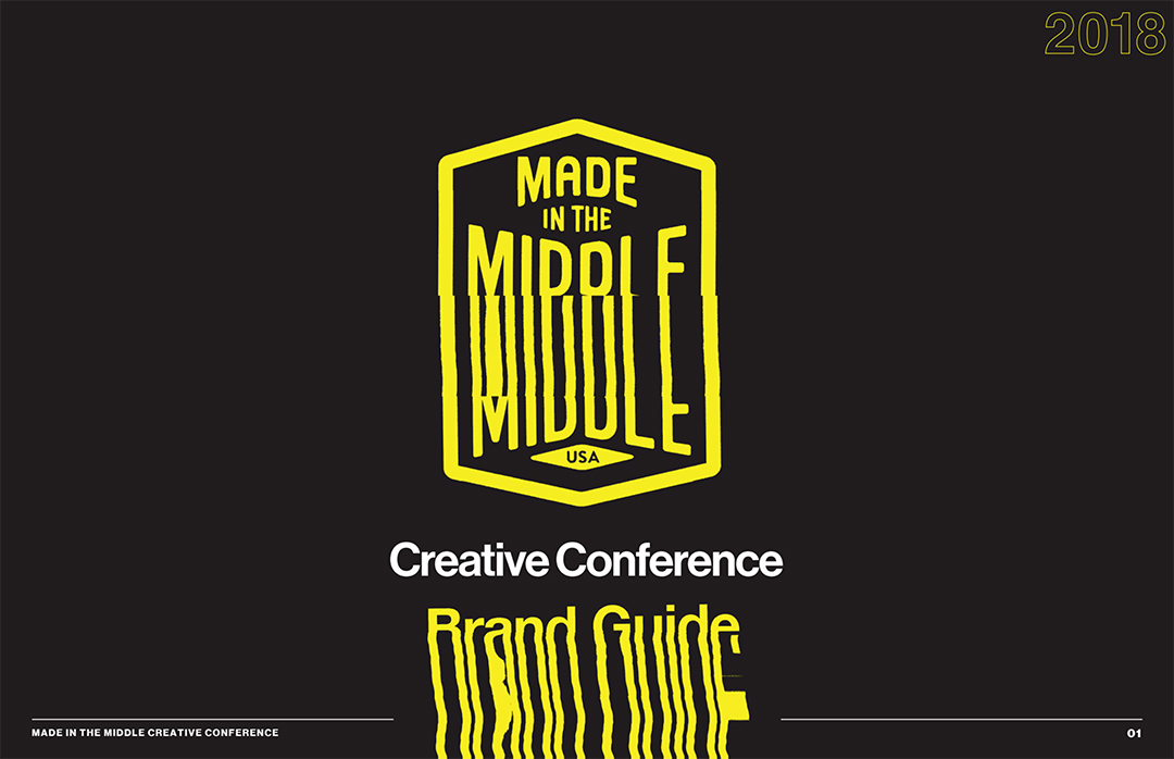
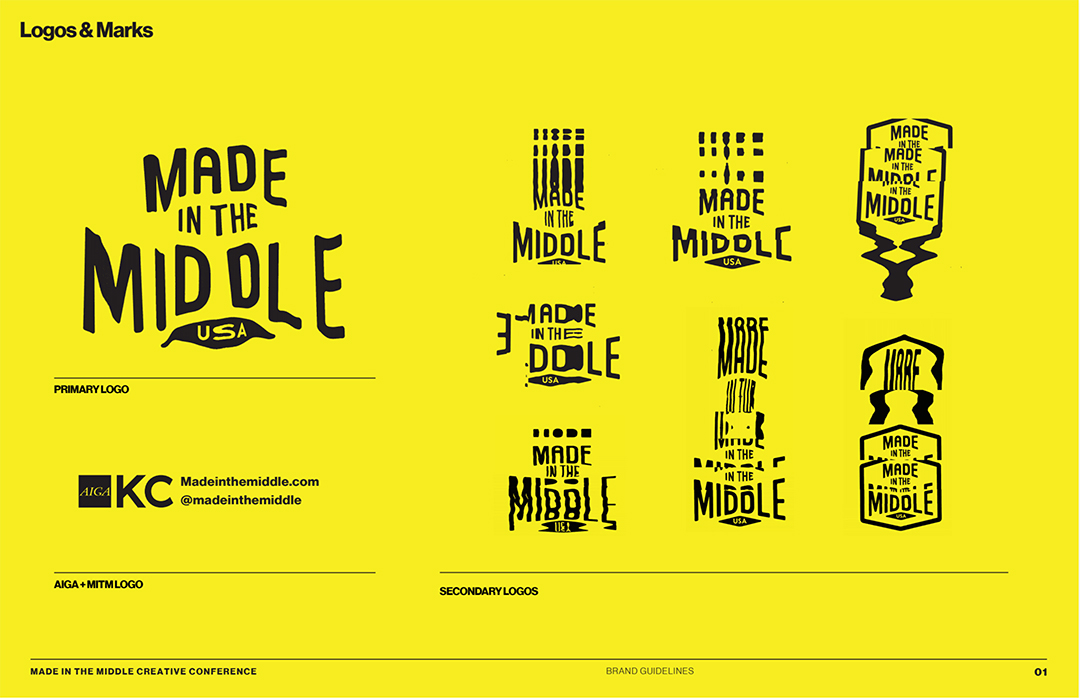
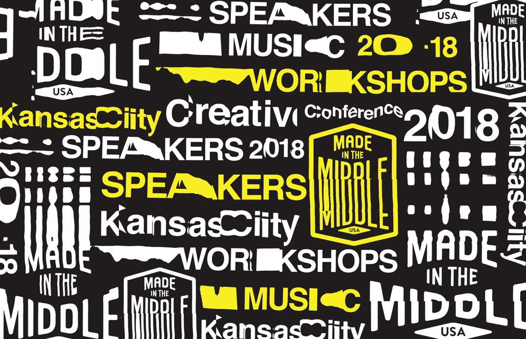
Images from the brand guidelines for Made in the Middle by Alex Anderson and The Carpenter Collective
BR: I had mentioned that if they were to continue the conference, I would love to do some work for them whether that’s branding or titling things. They took me up on the offhand promise I made two years ago! When they contacted me, they asked me about doing speaker cards. I basically co-pitched them on doing the opening title sequence as well.
How did you decide to take a purely typographic approach? Did you have other approaches you tossed around?
BR: No, I was really excited about doing a type-based piece! Every now and then I have an itch to really explore typography and figure out how far I can take it. Because of how the type is affected in their branding – it’s such a centrepiece of the conference – I wanted to take that spirit and run with it. It was an opportunity to get back to basics and do something just with type. Try to have the piece carry itself only on the merits of the typography.
You went really basic with the choice of typeface.
BR: Yeah! That’s Neue Haas Grotesk. And that’s based off of what they’d already established with the conference. You would think it’s Helvetica but it’s not.
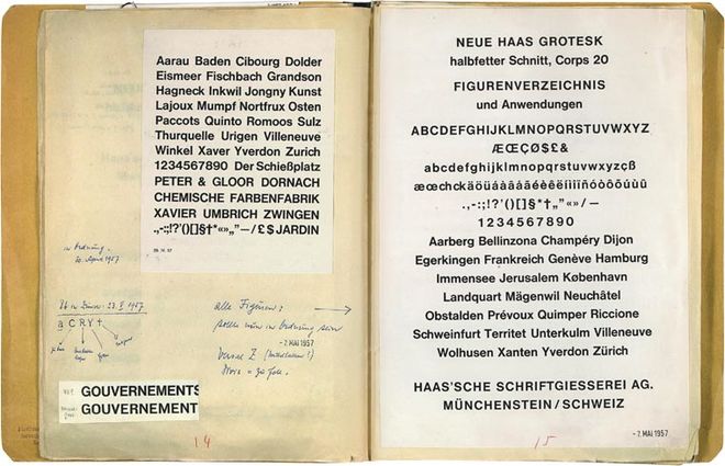
Pages from the notebook of Eduard Hoffmann, president of the Haas typefoundry in Switzerland, featuring notes on the development of Neue Haas Grotesk and Helvetica, 1957. Learn about Neue Haas Grotesk at Fontbureau.
Tell me about that music, the narration by Earl Nightingale.
BR: I’ve had that record for a while. I’d been looking for an opportunity to use it. It’s a motivational record called The Strangest Secret.
The Strangest Secret vinyl record cover, 1958
It seemed so appropriate for a conference because it’s about unlocking your potential and it’s just a fun piece about the process of creation and shifting your thinking. I didn’t do too much editing to it, just spliced a couple of things together. It was fun to use that as the foundation and let it go where it went.

Screenshot of layers in After Effects
And you created a sort of digital photocopier effect for the sequence. How did you construct that?
BR: It was all within After Effects. It’s a multi-layered effect where I take the text and I put it at the very bottom of the project and it gets run through a series of different effectors that pick up that look as it goes, so it keeps the textures and that photocopy look even after things are stretched. On top of that I built a custom particle system that simulates the grid of a photocopier so no matter how close I got to the text it would always keep that same fidelity and resolution. It was a cool process to put that together, put text at the bottom of the project and go up to the top to see the effect that it gave. It was fairly organic and wasn’t always predictable, which was fun because I had to improv, taking what it gave me. That was one layer.
I don’t adhere to the philosophy that you should work as many hours as humanly possible.
The second layer on top of that was working with displacement maps to create that stretching effect and that turned out to be the key way that everything was animated. For me that was really different just because traditional animation is setting key frames for position and rotation and that sort of thing but in this project there wasn’t any of that – or not very much – and it was all based on grayscale values. Depending on how light or dark something was would determine how the text would move across the screen or stretch.
How long did this project take you?
BR: As with all things like this, it was a labour of love. I had to fit it in between projects so it’s hard to quantify exactly how much time. It was about a month and a half, start to finish. From the brief to turning things around was six weeks or so.
How many hours did you put in?
BR: [long pause] Good question. In total . . . maybe 100 hours or so? Yeah, that sounds about right. [laughs]
In terms of conference design work people very rarely talk about the business details. Did you get paid for this work?
BR: No, this was a voluntary thing.
How do you navigate handling unpaid projects that take 100 hours or more?
BR: [laughs] Good question. It’s easier now that I work from home. I am more in control of my schedule, as opposed to working [in-house] at MK12. At night I can sneak out for a few hours after everyone’s gone to sleep or find a couple of minutes that I didn’t have before. It’s been great to have that freedom so I don’t feel quite as restricted between family time and free time. It helps to have a wife that stays incredibly busy as well.
Projects like this to me are sort of essential because there’s not a lot of creative direction and so you’re free to take it wherever you want to go. It’s about getting work out there as purely as you can without as much influence from clients and third parties.
Also, it’s a good conference and they don’t do it for profit, either. Everything that they make goes into funding the next one. It’s important to find room to work on projects like these to flex your creative muscles and learn new techniques. With this – working with displacement maps for all the animation – that was a technique I’ve never used much before, at least not to this level. Now I’ve got that in my arsenal if I need to use it for another paid client project, so it’s important R & D, I guess. If you’re not doing that with a client, it’s up to you to take that on yourself.
I want to have balance. I’m glad that I’m not playing that 12-hour-day game anymore.
I often see creatives who are also parents, especially dads, doing eight-week stints at a studio that involve 12-hour days, commuting 2 hours each way. I always want to know: how is that possible? Who is doing the work at home?
BR: Yes. It really is a young person’s game. Being out here in LA and having done a couple of freelance stints at production companies, I honestly don’t know. I don’t adhere to the philosophy that you should work as many hours as humanly possible. There should be a healthy balance between work and personal life.
For me, this is what I do for work and for fun. It’s a pastime for me. Some people do crossword puzzles, this is what I do. I try to be as contained as possible in terms of the time I put into these projects, especially now that I have a kid. I want to have balance. I’m glad that I’m not playing that 12-hour-day game anymore.
The Devil We Know (2018) main titles, designed by Ben Radatz
And what’s next? What can we expect from you in the coming months?
BR: I recently put out a short film collaboration I did with New York-based painter Brian Alfred. We’ve done a couple of collaborations in the past where I’ve taken his paintings and broken them down and animated them, so they’re more or less animated vignettes of his work. This time it was a little different. He had taken some of my photos and re-illustrated those and we split up the work of animating them and put together a minute-and-a-half short film. He had a gallery exhibit that featured it.
And then I have [titles for] a documentary on Teflon called The Devil We Know which uses a lot of archival and old film footage. It basically tracks the history of Teflon and its impact on industrial and pop culture over the years.
We’ll look out for the film. Thanks very much, Ben.

