A young New Yorker walks away, seemingly calm from a freshly dead relationship, with some garbage bags, a terrarium, and his own personal raincloud overhead. Oh, and dead birds fall on the poor schlub. And that’s the joke. That’s the absurdist, spastic humor of Simon Rich’s Man Seeking Woman, a sitcom that makes literal what we all too often internalize in the emotional minefields of love.
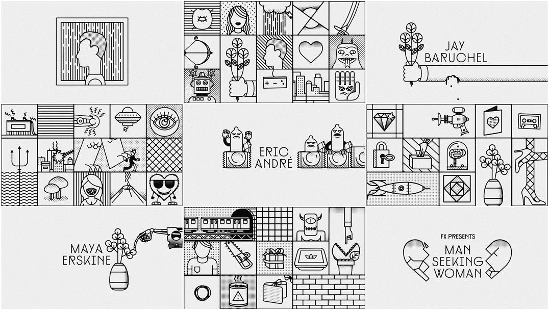
To convey that sense of romantic and manic whiplash, Digital Kitchen assembled the FXX show’s title sequence with a series of snappy black-and-white animations. Hurtling forward through an ever changing three-by-five grid, we get tidy little doodles of trolls, trains, and tridents; frowning condoms, wilting flowers, cassettes, skulls, and ray guns. How best to put it? It’s a giddy bit of nonsense that hints at Man Seeking Woman’s disparate, breakneck comedy. It’s like the atomic, twitchy love-child of Keith Haring and Tex Avery; a stream-of-consciousness cartoon, complete with sight gags, a punchy trip-hop theme, and cool, clean illustrations.
A discussion with Executive Creative Director CAMM ROWLAND of Digital Kitchen.
Give us a little background on yourself and what you do.
I’m the executive creative director of Digital Kitchen (DK) and DK Studios Chicago, where I’ve been since 2003. I have the privilege of working with a diverse and talented team of creative folks here, making work for some great entertainment and brand clients.
How did you become involved with Man Seeking Woman?
Spencer Berman at Broadway Video, Lorne Michaels’ studio, reached out to us. The show’s director, Jonathan Krisel, had recommended DK. They sent over the pilot, which we loved. The way it blended reality and fantasy was so absurd and funny. We were super excited about the project.
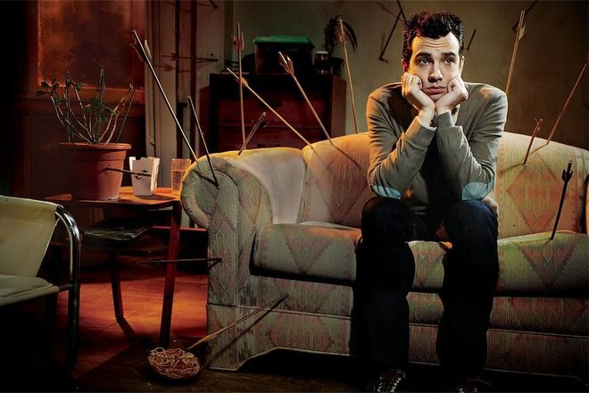
Still from an episode of Man Seeking Woman
What was your first meeting for the sequence like?
We connected over the phone with Spencer, Jonathan, and Simon Rich, the show’s creator-slash-writer. They were great from the get-go – very open-minded and enthusiastic. They had a general sense of what they wanted: something simple, iconic, and bold that spoke to the high stakes of dating, which in the show are life-and-death high! We talked about having a sort of blunt, direct tone that was oddly humorous but not trying to be ha-ha funny.
Unused early logotype concept
We also talked a bit about music direction, logo development, and visual styles. Also, we touched on the length of the piece, which was flexible. But from the beginning I was thinking it should be short and sweet – something that you’d look forward to seeing each time and never want to fast-forward through.
It feels like a welcome departure for Digital Kitchen. Much of the studio’s past title work has been characterized by blood and death. I’m thinking Six Feet Under, Dexter, True Blood...
Absolutely! Our previous title work was pretty dark. Even titles like House, Nip/Tuck, and Rescue Me have a pretty serious vibe. The opportunity to play in a very different territory was exciting.
And how did you start to develop the sequence? What was your process?
The first step, before diving into look or story, was to set production parameters to guide the process. This would be an important part of the brief. The show features hideous monsters, spaceships, and all sorts of other genre-spanning imagery, and does it with surprising realism. So, if we were going to be playing with these kinds of themes, it didn’t make sense to try to compete with that. The opposite end of the spectrum is where we wanted to keep things: simple, bold, iconic – without a ton of complexity.
With that in mind, we started by developing some title concepts that attempted to capture the tone of the show, with a nod to all of the crazy stuff that Josh (Jay Baruchel) has to survive in his pursuit of love. We produced several really cool, distinct directions in storyboard form. Our Creative Director, Elliot Lim, who is also a phenomenal illustrator, created the modular, grid-based concept that became the look of the titles.
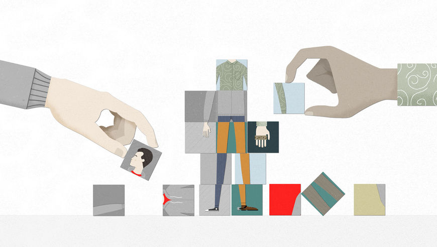
Block-based concept board (unused) developed by Elliot Lim
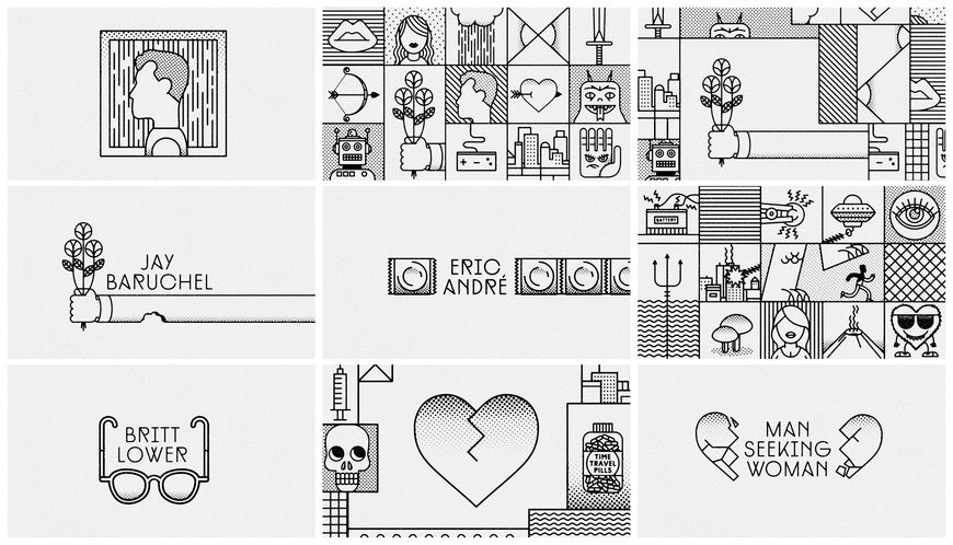
Grid-based concept board developed by Elliot Lim
How did you choose all the symbols you used?
The process was very open. The symbols are a medley of film genre and dating references. Simon Rich, the writer, told us that, as far as genres, all were on the table – from sci-fi, to horror, to fantasy – because the show itself would eventually draw from nearly every genre imaginable. We wanted to paint a picture of modern dating from Josh’s perspective as an underdog of sorts. Elliot did a great job of concepting and designing symbols that wove the two thematic threads together.
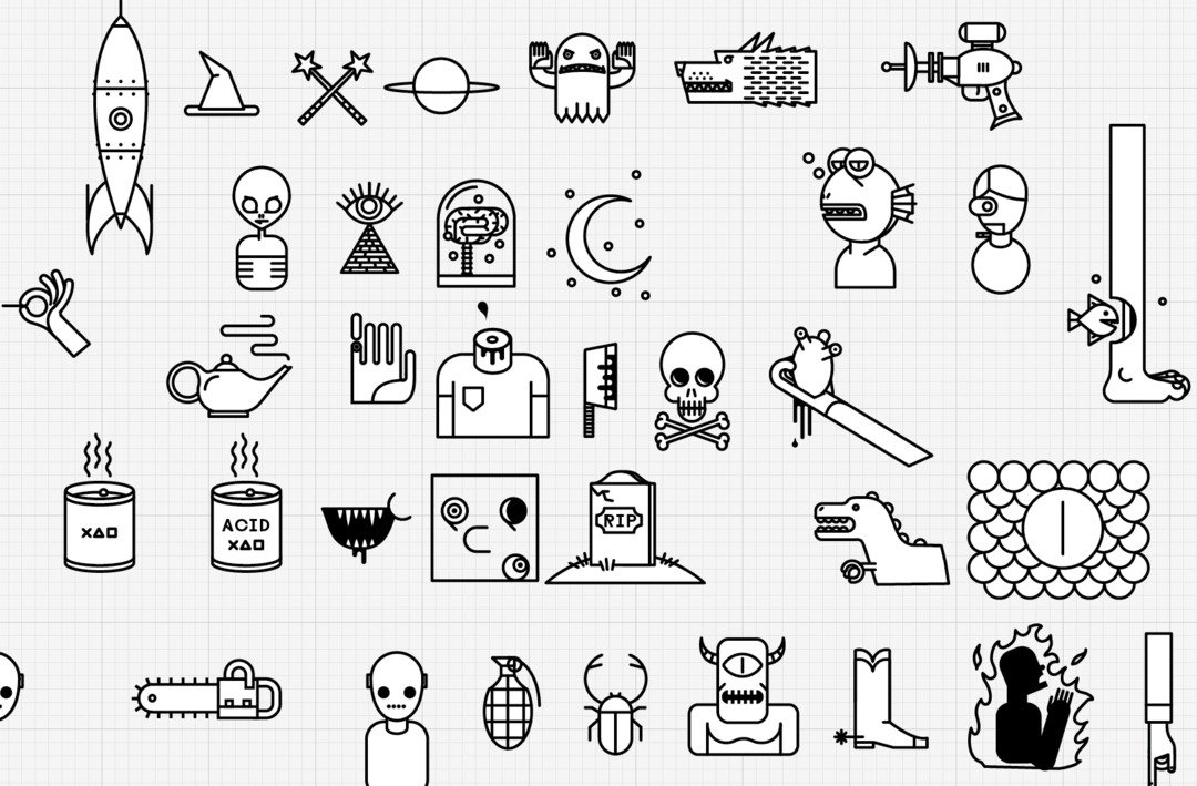
Various concepts for icons, drawn in Adobe Illustrator
Did the team inject any of their own love lives into these elements?
We talked with the client and we all agreed that the references should not be, in most cases, direct lifts from the show. Although we kept a couple in there like the stuffed heart with sunglasses!
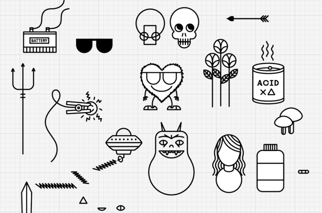
Icon concepts, featuring the heart with sunglasses, drawn in Adobe Illustrator
We kept things pretty Josh-focused, and any similarity to any of our own lives is purely coincidental – except for the chainsaw beheading. That happened to me once.
Let’s talk type. What typeface are you using here and why was it chosen?
We used Diamonds by Hannes von Döhren. The version you see is rounded slightly to pair well with the illustration style. The typeface has a lot of alternate characters, so it allowed us to keep things very clean and legible – using alt character shapes sparingly to add character.
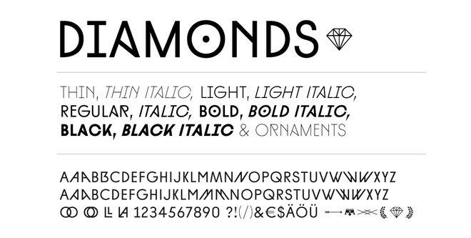
Samples of the Diamonds typeface designed by Hannes von Döhren in 2012
Tell us about working with Photay Productions on the music. Did you have the theme song from the get-go?
Photay was actually a pretty last-minute change! We had been working with another artist through the majority of production when Jonathan Krisel and team sent along the Photay track. We really dug the direction – and it synced up well with the pace of the animation. Because Photay’s sound is eclectic, the added sound design blended in really nicely.
How big was the team for the sequence?
Small. Elliot designed the piece and Chris Carboni tag-teamed with him on the animation. With me and Blake Nickle, who produced the project, the team was four in total. One large pizza could feed the team – extra-large if we’re talking thin crust.
And tools? What did you use to put it all together?
We used After Effects, Illustrator, and a little Flash.
And more generally, what would you say are some of your favourites, in terms of title design?
The titles for The Fall are incredible. Every single shot is so perfect it’s almost painful.
I also like the titles for Enter the Void. Now, these titles are actually painful, awesomely headache-inducing. But I like them because they pushed the boundary of design and were client-approved, so that means anything is possible!
Support for Art of the Title comes from


