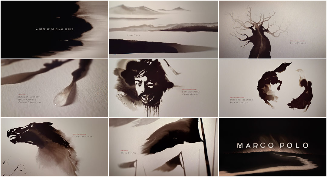
A tide of ink creeps eastward, like a bank of dark clouds signalling a coming storm. Another spreads west, roiling, soaking the land in a black, inescapable gloom. As the two fronts pass one another, the ink begins to take on a less imposing, more riverine form, painting a picture as it gently flows across the paper. Though the misty landscape that emerges seems peaceful at first glance, the scene that replaces it is anything but – A field of bodies impaled on stakes.
Such grim scenes greet legendary traveller Marco Polo as he journeys to meet the conquesting Kublai Khan. The relationship between the Venetian and the Khan, between eastern and western cultures, is central to the epic Netflix drama Marco Polo.
The show’s abstract title sequence, created by The Mill, mimics traditional Chinese painting. Done in the expressive Xieyi style (literally meaning “painting the feeling”) and featuring an erhu driven score that would not be out of place in 13th century China, the opening titles explore Marco’s life in the Mongol court, capturing the spirit of his continental adventure through ink washed imagery and themes.
Borrowing heavily from calligraphy, paintings of this style typically featured landscapes or plant life as their subjects (mountains, rivers, trees, flowers, birds, fish, etc.). Here though the subject matter is, quite fittingly, far less ordinary and much more gruesome. A tethered hawk, dogs, horses, a severed head, and armies of both the living and the dead.
In traditional Chinese painting, plants and animals often act as symbols for the underlying meaning of the piece. Plum blossoms represent nobility, the orchid stands for beauty and grace, bamboo for tolerance, the chrysanthemum denoting virtue, and so on. It's easy to guess at the hawk's meaning – Marco's limited freedom in Kublai's court – but flowering plants are nowhere to be found in the titles. Instead, the signifier here is the once mighty pine, meant to represent strength and uprightness. Though the tree’s twisted limbs reach for the sky, the branches are all but bare.
A discussion with Co-Directors BEN SMITH and BRYCE WYMER at The Mill.
Tell us a little about yourself and your position at The Mill.
Ben: I'm a creative director at the Mill+ studio in New York. I started out as a product designer in the UK, then got into animation and VFX, and then eventually into directing.
Bryce: I’m a director, designer, and visual artist, based out of Brooklyn, New York. I have been a freelance collaborating director at The Mill for the last five years.
How did you become involved with Marco Polo’s opening title sequence?
Bryce: My longtime friend and producer Danielle Amaral, at Mill+, called me up and said “Hey, I have the perfect project for you and Ben. What are you doing for the next few weeks?”
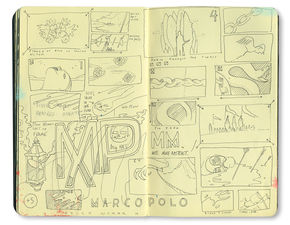
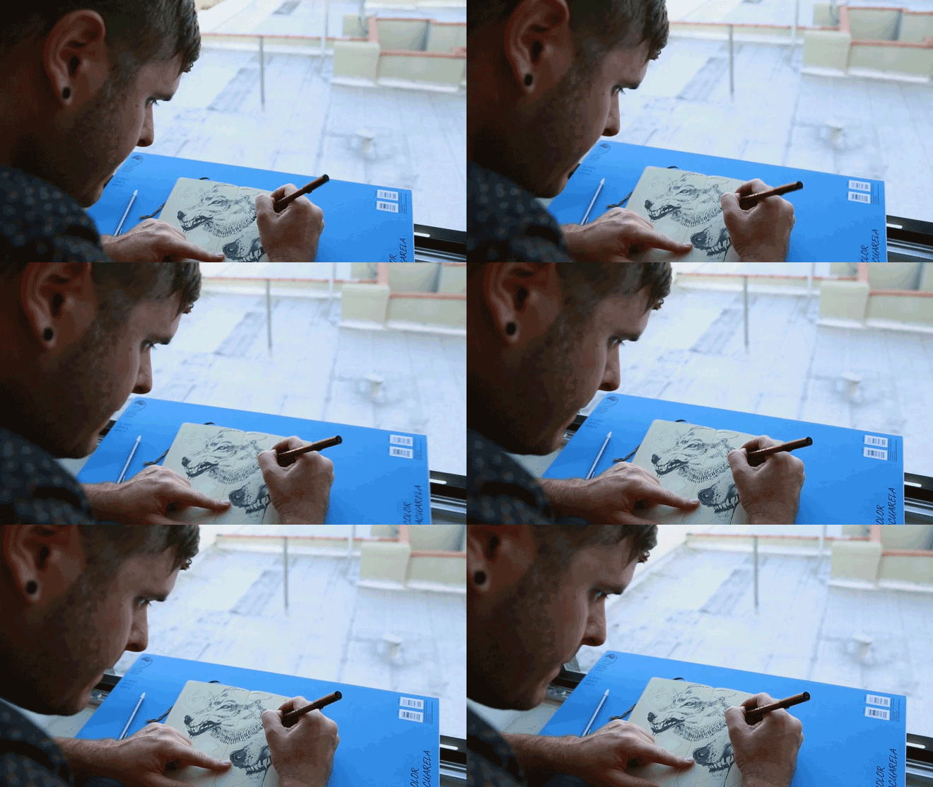
Pages from Bryce Wymer's sketchbook featuring explorations for vignettes and wordmarks
Ben: I think we had two weeks for that initial pitch. The first meeting was inspiring. They left the briefing open as they wanted to see what we would naturally come up with. They gave us the script from the two-hour pilot and a verbal rundown of the main themes and flavor of the show. They said the show would be shocking, brutal, full of swashbuckling adventures – nothing like the Marco Polo from your textbooks in school. They described Marco Polo as the Italian Indiana Jones, and Kublai Khan as a Mongolian Tony Soprano – so, pretty exciting!
How did you start? Did you dive into the research?
Bryce: We did a ton of research. I looked at everything from old spaghetti western posters from the early 1960s to 1200s Mongolian horse saddles. I also spent the better part of two days in the Asian arts wing of the Metropolitan Museum of Art.
Ben: I spent an afternoon in the Met, too, looking around the Asian galleries. I loved the idea of taking a historical medium associated with narrative and decorative arts, and subverting it to surprise viewers.
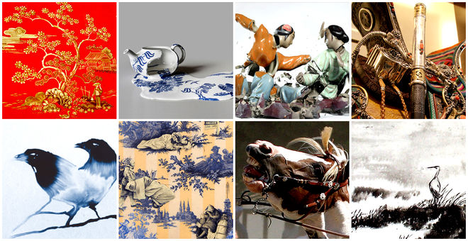
Found reference and inspirational imagery
What were some of your initial concepts for the title sequence?
Ben: Initially, I liked the idea of using a range of narrative mediums of the time to illustrate the themes in the show. Ink, embroidered silk, painted blue porcelain and engraved metalwork – all the types of riches that the Polo family acquired along the Silk Road. We presented a range of directions that could all be developed.
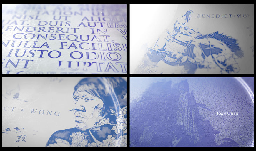
“Painted Porcelain / Toile” initial concept and reference imagery
Ben: One of my favorites was an idea that expanded upon the image of the Polo family crest. The idea was to create highly stylized and surreal crests that symbolized Marco's adventures, his duality as a Venetian in Mongolia as well as more general themes. There was something cool about the fact that family crests are European and often symmetrical. We thought this could be an interesting way to balance Marco’s Italian roots with the Mongolian adventures that defined him.
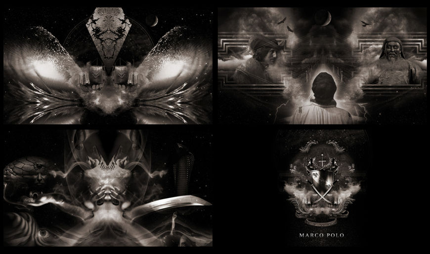
"Family Crest" initial concept and reference imagery
Bryce: But once we started diving into the project we really trimmed the fat. We knew we wanted the titles to create an explorative uneasiness with the viewer.
How did you decide on using the ink concept?
Ben: After discussing the range of ideas with the Weinstein team, it became clear that they wanted something simple and monochromatic to contrast against the rich and ornate styling of the show. So we decided to concentrate on the ink as it had so many great qualities.
Bryce: Yeah, ink itself has such beautiful ambient qualities. Ink as a medium has been widely utilized in title sequences. But because of that, we wanted to approach the medium in a new way that has rarely been done. We found that ink itself – and how we manipulated the medium – could instill a feeling of controlled anxiety.
Ben: Ink seems so traditional and “safe” that when you see the violence of the images, it creates a surprising contrast. The mercurial way it moves and expands to fill its surroundings seemed like a perfect visual metaphor for both Marco’s journey and Kublai's expanding empire. It also has a great blood-like quality that gives the whole thing a foreboding and sinister feel.
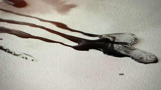
Water and ink spread across paper in this selection of unused frames
Did you explore working practically versus digitally?
Ben: Not at all. We always knew we wanted to do it practically! You always get something unexpected and beautiful and we wanted that. The surprises are what makes it so fun!
Bryce: We really did not even entertain the idea of using digital inks or mattes with ink elements. Ben and I had a fair amount of experience working with digital fluids and we knew from the onset that this needed to be real time. We also had a very short turnaround from concept to delivery so we had to create a solution that gave us instant results.
Ben: Of course, there is a fair amount of compositing and manipulation done in post, but apart from one very subtle element, all of the ink is captured practically. We wanted the ink to feel graceful and elegant to match the tone of the music, so we experimented with a variety of inks and liquids – including vodka and ferrofluids! – before settling on Sumi ink in water.
A ferrofluid is a liquid that becomes strongly magnetized in the presence of a magnetic field. It was initially invented by NASA's Steve Papell in 1963 as a liquid rocket fuel.
How did you select the various vignettes, the scenes you wanted to portray?
Ben: I loved this part. We basically read through the scripts, highlighting scenes and moments that personified the main themes, and then distilled those into simple silhouettes. We also got to watch the first three then-unfinished episodes, which was cool. We had around 20 vignettes we wanted to explore. We had to edit that down to eight to fit the runtime. We worked with storyboard artist Mark Yates to quickly rough out initial ideas.
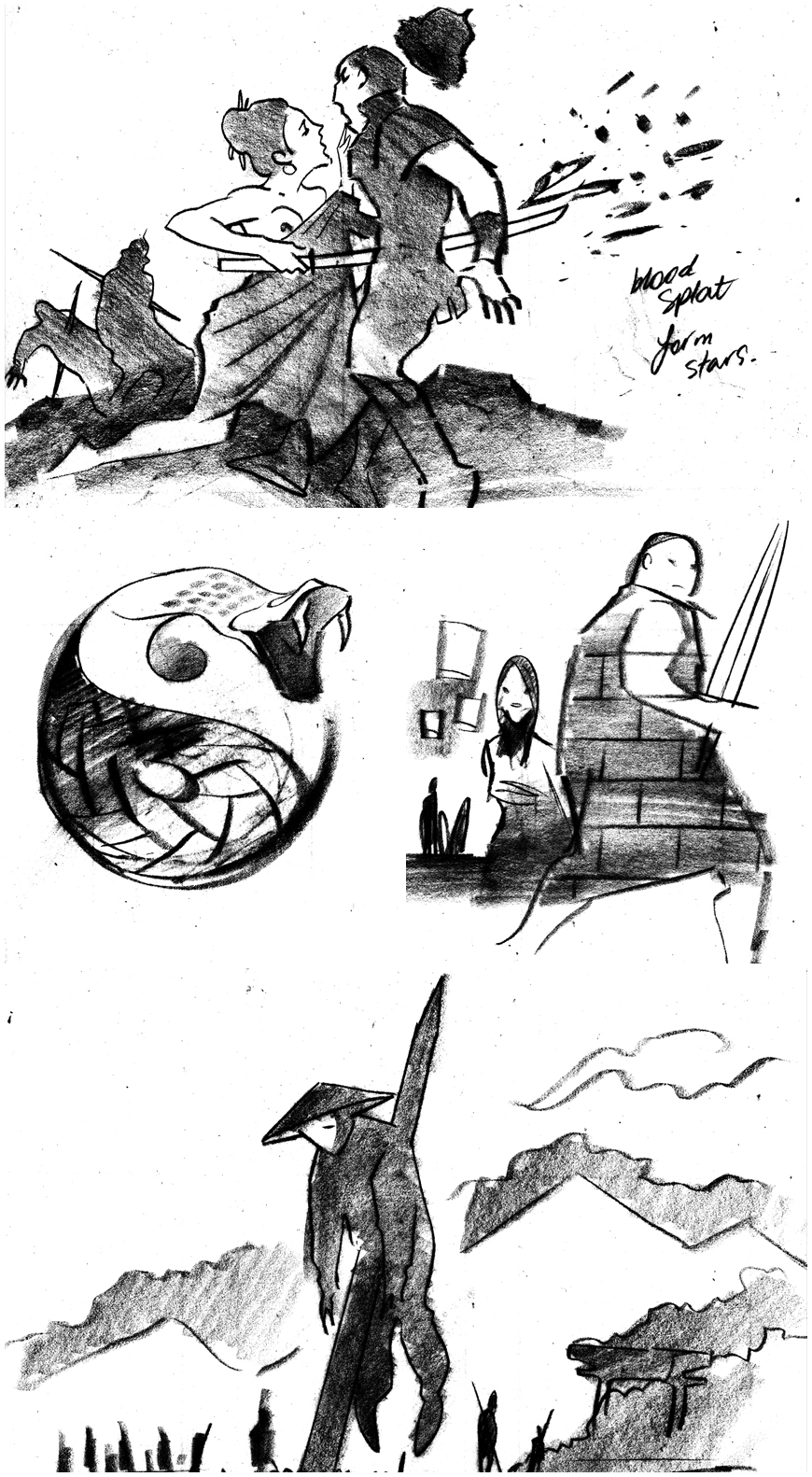
Vignettes illustrated by storyboard artist Mark Yates
Bryce: Some of our initial [vignette] designs were a lot more figurative and representational of the characters and scenes. But we were creating titles for a series-based show, so we needed to keep the content more metaphorical and less specific, so that the meaning of each vignette is open to interpretation and can connect to the show in many ways.
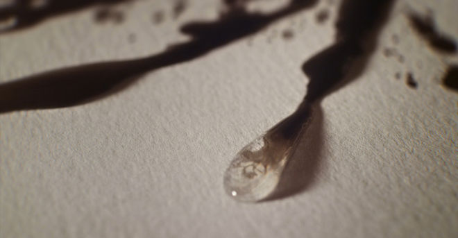
"Easter egg" shot: a skull appears in the ink
Ben: My favorite vignette is of the hawk. The Weinstein team wanted an image that would illustrate Marco's difficult position in Kublai's court – free to move around, but unable to leave, a trapped curiosity in an open prison.
I'm also really happy with the little Easter eggs we put in. For example, the ink forms the shape of a skull at the end of a drip in one shot.
How did you handle the live-action shoot?
Ben: We used a “wet in the wet” technique. First, Bryce came up with the cool idea of projecting the image of our illustration onto a fixed position, thereby creating a template that could be quickly turned on and off. This allowed us to lock off the camera position and try out different versions of the same image, confident that they would all line up in post.
Bryce: We had to get as much coverage as possible. Ben, our DP Adam Carboni, and I set up two Red Epic cameras, one locked overhead and one floating on a slider. This allowed us to safely capture any interesting ink happening in the wide and still get some sexy macro stuff in the second camera.
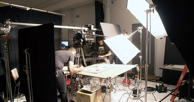
The camera build: two Red Epic cameras set up to capture ink movement
Ben: Bryce would paint over the template with water – the thickness of the paper prevented it from being absorbed. They would then add the drops of ink that would very quickly spread and “fill in” the image. The larger images would require multiple drops to fill in completely. To give the ink its creeping, mercurial movement, we shot everything at 120FPS. We knew that the more complex illustrations would need to be composed out of multiple elements in the end – in some cases, there are over 20 elements combining to create a final image. We also captured loads of elements that we knew would be useful in the compositing stage – various blooms, traveling elements and washes. The shoot was split over a number of days.
Bryce: A quick breakdown of the overall process went something like:
Behind the Scenes: Marco Polo Title Sequence
Digitally project completed illustrations on white 100% cotton watercolor paper
Two to three people paint in the illustration with clear water so the image is completely made of water.
Turn off digital projector. Now you just have clear water on white paper.
Two Red cameras are set up. One locked, one on a slider.
Tilt the table to the right degree to get the water flowing in the desired direction.
Two to three people drop Sumi ink onto various spots within the illustration depending on how we want the story to unfold.
Edit composite, build shots.
Grade (color correction)
What about the typography? What were some of your explorations with that?
Ben: The typography had to integrate subtly into the scenes and support the imagery rather than be distracting. We tried handpainted and weathered-looking typography, but that felt too similar to the essence of the ink.
Bryce: We decided that modern, sans serif letterforms were going to be best for the overall look and feel. [Netflix] wanted the overall project to feel like it was created in the same era as the show but also have a connection to the present.
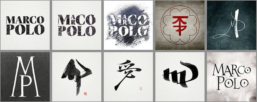
Typographic explorations for the show's wordmark
Ben: Ultimately, having the opacity bleed out slightly with hints of motion proved an elegant way to recall the movement of the ink without competing with it. We also explored how fine we could make the weight of the type while maintaining legibility whether viewing at 4K or even SD. Additionally, we avoided using pure white and black values and instead incorporated the rich tints of our grade.
Bryce: For me, simple, clean, legible credits are 50% of what a successful title sequence should be. It's easy to lose sight of what you are creating. Ultimately the opening titles are a setup for what is to follow. But there is a reason why they are called title sequences!
How big was your production team?
Ben: We had a pretty big production team and used all facets of The Mill to create this piece. From concept, through shooting, editorial, VFX and color. It was one of those jobs that everyone wanted to work on.
Bryce: Illustrator Michael Marsicano and Nuke Compositor Antoine Douadi also helped us bring this project to life. It was a rad team.
Which tools and software did you use to put it all together?
Ben: We shot everything on the Red Epic at native 4K. Editorial was done in FCP. We used Nuke for all the VFX compositing, Baselight for color and Maya for the tiny amount of fluid simulation we needed. All of the typography was done in Photoshop and AE.
Bryce: Also pencil, paper, a lot of ink, and the digital projector.
What are some your favourite title sequences, whether classic or contemporary?
Ben: I really love the opening sequence to Hitchcock's Strangers on a Train. It so intriguingly sets up the story that follows and makes brilliant use of visual symbolism.
Strangers on a Train (1951) opening titles
Bryce: I have always loved the simplicity of the opening titles sequence for The Game with Michael Douglas. You knew so much about his adult character just based on family videos from his youth.
Dawn of the Dead has an absolutely great musical track. And once again it gave you a fairly complete back-story for the film that followed.
What advice would you give someone looking to get into title sequence design today?
Ben: It sounds obvious, but a proper analysis of the film is so important. If you can discover the heart of the movie, then you're halfway there to creating a sequence that will resonate.
Bryce: You should always be creating, making and exploring your craft. You really need to create a place, or join an environment that gives you the ability to play, fail, and succeed. You learn so much about great design by creating bad design. Embrace them both and it will set you free.
Support for Art of the Title comes from

CINEMA 4D BY MAXON
Featuring an Unmatched Live 3D Pipeline with Adobe After Effects CC.

