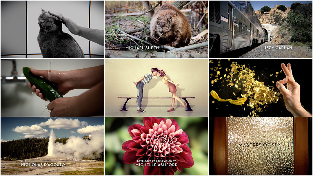
Pet that pussycat, pop that cork, grab that bull by the horns. The titles for Showtime's highly acclaimed new series Masters of Sex take us on a cheeky ride of erotic euphemisms. Through liberal use of stock footage, animation, carnal close-ups, and clips of the clinical, Santa Monica-based studio Elastic playfully explores variations on taboo.
Like 21 Jump Street's hilariously explosive end title sequence, this opening is another example of how appropriately curated stock footage can be used to great comedic effect. As the show’s title appears on the frosted glass of an office door, the straightforwardly sharp Neutraface Bold typeface reminds us what this show’s really about – scientific research. Right?
So come as you are, take a load off, and let Masters and Johnson show you how it’s done.
A discussion with Art Director LEANNE DARE of Elastic.
How did you begin, when it came to Masters of Sex?
When I first learned we'd be screening a show called “Masters of Sex” for Showtime, I immediately envisioned the type of seedy programming that you find broadcast around four in the morning! After we screened the pilot, however, we knew the show was deserving of a title sequence that could live up to – and complement – the tenacity and wit that Showtime had brought to the programming.
I, along with my two colleagues, Henry De Leon and Lisha Tan, submitted directions for this pitch. We presented a collection of ideas that spanned a range of approaches. Lisha and Henry made some amazing boards.
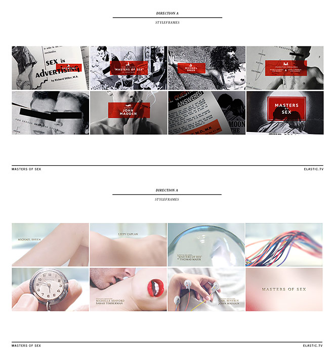
Initial treatments by Henry De Leon and Lisha Tan
We typically feed off of each other's creative energies, and this project was no different. Like all pitches, it’s never decisively one idea that “wins,” and when we met with Showrunner Michelle Ashford and Executive Producer Sarah Timberman, I think they loved the variety we presented.
How did you proceed with developing a concept?
The initial concept originated from days of collecting and staring at visual research. Of all the images, I found myself fixated on a photograph of a flower. It had no direct implications to sex, but it kept calling my attention. From there it gradually developed into asking, “How could I show sex without showing it?” So I started to collect some images, and after a bit of shuffling and playing, some pretty funny things started to emerge. It was a really simple idea – but it just clicked.
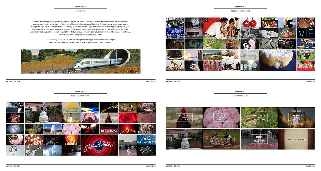
Selected treatment by Leanne Dare
And they totally went with it! We were exploring every innuendo we could, and found that being rather brash allowed us to expand on ideas in almost a conservative way.
Further along during production, we added some of the more raw and clinical imagery into the sequence; we found that we could strike a perfect balance of the two, keeping the sequence unique and fun, while still appropriately reflecting the storyline.
How much of the sequence was assembled from stock footage versus what you shot specifically for it?
After a quick count, these are the numbers I came up with:
- 28 shots were shot for the show
- 17 shots were stock footage
- 4 shots were from the show itself
Were there any innuendos or implications that you wanted to include but weren’t able to?
So many! We had so much fun making and shooting anything and everything we could think of. So many things we made ended up on the cutting room floor.
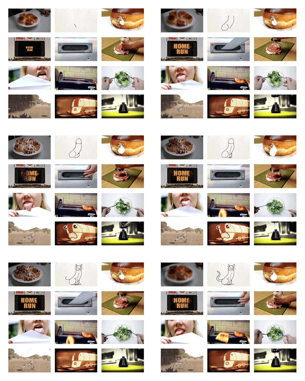
Unused concept gifs
Tell us about the animations of the two teens.
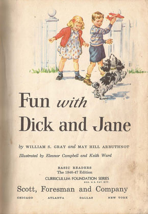
Fun with Dick and Jane, written by William S. Gray and May Hill Arbuthnot; illustrated by Eleanor Campbell and Keith Ward
The animations of the two teens happened close to the end of the production. There was a desire to establish a framework for the story that was open to “progression or sequencing of actions.” They wanted something that closely resembled the ’50s illustrations of Dick and Jane, but for them to be a bit older in age. I developed the initial characters, and once they were approved, they were passed off to the very talented Yi-Jen Liu. She did the final illustrations as you see in the piece, and Jon Forsman did the final animation.
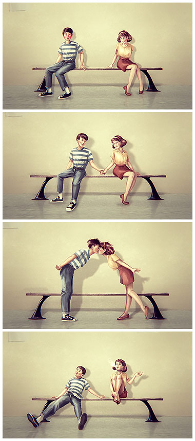
Historically, Masters and Johnson broke up the Human Sexual Response Cycle into four stages: excitement, plateau, orgasmic, and resolution. We decided to use the teens to demonstrate these four parts; they meet, they hold hands, they kiss, and then they’re exhausted. We referred to these four phases frequently in our process. Consequently, many entertaining discussions and arguments arose around which pieces of footage represented which phase.
How big was the production team?
That’s a tricky question! We had the fortune of having this project in our hands for a really long time. Our initial meeting was in December 2012 and we delivered in September 2013. For the long haul, it was myself and our invaluable producer Jamie McBriety, along with our editorial team Gabriel Britz and Ko Massiah, and of course our executive producer, Jennifer Sofio Hall. Along the way, though, we managed to get just about everyone in our office involved.
Which tools and software did you use to put it all together?
We shot most footage with a Canon 5D or 7D. The teenager animations were done in Adobe Photoshop and After Effects.
What elements of this sequence are you most happy with?
The scenes that excite me the most are the segments that came from footage contributed by colleagues in our studio – they really embody the collaborative nature of this project.
Some of my favorites: Designer Henry de Leon petting his cat Simon; two wind-up bunnies lent to us by our editor Gabe Britz and choreographed and shot magnificently by Jon Forsman; and footage of the train going into the tunnel, which Director of Photography Kate Rentz and I bravely risked our lives to capture. Oh, and of course we can’t forget the beaver – he was definitely a crowd favorite.
How would you feel about a possible Best Title Design category at the Oscars?
That would be pretty cool, but being featured on Art of the Title is quite an honor in itself!
What are some of your personal favorite title sequences, either classic or contemporary?
It’s hard to pinpoint just one. However, I do remember always loving the stop motion opening titles to The Parent Trap when I was a kid. The VHS tape must be wearing thin from so much rewinding and re-watching!
LIKE THIS ARTICLE?


