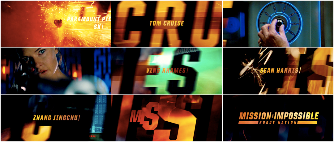
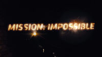
For the title sequences that bookend Rogue Nation, the fifth installment in the Mission: Impossible film franchise, LA-based studio Filmograph had to move lightning-fast.
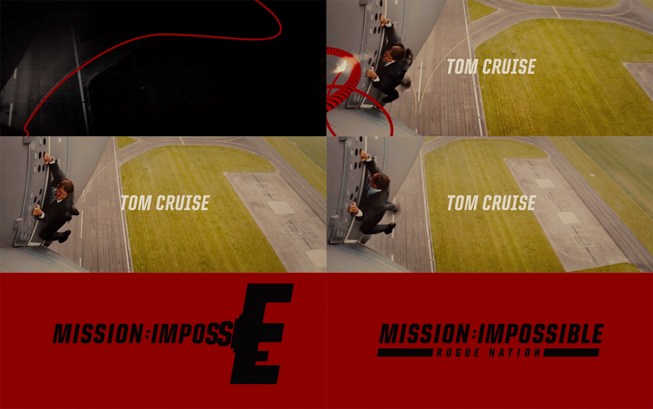
Working under fittingly impossible timelines – one week to create the pitch, six weeks to execute the damn thing – the team at Filmograph, led by Creative Director Aaron Becker and Executive Producer Seth Kleinberg, delivered not one but two sequences: an opening to declare the arrival of the film and a closing to round it off with levity, all at breakneck speed. The opening sequence acts as both trailer and primer, dousing the audience in style and rhythm while giving glimpses of the film to come – just enough to whet the appetite, but not so much as to spoil the main event. The familiar typography and that iconic Lalo Schifrin-composed score ground the opening in the series’ origin as a ’60s television show, while stepping firmly into new territory.
A discussion with Title Designer AARON BECKER and Executive Producer SETH KLEINBERG of Filmograph.
What’s been going on lately? It seems like things have really taken off for Filmograph since The Conjuring.
Aaron: When The Conjuring happened, that was right around when Seth and I were teaming up and the business started to evolve. Right when that was going on, Seth and I began pooling a lot of our ideas about what types of work we wanted to create, and what types of films we wanted to go after. As a result of that, we got some calls back.
Seth: It's really nice to be recognized for The Conjuring, to get cold calls, and also nice to write an email to someone you've never had any communication with and have them take you seriously and write back. A lot of the time, for someone who’s reaching out there for the first time, you get a lot of what we call "Hollywood nos," and it's nice to not have those, you know?
What's a "Hollywood no"?
Seth: They just don't answer the email. [laughs]
Aaron: [laughs]
[laughs] Makes sense.
Seth: They're much less frequent now.
You can't escape creativity in some cities, and LA is one of them.
So, designing for Mission: Impossible – Rogue Nation was a pretty great project to nab. How did that come to you guys?
Aaron: The Mission: Impossible thing was really funny because we got a call three weeks after I moved back to L.A. from a co-producer on [the recent] Star Wars, Ben Rosenblatt at Bad Robot, who I've known for a long time. He said, "Hey, do you want a chance to pitch on Mission: Impossible?" And we said of course! So, he brought us into Bad Robot for the screening, and said, "Okay, we have to see something in one week." On Paramount's side, the post-production supervisor was a very knowledgeable woman named Susan Novick, who we were in touch with in London as well. She was one of the main liaisons between us, the director, and editor, Eddie Hamilton.
They had a temp sequence slated in the film that looked pretty good to Seth and me. It looked professionally done, and we weren't sure what to think. We were kind of laughing while we were watching it. There were some fuses and things like that mixed into the edit. I don't know who did it, but it looked really polished. We were like, “Okay, why are we here?” It used a lot of original footage. It was almost a trailer to the film, but they only used like a couple quick shots. I think the director felt like it was missing some classicism or some nostalgia. We're not sure if it was an internal thing. There's sort of a mystery behind it.
But what we realized after the screening was that, even though it looked kind of polished and stuff, the director was not necessarily over-excited about what was in there at the moment, and so they asked us to show something in one week, and we got a small team together.
Seth: They gave us the criteria that it couldn't be boards; it had to be motion tests, and we're pitching against other companies. So we thought, is this worth the risk? And then we just decided to go for it.
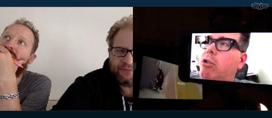
Aaron Becker and Seth Kleinberg of Filmograph speak to Director Christopher McQuarrie over Skype
How many other companies were you up against?
Aaron: We heard three or four, and we were told that they had the same rules of “no storyboards.” [The producers] were really under the gun. I think they were worried that if they were to receive storyboards, the people who might've put together a good storyboard couldn't actually execute on the animation. They needed to start.
The co-producer said, "You know, this is one of those weird situations where the director [Christopher McQuarrie] doesn't want to influence any of the visuals.” He just wanted the designers to screen the movie and to come up with ideas. So the only other piece of information we got during the briefing process was that he was a fan of the first film, and that he liked classic filmmaking techniques.
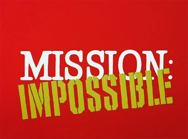
Seth: Right, and he liked the television sequence as well, the Mission: Impossible television titles. So, we watched, on Netflix, every single opening of the television series just to get inspired.
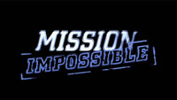
Mission: Impossible (1966) TV series opening titles from the pilot episode, with music by Lalo Schifrin and photographic effects by Howard Anderson Co.
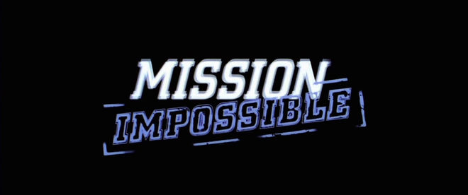
Seth: I watched every single film. We were very familiar with [the first film], not just because it was Kyle [Cooper]'s, but because it was an iconic sequence. It's such a great edit, you know?
Aaron: Yeah, it really was, and that's a good point about the television show. We looked at it and thought, this sequence is really cool but if we were to re-envision certain aspects of it in 2015, there would be a lot of updated elements; there would be new animation to include, and there would also be more modern typographic treatments.
Mission: Impossible (1996) main title sequence, designed by Kyle Cooper and RGA/LA
Aaron: So we thought, okay, let's speed up, let's do a pitch that takes this idea to the next level but keeps the first film's title sequence in our subconscious. We brought on a long-time collaborator for the pitch, Nathaniel Park, who's a very renowned editor.
Seth: We would stay in the room, pacing back and forth like, "We've got to get Nate, we've got to get Nate." We wanted to make the most fast-paced edit imaginable, and we were so fortunate that he was available.
Aaron: So, we were talking with Nate a lot about the edit, and I was doing typographic animation for it, but I was also doing a second animated concept.
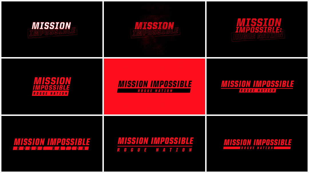
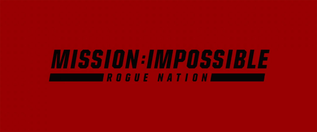
Image Set: Main title card early versions and alternates
Aaron: We didn't want to present just one idea. The other concept I was working on was this 2015 reimagining of the fuse in a graphic context because we knew that if we won the job, we'd only have about six or seven weeks to produce it.
Seth: Yeah, there would be no luxury to have a 3D fuse by any means, so we had to come up with a really easy fuse solution...
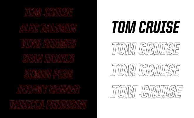
Image Set: Typographic treatments for actors' credits
Aaron: As designers, it was hard to accept the task of only showing motion tests because we want to design frames, right? We want to actually design things, and then put them into motion because we know that that's how things end up looking their best.
So, even though I had to start playing around with animation, I said to myself, I'm going to take a day to try to come up with a really simple concept that I would personally like to see. I looked at the television title sequence, and we kept watching this little white graphic fuse that was going across the screen really slowly over footage, you know? And it was this beautiful, simple graphic concept that I thought we could update and bring into the modern era while still being able to tip our hats to some of the original [movie] franchise content.
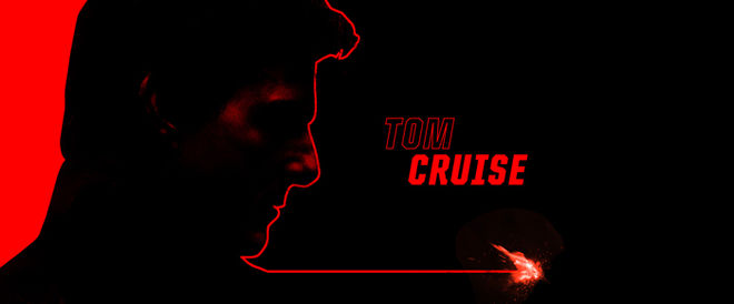
Initial styleframe and fuse concept
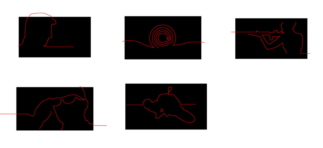
Image Set: Fuse silhouette lines with instructions for animation
Did that second concept end up becoming the closing sequence?
Seth: Yeah, but at that point, we didn't even know there was going to be a curtain call. We didn't know that. And so, on the phone, he's like, "I like both. I want to do both." [laughs]
Aaron: That almost never happens, where they want to use both of the things that you present. But they said they liked both ideas – they didn't want to lose one of them.
The opening sequence uses a lot of shots from within the movie. How did you work that in, given the timeframe?
Seth: We were initially given a preview cut that we were able to load up. We would go over selects, just finding the best moments of the film as it existed at that time. The underwater stuff hadn’t been shot yet. But we knew what the movie was, the entire narrative structure.
It’s just a really enjoyable summer movie. It was designed exactly as it was intended. It’s just like a feel-good movie. There’s a place in this world for those kind of films.
Well, clearly. [laughs]
Seth: $600 million worldwide. I mean you can’t go wrong with that, right? [laughs]
With the shots for the opening, was there any concern about what was being shown, in terms of spoiling the film’s events?
Seth: It’s really interesting because you see moments from the entire film that you’re about to watch, yet you don’t really know what’s happening. After you’ve seen the film and then you watch the title sequence again, you can kind of piece things together.
Aaron: Right, and [McQuarrie] is very much about honoring his predecessors, going back to the television series. The montage of snippets from the show you were about to see. Unless you went back and watched it, you wouldn’t necessarily realize what the snippets actually mean within the larger context of the film.
It’s basically saying, “Look, Mission: Impossible – Rogue Nation’s the fifth in the series of this movie franchise, and it’s aware of its roots.” It’s saying thank you to the origin of the idea.
Mission: Impossible – Rogue Nation (2015) end title sequence, designed by Filmograph
With the opening sequence, its tone is exciting, it's flashy, it gets you hyped up for the movie. But the closing sequence is more self-referential. It's more about the characters and the humour. Were you consciously pushing a sort of shift in tone?
Aaron: Definitely. That's such a good question because over the course of the film, Alec Baldwin becomes more and more likeable. He's there for comic relief, obviously, but he also becomes a partner to the IMF, the Impossible Missions Force... which is the funniest name. That's another story.
We were aware of the more lighthearted approach at the end of the film, but it was also influenced a lot by a 2015 version of graphic lines.
Nowadays, yes, we could've just done a flat, 2D-looking graphic thing that could've looked cool, but it is a new time, and we wanted the lines to look graphic but function in space, function in a dimensional world that then gets them to a 2D lockup...
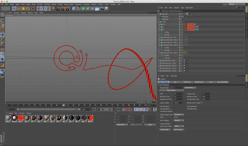
Image Set: Screenshots from the fuse-animating process in Maxon Cinema 4D
Seth: And then the flame, which is also a little bit elevated. We deliberately made the background black and white, so the fuse was really the star.
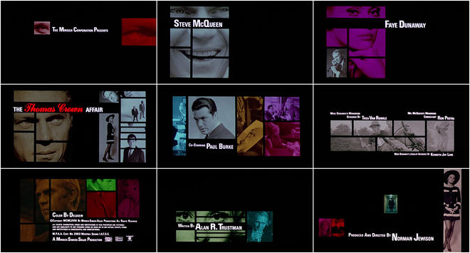
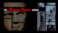
Aaron: The other big difference between the end curtain call and the main title in terms of edit – which, by the way, we should also mention that we had another editor on hand named James Long, he stepped in when Nate had to step away – but we were definitely influenced by Pablo Ferro. We were actually looking on your site at The Thomas Crown Affair stuff, just to understand why the director was looking for this classic feel. So, yeah, [the end sequence] is lighthearted and more playful than the upfront sequence, but there were also sliding barn door editorial techniques, there were large areas of negative space and black, which was very much influenced by the tiling effect in The Thomas Crown Affair and some of the Pablo Ferro editorial approaches that we thought the director would be drawn to.
The Thomas Crown Affair (1968) main title sequence, designed by Pablo Ferro
Aaron: We couldn't go really complex with a big Pablo Ferro grid or anything like that, but we wanted to have some sliding wipes that felt graphic against the black and white.
Just to keep it a little more classic.
Seth: Yeah, and then the scan lines were added for a modern-day component, so it wasn't just like a black and white edit with the fuses, kind of harkening to the technology in the film and the surveillance nation. We wanted to do that as a denouement for the end.
Now, Mission: Impossible has a really recognizable theme. How did you guys work with the music?
Aaron: Oh, man. How great is that music, though? It was a dream come true to work with that score. Like, come on, we've all heard this a million times...
Seth: Yeah. Joe Kraemer's score, obviously, of the original Schifrin tune is just incredible. We were playing it all the time in the office. We had that music really early on in the process, and Nate cut to it.
Aaron: Yeah, we had to lock in the timing.
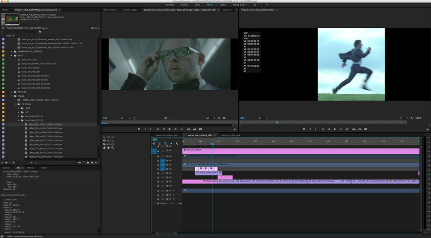
Image Set: Screenshots from the editing process in Adobe Premiere for the main title sequence and the closing sequence
Seth: Right. We didn't have film scans until about two weeks before it was completed, and so we really had to keep on our toes about the conform process. We built everything in HD and Premiere, and then we swapped out for scans in Premiere. They weren't graded. We got all ungraded scans. So, with our deliveries, we had to come up with a way for them to color everything independently, so we gave three-channel mattes for both the main title and the curtain call, so that they could still make color corrections in the digital intermediate to the final sequence. The red channel would cover the type, the green channel would cover what we called the large train text, and then the blue channel would be the background, independent of all the picture slides. And then, for the curtain call, we had that for the fuse, the spark, and the text, so that they could color-correct everything in-house without having to composite our work.
Actually we never even saw the final color until we saw it in the theater, and it was really great.
A lot of time designers try to steal the show, but that’s not our job.
What tools and software were you using throughout this project?
Seth: We had top-of-the-line iMacs. Local RAID storage for Nate which was Studio XL, 24-terabyte Thunderbolt RAID. We used the Creative Suite: After Effects, Premiere, Illustrator... Cinema 4D. And then we used Aspera to transfer it securely to Paramount.
Aaron: Obviously Cinema 4D was the most complicated part of this. We worked with a friend of mine named Chris Schmidt, at Greyscalegorilla. Chris Schmidt is someone that we like to collaborate with because he’s a very calm, patient, and knowledgeable 3D artist. We worked with him on Dumb and Dumber To, as well. So we gave him a creative brief with these fuse lines, saying like, look, we want them to feel dimensional but we also want it to feel flat. We attached a little null to the end of the fuse in 3D. And that null in After Effects allowed us to attach a live-action spark, like a live-action cycling fuse, to the end of that 3D fuse. So you had that fire at the tip.
And then we used TrapCode Particular for the smoke and some of the additional sparks.
Now, I know we’ve asked you this before, but it’s been a little while so maybe your answer has changed. What are some of your personal favourite title sequences? Can be classic, can be new…
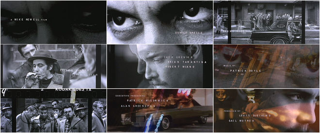
Seth: Oh, boy. [laughs] It’s funny ‘cause I do read your site all the time – I mean, I’m not gonna say Se7en! It’s not Se7en. No, I really love Donnie Brasco and I was reminded about that because I recently saw Black Mass, and it has a very similar main title sequence.
That’s still Kyle Cooper!
Seth: [laughs] Yeah, that is the old boss!
Donnie Brasco (1997) main title sequence, designed by Kyle Cooper and Imaginary Forces
Aaron: The one that always – I am gonna say something really similar, and I apologize—
Seth: You’re not gonna say Se7en, right? [laughs]
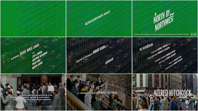
Aaron: [laughs] No, but I am gonna say North by Northwest. For some reason – ever since I was a student, in college – North by Northwest was one of the first title sequences I learned about. The first title sequence where I actually started to learn about the profession, and the craft, and for some reason I just can’t get it out of my mind. That’s the one for me that stands out the most. I think that’s my favourite of the past ones.
North by Northwest (1959) main title sequence, designed by Saul Bass
You never get over your first love, right?
Aaron: That’s exactly right.
Seth: If that’s true, my answer is Se7en! I can’t get over my first love! [laughs]
Aaron: Of the newer stuff, I do love the Halt and Catch Fire sequence.
Seth: Patrick Clair in general is kicking ass a lot.
Aaron: Also, after having worked two blocks – like, my studio in Chicago was two blocks away from Sarofsky. And I used to meet up with Erin [Sarofsky] and some of the people at Sarofsky for lunch, and we would go back and forth to the studios. I really respect their design process. They don’t overcomplicate their sequences. They come up with an idea and they let it be complementary to the film. A lot of time designers try to steal the show, but that’s not our job. I think Sarofsky is aware of that in a way that some other studios maybe aren’t.
Seth: I liked their Ant-Man end sequence, that was really nice. I really enjoyed it. The concept of using the microscopic slides for the type, I really liked that.
So last question, what kind of advice would you give to someone who is looking to get into title design?
Start by living in Los Angeles or New York. Go to a place where there are people you can ask questions
Aaron: My first advice is if you are really sure that this is what you wanna do, you should start by living in Los Angeles or New York. Go to a place where there are people you can ask questions, and surround yourself with people who are good.
The thing that I realized when I first started at Prologue was the value of surrounding yourself with people who are 5, 10, 15, 20 times better than you, you know what I mean? Especially early on in your career. You can't really put a value on what you take away from that situation. And that doesn't mean that you can't be creative if you live in Iowa and are on a farm. It just means that your sensory experiences are going to be different and sometimes it is about the quantity of the content and the people you're surrounding yourself with. So that would be my first advice. You can't escape creativity in some cities, and LA is one of them.
Seth: My main role is the executive producer and head of production of the company, so the advice that I would give someone new who was already getting work and starting out is learning to say no to a bad deal. It's really important not to be taken advantage of, and I think that's something that Aaron and I have learned and are still learning.
Aaron: That's a really good point. You are so eager to learn. And that's okay, but it's a matter of becoming aware that there is a lot of spec work, there is a lot of instances where you can be taken advantage of, and we have to remind ourselves every day to either politely decline or be economical about how to get it done.
Seth: That's not to say don't stay thirsty – because that obviously is the key to success – but know when you need to walk away.
Support for Art of the Title comes from

CINEMA 4D by MAXON
Featuring an Unmatched Live 3D Pipeline with Adobe After Effects CC

