In Disney and Pixar’s animated city of Monstropolis, multifarious monsters live and work in a society whose main industry is terror. At Monsters, Inc., creatures great and small, tentacled and hairy, lurk in the closets and under the beds of human children, frightening them to produce screams which are then bottled and used as a power source. The gateway between this parallel universe of colourful characters and the human world is a simple door.
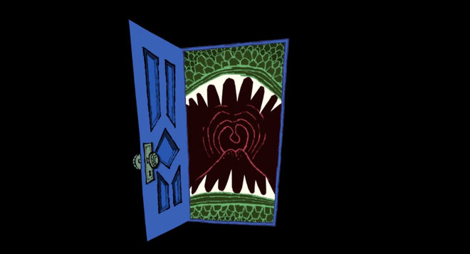
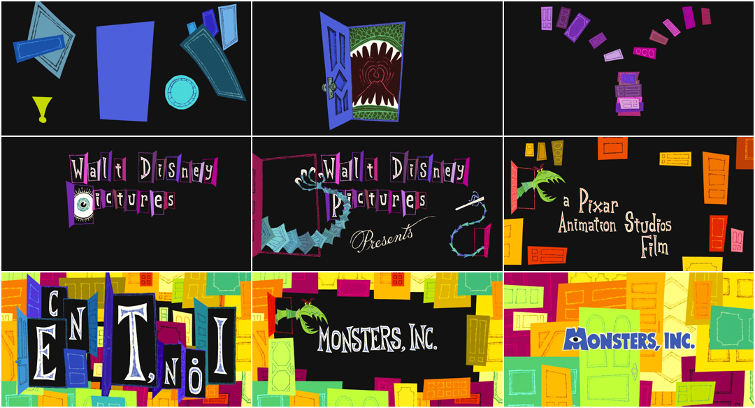
It’s this idea of the door that is the main subject of Title Designer Geefwee Boedoe’s vibrant and graphic opening sequence to the 2001 film directed by Pete Docter, David Silverman, and Lee Unkrich. Shapes bounce and dance in a black void, coming together to form a door, which opens on a closet, and then opens again to reveal a roaring, gaping cartoon mouth. What follows is a ballet of doors, stacking themselves into patterns and spitting out hand-hewn credits, squamous arms and slithering snakes, all set to the jolly and upbeat theme by composer Randy Newman.
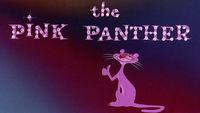
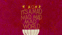
The sequence is reminiscent of classic 2D animated openings for live-action comedies of the 1950s and 1960s like DePatie-Freleng’s work for The Pink Panther (1963) and A Shot in the Dark (1964) or Saul Bass’s work for Around The World in Eighty Days (1956) and It’s A Mad Mad Mad Mad World (1963). Boedoe takes that mid-century graphic approach – normally used to open live-action films – and applies it to Monsters, Inc., a slick, computer-animated comedy. The sequence is charming and organic, the cut-out shapes and hand-drawn lettering bearing an imperfection that is inviting and accessible. It also appears directly after a dark and sinister opening scene, so it not only sets up the proper tone for the film but it dispels any discomfort that young viewers might be experiencing, reinforcing that it is indeed a comedy.
In talking about his work for this film, Randy Newman has said that music “is best at emotional things, at enhancing excitement, enhancing a tender moment.” Often working as an invisible effect, the music in Monsters, Inc. imbues the film with rhythm and warmth, and the opening title sequence offers the first taste of that.
A discussion with Monsters, Inc. Title Designer GEEFWEE BOEDOE.
First of all, thanks for joining me to talk about Monsters, Inc! It's a feature we've wanted to do for a long time. You had a bunch of roles on this film, right?
Geefwee: I was kind of an odd bird. I often wore more than one hat on a project. I worked on that film doing all kinds of pre-production designing. I did story work, I did design work, I did both character designs and environment designs, and then overseeing and designing the title sequence. I often would do storyboards as well. It’s often just called “visual development” or visdev. During the very early pre-production stages was when I actually presented a concept for a title sequence.
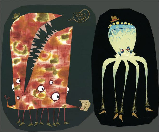
Concept art for Monsters, Inc. characters by Geefwee Boedoe
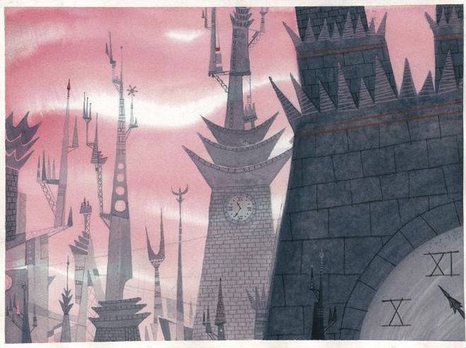
Concept art for Monsters, Inc. environments by Geefwee Boedoe
And that concept was for a 2D title sequence?
Geefwee: Well, my principal style that I work in – when I was at Pixar, all the artwork and the designs, everything I was doing... I never used a computer. I did all my stuff traditionally. I did drawings, I painted, I would cut out stuff in paper and glue it. To me it was more like trying to get designs and stuff that would inspire people later on if they were to build it in the computer, which is a much more time-consuming and labour-intensive process. So I spent my focus more on the concepts and physical designs.
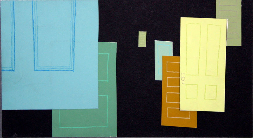
The thought was that the whole film was going to be much more stylized and graphic!
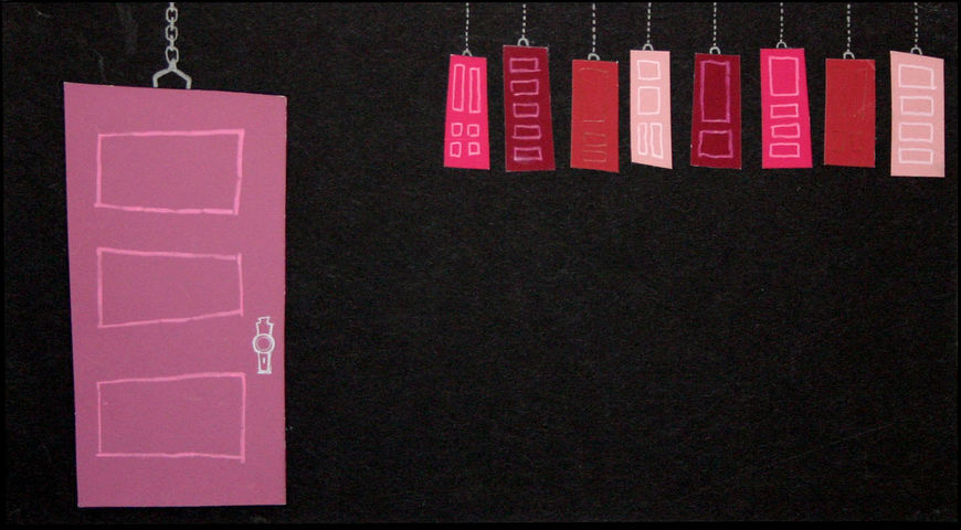
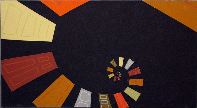
Scans of cut-out paper doors used in the title sequence development
Geefwee: It was during these early stages of it, and – Pete Docter and a small group of us including Harley Jessup and Lou Romano and Ricky Nierva and Ralph Eggleston – we were throwing out all kinds of ideas. This is before there was a script or anything like that. We had kind of an idea but it kept growing and morphing into different things. When there was some downtime I came up with this idea for the title sequence and I made little demos with black paper and coloured paper with little doors that you could actually physically open up in the paper and there would be a drawing or title stuff under the doors. So I made this little concept of this door title sequence.
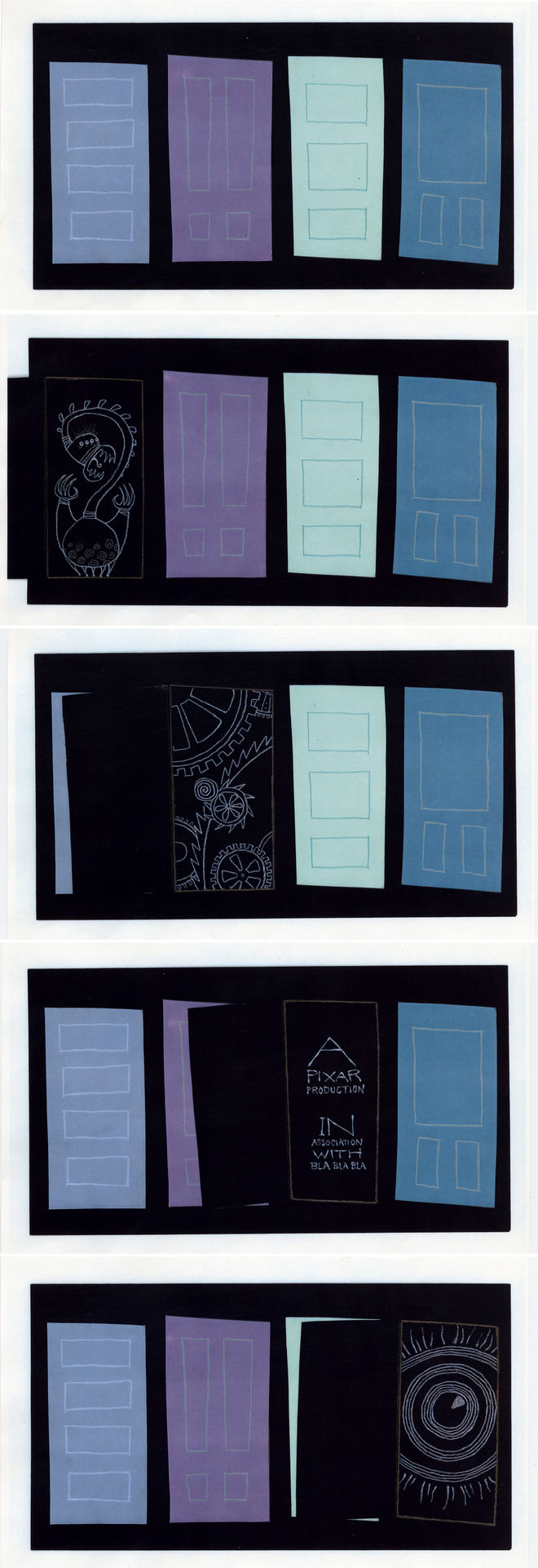
Scans of a title sequence demo made by Geefwee Boedoe, featuring cut-out paper doors, credits lettering, and illustrations
But that was back when we were really wanting to push the film into a much more stylized look. The thought was that the whole film was going to be much more stylized and graphic! Even though it would still be computer animation, the visual style we were going for was going to be different. Eventually that was sort of abandoned – that approach. And they went back to a more standard Pixar look, but I think Pete Docter, in some way, in the back of his head, still had the idea that maybe we could utilize some of that more graphic kind of styling with the title sequence.
I never used a computer. I did all my stuff traditionally. I did drawings, I painted, I would cut out stuff in paper and glue it.
It was something that was forgotten about for a couple of years and then as the film got closer to being released they had a test screening and they found that the way the film was opening – because there was no title sequence – it was just opening straight to this scene in a dark kid’s room, like the film opens now, where it’s the scare chamber or whatever. It’s a false tone opening, because the film isn’t a dark creepy film. But the film started out – without that title sequence – as kind of a false tone. In the test audiences they were seeing kids, young kids and such, shutting down and starting to imbue the film differently because the first impression was that it was gonna be this scary dark thing. They were getting negative reviews of how the film was opening so Pete realized, Oh, this is the perfect chance. Let’s put that title sequence back in there and have a lighter tone to it so we can say, “Oh, this is a comedy!” And then when we go into that scary chamber, the audience is relaxed, and you can move on. It’s setting that first impression.
Right, it eases the discomfort.
Geefwee: Yeah! That was a big part of the title sequence and what was important with it – to try to create that nicer tone. When I did the first take on the title sequence, we put in some temp jazz music. That test piece was shown to Randy Newman, and he was already working on the end song, so he basically took that and he kinda re-orchestrated that for a small jazz ensemble and sped it up so it’s more peppy, so it felt really nice. I listened to that music a thousand times and just really tried to figure out: Oh, which ideas can I use that will actually work well with the music? That was kind of an intense thing.
Was this the first time that Pixar had done a 2D sequence?
Geefwee: Yeah! To my knowledge. I mean, you just don’t see a lot of title sequences in films in general! And like, an upfront sequence too. It really commits to saying: Okay, this is a title sequence and it’s actually part of the movie. My thing with a back-end title sequence is it already feels like, “Well, the movie’s done, but okay, you can have a little thing at the end.” It doesn’t carry the same weight at all as an upfront title sequence. So it was quite a commitment! [laughs]
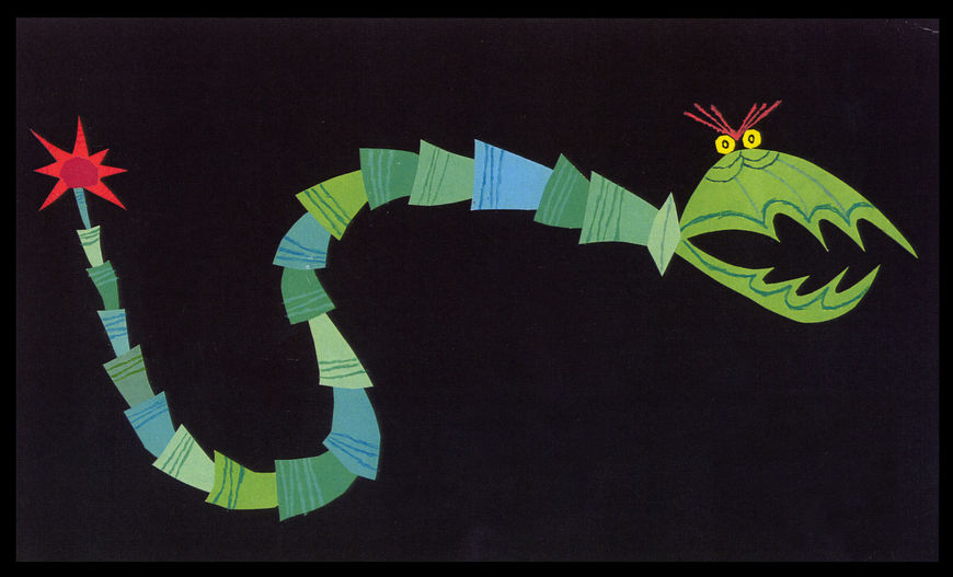
The paper snake from the title sequence, designed by Geefwee Boedoe
Geefwee: And the most ironic thing – usually when you think of a title sequence it’s got titles! [laughs] It’s got credits and stuff! But in this one all they really wanted was that it just basically says: “Disney Presents... A Pixar Film... Monsters, Inc.” Instead of having to have all the actors' names and such, I really just could have fun with the visuals and segue just those three things. The Disney, the Pixar, and then the Monsters Inc, and kinda spread that out and make it like a little story within itself.
I heard that the first version of the sequence you created was black and white?
Geefwee: I did do it with starting off with black-and-white lines. The actual artwork that I created for a lot of the doors and almost all of the characters and everything I still did it traditionally. Meaning, I did it with cut-out paper with pencil lines. And that stuff actually was in black and white!
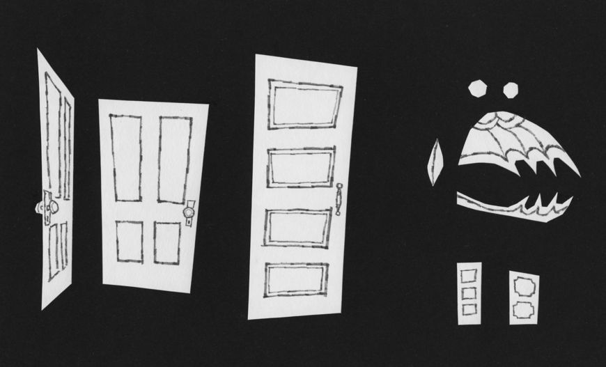
Cut-out paper doors and parts of the snake monster designed by Geefwee Boedoe
Geefwee: Then we took those cut-outs with the pencil lines and we scanned those in. Then in Photoshop and After Effects we coloured them and we animated them. You scan ‘em in and you basically cut ‘em into a reel with the music.
It was taking the traditional 2D elements – even though they were initially created in the real world – they eventually did go digital. It was a hybrid, you could say. A hybrid between cut-out animation versus digital – so it’s sort of a digital cut-out approach. It was the first time Pixar had ever used off-the-shelf software. Everything that they usually do is with their own proprietary stuff. That was an usual one because yeah, we did it on a Mac with After Effects and Photoshop!
So that was the first time After Effects was used in a finished Pixar feature?
Geefwee: Yeah! To my knowledge, it was.
It was the first time Pixar had ever used off-the-shelf software.
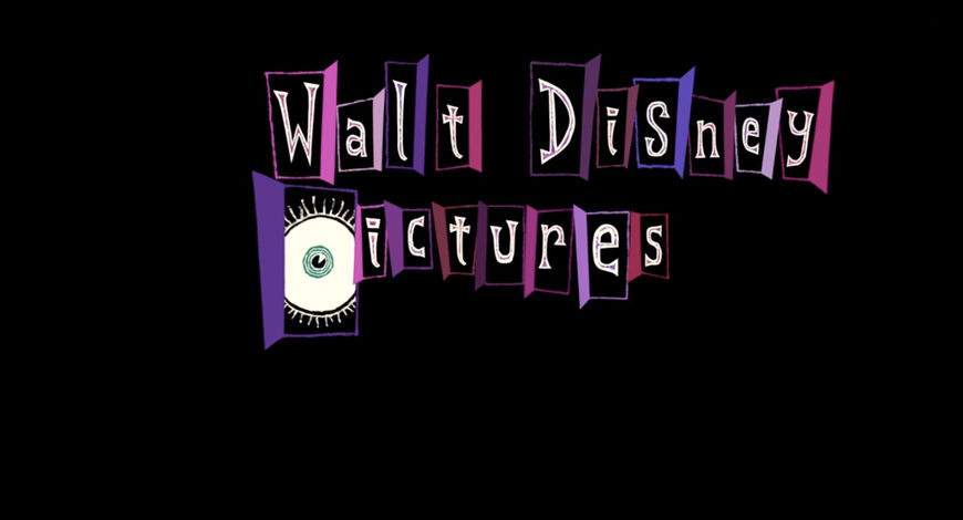
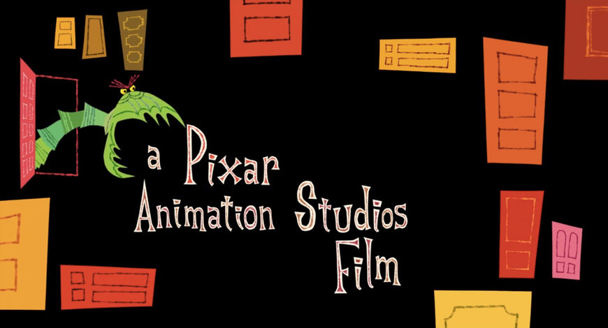
Stills from the title sequence featuring the Disney and Pixar credits
You mentioned that the team gravitated towards a very graphic look for the film initially, but it only remained in the title sequence. Is that midcentury aesthetic something that you personally gravitate towards?
Geefwee: [laughs] Yeah, it is! It was something that, like I said, when Monsters, Inc. was first started we were all wanting to go with a more mid-century modern graphic sensibility. It was kind of a highwater mark in terms of graphic design, you know, during the ‘50s, ’60s kind of thing.
Certainly for title design!
Geefwee: Yeah! And there was all kinds of great record album covers and poster art, but certainly in titles as well. So the idea was to try to really capture that but, you know, it’s not like I sat down with a book, trying to copy something, but I have a lot of influences within the mid-century modern world already. It wasn’t too big of a leap for me to make! [laughs]
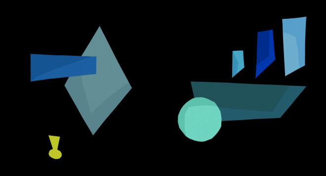
Still from the title sequence featuring mid-century-style shapes
You see it again a little bit in that short, Mike’s New Car, right?
Geefwee: Yeah! [laughs] That was just a one-off little title blurb for that. That was done fairly close after [Monsters, Inc.], you know? They definitely wanted to keep a similar aesthetic going.
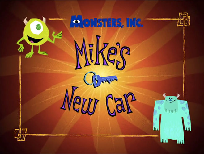
Title card from animated short film Mike's New Car (2002), designed by Geefwee Boedoe
As for the end sequence of Monsters, Inc., how did you work with Susan Bradley? She designed the end titles for that one.
Geefwee: Yeah! That was Susan Bradley. For the opening title sequence I actually designed the font. I pretty much designed everything from scratch for the title sequence. I had to create that font that I was using. So Susan Bradley, when she saw that, she said, “Oh, if you just fill out…” – because by having to do the lettering for that, I almost created a whole alphabet. There were just a few missing letters – so Susan asked me if I could actually fill it out and then she would take that and turn it into an official font. So she used that.
And then I gave her specific graphics and such to use at the back end. So she composed it and did the crawl and all that, but all of the main headers are in my font that I had created for her, and then the graphics in the back end are also all from me.
Monsters, Inc. end title sequence, designed by Susan Bradley and featuring illustrations and typeface design by Geefwee Boedoe
Speaking of type, it’s nice how in the beginning you have that really organic-looking lettering, but then it morphs into that heavyset modern style.
Geefwee: Oh! Yes! And that’s right at the end of it, like where the snake’s tail kind of hits it and then it looks a little bit more like the actual poster logotype. Yeah. If you notice, though, even when it morphs into that modern style it still is actually hand-done. It isn’t the perfect computer one. I really wanted to make sure that even though it looks sort of like the other one it still felt more organic and still had that hand-hewn approach.
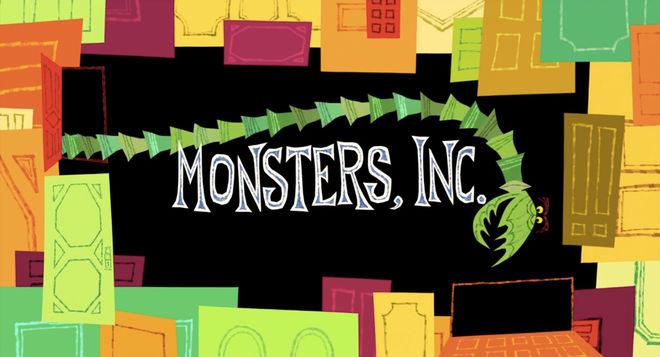
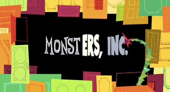
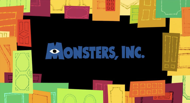
Stills from the Monsters, Inc. title sequence from when the paper snake's tail hits the title, transforming it into a hand-drawn version of the official logotype
When the movie finally came out, did you go see it in theatres? What was it like seeing it all together for the first time?
Geefwee: Oh certainly! It was fun to see it when we have the big wrap party. And then I did see it another time in a pay-for-it theater and such. The nicest thing was hearing the audience reaction. I could see that people were actually enjoying it.
To me, Monsters, Inc. was a nice moment where it felt like… it was like the planets aligning for me. I was able to get something that I could really sink my teeth into and claim for myself. But also to be a part of a team process. When I look at the title sequence I can still say, “Oh, that is something that I designed,” instead of saying, “Oh, there’s 10% of the nose on that character that I designed.” Things often go through such a process that you lose your own voice, but with Monsters, Inc. I felt like I could stay true to my own voice a little more.
Was Monsters, Inc. the only title sequence you’ve made?
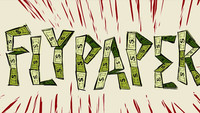
Geefwee: I actually did another title sequence for a very small independent film back in 2010. It’s called Flypaper. It was directed by Rob Minkoff. It was sort of a comedy-suspense-drama and it was super low-budget. I don’t know where it was even shown in theatres, but I did a title sequence for that.
Flypaper (2011) main title sequence, designed by Geefwee Boedoe with music by John Swihart
Geefwee: The funny thing with it was that we had such a low budget and so little time that I made a temp animatic to show what they wanted – to block out what the title sequence was gonna be – and they got that and they said, “Great! We’ll use it!” I was like, “What? No! Wait! That’s a temporary thing!” [laughs] I did get to go back and they gave me one week to finesse the temporary thing. It was rather odd.
Do you have personal favourite title sequences?
Geefwee: Ah, personal! Yeah… that’s a good question! [laughs] I’ve always enjoyed title sequences in front of films. To answer this in a long convoluted way: I remember seeing some animated title sequences as a child that were in front of like, live-action films…
The Pink Panther, perhaps?
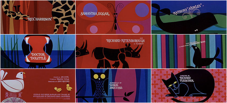
Geefwee: It might’ve been The Pink Panther… There are a number of them that have really graphic title sequences. Like Doctor Dolittle, with all those graphic images? So, to me, when I saw those, and then the film would start, I was always disappointed! [laughs] I want the title sequence to keep going! I was always like, “Aww, now it turned into real!” I don’t want to see real stuff.
Doctor Dolittle (1967) main title sequence, designed by Don Record
It’s funny because that feeling was so common – people were so disappointed – that The Pink Panther got his own show.
Geefwee: Oh right, when they turned it into an animated cartoon! Which is funny! [laughs] That’s funny. Usually that doesn’t happen!
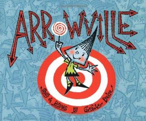
Arrowville, the children's book written and illustrated by Geefwee Boedoe
And what are you working on these days?
Geefwee: I’m working on a lot of little projects. I still do freelance for some of the bigger studios and it’s mostly visual development. I’m working on some more children’s books. I’ve got one published and I’m working on a few other ones. I’m also working on some independent short animated films. I prefer shorter length stuff these days.
Do you teach?
Geefwee: Oh, yes, I actually did start about a year ago, at the California College of the Arts, so now I am teaching as well. I’m doing character design and also teaching a senior project class which involves helping students make their films. It’s all stuff I know very well.
