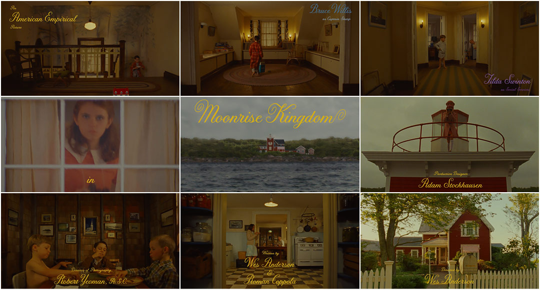
The opening sequence to Wes Anderson's Moonrise Kingdom is a gorgeously intricate, moody, and playful introduction to a family apart.
The boys kick it off by playing a record featuring the theme from The Young Person's Guide to the Orchestra, a narrated introduction to various families of instruments. Simultaneously, the camera pans around the dollhouse-like set, establishing the characters as the elements form a rhythmic symmetry. We take turns peering in at the boys, their mother, their father, their sister Suzy and her binoculars, rinse, repeat – everyone under the same roof but in their own little worlds. Suzy’s unrelenting binocular gaze mirrors our curiosity back at us in a recurring nod to great Canadian painter Alex Colville and his work To Prince Edward Island (1965). Suzy is the only one looking out of the house, at something in the distance, at us, while we're looking at her.
The meticulous framing and attention to detail is evident in every aspect of the film, from Robert D. Yeoman’s cinematography, to Kris Moran’s set decoration, right down to the typography designed by Jessica Hische. This elegant and warm lettering features graceful curves and friendly swashes that ultimately became a large part of the film’s distinct identity. Though grounded in a refined typographic tradition, the credits of the main cast alternate from yellow to an array of bright colours, giving the lettering an air of modernity and mischief.
We chat with Jessica Hische about her influences, her process, and how a simple type design project became something much bigger.
A discussion with letterer, illustrator, and Moonrise Kingdom title designer, JESSICA HISCHE.
Tell us a little about yourself and how you got involved with this project.
I am mostly a letterer and occasional type designer. When I got hired for the Moonrise Kingdom project, it was primarily for lettering and then some type design for the end credits.
I was contacted by Molly Cooper, one of the co-producers on the film and someone who has worked with Wes on a few of his titles. The initial conversation was super casual. The tone of the email was kind of like, “Hey, Jessica. Not sure if you know us, but...” It was amazing that they reached out in this very nonchalant way. They said they were working on the titles for Wes’s upcoming film and they wanted to see if I was interested in doing some tests for it. I was elated and happy to do it. They paid a tiny sum to get me to do some tests to see if I could get on the same page as them and we could work together. After a few rounds, it seemed like it was going to work out, so they hired me officially.
Were you a fan of Wes Anderson’s films previously?
Oh yeah, of course. I think it’s impossible to be a creative person and not be at least inspired by the art direction and set design of his films. He’s definitely one of my favorite directors. It was one of those projects that seemed like it was too good to be true. So, pretty much up until the Apple trailer launched I didn’t really believe that my work was going to be used! You know, that’s how things sometimes go.
I have so much respect for Wes and his work. I’ve heard that he has a hand in absolutely every part of his films. For me, this was not an issue whatsoever and I was happy that we could work together, that I could be the one to help him visualize what he had in his head for these titles. It’s very rare that you get to work on a project where, when people are requesting changes or revisions, you just 100% trust them. It made all the extra rounds that we got into not feel like a big deal because I knew that he was asking for them because he was as much a perfectionist as I was.
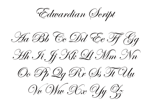
Edwardian Script ITC alphabet
I read somewhere that you started off basing the lettering on Edwardian Script, is that right?
The very first sketch that we did was based on Edwardian. At first, Molly was my communicator with Wes since he was busy with post-production. She would contact me and say, "Wes really likes [Edwardian], but he thinks it’s too formal and that it’s not going to work well on smaller screens. What could you do with this as a starting point?" Of course, it had to be closely related to the film – which I hadn’t seen! I hadn’t seen any previews or read the script. I only knew what was available to the public. That ended up being very good, because it made me trust the direction that was coming at me more. I didn’t have my own basis to jump from.
So, we started from Edwardian, but after a few tries with it – doing a less formal version, a thick or thin, a mono-weight – it was still too formal, there was something missing. Then, after a week or something, Wes came back with the titles from a Claude Chabrol film.
Oh, was it La Femme Infidèle?
Yeah! La Femme Infidèle.
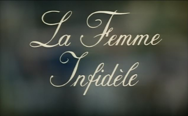
Title card of La Femme Infidèle (1969) directed by Claude Chabrol
He had seen those and said, “This is more along the lines of what we want. What if we did these in your style, made it feel more ’60s American rather than ’40s French?” To me, that was really fun because if you think about New England in the ’60s... it’s not like most places would be staying on top of the most current trends in type, using typefaces that were released that very year. So, using something from the ’40s made sense to me. If you think about a small, conservative New England town, lord knows all the printers and designers in town are probably still using type from years ago. I think when people think about historical type references, they often don’t think about that. You should be reaching from that time period to 15 - 20 years earlier and then you’ll be getting stuff that’s quote-unquote “current.”
Right, it takes people so long to catch up.
Exactly, and at that point, type was so expensive. It’s not like now, when you pay $25 and you get a new typeface in an instant. You had to buy all the sets of everything.
With that new direction in mind, how many different iterations did you go through?
Oh, I don’t even know – hundreds! Haha. It was less iterations on the style as a whole and more like, micro-changes. Certain letters got a lot more love than others. Wes’s favorite letter to criticize was the capital F and maybe, I think, the lowercase ‘r’ went through a lot of rounds.
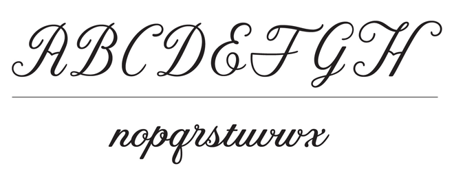
Example upper and lowercase letters from the final Moonrise Kingdom alphabet
A swash is a typographical flourish on a glyph, such as an exaggerated serif or terminal. Read more about swashes and type anatomy.
I really like how the caps turned out. I feel like it has a really good personality to it and not too much swashiness. It feels really classic and also down to earth, somehow.
How was the color yellow chosen?
The color was totally up to them. I had no idea that they were going to use these awesome, crazy, pastel colors. If you look at the end credits on the film, it’s so colorful with all kinds of motion, with things flying out of the screen. I had no idea it would look like that until I saw it on the big screen myself! So I pretty much just set the front credits so I could make sure that everything was set well and handed over the typefaces for the end credits and for promotional stuff.
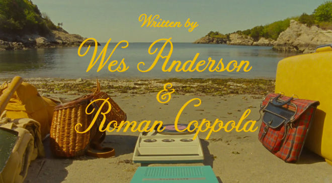
Trailer typography
But ultimately, your type work determined the branding of the film, right?
Definitely. They originally planned to find a typeface that worked well with what I’d created, for the promo stuff. The display version wasn’t part of the contract. So I said, let me take an extra couple of weeks to put that together. We have so much of the alphabet already, we might as well fill it on out!
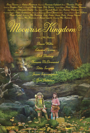
Moonrise Kingdom poster
And is that typeface something that we’ll see released commercially at some point?
I’m technically allowed to now, but making a typeface for a small group of creatives working on films is different than making a typeface that you can release commercially – I can’t tell all humans that buy my typeface, “Oh, hold on, you don’t have Opentype features enabled!” [laughs] So, I’m working with Font Bureau on finalizing it so we can make it as good as possible for everyone, regardless of them having the latest software.
In terms of title sequences, was this your first?
Yep! My first.
Do you think you’d like to do more?
I would love to, but I think it would be hard to find a process as lovely as this one was. I think it would feel way more like a “client job,” haha, versus this one, which felt more like a labour of love. And I’m sure you know – anybody that’s a designer knows – generally when you’re doing work for “cool” industries, you’re not exactly raking in the dough. It would be harder to take on a lower budget project when you don’t feel as connected to its content.
Moonrise Kingdom end credits, animated by Collider.
What are some of your favorite titles?
I think every designer likes the Catch Me If You Can sequence – all the fun references in there. I really liked all the calligraphy in the recent Sherlock Holmes films. I just love when people use calligraphy, because I’m not a calligrapher myself and I admire it so much. I really like it when they get their time in the sun.
If you could choose another director to work with, who would you pick?
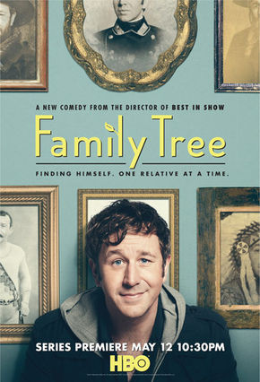
Family Tree poster
I got to work recently with Christopher Guest on his new HBO series Family Tree, which was really fun. I got to go down there and meet with them, read the scripts for the show, with Christopher Guest randomly popping in.
I did the logotype for them and then did some advising for typefaces they could purchase to set all the titles. The deadline was really tight – a much smaller project than Moonrise Kingdom. So, that was great, and that was another thing that was completely unexpected. I love Christopher Guest, so it was really fun. Any sort of situation like that, I would welcome.
I think Quentin Tarantino would be up there on my would-like-to-work-with list. Though I don’t know if he would do anything in my realm of art anytime soon, haha.
Support for Art of the Title comes from


