Title Designer RANDALL BALSMEYER of Balsmeyer & Everett (now Big Film Design) speaks about the Naked Lunch title sequence in this excerpt from our Dead Ringers article.
What can you tell us about the production of the Naked Lunch title sequence?
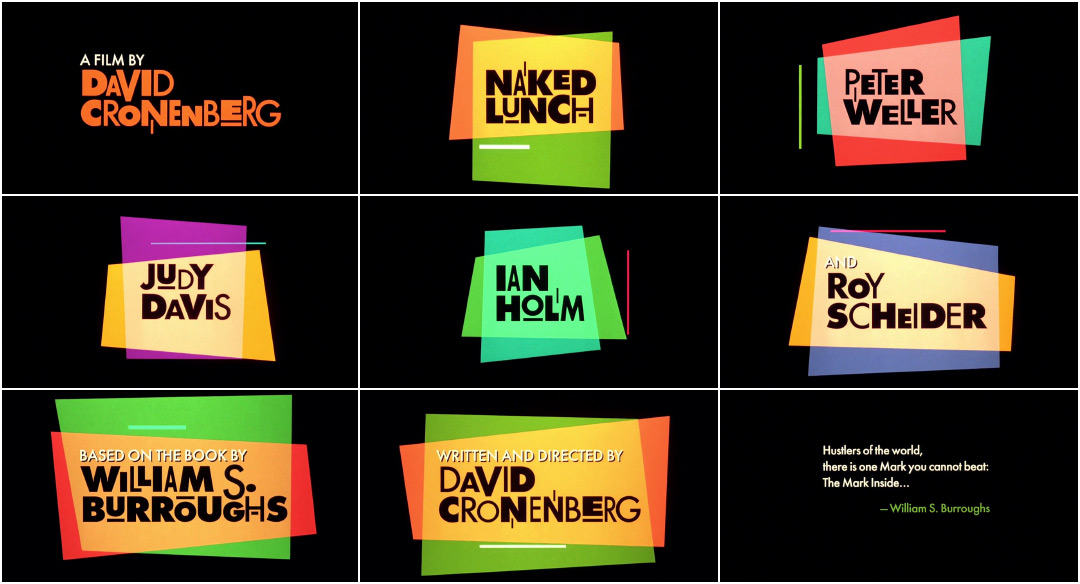
Randy: Naked Lunch was a very frustrating project with a happy ending. When you love somebody as much as we love David [Cronenberg], when he asks you to do something, you want to come to him with something really huge and elaborate, and we tried.
What were some of your initial concepts?
Randy: I remember stuff like printing pictures of Eisenhower and the atom bomb on canvas, and making this kind of pop art that had all this history and symbolism in it. We made two or three trips up to Toronto with storyboarded sequences in that general nature, like really content-laden, elaborate texture and style, and each time, he'd kind of go, “Hmm, I'm not feeling it.” We were crushed, you know?
I don't even know where it came from but someone had done a Naked Lunch logo for the crew hats and things like that, which looks like the title of the film. At a certain point, I went, you know what? That's really cool. Let's just run with that and make three shapes and some little abstract lines, let's go the other direction completely. Let's go abstract, no content, no message, no information at all, and just let it be a mood piece. David liked it.
Then it just became a really interesting exercise in colour theory about what do colours do when they combine, which was a very fun testing process.
It’s funny where inspiration can come from! So the sequence was inspired by a logo on the crew hat, but how was it actually shot and assembled?
Randy: The final title sequence was shot on our animation–motion-control camera. The names were all shot onto hi-con black-and-white film. That film was developed and put back into the camera as a bi-pack roll, that would hold out the names while the colour shapes were shot. The shape art was all black tape and construction paper on clear animation cels, backlit with colour gels underneath. Each colour shape was shot separately, winding the film back in the camera for the overlaps. So two rolls of film passed through the camera simultaneously: the matte roll and the unexposed colour film. The third colours were a result of the shapes “adding” to each other, which we had tested extensively prior to the final shoot. Once the colours were exposed, the matte roll was removed from the camera, and we made another pass to expose the white titles.
Randy: I always thought the cool part of this sequence is how the names are only revealed by the presence of the colour panels. It’s like they are there all the time but hiding!
Title Design: Balsmeyer & Everett, Inc.
Title Designers: Randall Balsmeyer, Mimi Everett
Music: Howard Shore, Ornette Coleman

