It will be yours... It will be yours...
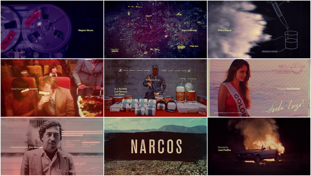
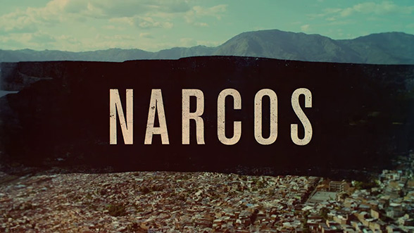
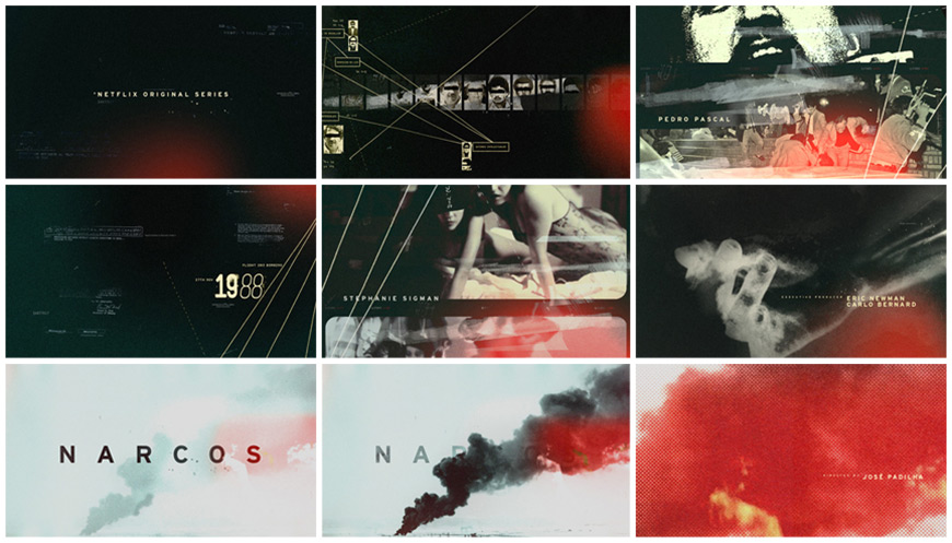
The solemn promise of Rodrigo Amarante’s "Tuyo" grounds Digital Kitchen’s pitch-perfect introduction to the Netflix crime saga Narcos. The title sequence is our passport into the sordid, seductive world of Colombian drug lord Pablo Escobar, offering a tantalizing glimpse at the life of the notorious "King of Cocaine" and a peek inside the international effort to bring down his multi-billion dollar enterprise. The opening is also the story of cocaine itself – the narcotic that built Escobar’s empire – and the wealth, power, glamour, violence, and death that always seems to accompany it. Hero to some, villain to many more, the effects of Escobar’s reign are still felt to this day, making the opening feel all the more relevant and vital.
Created by DK’s Los Angeles studio, the Narcos opener is a brilliant blend of past and present, combining archival photos and footage – some taken by Escobar’s actual family photographer "El Chino" – with a clean, sans-serif typeface and recreations of early ’80s espionage and excess. Capped off with stunning aerial shots of Bogotá and a portentous burning automobile, Amarante’s stirring ballad plays on, promising more and more and more.
A discussion with Creative Director TOM O'NEILL at Digital Kitchen.
Give us a little background on yourself. You're from Australia, but you moved to LA in 2009, right?
Tom: I basically arrived completely fresh-faced here in Los Angeles. I'd worked in Sydney as a motion graphics guy, but my background was in product design. I was an industrial designer and I switched over to graphic design and motion graphics. So when I arrived in LA I freelanced with a lot of shops, just art directing and animating, designing here in the area and I eventually caught the eye of a director I worked with at The Mill, Paul McMenamin. I was there for about four years. I did motion graphics for the MTV VMAs there and the 2012 Oscars package as well, but didn't really do any title work. Then about one-and-a-half years ago, I switched over to Digital Kitchen to focus on more traditional design work. That's how I got to DK.
So how did Digital Kitchen get involved with Narcos?
Tom: So Chris Brancato, one of the creators, Eric Newman, executive producer, and José Padilha, producer and director, came to DK and they gave us the full lowdown on the series. We chatted about a bunch of stuff, from Gabriel García Márquez, to the music of the time, to magical realism and particularly about colour. We listened to the title track.
Narcos (2015) season one trailer
We took that back with us and we pitched a range of looks. We covered some of the more violent, bloody aspects of it. One thing that I wanted to really focus on was getting away from the traditional tropes of narco culture. Talking with the guys and really understanding Colombian culture and some of the more bizarre aspects of Pablo Escobar's rise really gave us an awesome footing for ideation. We did a huge amount of research.
There's a book by James Mollison called The Memory of Pablo Escobar which is one of the first things that caught our eye. It has pictures of ephemera from the time, guns hidden in bibles and all this other stuff, and it's just a fantastic book.
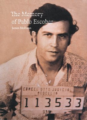
The Memory of Pablo Escobar by James Mollison
And then Escobar set the tone for the brutality that followed. I don't think anyone has matched his level of power there. When you investigate the history of it and get to understand Colombia at the time, you realize that people – particularly the poor – tended to idolize him as some sort of folk hero.
Almost a Robin Hood-type.
Tom: Exactly, but on the flipside he was incredibly brutal. So we wanted to skirt around and through all of those various issues. It was more about painting the story of cocaine, so in the pitch phase we wanted to show the arc of the American involvement; the old school surveillance, the computer equipment, all the offices. It was the era of the readily available flights so that's why we had the interior of the plane and various other things, the trafficking all came into it.
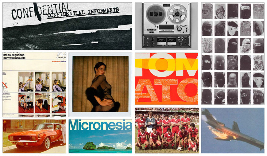
Visual reference material
If you had to describe the concept in an elevator pitch format, really quick, how would you describe it?
Tom: It's a story of the rise of narco trafficking and America's cultural and political involvement there. The story begins at the end of Escobar's reign so we intentionally wanted to leave the ending ambiguous.
How much did you know about Pablo Escobar and the situation before starting out?
Tom: I think I held a lot of basic stereotypical thoughts about that time. I understood some of the turmoil of the time – the contras and all of the various kinds of guerrilla warfare that was going on, but I wasn't really aware of the specifics of Escobar himself. Delving into it, it was incredibly interesting. The rise of Colombian soccer could pretty much be single-handedly attributed to the money that was injected from narco trafficking, and Miami basically wouldn't be Miami without Pablo. So I learned a lot of incredibly interesting political and historical facts.
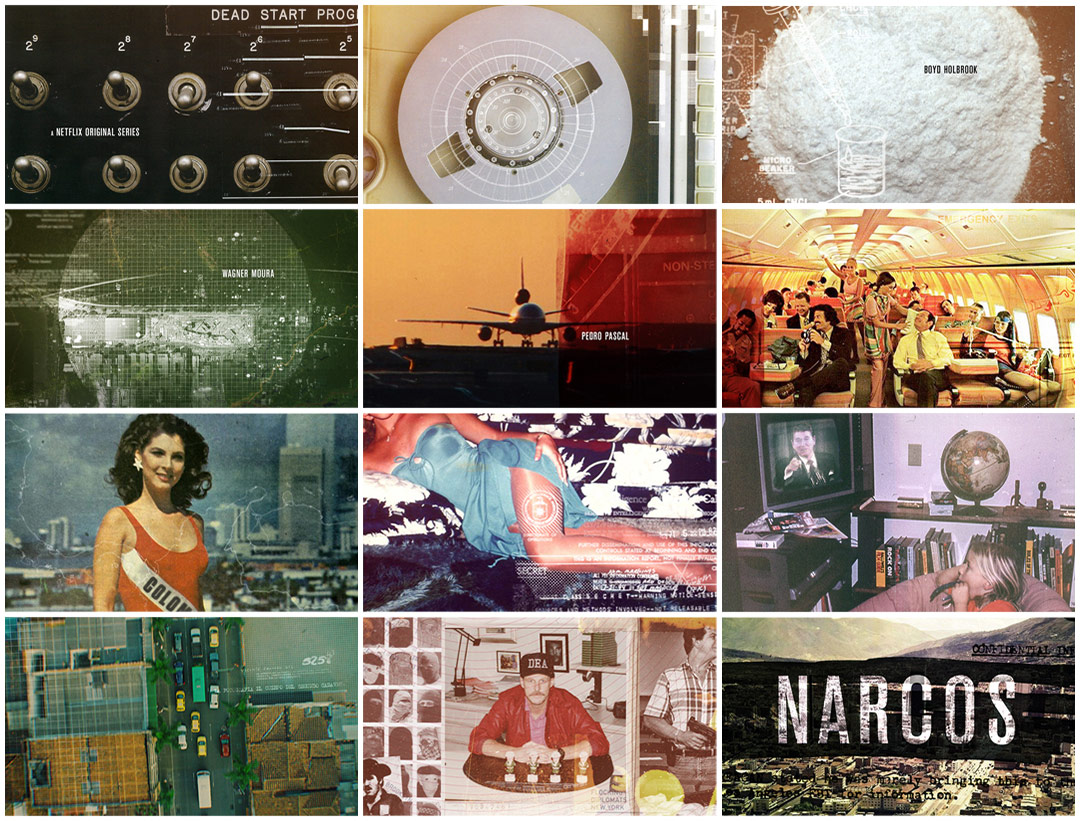
Image Set: Narcos final design boards
You mentioned some photos in James Mollison’s book. How did you go about accumulating photography and footage in general?
Tom: The research experience in itself is a whole other story! El Chino, who was Pablo Escobar's personal photographer, is one part of that story. We had a production team in Colombia, I went to Bogotá as well, and they were on the ground dealing with various people who had dealt with Escobar. El Chino was his personal family photographer and some of the photographs in the book were of Escobar’s personal zoo. Those were the ones that really attracted us to El Chino's photography and led us to reach out to him.
It was a very interesting process. One issue that really fazed us was that we were delivering in 4K but a lot of this stuff was archival. When it came to El Chino’s stuff, there were obviously photographs that were bigger but we were pulling from film archives, here and in Colombia. It was an incredibly long process to find a lot of the imagery and once we had it, then, of course, legally there were a lot of contentious issues, shall we say, over people not wanting to appear in photographs.
For instance, sporting teams did not want to appear in photographs. So we had to be very cautious about what was shown and in many cases we had to pull imagery from the sequence due to various issues… There was a shot at the end of Pablo and his son standing in front of the White House. It was amazing, but it was taken out for legal reasons.
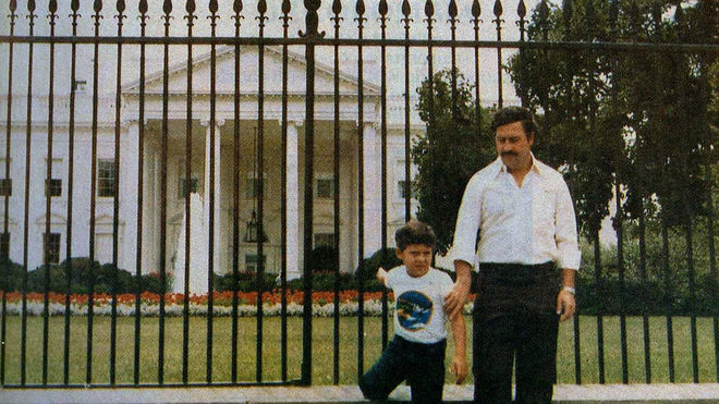
Pablo Escobar (right) and his son in front of the White House in the 1980s, from Nicolas Entel's 2009 documentary Sins of my Father.
Overall that process was an interesting one. It's the first time that we've ever paid for footage cash-in-hand.
Oh, really?
Tom: Yeah. Some of El Chino's stuff in what we call the "Hacienda Section" – the zoo section which comes after the girls – and that first shot of the gateway to Escobar’s hacienda is actually a photograph, but we projection-mapped and turned it into a sort of home video feel. That moment there was the trying to recreate the vibe that El Chino had in his very intimate photographs.
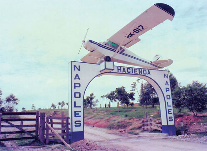
Original photograph of Pablo Escobar's estate, Hacienda Nápoles

Image Set: Creating the Hacienda Nápoles entrance shot in Adobe After Effects (left) and Maxon Cinema 4D (right)
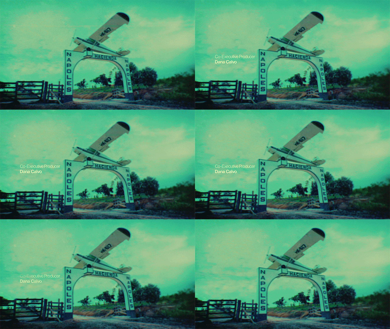
The final two-second Hacienda entrance shot
And you know, for the most part his photos are not particularly artistically relevant or particularly well framed but they capture this very different side. You saw a lot of Escobar’s henchmen, you saw a lot of these almost children that were working for him, and so it gave a very good insight into the inner workings and the background, the reality of who he was.
How was the shoot in Colombia? Which parts of the sequence were shot there?
Tom: The shoot in Bogotá coincided with the piece we produced for the show teaser. We picked up high-speed cocaine footage shot on Phantom Flex 4K in conjunction with character vignettes that we were shooting for the teaser, the aerial shots of Medellin for the surveillance bird’s-eye view and the descent shot that was used in the show title card at the end, as well as the shot of the burning car. All were shot in 5K Red Epic. One of the great luxuries of designing the sequence was visiting the set for reference. Items such as the aerial photography, surveillance, and overlays used in the sequence were strongly influenced by the visit.
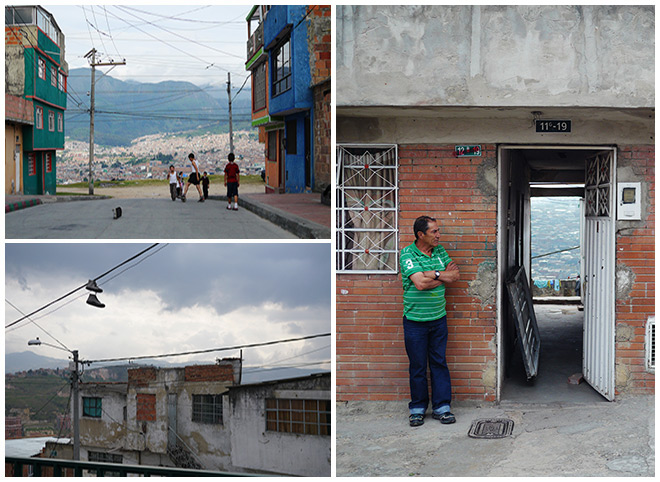
Image Set: Reference photos taken in Bogotá, Colombia
The photos of locals were taken in the La Resurrección area, near a chapel in the outlying mountainous areas of Bogotá. The colour patchwork and chaos of the city was truly an inspiration.
What elements did you end up creating for the live-action shoot?
Tom: So a lot of the front-end switch work, the real surreal stuff, the girls, were shot 4K, on a Black Magic I think. We had an extensive casting process to get the right feel, so we have sort of a Miami girl (Rachel Eileen) and then we had the Colombian beauty queen. We actually looked into a lot of pageants from the ’70s to find the right look. We wanted this bombastic, big ’70s kind of hair. The girl we ended up getting, Oralia Cortes, was actually a Mexican beauty queen.
We also shot some high-speed cocaine footage, a few other pickups, the money, the hands, the cocaine jumping across the screen, which we called our "Cocaine Dance Section". We built all the bricks of cocaine for the shot of the federales-slash-Pepe standing in front of the stash. That was recreated from a real historical image. We built all of the coffee cans from scratch and filled them up with baking powder.
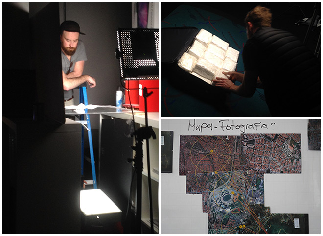
Image Set: Behind-the-scenes production photos
How did you shoot those giant piles of money and pounds of fake drugs? That's not something you want to get pulled over with on the way to the shoot...
Tom: Yeah! For the money we had to find original ’80s hundred and twenty dollar bills. There's some contention around showing money in film as well, so we had to be a little cautious about how we showed it. Then obviously when we were purchasing pound upon pound upon pound of baking soda from the local store and that raised a few eyebrows [laughs].
[laughs] That's hilarious! And how did you create the shot of the burning car at the end?
Tom: That's from the actual show. They blow up the car and you see a side profile of them firing a missile for fun. The car was something that I wanted in there from the start as this ominous symbol of the coming drama. We had to extensively comp that shot, that was a day-to-night shot. The smoke and fire coming off the top of the car had to be completely recreated. That shot is almost completely different from the original since we had to extend the set – we had to go a lot wider than the shot was framed.
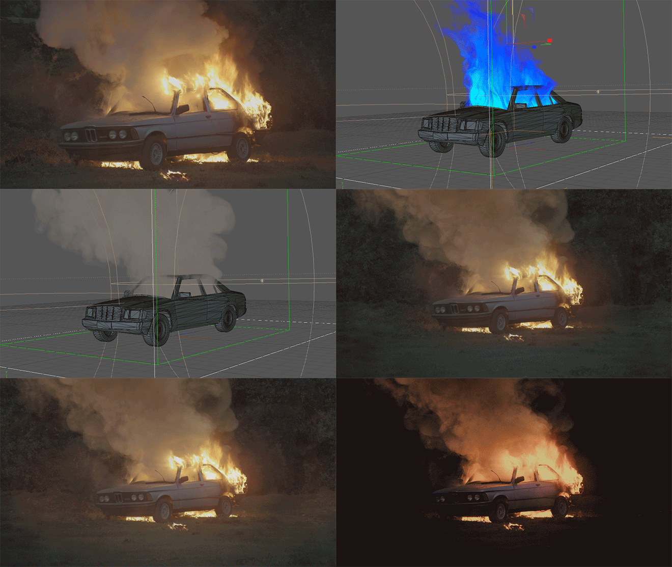
Animated VFX breakdown of the burning car scene
What about the music? How early in the process did you get the title track?
Tom: We got that early in the process. It's an amazing song – “Tuyo” by Rodrigo Amarante. It made the process of making the title a lot easier. Sometimes the music can be contentious right up to the last point and it creates a very difficult scenario where you're cutting without the correct track and then you're trying to figure out what the tone is.
Right. And the typography? How did you choose that?
Tom: We chose the recently “remastered" Neue Haas Grotesk. Early on I decided that Helvetica was the best fit.
Check out the Pan Am brand redesign work by Chermayeff & Geismar from the early 1970s here.
During our concepting phase I took a lot of inspiration from Pan Am’s modernization and rebrand during the 1970s, where they switched to using Helvetica on their travel brochures. I loved the quality of the printing, the reversed-out type and the saturation of the images. With the international travel and the rise of trafficking. I really wanted to create something of a historical document for the sequence. We tried a bunch of options and we all said “Oh no, not Helvetica,” but it really was the appropriate choice. Hat tip to David Badounts who suggested the original, Neue Haas! It’s a subtle difference, but it helped make the typesetting a little more special.
Unused alternate concept
How big was the production team on this project?
Tom: Very small. It was myself, Josh Smith, our CG lead, Nik Kleverov, our editor. David Badounts, a collaborator and freelancer, Paul Makowski, our producer, Cynthia Biamon and Erica Coates, our EPs, and then we had a junior, Harshit Desai, on the side who was helping with production design. He built all of our bricks of cocaine, amongst many other things.
What tools and software did you use to put all this together?
Tom: It was all After Effects and Cinema 4D!
Was there anything that really took you by surprise when you were working on the sequence?
Tom: The main thing that took me surprise was the difficulty in obtaining some of the shots, particularly that interior shot of the plane. We had pitched this slightly campy, very saturated imagery of some marketing material for probably Avianca, the Colombian airline, and it took us three-and-a-half months of constant research in order to find that shot in an archive. I don't know how many shots we went through that just didn't work until we found the one that’s in there, right toward the end of production. I knew it would be difficult finding these perfect archival images but that one in particular was the most surprising in terms of the amount of research and time it took to find.

Narcos title sequence airplane scene concept (left) and final execution (right)
I really love that plane interior shot. I love the transition, the colour, the warmth. It's very much of the period and so that for me is my favourite. That came from Boeing, actually. They dug through their archives to find that. So all those people on the plane are actually Boeing employees. That tracking was in there and it was very shaky so we had to stabilize it. We had to freezeframe heads, we had to mask people's faces. I was always very adamant that it had to be there.
What's inspiring to you from a title design standpoint? What are some of your personal favourite title sequences?
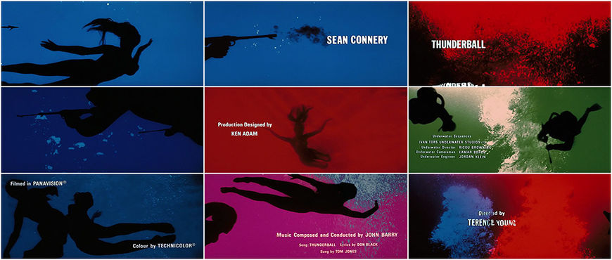
Tom: All the Maurice Binder stuff for Bond, definitely! This is before the age of the Internet and as a young boy, those title sequences were pretty controlling. Thunderball is one of the ones that stuck out in my mind. The one with girls swimming on the water, that piqued my interest early. I was really obsessed with them!
Thunderball (1965) title sequence designed by Maurice Binder
And then also the Lardani stuff, the Spaghetti Western stuff. The Good, The Bad and The Ugly. I just loved that bold colour. That would be one for sure, from the older era, and then Thunderball.
My favourite main title from recent history... It's hard to pick one! I know all of the people who made them and I don't want to be responsible for calling out certain ones! I have to go with Delicatessen.
What excites you outside of design and filmmaking?
Tom: Art and music are two of my real great loves in life and I think music has driven a lot of the design work that I have done. Music is probably my primary creative inspiration outside of the visual art, but I really like to take inspiration from everywhere. My background coming from a variety of design gives me a subtle unique approach to how I look at these things because I haven't come from a very traditional graphic design background. I think that this particular job was one of those ones where it was quite certain to be able to do that. I love the historical aspect, I love the research aspect, and so those things were incredibly inspirational in this particular sequence.
Support for Art of the Title comes from

CINEMA 4D BY MAXON
Featuring an Unmatched Live 3D Pipeline with Adobe After Effects CC

