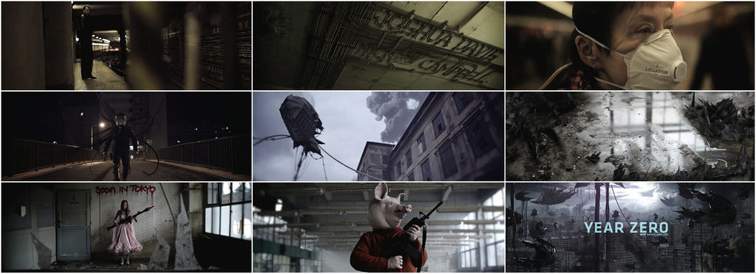
Riot police patrol the streets. An infection spreads. Unrest reigns. The malformed offspring of a broken generation roam in gangs.
Mischa Rozema and Si Scott’s nightmarish vision of the future gives the audience glimpses of contextual information to tie together a loose narrative. Simultaneously, the sequence challenges the viewer to unearth the credits of the festival's participants embedded throughout: on a cassette ejected from an exploding vehicle, sitting atop a dinette, even tattooed under the fingernails of a torture victim.
The power of concealment is evident as repeated viewings are rewarded with startling new details, showcasing unique ways of presenting information in Director Mischa Rozema and Writer Si Scott’s dystopian titles for the 2011 OFFF festival.
A discussion with Director MISCHA ROZEMA, Executive Producer ANIA MARKHAM and CG Supervisor IVOR GOLDBERG of PostPanic.
Tell us about the conceptual stage. Did you have tons of ideas you wanted to work through? How did you whittle them down?
MR: The project started out as a collaboration between myself and Si Scott. Right from the start, we decided that it should be the darkest thing we could make. I think it just felt natural to the both of us; if we had to nail the future, it would not be a nice place. To get started, we made a collection of 50 ideas that would scare me and Si and the list just kept on growing! Sometimes the ideas were completely worked out and sometimes they were starting points for a scene or micro-story. The main underlying idea was: what would happen if the future landed on our doorstep today? Let's take mankind, add perhaps 100 years and then let them show up on our doorstep today. The future would pretty much devour the present. Probably in a matter of, let's say, seven days… so that's what we're looking at. But every ending also means a new beginning, hence Year Zero.
So we had the long list of ideas to work with and the desired props but I also wanted to leave plenty of room for improvisation – working with people, situations, or locations we bumped into.
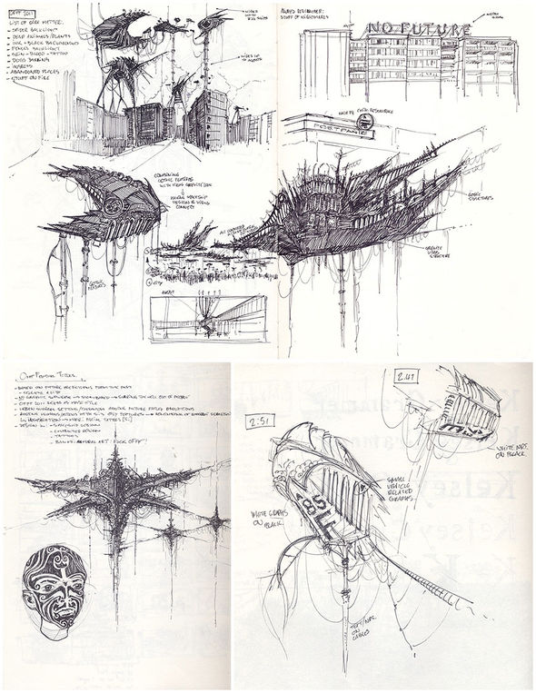
Concept drawings
What were some of your inspirations? There are scenes reminiscent of The War of the Worlds, Dark Days, Requiem for a Dream, etc.
MR: Inspiration was darkness – total darkness. This idea evolved into a clash of times inspired by the late Arthur C. Clarke. He wrote about different historical civilizations meeting in a single point in time. And Kubrick of course – he's always lurking somewhere.
How did you create the main character?
MR: I actually made up his role on the plane going to Prague. So there was very little time to produce his storyline. I had this idea of starting out in a kind of documentary style – following an average guy home and then bit by bit his environment gets stranger and more uncomfortable to watch. The background takes over and the piece changes into an urban nightmare. And like a nightmare, the story/edit doesn't always make sense but it makes you feel really uncomfortable. I wanted the viewer to experience the nightmare.
Can you describe the process from there?
AM: Once Mischa and Si came up with the initial ideas for the film, we spoke to our production partners, Savage, who are based in Prague. We knew that with their help we could achieve the impossible: shooting with no budget. They helped us enormously with sorting out locations, casting, and supplying the crew and equipment. The vast majority of the filming was done in Prague with only a few macro bits done in-studio here at PostPanic in Amsterdam.
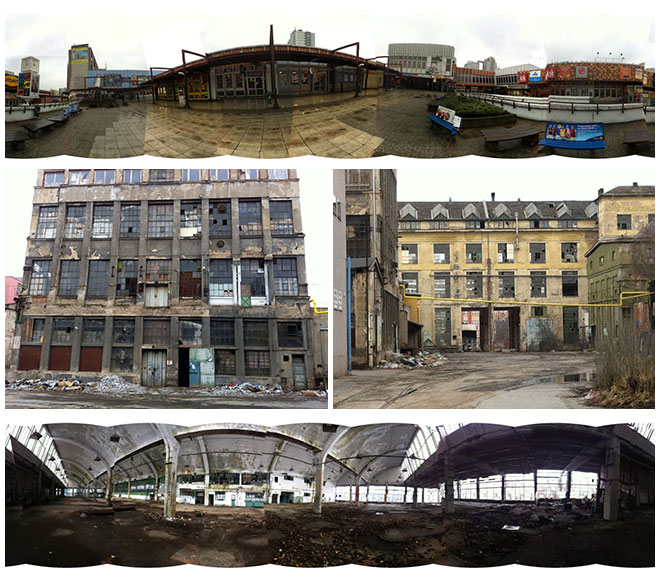
Location scouting
Whilst all this was going on, the rest of the PostPanic team back in Amsterdam got started on the post work – both from a design and motion graphics standpoint (like designing all the names) – and also prepping the CG and VFX work. We’re lucky that PostPanic has its own post team in-house, including seven permanent staff and usually three interns and freelancers, so we were able to work on these titles in between our paid commercial projects. We also pulled in some friends, suppliers, and freelancers we had for other projects to do extra work on the OFFF titles in the evenings and weekends as there were so many CG elements and effects that we wanted to include.
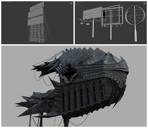
Ship and billboard design, modeling and rendering
What were some of the obstacles in filming and animating the sequence? Did you have to sort out permissions to film in certain public places?
MR: The biggest obstacles were time and money. There was no budget, so we had to be clever with time, working outside of our paid projects to make this piece. We had some locations worked out and some we shot without permission. Doing that was easy because we were a very small team, shooting with two Canon 5Ds – one for Jirka, the DP, and one I carried around – so most of the time people weren't even aware that they were walking into a film set!
Animation and post were a blessing even though it was a lot of work. There was no client involved, so a lot of the frustration was kept out of the process. All there was left was a lot of enthusiasm and love from the crew involved! We had a good time making this.
How much shooting did you do in Prague?
MR: I think we had three to five days. We also had some bad news. Due to his back problems Si Scott had to abandon the project and couldn't join the shoot.

Location shooting
How did Si having to drop out affect your schedule and process?
MR: Si is irreplaceable. He has a very unique sense of typography and design. Creatively, it was tough. We had been looking forward to working together on this for ages. So when he had to step out it felt very sad. I was looking forward to his mad typefaces and designs. But from a production point of view, it wasn't disastrous. I started out as a graphic designer many years ago and in a sense I still am. So together with some really talented designers at PostPanic, it was a challenge we could overcome.
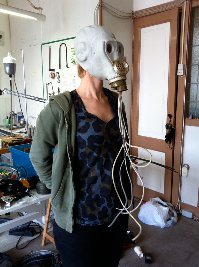
Props designs
How long did the post work in Amsterdam take?
MR: In between commercial projects, about three months.
And all in all, from concept to finished piece?
MR: We started thinking about it in September, finalised the concept in January, filmed in March, and delivered in June. So, about 10 months in all.
How was the car explosion scene created?
IG: First and foremost, we shot the live-action plate with the abandoned car. Extra plates were shot of whatever car parts we could find with the idea that we could then embed these into the shot, although in the end most were reconstructed in CG. The lighting and environment were captured and recreated in the scene to light and integrate all the CG layers that were created, such as the flying objects, the smoke, and the fire.
The shot was then tracked, the geometry matching the car was built, and piece by piece all the elements were rendered and forced together in compositing using any cheats, fudging, and faking that we could get away with.
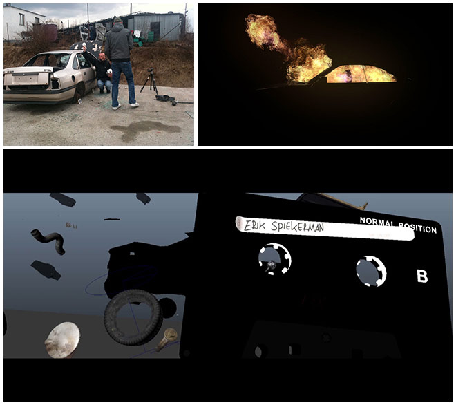
Car explosion process shots
Can you describe the process for embedding text into the scenes?
MR: We wanted the titles to be completely embedded into the texture of the piece. So we had to find a lot of clever solutions to display them without losing the viewer’s attention. It was fun to think of these concepts because they're all so different and surprising when you watch them – that was our aim, anyway. We had close to 70 names to deal with so we grouped them quite randomly. Sometimes it was the meaning of a name that decided its place in the film. And sometimes it was just the length of it.
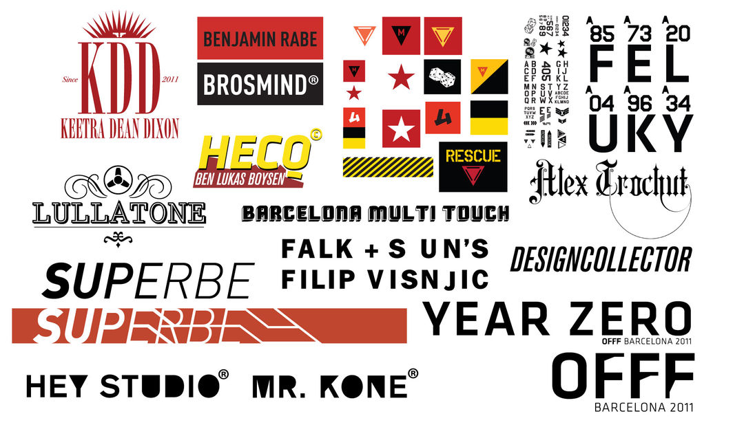
Logo graphics
How did you choose the actors?
MR: I wanted real people, so that's who we cast. I was looking for faces with a lot of background, faces you would find in wartime portrait photography. I wanted the main character to live with his parents and have two identities: a tough exterior one and a weak one when he would be home with his family. That's what we ended up doing. I planned out little routes the lead actor should walk through – not knowing where he would end up most of the time – and told him to act natural, like himself. He felt like an action hero and it was exactly what I needed: a Russian mobster living with his mom!
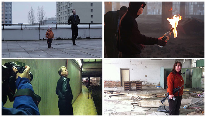
Shooting the lead actor and extras
As for some others, the producer called a girlfriend in to act as his sister and then she arranged an elderly couple on the spot to act as the parents. Not too long after that, we all showed up at the old couple's apartment. Nobody knew what the hell we were planning on shooting. And in no time these poor old people had a riot cop in their kitchen, a sibling fight, and guns on every coffee table while we filmed them doing their crossword puzzles. Business as usual! They were truly the sweetest people I have ever met.
What about the children involved in the shoot?
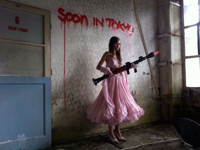
Location shoot with kids
MR: I was looking for contrast. Children are the epitome of innocence, so to place them in violent surroundings emphasizes the violence or distorts our perception of the child. The child becomes a powerful entity. The kids in the film aren't victims – they're fully in control of their situation. To me that was very important.
Can you talk about the sound design a little?
MR: The sound design and music was made by Hecq and it added a lot to the feel and scale of the film. It clearly divides the three acts. The first act is up to execution, the second moves from there, and the third is the final shot. It makes completely different ideas and scenes feel coherent. It also emphasizes the dynamics of the film and brings the much needed pacing at the end. It's been great working with him – we've been surfing the same wavelength throughout the project.
And what software did you use to animate, edit, render, composite, etc?
MR: The usual suspects: After Effects, Nuke, 3D Max, Maya, Illustrator, and Photoshop.
Camera tracking tests
The sequence got us thinking about creation as a hopeful act; however, the darkness of the piece seems to counteract that. Can you speak to this seeming contradiction between the tone and the message?
MR: The way we saw it was: art doesn't prosper in a Utopian environment. I think the best art, film, or music out there is inspired or driven by the darker aspects of life, be they poverty, war, politics, bad relationships – you name it. Creativity has a deep connection with suffering on many levels. Art is not Disney, Hollywood, or happy endings. Art is real, inspiring, provoking, raw, and even in darkness, hopeful.
PostPanic OFFF Barcelona 2011 main titles - making of
LIKE THIS ARTICLE?


