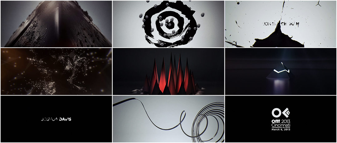
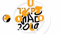
Taking inspiration from the wide array of presenters at this year’s fest, Onur Senturk orchestrates the opening titles to OFFF 2013 Cincinnati in stark and dark textural style.
With a nod to the hushed grandeur of Kubrick’s 2001: A Space Odyssey, we float through the strange geometry of an aesthetic world. Among the architectural grids and the tessellation of webs, an unfurling record and a slew of ball bearings, there is always a spark on the edge of the frame – connecting each scene, uniting each part. Speaking the silent language of objects in space, the sequence creates an atmosphere of expectation and gives a sense of the celestial as each name is elevated beyond itself.
A discussion with Creative Director ONUR SENTURK.
Give us a little background on yourself.
What I do includes everything from short films to title sequences, music videos to commercials, graphic design to film posters. Formerly, I was at Prologue for over a year and worked on a range of projects. I collaborated with Kyle Cooper, Danny Yount, and many other good artists, editors, and designers who really taught me a lot. In 2011, I contributed to the exceptional opening sequence of The Girl with the Dragon Tattoo in terms of concept design, typography, and look development at Blur Studio.
Could you tell us about the initial concepts for the OFFF Cincinnati title sequence and how it was developed?
OFFF approached me about designing the title sequence for the Cincinnati event. Design conferences present a selection of artists, designers, and thinkers to their audience so the title sequence had to be a representation of that selection. Mostly, I do not really have a traditional way of creating concepts. In this case, the selection of speakers was the catalyzer; this was my starting point. So, I included different flavors and techniques for each segment. I wanted the titles to be a multilayered entity, mixed with clichés and good, bad, and ugly ideas – everything on the same plate. Maybe it can be defined as an abstract recap of the event from my perspective. For each segment, I tried to create a design that would represent the particular designer based on my perception of their work. While doing that, I tried to keep the overall look and mood consistent.
Is that where the black and white color palette came in?
Yes, I wanted to maintain a degree of simplicity by using a limited color palette and typography. Without it, I thought the titles would be very disorganized. In most of my works, I try to have a contrasting element. It makes everything a little more exciting. Even though there is a chaos of different visual approaches, that element is a solid structure that binds everything together.
Good music and sound design can define mood and tell a story without showing a single image.
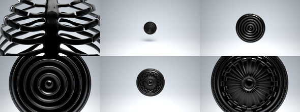
One frame visuals
Were you given a lot of freedom in terms of developing concepts, or were there limitations?
I was completely free! Doing work for OFFF festival is all about freedom. They did not interfere on one single element or frame. If you check it frame-by-frame you can even find a picture of my cat! I just love doing one-frame cuts in the editing.
Sound design and music are a big part of this sequence – what was the collaboration like for those elements?
In general, music and sound design plays a key role in the filmmaking process. If you have top class visuals with the wrong choice of audio, everything will fall apart. Good music and sound design can define mood and tell a story without showing a single image. Very powerful craft by itself.
In this process, I started working with the sound while doing the first motion tests and editing. Along the road, both audio and video were slowly refined to the final.
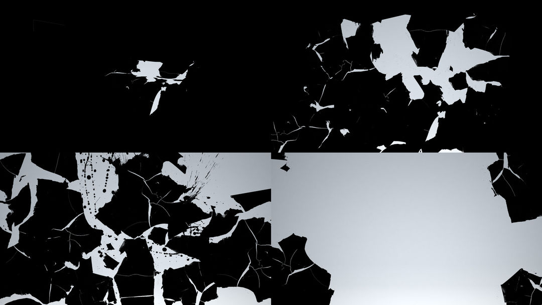
Burgerman "Tearing" styleframe
Tell us about the typography and the different reveals of the names.
Actually, the reveals of the names are not that variable; I tried to keep the typography and the revelation of it simple. I used a geometric modern typeface – Gotham Light and Bold – which fit the different techniques and created a sort of consistency. I used typography as a design element in a few segments though – like where I played with the scanner – but in general, the placement, the size, and the revelation is almost the same for each designer.
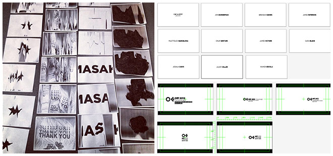
Scanner/photocopier manipulation and typography layout examples
The piece also seems to have been influenced by 2001: A Space Odyssey. Were you conscious of this when creating the sequence?
Yes. 2001: A Space Odyssey is one of my all time favorites. Also Andrei Tarkovsky's Stalker, Luis Buñuel's Un Chien Andalou, and Maya Deren's Meshes of the Afternoon are in the same list. Even though I follow the newest features old short films and features are always a source of inspiration for me.
How big was the production team and what tools and software did you use to put it all together?
Quite small actually. I received help while dealing with the title cards which were designed by Ipek Torun. The music and sound design was done by Cypher Audio. The rest of the work – design, animation, and some shooting – was by me. There are a couple of high-speed plates which we shot together with DOP Steve Romano.
As for tools, we used a photocopy machine, scanner, Phantom Flex, Canon 7D, 3D Studio Max, After Effects, Illustrator… Basically every tool around me.
Rough workprint
Was there anything that took you by surprise when working on this sequence?
The photocopy section for sure! It was hard to guess the end result while I was doing it. But after playing with it for awhile, it seemed to be quite a familiar process. I realized it was something similar to stop motion technique.
What elements of this sequence are you most happy with?
Overall, I am content with entire piece. There were a couple more techniques I was considering that did not make the final cut because of timing constraints. But I learned perfection is a road that has no end!

