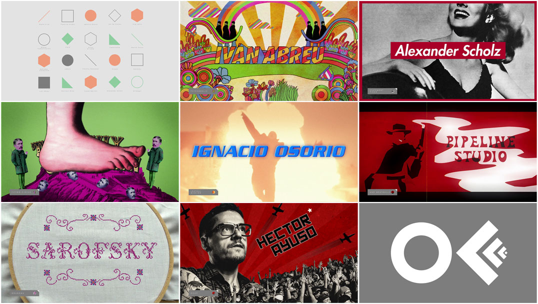
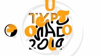
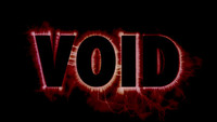
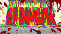
Colourfully dubbed "One Fabulous Fucking Filter," Sarofsky’s opening titles for OFFF Mexico 2015 – a recent iteration of the global “post-digital culture” festival – introduce presenters with a volley of logotypes and stylistic treatments, both sophisticated and simple, classic and clichéd.
Title sequence devotees will instantly identify loving homages to greats like Binder, Bass, and Lardani, as well as obvious nods to the work of claymation master Art Clokey, the cut-and-paste madness of Monty Python, and Emmy-winning design studio Elastic, but the sequence is not limited to paying tribute to titans of title design.
Designed to spoof our ever-filtered visual experience, anything and everything is fodder for Sarofsky’s joyful, decade-spanning ride; from the steely opening of the nightly newscast, the glitchy output of a dusty old video game cartridge, and those well-intentioned public service announcements of yesteryear, to postcards, propaganda posters, De Stijl design, and even needlepoint, the sequence is a veritable encyclopedia of graphic design, motion design, high art, and kitsch. Bracketed by a mock minimalist interface, an invisible finger flicks between credits and styles with the sort of hungry impatience that has become all too familiar in the digital age.
A discussion with Sarofsky Corp. Creative Director ERIN SAROFSKY, Lead Designers DUARTE ELVAS and TNAYA WITMER, and Producer/Editor MICHAEL BURKE.
When we last spoke you had just come off designing for Captain America: The Winter Soldier. What has the studio been up to since then?
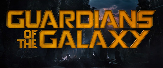
Erin: Oh man, we have been up to so much. Since Captain America we worked on two more Marvel Films. The first was Guardians of the Galaxy. [Director] James Gunn decided to put the titles up front over picture, which gave us the opportunity to focus completely on the typography. So we created a custom typeface.
Guardians of the Galaxy (2014) main titles, designed by Sarofsky Corp.
After that was Ant-Man. We’ve can’t share the work until the DVD is released in December, but Ant-Man was an incredible production for the studio. Not only was it an unexpected concept, but also the execution style was very unique and that required us to develop a completely new pipeline.
How did you get involved in OFFF Mexico?
Erin: Well, I met [Global Festival Director] Héctor Ayuso a couple years ago when he asked me to speak at OFFF Barcelona. So we already knew each other. He just randomly reached out one day and asked.
At first the idea was to collaborate with David Mack again because we initially met at that conference in Barcelona and he was such an integral part of our Captain America titles. We loved the idea of that but the issue was the scope of work. We wouldn't have been able to absorb doing another project like Captain America for an unpaid passion project. So we had to rethink.
Our first meeting after that was to discuss some big picture stuff, like overall concepts and a general tone for the titles. We knew we wanted to have fun producing it and wanted to make sure it was accomplishable with our in-house team. We had a year to work on it… So it’s something we wanted to be able to fold into our schedule as other jobs allowed.
How did that unfold? How did you develop the sequence, all those typographic variations?
Erin: We wanted this title sequence to do two things: highlight the speakers, and show the visual diversity of the creative landscape. So while we knew we would be creating a type-centric title sequence we had to work out how we wanted to communicate the latter.
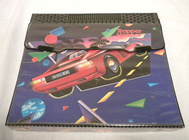
Image set: Trapper Keeper binder examples
After a lot of brainstorming we landed on the idea that our community has essentially “filterized” different styles, artists, and genres. We’re constantly getting requests to make something more Saul Bass-y, or retro in a 1960s postcard kind of way, or add a touch of Bauhaus, or add a bit of kitsch, like an old Trapper Keeper, or, what about some ’90s surfer photocopy art... While all these things and more inspire our work it’s important that we take a step back and not treat the creative process like it’s a giant selection of Instagram filters.
Tnaya: The filterization of the creative process is kind of a heavy topic so it was important to approach it with a sense of humour. We wanted to celebrate the work that inspires us, exasperates us, and maybe admit to some guilty pleasures – like ’90s action movies – all while creating a visual context that would effectively communicate our message.
Erin: So we created a visual buffet! Yes, we went ahead and made a piece that does exactly what we don’t like being asked to do, day in and day out! We filterized popular, and not necessarily pretty, styles. Then we created a visual construct in which we could show all these vignettes.
What happened is kind of hilarious. While, yes, we tell the story of the filterization of our medium, we also created a fun look back at our history and the things that fueled who we all became as artists. The title sequence became both a commentary and a celebration. You can watch it over and over and see something new each time… You may be mad about it or you may love it... but I guess that's the point.
For us as a team, because of this exploration, we were left more inspired than ever to stop trying to recreate the past but to invent the future. And it leaves us with the hope, that some day, someone else will use our work as a source of inspiration.
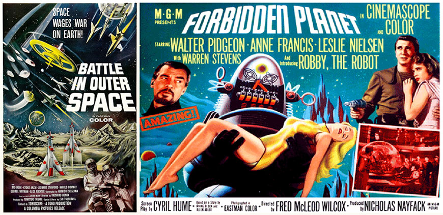
1950s science fiction reference material
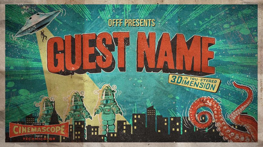
1950s science fiction styleframe
How did you decide on the order of credits? Did you storyboard?
Erin: The order sort of found itself as we got into the animatic. However, we knew we wanted Héctor’s credit at the end.
We kept a design style matrix and married that to the list of speakers. At first we assigned looks to specific artists. But as the frames started being produced we started shuffling things around. Some styles lent themselves to longer or shorter names and sometimes there were serendipitous moments where looks just lined up perfectly. We moved right into the animatic. So our boarding process was way more informal than we would normally do.
You’ve got homages to so many famous logotypes and title sequences in there. How did you go about picking what you wanted to riff on?
Erin: At first we focused more on genres. But as we started designing we started referencing specific pieces. It was hard to avoid. When something is that iconic… you just have to run with it. We had a big company meeting and brainstormed. It was amazing; it felt like being back in college. Actually this whole piece had an academic feel to it...
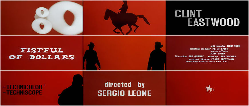
A Fistful of Dollars (1967) title sequence, the classic Spaghetti Western opening designed by Iginio Lardani was used as reference for OFFF Mexico 2015
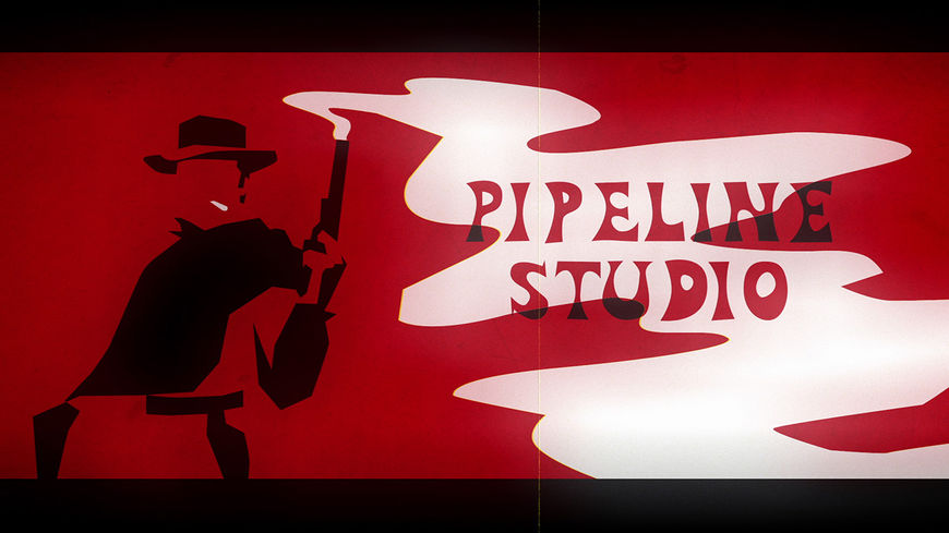
Spaghetti Western styleframe inspired by Iginio Lardani's title designs
Tnaya: Getting together as a company and brainstorming ideas was a really special experience. Absolutely everyone had something to contribute and it was really fascinating to see what inspired people.
How did you choose the styles for Sarofsky’s credits in the sequence?
Erin: Well, we have a little addiction to Gotham… So we wanted to poke a little fun at ourselves with that card. We often listen to ’80s hits radio at the office, so seeing Sarofsky in Mistral with a VHS look just seemed fitting. The needlepoint felt homey and warm… very “family.” Which is how we feel about ourselves.

Image set: Sarofsky's three title cards in the OFFF Mexico 2015 sequence
What’s the story behind the interface that acts as a bumper between the various title cards?
Erin: We knew from the beginning that somehow this idea had to have a narrative to it. We had to walk people through what they were looking at. So an interface, akin to Instagram, was our best option. The question was: how literal did we have to be? Doing the same thing over and over for two minutes would get boring. So once we established the idea of the interface, we were able to mix up the transitions. Luckily we knew we had a savvy audience.
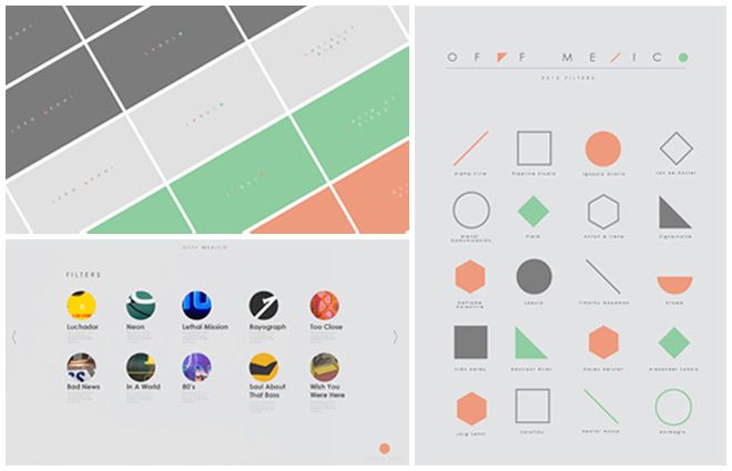
Image set: Interface process boards
And the music? How did Groove Guild get involved?
Erin: Paul Riggio and Al Risi at Groove Guild have become close friends and collaborators of ours. Most of the time the title sequences we do come with a composer or song already attached… So it was nice to finally be able to call them with a title to work on.
They got the concept from the get-go and even worked to add specific audio cues to all the specific styles. They did a totally brilliant job.
What are some of the differences between creating a film main title and creating something for a conference like OFFF?
Erin: Easiest question ever… no client and no script! Usually when you make a main title you are distilling what the film or series is trying to communicate. In this case we have no film and no client supervision!
While you may think it is great news… having the ability to do anything can be quite paralyzing. So the first thing we did was define what a client normally would for us: a root idea, the tone, schedule and a budget. We then had our marching orders and a paradigm for success.
Duarte: We were designing for an audience of our peers rather than a general audience. It forced us to think quite differently about this project. What do we want to tell other creatives?
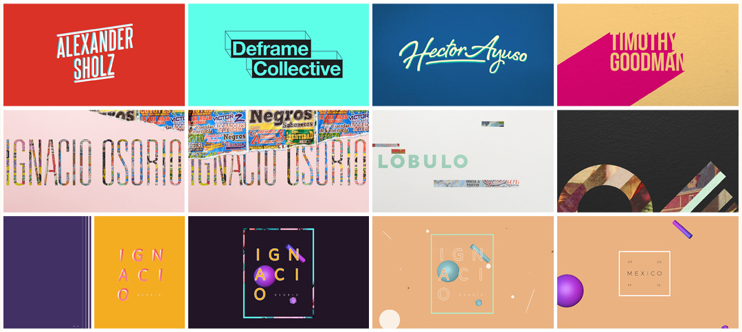
Image set: OFFF Mexico 2015 unused concepts
Michael: Echoing what Erin said, it was doubly important for us, and for me as a producer, to stay on top of the project and keep everything on track. Without a traditional client, we were only answering to ourselves in terms of expectations and satisfaction with the finished product. Considering this project had no budget but involved every designer in the studio, it was challenging at times to allow people the time they wanted while balancing our other projects.
However, I do think it was a great break from their regular work for our designers to be able to dive into these crazy worlds and styles they may not normally get to explore.
Duarte: As fun as this piece turned out, I still see it as a conceptual work at heart and that is my favourite aspect of it. I think it successfully tackles important creative issues such as derivative design, authorship or originality in a fun, non-pretentious way and it definitely sparks interesting conversations.
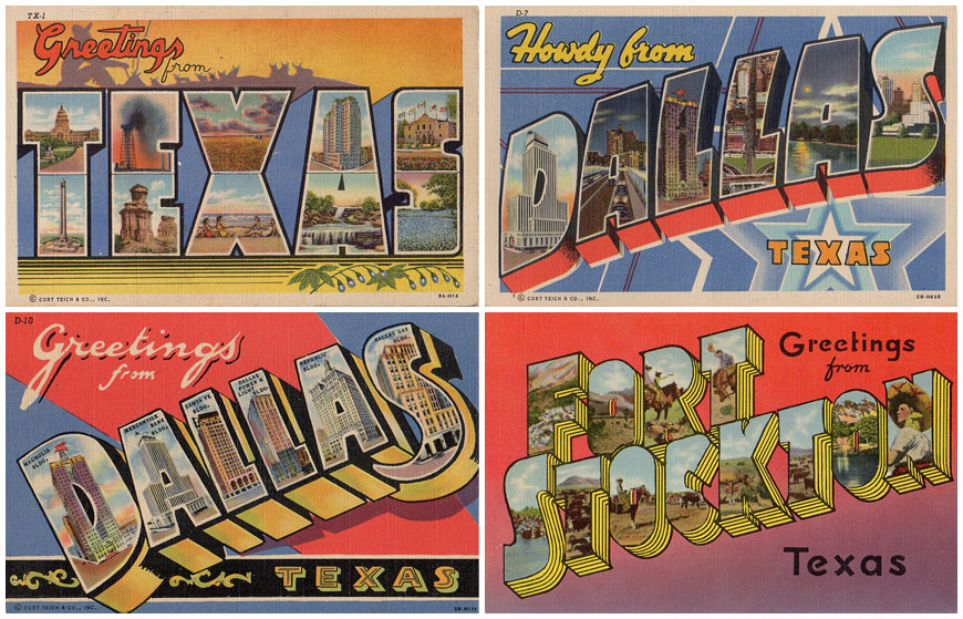
"Wish You Were Here" postcard reference material
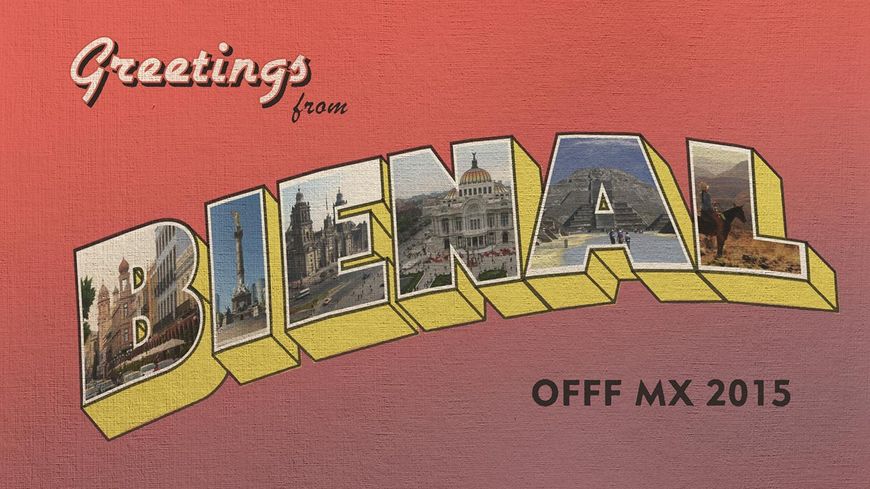
Unused "Wish You Were Here" styleframe
What advice do you have for people wanting to get into the fields of motion design or title design?
Erin: The advice I give people is to research the history of the medium and to create their own work. I try to encourage people to do short pieces so that they don't get too emotionally invested. When you’re just starting out you tend to want to shoot for the moon out of the gate. But what happens is you spend a lot of time on one thing. Then when it comes time to put a reel together you are limited. And your early work is going to be crappy compared to your new stuff so you shouldn't be showing it. So do more, shorter pieces. Then when you make a reel or montage… You will be in good shape.
Duarte: I think a valuable piece of advice is to invest as much as possible in collaboration and communication skills. When starting out in this field it is tempting to try to do everything yourself since, for many projects all you need may be a computer with a couple of applications installed. However, in any studio environment, reality is very different. It is crucial to be able to integrate a team and to be able to communicate effectively. It is also extremely helpful to get and give feedback from your peers in order to take projects to a next level.
Michael: If at first you don’t succeed, become a producer. Just kidding!
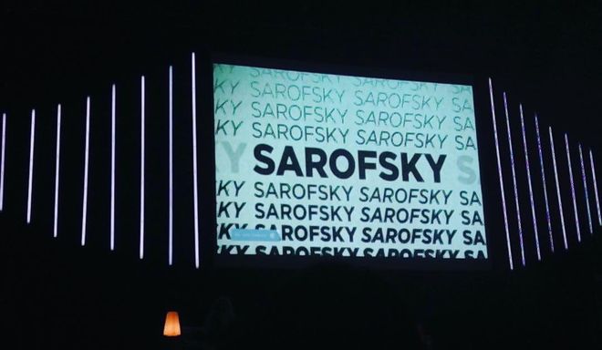
The opening titles screening in the Auditorio BlackBerry at OFFF Mexico 2015. Photo by Alexandra Absolute
Support for Art of the Title comes from


