To quote American designer Charles Eames: “The details are not the details.”
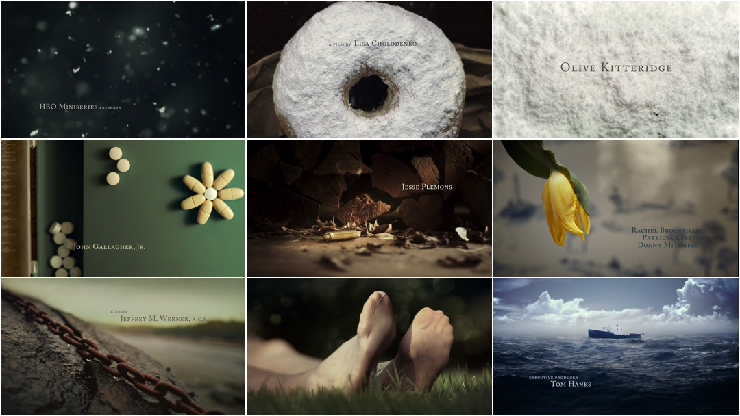
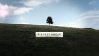
It’s just so in the leisurely opening to Olive Kitteridge, HBO’s 4-part miniseries about a woman unravelling in a picture-perfect small town tucked away in New England. This impressionistic sequence takes its time, following in the footsteps of title sequences to shows like Six Feet Under and Dexter, allowing the items and small rituals on display to tell their stories with grace and stoic aplomb. What first appears to be snow, falling starkly against a dark background to melancholy music by composer Carter Burwell, is confectioner’s sugar on a doughnut — the sweet delightfully mixed in with the sour. Then follow pills in the shape of a flower, an embroidered heart leaking, the stain from a drink peering out from itself, stockinged feet in the garden, a landscape becoming wallpaper. The audience is invited to continuously ask: Who is Olive, among these small things?
Nominated for a 2015 Emmy in Outstanding Main Title Design.
A discussion with Designer and Art Director SYNDERELA PENG, former designer with yU+co, current creative director at FX Networks.
Before we start talking about Olive Kitteridge, I thought maybe we could get a little background. Where did you start out? How did you get into motion design?
SP: So, I studied illustration at Art Center and then I worked for like a year, two years, and then decided I wanted to – I needed to learn more typography so I went back to school. I went through the program at CalArts for their design masters. I had known Garson Yu before that, and I had worked for him before that, so when I graduated I kinda just went back. I folded back into yU+co, so since then I had been working for yU+co. That’s the short version of the story.
How did you start working with Garson Yu, and join yU+co?
SP: Oh, gosh. I think it was probably 1996. I had just finished school at Art Center, I was 22 or 23. One of my friends said that there was a new startup design company that needed a designer to work on some boards. Somebody at Imaginary Forces or R/GA was breaking out and starting their own thing. I was like, “OK, I’ll give it a shot!” It was a weekend’s worth of work. It was one of my first all-nighters at a job. It was a small teaser for Saving Private Ryan. That was the start, almost twenty years ago.
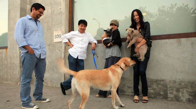
Members of the team at yU+co. Garson Yu is second from left, Synderela Peng is on the right
And then you got your masters, and you started officially at yU+co after that, right? When was that?
SP: I think it was 2001. They had just moved into their new space, which is where yU+co is currently, and it was a crazy time. It was right after September 11th happened, and so there was a strange kind of lull. Everybody was shaken. I remember that time distinctly because of that. They were doing a ton of title sequences but they were not big, effects-driven titles.
So, let’s jump forward to 2014. You worked on the titles to Olive Kitteridge, which was just nominated for an Emmy. How did this project come to you initially?
SP: Initially, we were approached by a bunch of editors at HBO who were trying to promote the show before it was fully made. They wanted us to put together like a promo graphics package. I didn’t know anything about [Olive Kitteridge], so I had to read the books. Sandy, who was the sales rep at yU+co, was a huge fan, so she was encouraging us to do this. There was something about this curmudgeonly old woman who is incredibly honest and biting and I think that we can all count ourselves as having a bit of that. So for me, the charm came through. I got into the character, and I liked her. There’s a certain kind of resilience, so the weather factors into the kind of conversations that we would have about the place and how it informs the people of that small town.
I thought, you know, it’d be really cool to have these really nice picture cards that are shot practically, like picture postcards. I was inspired by Willem de Kooning, who vacationed in the Hamptons every year in the ’60s, and he had these gorgeous postcards.
From then I thought, each episode, which there are four of, had a very nice title, and one was “Security.” I thought, there’s a certain sense of security when you eat things you like, you know, emotionally, so that was a tie-in. Whether that was correct or incorrect, for me, that was a connection I could make, so I used it for the graphics with the word “Security.” I liked it, it was fun.
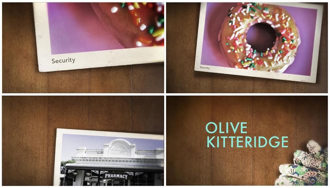
Images from the Olive Kitteridge promotional graphics package designed by yU+co
And that went away, and finally, about eight months later, HBO approached us again, and said, “Hey, are you interested in the titles?” We were like, “Hell yeah we’re gonna do it!”
So, we started working on it and we presented five or six different ideas. There was a whole approach with doing this in terms of the characters, really kinda getting into the people, the way they’re made in that place – they’re hard people. We were thinking about this, the weather, the art of Andy Goldsworthy, where things almost come back in a timelapse way.
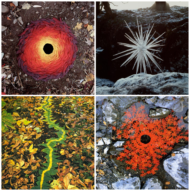
Earth Art pieces by Andy Goldsworthy. See more of his work in the Andy Goldsworthy Digital Catalogue.
We were thinking about flowers, because of the various things [Olive] loved. There was the flowers, and her garden, and thematically they’re seen throughout the show. It’s beautifully acted and the series is really like a labour of love, so the details are what makes it what it is.
And then the idea of food kind of came back to me, with the donuts. [Olive] likes the plain ones without sugar, and the sugar seemed to resemble falling snowflakes to me, and I thought that’d be a funny tie-in with a little hint of magic realism to relate back to the weather and the place, and also there’s a kind of closed-in small-town homey feeling. So it began from there.
What we wanted to present is a quiet piece that surrounds and frames the larger work. There’s the hint of depression, the hint of melancholy. There’s the whiskey glass, which represents a person [Olive] got involved with. The whole thing with the wine glass and the whiskey glass was sort of bittersweet. It’s lifted up and you see the imprint of the glass, and there’s a hint of a face. I remember Lisa [Cholodenko] was saying, “No, don’t make it too smiley, you can hint at a face but you don’t want it to be a big old smile.”

Stills from the sequence featuring a whiskey glass, and a stain in a napkin resembling a face
There are four or five key moments that Lisa liked, that she thought were representative of the show. So we sold them on those key ideas, and also the wallpaper. The ocean, the waves, all becoming part of the wallpaper.
How did you present these ideas? Did you storyboard them all?
SP: There were five in all, I think, and yes, they were storyboarded. They were shown, and there were elements that [Lisa Cholodenko] liked of each one. We had three designers that worked on this – myself, Edwin Baker, and Cecilia Fletcher.
One concept was “Earth Art Frozen in Ice” – thawing, different types of vegetation, mostly flowers. I think there were two versions that dealt with freezing and earth – earth art stuff. Having a timelapse of seasonal change, represented through wilting, growing, something coming to life.
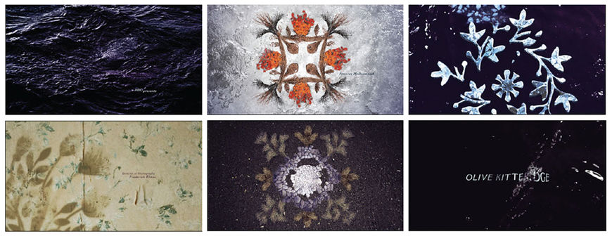
"Earth Art Frozen in Ice" alternate concept
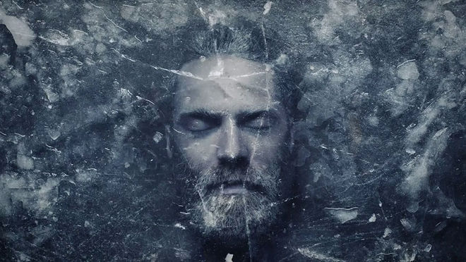
There’s a music video, Chet Faker, the one where he’s kinda frozen underneath a layer of ice, and then his face comes out. This was just one of the things we looked at, and we touched upon that idea.
Chet Faker – "Talk Is Cheap" music video, directed by Toby & Pete and with cinematography by Dan Freene
There’s another version that dealt with miniatures, and it’s obviously – that’s been done a few times. That was intriguing but we ended up, of course, not going in that direction.
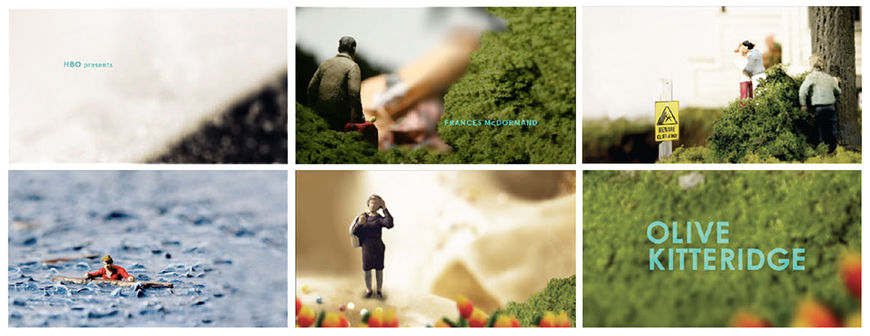
"Miniatures" alternate concept
And then one more – shattering flowers! They’re literally shattering flowers. But I think the kind of violence that is presented in the show is much more – it’s not big and showy in that sense. So I think that’s why – even though they loved the visuals – they didn’t think that it was as close to the tone of the piece.
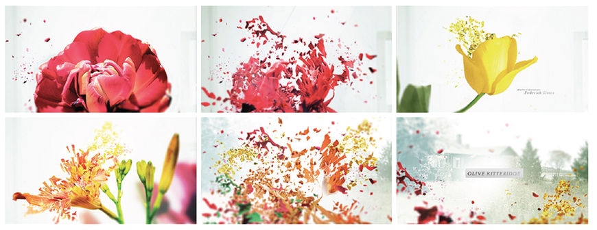
“Shattering Flowers” alternate concept
You mentioned the other designers… How big would you say your team was?
SP: Right, so it was three designers altogether. Myself, Edwin Baker, and Cecilia Fletcher. We had two compositors who were really good, Ilgi Candar and Gregory Jones. It wouldn’t be complete without their work.
In the credit list for the Emmys, there was only one DP that was allowed to be credited, Alex Pollini, but there were two other people who helped out, Aaron Weldon and Keith Downey. We had a set designer, Karyn Gabrielsen, and she was very good at getting a lot of the pieces to match what the boards were. It’s pretty faithful to the boards, and she was there for one day, for the establishing shots.
And there was Mike Park, whose contribution went above and beyond that of an editor. Not only did Mike string together the disparate vignettes into an elegant narrative, he pulled together the visuals from a sensory perspective, adding raindrops to shots that were plain, correcting colour so it would all appear seamless, adding many details that most people wouldn't detect. Mike shot the cross-stitch heart after we discussed that there was a gap in our narrative. He worked with the compositors when I had to leave for an emergency trip; he was the one person I trusted to carry the sequence through completion.
For the live-action footage, how many days did you shoot?
SP: There was one full day of the actual set-up and then the second day was the pick-up photography where I had Aaron and Keith, who had their own REDs, do some pick-up shots. Of course, we wanted to have controlled lighting and controlled everything, and we had ordered giant ice blocks, because there was a scene where we wanted to freeze something inside a block of ice. That’s how it was originally boarded, and we also wanted like the surface of the ice to have little flakes that are flying off, and get a very close-up shot.

Ice blocks set-up
On the Sunday we had to get an ice sculpture place to deliver these gigantic blocks of ice, which were then cut into quarters. Ice does not melt as quickly as you’d think! It was sitting there and melting forever and we had them collecting in like three trash cans. They melted overnight and then went into watering plants. It was all about the speed of ice melting. So it was a lot of work. That was a full day, and more than half of those shots did not make it. Those are gone! There were like three shots that made it into the final.
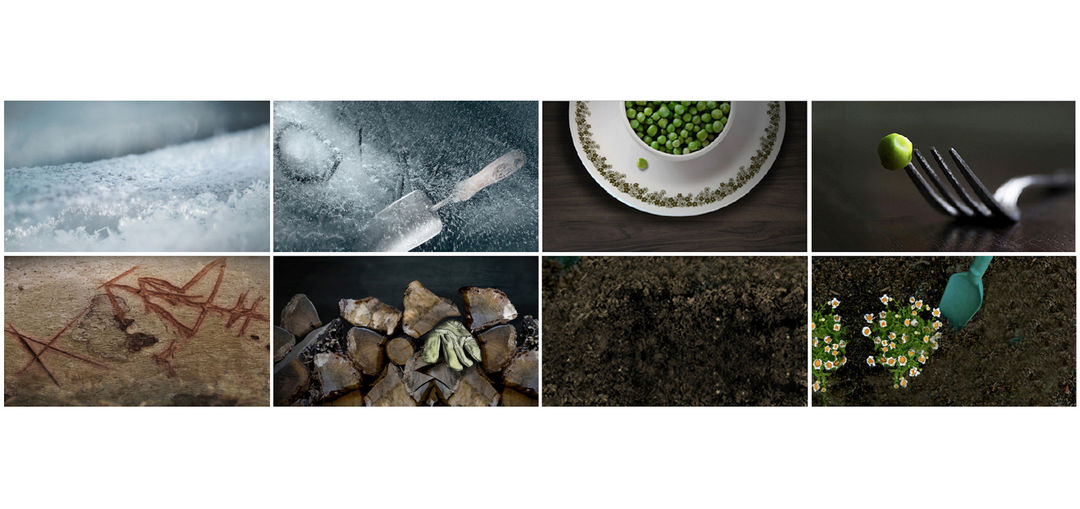
Outtakes and deleted scenes from the final sequence, including ice block shots (top left)
We also tried to create an indoor flowerbed. The concept was to have a square or a rectangle, a flowerbed that is almost resembling a grave. The original idea was a bit grander than that, but it ended up being, because of the lighting and also the way it looked, I think that it wasn’t exactly right.

Indoor flowerbed set-up
John Robson, who is Garson’s old friend, he actually lives in Maine, so that little fishing boat in the end, that’s his boat. He was great, he went out and he shot a bunch of things for us.
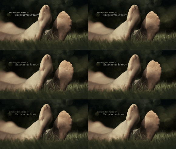
The woman in stockings, the supposedly dead woman who kind of wakes up, that’s a friend of his. He had her lie down in the grass with a pair of stockings with those holes, a few times. I have to credit him for doing the wiggle scene, which took a few takes, and I’m sure it wasn’t very fun for her. It was cold, then.
Who actually drew that wallpaper?
SP: Oh! We had a matte painter, Barry Jackson, who came in to help with some of the cloud elements. That was me and him. We took elements of clip art and altered them, combined them with what would be faithful to the scenes and what makes sense with the story. I mean, there’s gotta be a lighthouse! And of course the boat itself, it’s a tracing of the boat that’s in there. So Barry helped with that.
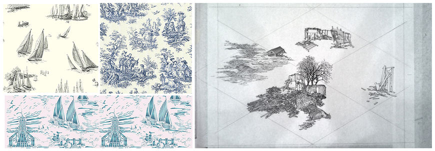
Toile wallpaper reference (left) and in-progress illustration for Olive Kitteridge (right)
Now a technical question. You’ve mentioned the compositing, the photography editing. Which tools did you use throughout this process?
SP: Photoshop, After Effects, and a little bit of Nuke for the boat scene. Nuke was used for a small portion – the bullet and the smoke in front of the firewood, and the boat on the water. Otherwise it’s After Effects. And Illustrator for the layout of the wallpaper.
I know the DP shoot was definitely in RED, and then John had a smaller camera, a Canon 5D.
And generally, what do you think the title sequence gives to the show?
SP: I think it sets the place well and I think it sets up the quiet tone. It’s good for the piece. You don’t want the titles to override something that’s very performance and character-driven. There’s a lot of quiet intensity and subtleties in how these people are. For me the titles are a good set-up and introduction without being insistent, and without taking too much attention from it. You want to provide a stage for the main affair.
In terms of title sequences, do you have any favourites or ones that stick out in your mind?
SP: For this year, I would say one that I really like is Halt and Catch Fire. I think it’s beautiful, and I told Patrick that, too. Did I? Maybe I didn’t tell him in person, but I think it’s a gorgeous sequence.
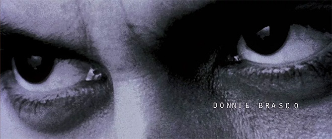
But actually my all-time favourite was the sequence for Donnie Brasco. I think that’s a beautiful piece.
That’s Kyle Cooper.
Donnie Brasco (1997) main titles designed by Kyle Cooper at Imaginary Forces
SP: Yes, and it was an Imaginary Forces piece. I always loved it. It’s so beautiful and there’s something about the music that really moves me. I was trained as a classical pianist when I was a kid, and so whenever I hear really evocative pieces, something that’s orchestral but is used in a way that is not traditional, there is still an emotional response for me. There’s just a moodiness and I like the black and white photography. You feel like he’s being watched – the shifty eyes, and he’s looking up – and you know he’s leading a double life. There’s just something that’s weighted in the way that the title sequence is setting up the role of this person, who was an FBI agent that worked with mobsters for 30 years. The tone of it has always stayed with me.
That’s a great answer.
SP: Yeah, and there’s been a lot of really beautiful sequences of late. Even some of the people that you mentioned [in the Emmy article] that were not nominated. It’s exciting to see sequences that are a little different, like Man Seeking Woman. It’s like, we’ve seen this technique in commercials, we’ve seen this in other aspects of motion graphics, but I haven’t seen something that’s full-on graphic and symbol and iconography-based and elegantly executed like that in a title sequence. I thought that was great. It’s cool to see something that’s unique.
What have you seen lately that’s been exciting to you?
SP: I really enjoyed watching Penny Dreadful, I love watching that show. It’s beautifully done. And what else? I’m trying to read a little bit more. I’ve renewed my subscription to the New York Review of Books, so I’m trying to read more nonfiction and short essays.
That’s refreshing to hear! It often seems like motion designers aren’t reading much.
SP: Yeah! That’s the thing I find. I think that motion graphics – there’s a lot of this attitude of, you know, what’s the newest, coolest, more technically intriguing way to express this thought, this idea that I have? And you do have to invest a lot of time and energy to that. It’s not an industry that allows us to have a lot of spare time, you work hard and you work long hours. But I’m a little older now and I really enjoy reading and I’ve fallen out of step with it! At some point I remember thinking, gosh, every time I pull a book out I fall asleep! So I’m trying to combat that.
LIKE THIS FEATURE?


