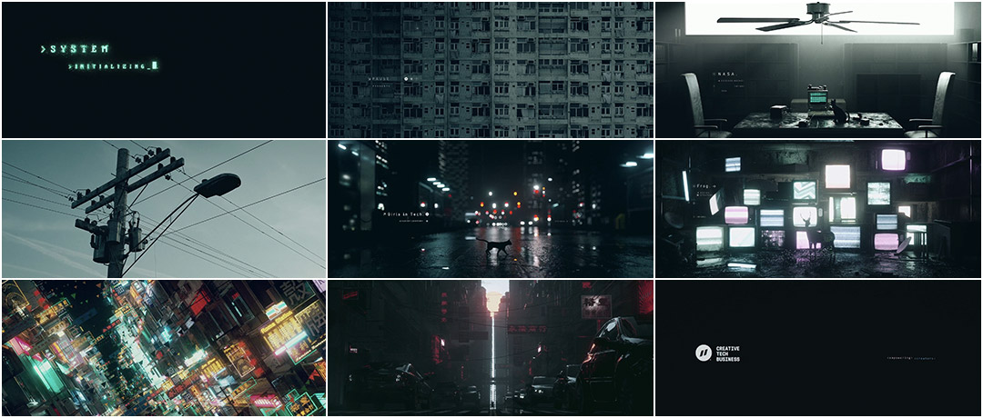
A computer boots up. The fuzzy blink of a green cursor catches the eye of a small black cat. The system initializes. Gloom sets in over a block of apartments as the feline sets out into the city, padding through darkened office towers and subway tunnels, down alleyways bathed in neon and cathode rays, and streets glistening with fresh rain.
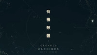
This is not footage captured from some dystopian future, but the work of Xiaolin “Zaoeyo” Zeng, a Beijing-based visual designer making waves with his stunning VFX-driven creations. In 2016, Zeng released Organic Machines, a spec title sequence he produced in order to stretch and test his creative muscles. The piece went viral in motion design circles leading to the designer being hired to create the opener for Pause 2017, an annual Australian tech and innovation festival now in its seventh year.
The futuristic title sequence wears its cyberpunk and sci-fi influences on its sleeve, subtly nodding to masters of the genre such as Mamoru Oshii and the Wachowskis, while paying more overt homage to foundational figures like Philip K. Dick and Ridley Scott. But in place of a cyborg, hacker, or chosen one, viewers get a cat for their hero – a curious grimalkin offering a different perspective on this well-trod ground. The creature is right at home in this digital wilderness, lighting the path for others to follow and find.
A discussion with title designer XIAOLIN "ZAOEYO" ZENG.
Could you give us a little background on yourself?
I was raised in a small city called Xiangtan in China. After my college entrance exams, I came across After Effects on Video Copilot. I got an average score and failed to be selected as an advertising major. After that, I was told by my parents that I should choose a major that would help me find a job. They thought accounting was the best choice based on how I’d scored on my exams, so I attended an economics and finance school. In the college, I was so angry about the course and the way teachers taught. Also, I ended up skipping a lot of my economics classes to stay in my dormitory learning After Effects.
I stayed at that school for about two years and then found out there was a university – the Communication University of China – that taught After Effects and animation. This university is the best digital media and animation university in China, so I decided to drop out. I thought it would be a total waste of time if I continued there. At that point I became a free auditor at Communication University. I picked my classes by asking freshman and junior students about their courses and rented a small room near the university. Before I knew it, I’d learned lots of solid basics at school, including animation, film, and digital art, and Cinema 4D by watching tutorials on the internet.
And now you’re working as a professional motion designer and VFX artist. How did you break into the industry after college?
I spent my college days learning After Effects and watching countless motion graphics and VFX videos on Vimeo. I was totally crazy about this artform. I’d spend hours on Vimeo every day and collected a bunch of videos from motion graphics to short films. Sometimes I would even watch them frame by frame. I just loved this way of expressing ideas and concepts, so after school I decided to become a motion designer and visual artist in the Chinese industry. I joined several studios and made many videos for clients, but I wouldn’t show these works to the public because most of the projects were created in a limited timeframe and had strange requirements, which made for mediocre results. I plan to continue practicing my skills, but I’d like to step out of the industry a little bit to focus on more personal works.
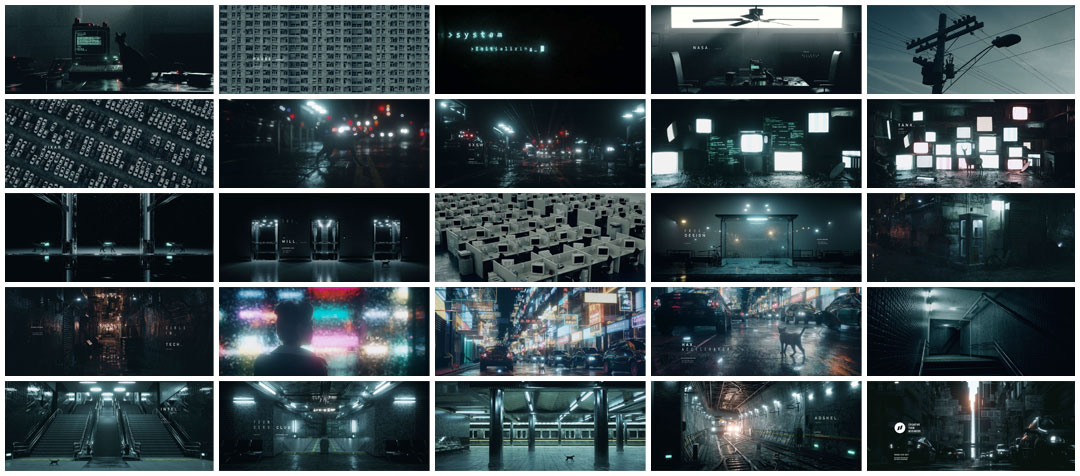
Image set: Pause 2017 storyboards
You’re credited professionally as "Zaoeyo". What is the origin and significance of your pseudonym?
You have a sharp sense of details! It may seem very naïve these days, but I use the name to preserve and remind me of the things that I loved as a child, such as games and anime. I created “Zaoeyo” when I was 13 years old, and here is the formula: “Z” equals Zeng, my Chinese family name; “aoe” stands for Age of Empires, a famous strategy game; “yo” represents Yu-Gi-Oh, a monster card-based anime. Also, originally the full nickname was “Zaoeyo S.C.” The “S” meant Science and the “C” stood for Creativity. I thought it was too long to add the words at the end, so I just removed them.
So my nickname “Zaoeyo” is a tribute to the things I loved at that age. I definitely had more things I wanted to put into the name, but I just randomly chose some of them and put it together. I’ve been using the nickname for about eleven years and it’s a constant reminder of my childhood.
Speaking of your childhood, what would you say was the first film or TV title sequence that opened your eyes to the possibilities of the artform?
I think it was the first Batman film. I forgot when I saw it, but Danny Elfman's soundtrack combined with the movement of the camera made my heart flutter. It firmly captured my attention and emotions.
Danny Elfman's soundtrack combined with the movement of the camera made my heart flutter.
Batman (1989) main titles, designed by Richard Morrison
I actually first learned about title sequences as an artform from your site about five years ago. I recognized so many film titles and motion designs on the site that had been favourites before I’d even heard of the term title sequence. I immediately knew that creating this type of work was my goal – it could be my way of expressing art and ideas. I’m so excited now because I’m on Art of the Title! Thank you!
We’re very happy that we can feature your work! So tell me how you first became involved with Pause Fest? Had they seen your spec work Organic Machines?
Yes, the founder of Pause Fest, George Hedon, saw Organic Machines and contacted me via Behance.
Organic Machines (2016) spec title sequence, designed by Xiaolin Zeng
At the time they already had a studio for the titles, but they weren’t sure about whether they would have enough time or resources to take on the task. So he contacted me in advance in case of the studio’s absence. Luckily, after several emails to George, he gave me the opportunity to craft this year's title sequence for Pause Fest.
Tell me about your first meeting or discussion about this sequence.
George is a very energetic person. We first used Skype to chat about the fest itself and the opening titles. George gave me a lot of information about the theme of this year’s Pause, like what would be shown and who would be coming to give talks. I felt his great passion for the event and his willingness to bring me on board. To be honest, I was totally in the dark about the process and schedule as this was my first international project. I had no experience working on such a big event, so I asked him lots of questions, details about the production schedule, delivery deadline, and how the previous studio worked.
Did the organizers have a vision based on the theme of “Different Perspective”? What was the original concept for the title sequence and how was it developed?
Basically, Pause’s organizers let designers do what they want to as long as the concept is related to the theme. In the initial stages we had four totally different concepts. The first concept was called “Nano World” in which we wanted to redesign the nano world in our body, such as antibodies and DNA machines, and use retrofuturist visuals to design it.
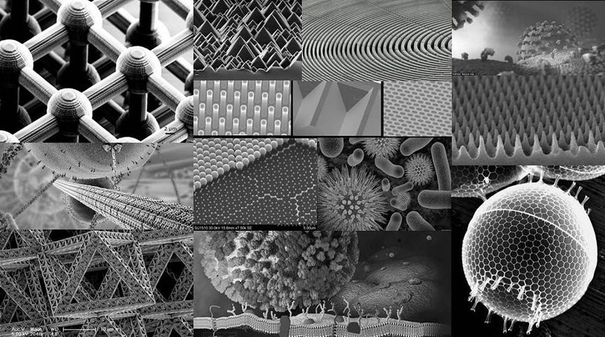
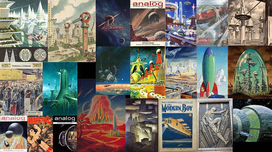
Reference material for the "Nano World" concept
This idea came from the classical music “Boléro” composed by Maurice Ravel, which was used in the opening titles of Digimon Adventure.
Digimon Adventure (1999) main titles
I wanted to use this piece of music to present a magnificent world. I discussed this concept with my coworker Yan Liang and friend Somei Sun, and then brought in my friend XiangDong Cao to have some concept drawings for me – he actually passed away this month. I’m so sad about that.
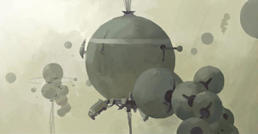
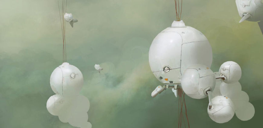
“Nano World” concept art by Xiangdong Cao
Then I created some styleframes and animatic tests. After several tests, I decided not to use this concept as it would be a really big project if we went into production.
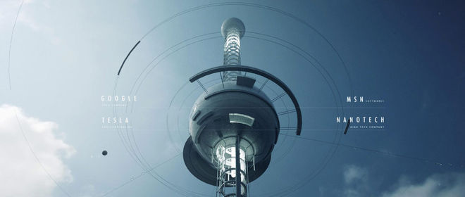
"Nano World" styleframe example
Then I came up with another concept which was a microscopic diver going into a drop of water, discovering unseen creatures. I followed the same procedure as the previous concept, but after finishing several styleframes I thought this concept also wouldn’t continue as I’d need to design the creatures in a drop of water, which might require Zbrush and involving another concept artist.
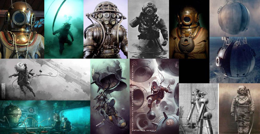
Reference material for the “Dive” concept
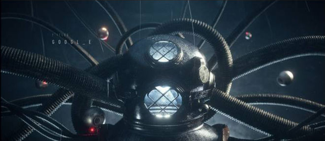
“Dive” styleframe example
It took me another month to decide on the final concept, but the previous concepts had taken me 20 days to test and they weren’t executable. This was a tough stage for me. I needed to have an executable concept within 10 days. I randomly clicked the previous concept files, and watched the opening titles of Digimon Adventure again and again.
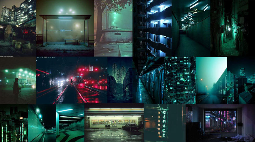
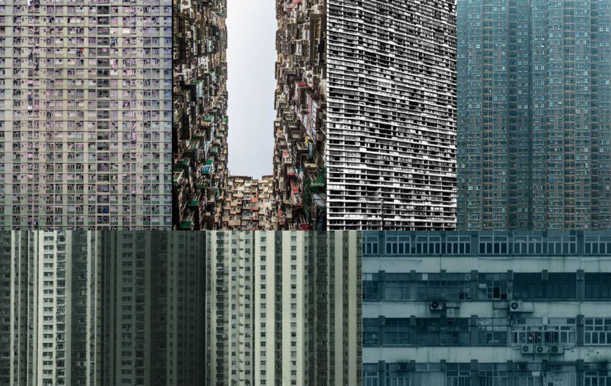
Reference material for the “Digital City” concept
At that point I decided to use the concept of the Digimon opening – which is a montage of shots of an empty city – and combine it with digital elements.
After finishing several styleframes, I came across an indie game called HK, in which a cat is walking on the street of the Kowloon Walled City. I felt that a cat could enhance the feeling of isolation between people and buildings, so I merged it into my concept and brought my little cat "MaiMai" into these scenes, keeping the visual style clean rather than making it too sci-fi. I contacted the team via email to show them what I was doing. I think this is an essential element for the whole opening titles.
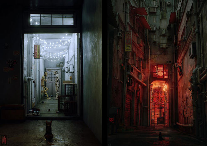
Early screenshots from HK
Creating a convincing computer-generated animal must be difficult. What kind of issues did you encounter trying to bring your feline star to life?
I had no idea how to make an animal or its animations before this project. George helped me purchase a cat and its animation from professional 3D assets website. I tweaked some animation settings to make it slow motion. Also, I added some dark hair and details to the cat. That’s the important part which makes it more realistic – and makes it look more like my pet than an asset from the internet.
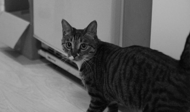
Zeng's cat MaiMai served as an inspiration for the Pause 2017 title sequence.
You reference some pretty iconic science fiction and anime imagery in the sequence. Could you walk us through some of your specific inspirations?
Sure! There are several shots that are visually identical to famous sci-fi works. I totally borrowed a shot from Blade Runner. I thought this was not good at first as I didn’t change much, but I asked several people about this, they all thought this is a very nice way to pay homage.
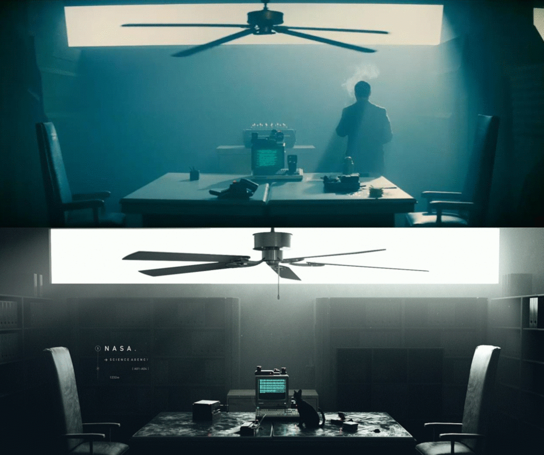
Comparison of shots from Pause 2017 and Blade Runner (1982)
The first coding scene was potentially inspired by the Digimon Adventure’s evolution scene and The Matrix. Also, the tone of the opening scenes are inspired by the colour grades of The Matrix, which has kind of a green and dark mood. All the Hong Kong scenes were a big homage to Ghost in the Shell.
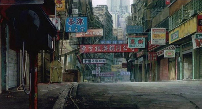
All the Hong Kong scenes were a big homage to Ghost in the Shell.
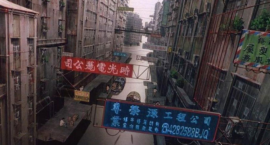
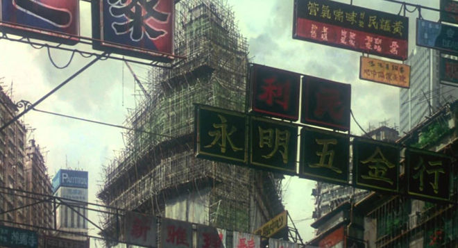
Stills from Ghost in the Shell (1995) used as reference for Pause 2017.
The soundtrack fits the piece perfectly. How did Echoic Audio become involved? What was your collaboration like with them?
I’m so lucky and thankful that they joined this project. They approached me in the early stages after Pause's official announcement about this year’s designer selection. After I delivered the final concept to them, they gave me a lot of reference tracks, such as Blade Runner and Moon, and I gave them my selected references, such as American Beauty. After delivering the storyboard, I asked them for some temp track suggestions for the editing test. Tom Gilbert, the founder of the studio, suggested that the soundtrack for the opening should have a good tempo and a pulse throughout and I agreed we should follow that idea.
After delivering the first animatic cut to them, they sent me an early version of the music track. I gave them more references for refinement, and they would send back a different version to try more possibilities. In the end, we both agreed to use the first version as the foundation to refine from. I was so happy with the final result. It really suits the visuals and provided the opening with an epic scale.
And what role did Beauty of Science play?
I work for this company, but the relationship between me and them is not an employer-employee relationship. It’s more like a cooperative relationship. They provide me with many resources, such as a rendering machine, good video cards, and technical support, and I sometimes help them make videos and provide my CG resources. In the discussion stage, the founder of Beauty of Science, Yan Liang, helped me with the “Nano World” concept. He is both scientist and artist, so he has a passion for creating beautiful science visuals and educational videos.
Pause 2017 process video featuring composer Thomas Newman's title track from American Beauty (1999)
Who else worked with you on this? How big was the production team?
It was a pretty small team. I had two friends at the beginning, Yan Liang and Somei Sun, who were on board for the concepting stage. Then I tried some of the concepts and asked my friend XiangDong Cao to create three drawings for me. But all the concepts we came up with would have been too hard to execute. Then I started to develop concepts on my own and produced everything in the end. During the production stage, Echoic Audio also gave me some reference advice and feedback on the tempo of the piece. I also got some additional 3D models from my friend Yuan Wang.
Which tools and software did you use to put it all together?
I used Cinema 4D as the main production tool for this sequence. Octane Render helped me visualize the renders quickly. I barely needed any post-production work as the render engine provided me with realistic and film-looking results. I created many big shots for this project which required super GPU power to render. My software actually crashed on several shots after I added one too many fog effects. So I needed to delete some effects and models to make it through! Luckily the results were not that bad even after getting rid of some fancy effects. Adobe Premiere was used for editing; I edited several versions with the temp track. In the end I used After Effects for some quick colour corrections and lens flare effects.
There's certainly quite a lot going on in this sequence. Are there any small details or easter eggs that you put in there that viewers might not have noticed?
There were two main things which had a great effect on the direction of the sequence after I went into production. First, the game HK which give me the cat idea. Second, a short film called None directed by Ash Thorp and Chris Bjerre.
NONE (2016) short film, directed by Ash Thorp and Chriostpher Bjerre
When I saw this film, I was already half finished the opening titles. I thought their work was similar to what I was creating, so I added two shots, such as the traffic lights and utility pole because of the film.
What are some of your personal favourite title sequences, whether classic or contemporary?
I really love the sequence made for The Pacific TV series, the soundtrack composed by Hans Zimmer is perfect for the gentle movement of each shot and the visuals, and the closeup shots of the charcoal drawings really generates a sense of honour and bravery.
The Pacific (2010) main titles, designed by Imaginary Forces
I tried to create my own version of this title sequence with After Effects when I was in school, but I only finished part of it.

