It’s the summer of 1985 and all 13-year-old Radford Miracle cares about is junk food and jams, slurpees and LPs. But on a family vacation to Ocean City, Maryland, Rad’s world gets turned upside down in a fight for ping pong supremacy.
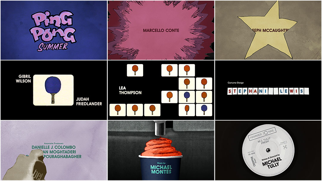
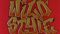
Like Tom Tykwer’s multifarious opening to Run Lola Run, the title sequence runs a gamut of styles, combining hand-drawn type and animation, multiples, and collage which allow it to harken back to the low tech of the ’80s. The obvious nods to Wild Style and the use of The Fat Boys’ rousing 1984 battle rap “Stick ’Em” lend the film’s opening an ebullience and lighthearted bravado. In this way, Michael Tully’s indie coming-of-age comedy – starring John Hannah, Judah Friedlander, Amy Sedaris, and Susan Sarandon as a table tennis Mr. Miyagi – gets an apt introduction brimming with energy and nostalgia.
Finalist in the 2014 SXSW Title Design Awards.
A discussion with Designer TEDDY BLANKS of CHIPS.
Give us a little background on yourself and CHIPS.
CHIPS was founded in Brooklyn in 2009 by Adam Squires, Dan Shields, and myself. We make websites, books, album covers, posters. Our first title sequence was for Lena Dunham’s Tiny Furniture, for which I also composed the score. From there, that side of the business took off.
What was the first meeting about this title sequence like?
Since the director, Michael Tully, lives in Austin, we never actually met in person! We had been friendly and met several times when he lived in New York. He sent me an early cut of the movie where after the opening scene it just cut to black and then the words “Awesome Title Sequence” set in a neon graffiti font jumped around on screen for a minute.
Original edit with title sequence placeholder
As silly as it was, it gave me an immediate idea of the vibe he wanted. We had a quick phone conversation to make sure we were on the same page, and it went forward from there.
How did you start? What was your first concept?
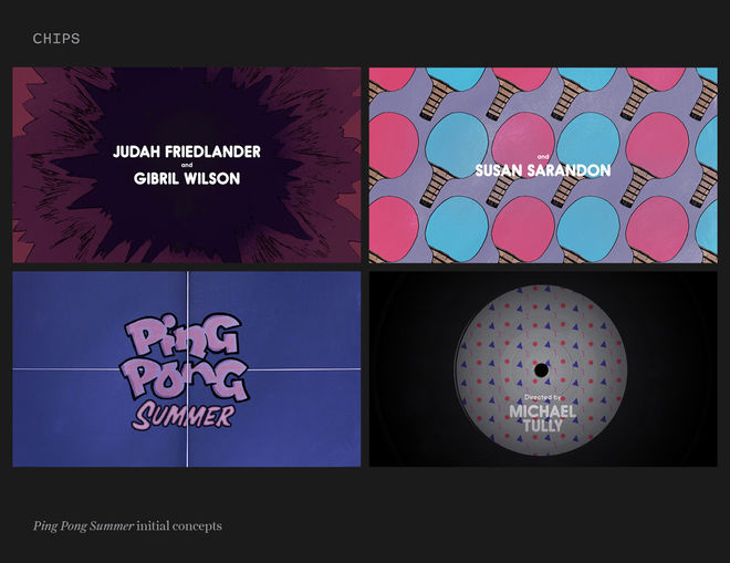
What kept coming up was that the sequence should feel like most of the movie does: something like a PG comedy you might've picked up at your local video store in 1985. Tully said he wanted the titles to be as “un-computer-graphic-y as possible.” I sent him a few rough sketches that showed the basic look and feel, along with the typeface we wanted to use. Those sketches also introduced the ideas for a couple of the key sequences: the explosions for the first few cast titles and the names on record labels.
Concept sketches
Did you storyboard? How did you plan the sequence out?
I’m embarrassed to say there were no storyboards. Since we wanted to do a lot of hand-drawn frame animation and I had no experience with this or any idea how we might pull it off, I felt the best thing was to jump in and start making things.
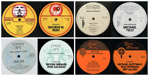
First, we divided the titles into groupings of 4 or 5; each grouping got its own style section. For example, teenage actors were illustrated using "explosions," adult actors as multiple flipping paddles, and above-the-line crew were rendered with record labels.
Record label homage
We tackled each section on its own, sending it to Tully for feedback. When a section was approved, we’d move on to another one. Once they were all strung together we began making transitions that would get us from one section to the next.
What kind of feedback would you get from Tully when you sent in your work?
He would have a few key suggestions for improvement, but for the most part he responded with emails saying things like, “YESSSSS!!!! Keep on keepin' on!” or “HOLY SHIT.” I was constantly surprised by his encouragement and the free reign he gave us to create something we felt really good about.
Whose idea was it to use the Fat Boys track and how did you decide on it? Were any other songs considered?
“Stick ‘Em” was always there, and it was definitely Tully’s idea. At some point I made some edits to the song in order to better match the timing of the credits, and that was the only time I got any serious pushback from him. He was adamant that the song’s integrity be preserved. And he was right: it had to be that song and it had to sound just the way it sounds.
Are you a fan of hip hop?
I am! But my knowledge base doesn’t run too deep. Sean is much more of a crate-digger, and a fan of old-school hip hop. Most of the record labels we designed for the end of the sequence are inspired by ones from his collection.
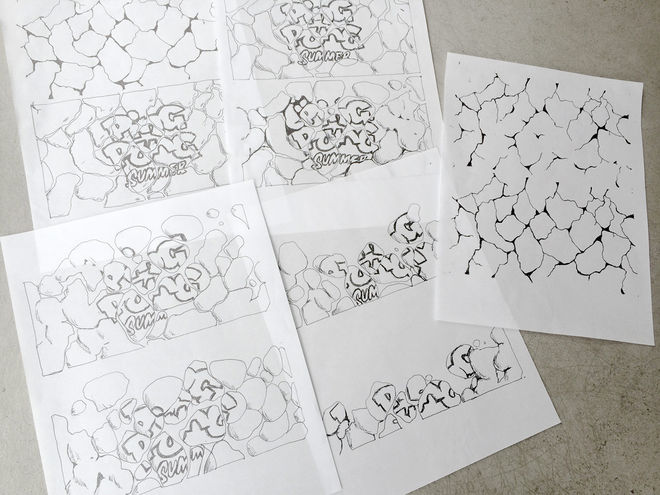
Main title and slurpee animation drawings
Let's talk type. Was the main title drawn by hand?
Yes. Adam, my partner here, spent a lot of his youth tagging and making street art, so I asked him to draw a “graffiti-ish” title treatment. I think he made one pencil sketch, and that’s basically what ended up in the movie.
And how did you animate that, with all the little balls?
It was a high-tech solution, even though it looks super lo-fi. Sean learned how to use the physics engine in Cinema 4D to create a wall that was the shape of the title and blow a bunch of tiny spheres out of it from the bottom, with fans.
He did this several times until we found one that, when reversed, looked like the balls were falling into the title. He printed out every frame of the animation, and I painstakingly traced over each one with a ballpoint pen, scanned them, and imported them into After Effects.
Who worked on this with you and what were the tools you used to put it all together?
It was a two-man team: me and Sean Manchee, a designer, web developer and animator here at CHIPS. He has a crazily diverse skill-set. We used Final Cut Pro, Adobe After Effects, Cinema 4D, and a ton of tracing paper.
What about the typography for the credits themselves?
The reference Tully gave for the end titles was the 1986 BMX movie Rad, which uses one of those ubiquitous ’80s fat rounded fonts that look like the Dunkin’ Donuts logo. It was probably Frankfurter. I found this beautiful contemporary typeface called Hiruko by Alex Haigh, a type designer from the UK. According to the description, it’s “inspired by Japanese culture,” but to my eye it’s a refined update of Frankfurter, with a lot more weights.
Where did the inspiration for the “multiples” section of the sequence come from? (0:38-0:56)
I had originally wanted that section to be a Busby Berkeley homage in which ping pong paddles dance around and form various geometric shapes. But I didn’t get very far before that idea was scrapped.
Paddle flip VHS degrade
The one element that survived was a charming little animation of a paddle flipping from front to back. I asked a friend at a post-production house to run the flipping paddle through a VCR a couple times. We put the VHS version of the flipping paddle into a Brady Bunch-style expanding grid, and it felt right out of an ’80s Saturday morning cartoon.
What was your overall inspiration for the sequence? What were some of your references?
Tully’s first email to me said that he wanted the sequence to “feel as much like the Wild Style credits as possible, but with its own original stylistic flavor.” I was already a fan of the Wild Style titles from seeing the movie in college, and from the post about them on Art of the Title. That was definitely our jumping-off point and the influence can be seen most directly in the “explosions” section at the very beginning.
From there, we took a lot of the ideas from the movie itself: the scorecards used in the ping pong matches to the Icee machine, which has an entire scene devoted to it.
What are some of your personal favorite title sequences, either classic or contemporary?
Of course, I constantly refer to Saul & Elaine Bass, and Dan Perri, and Pablo Ferro, because there is just so much variety and experimentation in their work. I have a special affinity for the titles designed by M&Co. in the ’80s and ’90s for the Jonathan Demme films Something Wild and The Silence of the Lambs. There’s a wonkiness to the typography that I love.
More recently, I was blown away by the titles for Enter the Void and Scott Pilgrim. Both of those have advanced the form.

