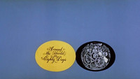
Upon its release in 1968, Prudence and the Pill gained a reputation as the first film comedy centered on birth control and the new contraceptive pill.
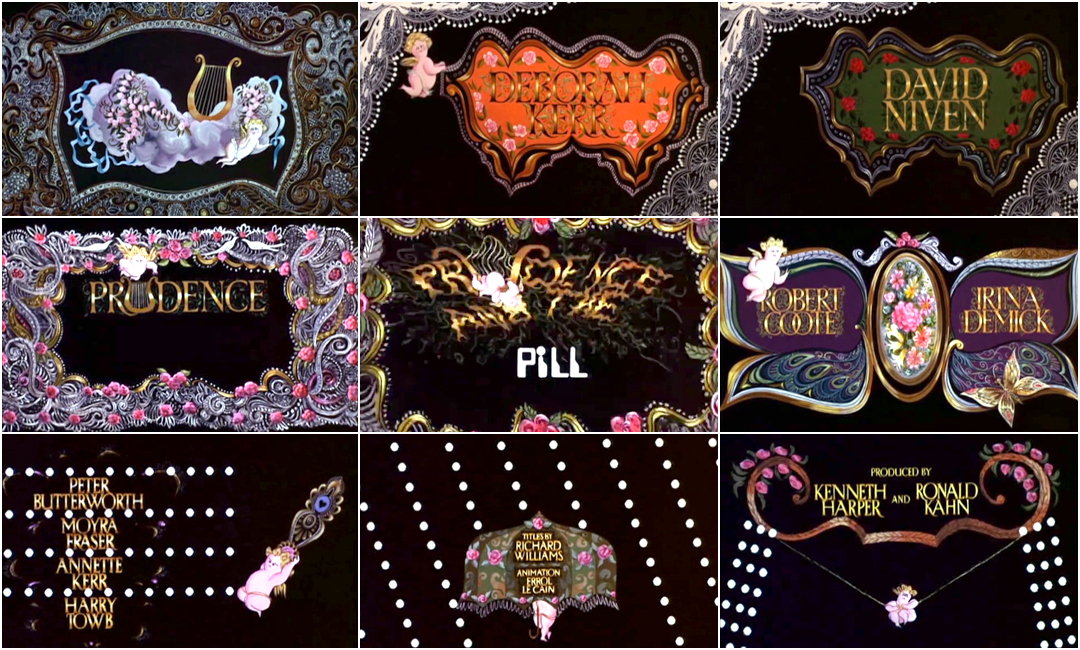
Its animated title sequence takes conservative notions and flips them about, sending Cupid into fits of fury as he vainly attempts to go about his business. The Victorian-tinged elements of lace and filigree, ornate serif typography, and gilded edges come together to create an image of refinement and grandeur rooted in history. Almost immediately, this image and idea is dashed – assaulted by the pill.
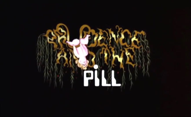
The typography of the title card gets electrified and Cupid hangs on
Represented by flat white dots in rigid, modern formations, the pill is Cupid’s enemy and it invades at every opportunity, disrupting the title sequence. Finally, awash in a rain of pills, the cherub relents, pulling the curtain up on a window to the film proper, a live-action scene optically inserted by Camera Effects Limited into the last animation credit.
The pill had arrived on the American market in 1960 and on the UK market in 1961. By 1964, it was the most popular contraceptive in the United States, but transforming social mores was by no means a tidy affair. The animated sequence addresses this tension head-on, with the pill triumphing over Cupid and his antiquated methods and ideas. Notably the film itself has an entirely different narrative trajectory where characters take women's birth control pills and switch them about, putting women and their agency over their bodies in jeopardy at every turn.
The title art, designed by Richard Williams and animated by Errol Le Cain, is an electrifying and entertaining opening to a film tackling a subject which was new to cinema and still being digested by American society.
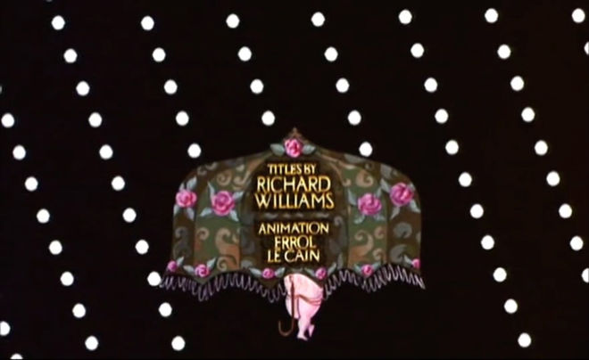
Still from the sequence featuring the credits for title design and animation
Title Design: Richard Williams Studio
Title Designer: Richard Williams
Animation: Errol Le Cain
Opticals: Camera Effects Limited

