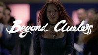
It’s all there... the hustle and bustle of any suburban American high school at 8am, school buses, teachers, students, lockers, classrooms, bells ringing, an intentional for-shot remake of The Breakfast Club open with a Molly Ringwald look-alike getting out of dad’s Mercedes. The cool kids, the regular kids, the dweebs, the defeated, the autocratic teachers, all playing their parts. Everybody knows what’s coming next. Everybody knows it’s another Hughesian teen angst-fueled opus.
Except it isn’t.
This is an Allan Moyle film. The Canadian writer/director laughed out of Hollywood for making Times Square, a movie about the New York punk scene descending into the New Wave with two girls as main characters. This is Leonard Cohen. This is Bad Brains and Henry Rollins and Ice-T. This is pirate radio proclaiming everything in America is “completely fucked up” in the opening line of Christian Slater’s voiceover. These are iconoclasts. And this is iconoclast designer Pablo Ferro introducing them to the unsuspecting status quo.
Ferro does so skillfully, of course. Under Slater’s warped voiceover, Moyle’s camera pans over a no-moon nighttime suburbia, abruptly turning in the opposite direction to illuminate what has to be the most boring tract of all the tract homes in America. This is what we were looking at under the darkness? Fade to red. Red? Yes, death to monotony.
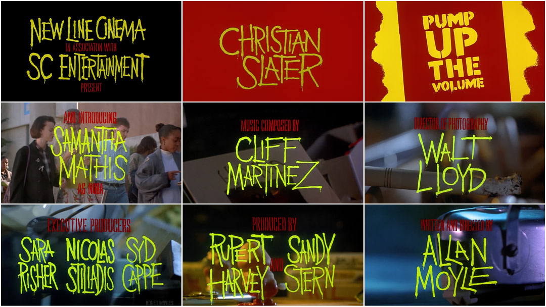
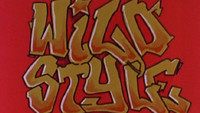
Awaken to letterforms. It’s graffiti, the visual language of the disenfranchised, acid green and dripping. The letters are Pablo Ferro’s, tall and thin, with no dull edges. The letters rebel, confront, and demand our attention. We’re stirred. Cue the Hughes stereotypes at High School, USA.
By the time Cohen’s wise baritone plays in the protagonist’s refuge, “Everybody Knows” we’re in for something very different than a brain, an athlete, a basket case, a princess, and a criminal frolicking in forced high school harmony. This verbal bloodletting is a challenge to the viewer’s own prejudices. This is disillusionment and crude angst being broadcast into the darkness.
A discussion with Title Designers PABLO FERRO and ALLEN FERRO.
So, tell us about Pump Up The Volume. How did you work on that?
Pablo: We made that look like a stencil.
Allen: That was the tabletop shoot that we did with the yellow stencil lettering.
Pablo: The director [Allan Moyle] – that’s what he did as a kid in New York. He’d make a stencil and paint on the wall. He cracked me up because sometimes he’d like some dripping and sometimes he didn’t want any dripping. I said, “You can’t control the drip, you can only add more or less.”

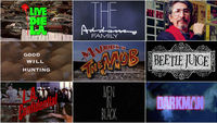
Image set: Examples of typography using the dripping paint effect
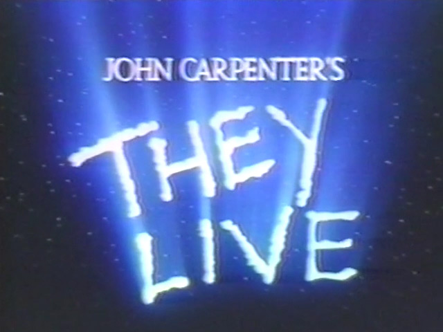
Allen: It’s a matte. We stole that one from They Live. We steal from our own stuff quite a bit, but what’s interesting about it is that it’s a collaboration with people in special effects who have a great understanding about forced perspective and principle photography. We use all the elements that we can in making mattes and utilizing that within very simplistic overlays and composites. When the design was approved we knew this approach would work very well – the stencil spraying on and peeling off was a very quick move. But what I think really worked out very well were the titles over the tabletop, which I believe the idea came from Citizens Band.
They Live (1988) theatrical trailer designed and edited by Pablo and Allen Ferro.
Pablo: And Harold Adler, he helped a lot. He would do rough lettering and when he was finished with it, it was beautiful! Sometimes if I was looking for something beautiful and rough, I would go over to his studio to watch him work and say “Stop! Don’t touch anything else, I think that’s great, Harold!” and he’d say “No, no, I gotta do this or that!” – “Don’t touch! That’s exactly what I want. You got it.”
Allen: [laughs] It’s hard to get people to accept their mistakes.
So you used the stencil and spraypaint concept. Were there any other concepts you worked up with Allan Moyle before that?
Allen: It’s editing, really. Allan basically trusted Pablo implicitly to produce it, so we produced it together, and he created the graphic and we put it all together. The producers looked at it, approved it, and we went to film on it.
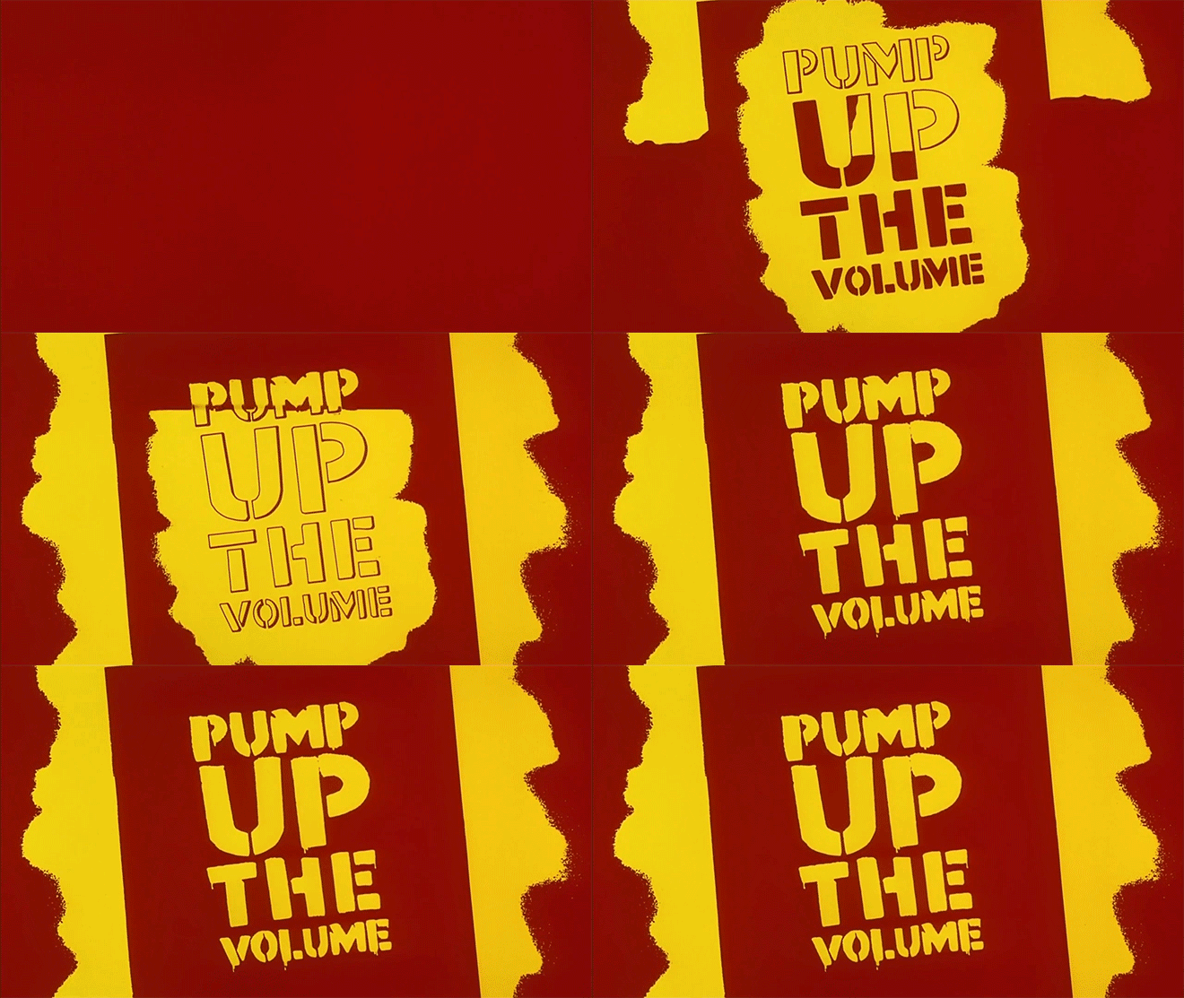
Pump Up the Volume title card animation
Pablo: We’d worked with New Line Cinema before Moyle. We were recommended because of what we did before.
Allen: Right. Pump Up the Volume came after Book of Love, directed by Robert Shaye, the founder of New Line. This is the way that ideas get recycled and perfected for a movie. These concepts work for certain genres and certain presentations. I’ve always said that the first reel is the most important reel to make a statement in a movie, unless of course you have something that is going to carry through the movie, then you smack a title on the end.
The opening shot of Pump Up the Volume is reminiscent of the first shot of the Bullitt title sequence, which you worked on as well. That long night-time exterior pan across the buildings. Was that an intentional nod?
Allen: It was the first reel, so Pablo and I were very involved in that first reel.
Pablo: We shot somewhere for that. Not too much. [The director] had something that didn’t fit well and he needed something extra. I can’t remember what it was, but I remember we had to shoot a few extra shots.
Allen: We had to find a community and shoot a wide angle shot of the community. We shot some material but whether that ended up in the movie I’m not certain.
We had people working with us at that time. We had a team...
Pablo: Of course we had people come in so you can get things done for a deadline. But everything I do, I always show it to Allen and ask what he thinks. He might have an idea about how to change it.
Allen: We had some people that we worked with who’d worked with Hal Ashby. We had a few editors, we had Terry Southern’s kid Nile Southern working with us.
Leonard Cohen’s “Everybody Knows” plays a prominent part in this opening. You guys beat the True Detective season two opening to the punch by about 25 years by using Cohen.
Allen: [laughs] Oh, hilarious! Yeah, Leonard Cohen’s song was pretty apropos, even for that time. That was Allan Moyle’s choice of music for the movie and I think it was great.
Have you seen any recent titles that you've liked?
Allen: The one that sticks out in my mind because it was just so well thought-out was Zombieland. Love Zombieland because it was just so well thought-out, just so funny, and it made sense for the movie and so I love that whole rendition. That sticks out as being one of my favourites of the last ten years.
Pablo: The new Captain America did a great job at the end of the film, where they used a white background. Around the ’60s they started using black backgrounds and they haven’t stopped!
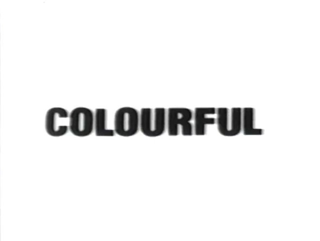
TV commericals created by Pablo Ferro in the 1960s
Like you look at my commercials, they’re all light background. The light background textures. It’s an interesting image that you see in white, that you would not see in black. On black, all the lines and the lettering, sometimes you can’t read it – it eats it up. Black is so pronounced that it eats up the lettering – the lettering looks swollen. On a light background the lettering looks bigger.
So I like Captain America – and Saul Bass. Now, Saul Bass, one of his best titles was The Man with the Golden Arm. He used black, figures and shapes, and white type. It’s sped up so much and that music was just perfect for it. Shorty Rogers – ta-ta-ta-ta! I like what Saul Bass and Elaine Bass did with their pretty backgrounds, instead of black, especially in those last films they did with Marty, all the texture. Then titles all went back to black…
Allen: We like the Captain America: Winter Soldier titles. They’re good, we like those.
LIKE THIS ARTICLE?


