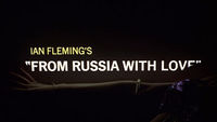
What stifles creativity? Tedious third party rudeness, fear of appearing the fool, fear of failure, fear of authority, fear of bucking the team or the trend?
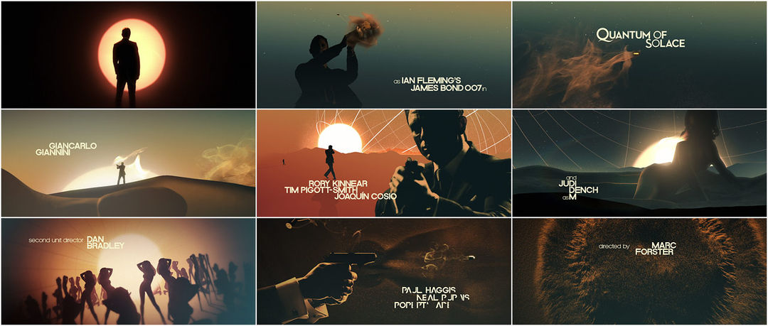
MK12, the title and motion graphic designers for director Marc Forster's 2008 entry in the James Bond franchise, Quantum of Solace, englobes 007 with women in the dunes and the persistence of arid visions; a zoetrope in free fall and sandy contrails of a bullet on its way. Taking the title design reins from names like Binder, Brownjohn, and Kleinman, MK12 seems to have attained a self-fulfilling creative kinship that flies in the face of what author Bruce Sterling describes as the flux of "Hollywood film ad-hocracies."
To make a movie, Sterling says:
You're pitchforking a bunch of freelancers together, exposing some film, using the movie as the billboard to sell the ancillary rights, and after the thing gets slotted to video, everybody just vanishes.
To take the idea further, Joel Kotkin, author of a landmark 1995 article in Inc. entitled, "Why Every Business Will Be Like Show Business," writes:
Hollywood has mutated from an industry of classic huge, vertically integrated corporations into the world's best example of a network economy. Eventually, every knowledge-intensive industry will end up in the same flattened, atomized state. Hollywood just has gotten there first.
Ben Radatz, MK12 creative director is part of something different:
The studio as an entity is definitely greater than the sum of its parts. It's casual, because everyone is unpretentious, anti-hierarchical, and open-minded. Yet it's also personal, because I believe most of us are introverts. And more importantly, we are all friends first.
So MK12 is a collective that capitalizes on true collaborative creativity realized (or not) by and with the hands of friends. Why is this alternative not the well-practiced norm from the damn beginning? What progressive, Vandermeerish planes of warped Gothicism would we be exploring? Even as we take solace in the knowledge that we will have a crack at it in this lifetime, the underbelly's nibblet tugs are ever-feeding with the awareness that we might've been there sooner.
A discussion with MK12 Partner and Creative Director BEN RADATZ.
Can you explain who, or what, MK12 is?
BR: We're a bit of an anomaly in that we're not set up like a regular commercial studio; we are five partners and four employees, but by and large we're a democracy, with everyone regarded as a peer and able to influence the course of a project. We do appoint creative leads from time to time, but we pride ourselves on being generalists and often pass projects around so that everyone can add their own layer to it. Most of us have been working together for years and have a pretty good shorthand at this point, so projects stay on course without much creative management.
Most of us met while at Kansas City Art Institute, where we majored in photo/video, which sort of doubled as an unofficial animation department. We'd collaborate on projects often, and after we graduated we just kept on going, creating our own short films and experimental pieces. Eventually our work got noticed on the festival circuit, and we started getting calls for commercial projects, and we gained momentum from there.
How does one approach designing something as anticipated as the opening title sequence to a James Bond film?
Hmm, well, if you're us, you do your best to not think about the context – it's a bit overwhelming if you do! Not only is Bond the most successful and steadfast franchise in the history of cinema, but it's also best known for promoting title design both as an art and as a platform for new technologies and techniques. Think of the optical effects in Thunderball or the lasers in Octopussy, for example. Bond titles are the definition of a successful marriage between craft and technique, and – if that weren't enough – the Broccolis have always had a knack for finding the right people for the job. Binder, Brownjohn, Kleinman – all visionary graphic directors, able to weave abstract narrative, high technology, and high design into a single graceful statement that defined the franchise as much as 007 himself.
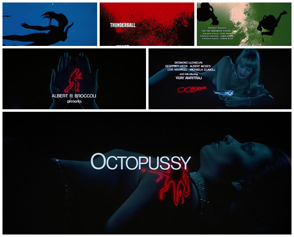
Thunderball and Octopussy credit examples
Our first week on the job was miserable… we felt like kid astronauts with keys to an actual shuttle, like someone was going to call our bluff at any minute. Once we got over the initial scare, though, we realized that this was the kind of project we were built for. Much of our commercial work is in advertising, and we always struggle with that format; our forte is filmmaking, usually of the experimental variety. In drier words, we're at our best when we're able to tell a whole story through our specific lens. It turns out that the Bond titles are just a bigger, fancier version of what we do in our spare time anyhow, and once we put it into that context, things got easier.
Can you detail the different concepts you went through?
Those who have seen the film will remember that water plays a central role in the story. Dominic Greene is the villain-du-jour, bent on controlling the world's superpowers by holding their water supplies for ransom. In the tradition of past Bond titles, we chose to focus on this central element as our angle, and we went about mocking up faux sequences when we weren't busy with our then-official job of designing the GUIs. Up to that point we'd only been earmarked by Marc, the director, but we hadn't received the official blessing from the producers.
We used the early tests more as conversation starters than as formal pitches, and they also served to show our understanding of the franchise and QoS in particular. Through these conversations we learned that we'd been thinking about the film from an opposite perspective than that of Marc and the producers: where we saw water as the central theme, they saw the lack of water as Bond and Greene's motivation. Both had good merit, and so we switched to that angle. Surprisingly, we were able to transplant most of our ideas quite easily. Out initial concept set Bond in a landscape made of backlit female forms submerged in water, abstracted to the nth degree through reflection and macro photography. After mulling over random ideas for a few days, it occurred to us that the same technique could be transplanted to a desert scenario, with the female forms instead becoming sand dunes.
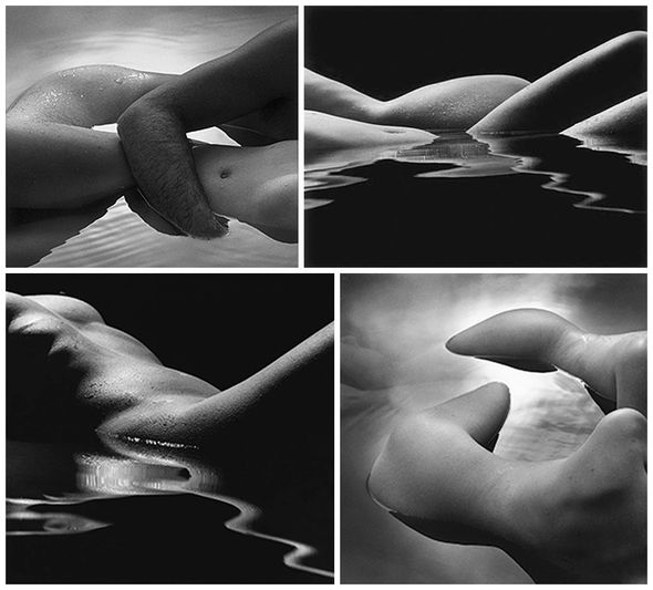
Karen Rosenthal's "Cape nude" examples
Our choice to re-introduce the female form was both a hat-tip to past Bond titles and an apt metaphor for his current emotional state, having just lost his only love interest in Casino Royale and now in uncertain waters as he re-evaluates his relationship to women. We didn't want to be as exploitative as in past sequences; instead, we approached it from a fine arts angle, looking to a lot of renaissance nudes and early experimental photography. We were really inspired by the photographic nudes of Karen Rosenthal and Man Ray – specifically, their eye for distorting and recontextualizing the human figure. Much of the action in the film takes place in desert environments, and in that we saw an opportunity to address not only to the theme of the film but also Bond as a character. As Bond goes through an emotional transformation in Quantum, his allegiances become ambiguous – both to the audience and to his peers. The desert seemed an ideal setting to illustrate that uncertainty, and so our sequence finds Bond lost in the middle of it, hunting an unknown foe as the world turns against him.
Some of the ideas on the cutting room floor were really interesting but not sustainable. We experimented with an op-art approach we called Pink Panther for Adults, we had a fractured mirror concept that we ran with for a while, and an entire world made of dripping blood – a visual nod to the infamous 'Bond Barrel' that opens every film. We had a backlit-projection idea that produced some amazingly beautiful and haunting images, but that ultimately proved a bit too spooky and off-character.
How did the live-action shoot go?
It was a pretty complicated affair; in total we shot for four days: the first day was elements and special effects, the second and third were with the women, and the last was with Daniel Craig. We shot at Pinewood out in London right after principal shooting for the film had wrapped, and myself and Tim Fisher – partner at MK12 – ran the show.
We arranged the stage so that there were two setups on either end; that way we could split up and double our shots. The crew had built two massive sandboxes, which they sculpted into desert landscapes on a shot-by-shot basis. Sometimes we'd use the boxes as 1:1 sets for detail shots of Craig, but most of the time they were miniature landscapes sculpted around our female talent. We also had a couple of middleweight stunt shots that required some custom rigs and rehearsals. At one point there was a three-story jungle gym thing erected with a floor that would collapse on cue so that Craig's double could fall through it, which we then composited into a motion-control plate of our women moving around in the sand. We also used a gyroscopic armature – affectionately called the “Potter Rig” due to its use on that franchise – which Craig would strap himself into and tumble around as though in free fall.
Behind the scenes of the live-action title shoot
The motion control component was by far the most difficult to coordinate. We'd put together a 3D animatic beforehand, and that data was plugged into the rigs, but there was still a lot of analog guesswork involved because we were shooting takes of the miniature desert sets, then replicating those moves in full-scale with Craig using a different lens. And because they had to be shot at different frame rates (the miniatures were filmed in slow-motion), those shots became our time-consuming heavyweights in post. Most of the time we were able to reconcile the motion control data, but some shots relied on good old fashioned hand tracking.
What was the length of the project?
The timeline is a bit blurry since we'd unofficially been working on ideas and tests throughout the production of the film, but once we had the green light, it was roughly a three month affair.
How large was the production/post production team and what were their roles?
The team grew and shrank quite often during production; in the beginning it was just a few of us bouncing ideas around, which grew to six creatives and two producers once things got going. The shoot itself was a monster: five producers, two directors from our side, an assistant director, our DP Simon Chaudoir, the choreographer, motion control people, stunt and safety guys, makeup, talent, crew – around 90 people in all. Once we got down to work back at the studio, we had our entire in-house crew of nine, plus five freelance artists, a project manager, an editor and a particle specialist.
What was it like working with Marc Forster this time, your third collaboration?
We really enjoy our relationship with Marc; he affords us a lot of trust and expects our best work in return. He gets very excited about experimental techniques and new ideas and loves to rummage through boards and motion tests, making connections and puzzling things together. It's good fun to watch. He also understands that protecting the creative vision is key to making good work, and he goes out of his way to make sure we're not affected by politics or overhead.
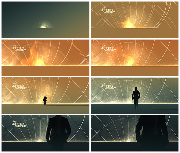
"Jeffrey Wright" credit detail
Before the Quantum title sequence, we'd already been working for several months on all the graphic interfaces in the film (the computer displays, PDAs, mobile phones / etc), and so we'd already had lots of conversations with Marc about Bond and knew where he wanted to take the film, tonally. And from past experience, we had a good idea of what would resonate well with him, so our early tests were already in the ballpark, freeing us up to micro-develop a narrower spectrum of ideas.
I should mention that we've worked on one other project with Marc since Bond: a short film commissioned by Swiss Air called LX Forty. Marc did the writing and was also the subject of the film, and we co-directed the shoot and produced the content.
What other graphic elements did you handle in the film?
We designed all of the GUIs in the film, along with a custom operating system for MI6, the agency Bond works for. We extended that design out to Bond's hi-tech gadgets, including a mobile phone that snaps high-resolution photos using infrared, thermal, sonar, and visible light sources to create a composite image. This was featured in a key scene in which Bond attends an opera and exposes a crime syndicate by using the composite photos to identify the players in the dark.
We worked a lot of theory into the OS, reading up on new-age mind mapping and radial thinking techniques, which basically prioritize color, shape, and visual arrangement over hierarchical lists as a way to organize and process new information. We also integrated Boolean logic and free association into the design, giving the OS a very organic, intuitive foundation. None of that was really meant to be seen, though; it was just the behind-the-scenes thinking for a deceptively simple shell, but it was simple for a reason: MI6 is a spy agency, so its agents need an intelligence system that could not only parse mountains of data in real time, but would also be dead-simple to use in the field.
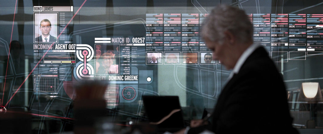
M's office data wall
Because the human brain responds to color faster than any other visual stimuli, we coded data sets with annoyingly-bright colors and arranged them into primitive 'nodes' designed to catch attention and direct the eye. This all folded into a nonlinear data web – a self-constructing pool of information that constantly morphs and adapts to new information from any number of sources: intelligence reports, government databases, the news, the web, wiretaps, fieldwork, etc. This information is contextualized in real-time, and the computer then makes intelligent decisions about what pieces of data are most relevant to the task at hand, presenting them as a consolidated 'book report'. So for example, when M speaks with Bond on the phone in her office, her wall-sized transparent display tracks his movements, analyzes his voice, calls up leads he's following, and so on, all without her involvement. That data is also tailored to her rank and needs and arranged on the fly for quick consumption.
Quantum of Solace: VFX Reel
At one point, M calls the CIA, and it's amusing to watch her computer as it tries to auto-hack their servers, mining for data. The CIA, of course, is doing the same thing, so there's an all-out tech battle happening behind their otherwise cordial conversation. An appropriate easter egg, we thought.
Another big scene of ours was in a forensics lab at MI6, where Bond, M, and several other agents trace laundered money on a large touchscreen table. We mocked up the table at our studio and shot the full sequence using ourselves as stand-ins. This was very useful for blocking the action, as there were a dozen things happening on the table at once, and everyone was passing files back and forth. It would have been impossible to keep continuity without solid choreography. We set up a witness camera over the table and mapped out exactly where everything needed to be, using acetate sheets with tracking marks as virtual documents. We mocked up a previs of the scene with crude graphics on the table, took that with us over to London, and supervised the shoot under Marc and FX guru Kevin Tod Haug.
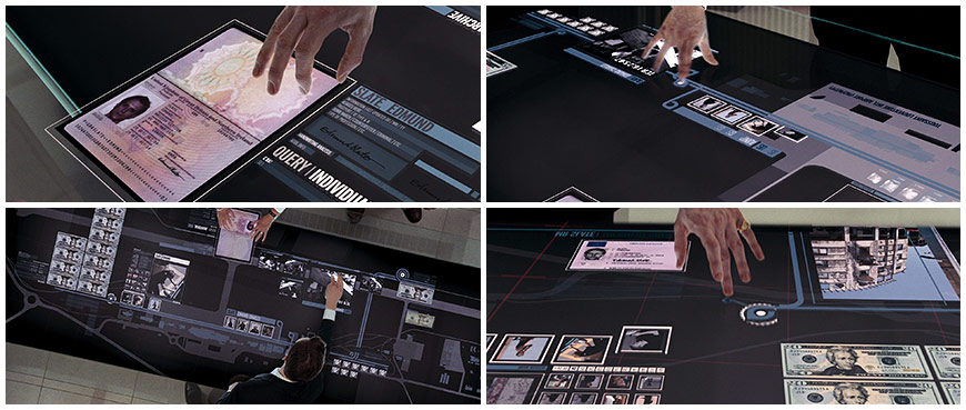
Touchscreen GUI examples
Interestingly, a functioning (albeit limited) version of the touchscreen table was built for a Bond exhibition at the BFI headquarters in London last year. We didn't have a chance to visit, but we have seen video of it in action. It's very strange to see it actually work as envisioned! Another more limited version of the table was also designed for a Bond exhibition at Madame Tussauds Wax Museum in London.
Last but certainly not least, we also gave the iconic "Bond Barrel" a makeover, starting from scratch with a new Craig and a transition into the Quantum end title card. (Fun fact: this was the first Bond film to have the barrel at the end of the film.)
Redesigned "Bond Barrel" shot
Would you have done anything differently?
The theme song came in very late on account of Amy Winehouse dropping out; the first time we heard the official Jack White/Alicia Keys track was on the day we began shooting. We knew about the delays, though, so we had worked some flexibility into the sequence to account for differences in tempo. The White/Keys track was more high-energy than we'd expected, though, so we had to do a lot of fancy footwork on set to make sure we were covered.
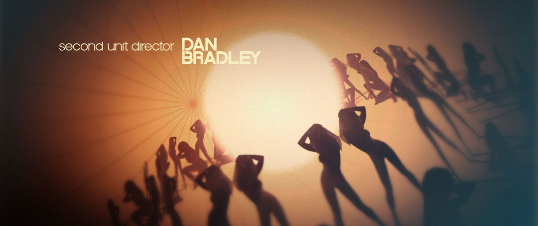
Zoetrope women
Much of the shoot was dedicated to motion control, and shots had to be committed to weeks in advance. At first it was difficult to visualize the sequence against the new track – we'd been planning on a ballad, so many of our programmed camera moves were these long, graceful shots that were meant to be stitched together seamlessly, both visually and temporally. Theirs was a straight-up rock ’n’ roll track, which threw us for a bit of a loop. But we shuffled some things around and found ways to integrate a more staccato pacing into the sequence while still keeping our camera moves and story arc intact. Ultimately, the two blended together quite well, but if we had a do-over, I'm sure we'd annoy everyone even more than we already did with requests for the track earlier on.
Any creative epiphanies during the creation of the sequence?
A lot of the concepts we shelved are finding their way back into our work, though perhaps not so much visually as in spirit. Subconsciously, I think we were wanting to clear off the table and do something entirely different from our other work, so the techniques we experimented with were novel even to us.
Did you ever feel like working on a Bond film was a kind of test?
In context, I'd actually see our previous title work as the test. Most of our titles to date have been with Marc Forster, and he seems to up the ante every time we work together. On Stranger Than Fiction – our first film together – we came in on borrowed time, as Marc already had it in mind to scrap the sequence altogether. We wouldn't have been much of a liability had we screwed things up. He gave us even more freedom and trust on The Kite Runner, and I'm certain that we wouldn't have titled Quantum had we not gone through those steps. I suppose that Bond was a test in that it really did require our best thinking and execution, and its success depended on us working outside of our usual comfort zone.
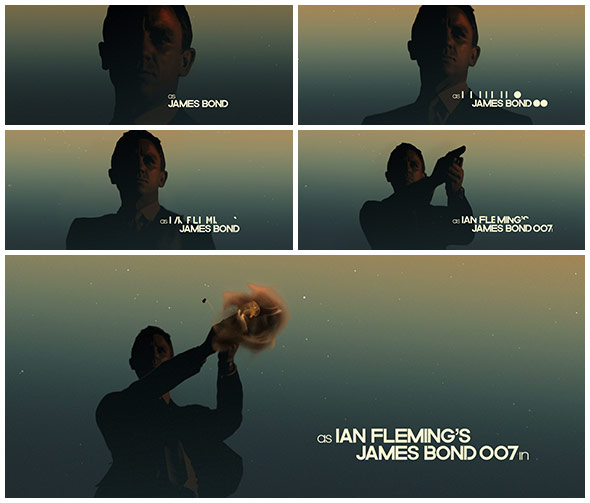
Type details
What is the trick to keeping the Bond community expectations sated while introducing fresh sophistication?
We'll let you know when we find out! Bond fans are an oddly stubborn and loyal group. Usually, if it's not Connery in a DB5, any news of change can spark riots. Remember when Judy Dench replaced Robert Brown as M? But, they also accept that the franchise needs to evolve, and over drinks I'm sure they'd admit that that's part of what keeps them vested. The news that we were going to be designing the titles was met with skepticism, as Kleinman was very popular with the base. And the franchise is proudly British, so we already had a strike against us just by signing up. What's interesting with Bond fans, though, is that once it's on film, it's Bond – there's no longer a debate on the Bond-ness of something from that point on.
One of the most rewarding things about doing the titles is hearing people who are certifiable 007 authorities dissect our sequence and put it in context with the full Bond canon. We're not able to be that objective, so listening in on that debate – both the good and the bad – is really great, and a bit humbling.
How did you identify with the consistency in the long history of the 007 opening title sequence?
Preserving the tradition of the sequence was really important to us, and somewhat counterintuitively we chose to work with a lot of the pre-established tropes, particularly from the earlier years. This is most evident in our type design, which was inspired by Binder's famous stop-frame dots in his Dr. No sequence, but it also informed our use of color, tone, and rhythm. We did this both as an homage and as a continuation – a contribution to the larger coloring book, I suppose. Of course we wanted to add our signature to the franchise, and we had a lot of encouragement from Marc and the producers to do so.
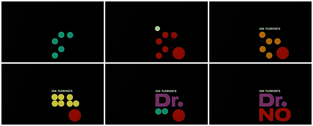
Dr. No main title treatment
As I mentioned earlier, a Bond title isn't a Bond title without some kind of tech gimmick – something that not only compliments the narrative and frames the aesthetic, but also has a novelty factor. Our gimmick was motion control, and while that in and of itself isn't that novel, the way in which we used it – compositing a regular-sized Bond into a world of giant women, or creating abstract transitions between 'sets' – proved a challenge to the technology.
Are there some projects that were never used that you can share with us?
We always have some kind of extracurricular project in the works, but we're not able to follow through on all of them – either they're too ambitious or we get distracted by something shinier. MK12 rebrands are the worst offenders, as we tend to take them very seriously and put ourselves through a dozen rounds of design before settling on a direction, and even then we'll tinker with it up until we launch.
Probably our biggest flop was the film that actually kept us working together after college: a feature-length sci-fi noir called Arcadia 9. It follows several bizarre and intersecting stories in the retro-future city of Arcadia – an Orwellian megalopolis with a population so dense that they've had to excavate downwards through sedimentary layers of older buildings in order to make room for everyone. The result is a fascinating and literal cross-section of the city, with its history and population on display – the poor living at the bottom and the rich ever-building over their heads. The film itself was sort of a dance with the politics of vertical living.
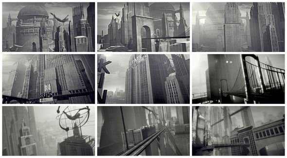
“Arcadia 9” stills
We worked on the project for almost two years, mostly at night after our pre-MK12 jobs. In that time we developed a fairly large chunk of the city in 3D with an absurd amount of detail, as we wanted to be able to 'scout' virtual locations for scenes. We also shot live-action plates of people walking around and composited them into the city with very promising results, considering our lack of experience at the time.
We had a short film in SXSW around the time we were working on Arcadia, so we took advantage of the spotlight and drove down to Austin with a trunkload of homemade press kits, which were comprised of fake newspaper clippings, old postcards from Arcadia, vials of colorful pills (tic-tacs), a tourist brochure, fake newsreel footage of the city, and a torn-out Sears catalog page featuring things like personal robots, depression medication, pure oxygen, and animatronic pets. We unloaded the kits on anyone who looked important, and we actually did get a few return calls, though most were wondering about the contents of the vials.
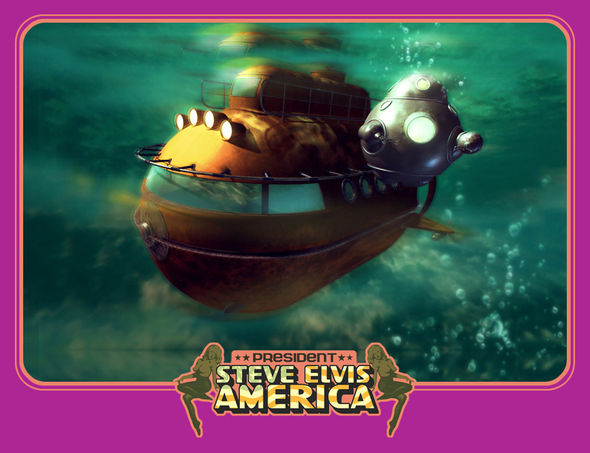
Man of Action! sub bot
What ultimately killed the project was our technology ceiling; we'd designed a city so large that we simply couldn't render it anymore! Without funding we couldn't go any further. By the time we did get capable machines, we'd already moved on.
Also, one of the films we're best known for is Man of Action!, a rapid-fire parody of the Connery/Coburn-era spy genre. It chronicles the adventures Steve Elvis America and his sidekick robot monkey, Robobobo, as they travel the galaxy in search of Mr. Tha The Mad Misunderstood Professional Evil Maniac, who is holding the world for ransom with a Cosmic Death Ray able to wipe entire countries off the map. We had so much fun making it that we immediately started on a sequel, this time putting Steve Elvis against an exiled Nazi crime ring on a planet made up entirely of casinos. We had a working script and a good start on the sets, but other projects took precedence and we eventually shelved it. There has been some talk of reviving it lately, though...
What advice would you give to someone entering the field of title design specifically?
The number of schools that teach motion graphics and title design has grown dramatically in the past few years, and they churn out a lot of designers who seem to focus on technique and aesthetics and neglect the conceptual and narrative side of the craft. The industry itself is partly to blame for this, I think, because it establishes the idea that creative directors run the show, and designers are only the executors of their vision. But there's no communication gap when the designer is also the director – no barrier between a good idea and its execution.
Though it may be true that not all designers care to wear both hats, giving work a greater context can only make it more robust. Not that all title sequences need story arcs and high-brow treatments, but they do need to adhere to their own internal logic. We see a lot of reels from graduates with very pretty work but little substance, and it's a rare gem to find one that favors concept over content. The latter can be taught.
William Burroughs once wrote a rebuttal to critics called A Review of the Reviewers, in which he cited Matthew Arnold's three criteria for criticizing writing, and also introduced one of his own. I think they apply equally well to title design:
1. What is the writer trying to do?
2. How well does he succeed in doing it?
3. Does the work exhibit "high seriousness"?
4. Write about what you know.
What changes would you like to see in the profession?
Title design is a fairly competitive field, centralized in Hollywood for the obvious reasons, and while it has been enjoying a renaissance of sorts, technology and location can make it difficult for new and unique voices to be heard. The advertising world relies on a network of agents and producers to discover and promote new talent, but there's no such system in place for title designers, at least not in any formal capacity. Many of of those outsiders may end up at the bigger shops, but it would also be wise to facilitate those who don't. Originality is the heart of title design, and fresh voices keep the renaissance going.
And what’s next?
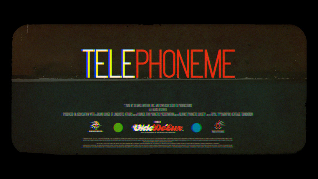
We just finished a new short film called TELEPHONEME and are busy promoting it, and we have some work in a feature-length documentary called Holy Wars that is currently making the festival rounds. We also designed the titles for a documentary on the infamous RoXY club in Amsterdam, which should be coming out soon. We're also waist-deep in two new film projects of our own, but both are fairly ambitious and will take some time to develop.
TELEPHONEME short film
We also just started work on an opening title sequence for the FITC conference in Toronto, which is celebrating its 10th year. We're very excited about it, as it involves a lot of traditional cel-frame animation, which we've only dabbled in. We're also designing their entire identity this year, meaning posters, advertising, the venue – the whole nine. It's always fun to have that much control and design a full experience, not just the components.
Finally, has being in the midwest helped or hindered your projects in any way?
Being in Kansas City is probably the only way we're able to do what we do. The cost of living is reasonable, so our overhead stays low. That lets us be more selective with the types of jobs we accept, which affords us more time to develop our own material, which is critical both to our business model and to our artistic sensibilities – they all feed into each other. We're able to maintain a professional-grade stage and shoot live action right across from our desks, which is a great thing to have at 2 a.m. when you need just one more walk cycle. Overall, this is a great town to live in – it has a lot of creative energy and a surprisingly talented crop of local artists, musicians, and designers. Good vibes to plug into, certainly.
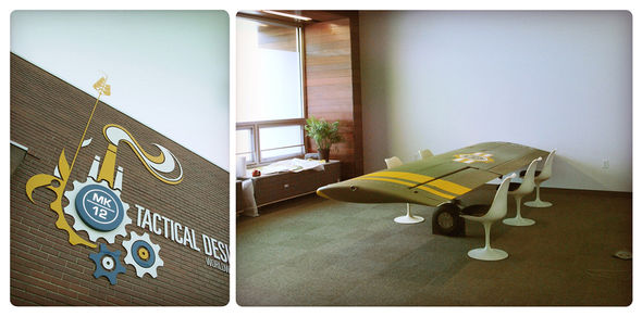
MK12 - a full service lateral hyperthreaded tactical design and research bureau
The downside, of course, is that we're miles away from the industry, so we have to rely on a combination of good representation, frequent trips, and a crazy amount of bandwidth. And a lot of people are simply hesitant to work with remote vendors, especially in the film industry where terabytes and daily updates are the norm. But it is becoming a more common practice, and there are now a lot of good online tools for two-way conversations about the work, so that barrier is becoming increasingly obsolete. So then all that's left are the people who still think Kansans are hicks, but that's ok – we're on the Missouri side. We voted for evolution.

