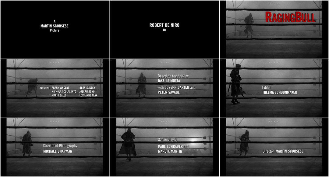
Robert DeNiro’s Jake LaMotta is a coiled animal, caged like a note on sheet music: fierce, balletic, and balanced to its function. The ropes of the ring are frames, like bars of music. Indeed, “give me a stage where this bull here can rage… that’s entertainment.” A row of people sit, silhouettes in judgement, while flashbulbs pop and die with the slow pace of the events about to unfold. What do those photos reveal?
The opening of Raging Bull bears something uneasy, yet refined and languorous, somewhat reminiscent of the quiet roll of the marble in the opening of To Kill A Mockingbird. Both opening sequences share the perfect music – here, it’s “Intermezzo” from the opera Cavalleria rusticana by Pietro Mascagni – as well as incredibly visualized soundscapes, beautiful black-and-white cinematography, and a sophisticated yet gritty production design.
Instead of moving in tandem with or in the same direction as the action, the music runs against the scene, playing in stark contrast. The Cavalleria rusticana makes the scene celestial, dreamy, elevating LaMotta’s furious display to the level of graceful performance. This technique of placing classical music against a scene of action – also slowed down, in black and white – is used to stunning effect in the opening of Tarsem’s The Fall.
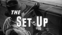
Director Martin Scorsese speaks about Raging Bull, from the commentary track for Robert Wise’s 1949 film The Set-Up:
“I didn’t understand what the ring was. I couldn’t interpret it in my life… but I think at that time I was taking it too literally. Ultimately I came to understand that the ring is everywhere. It depends on how much of a fighter you are in life. The hardest opponent you have is yourself.”
The introduction to LaMotta is through movement, through extremities: his hands, his feet, bobbing and weaving through air and smoke. Faceless, nameless, alone, an instrument of choreography, De Niro’s LaMotta embodies both the star and the never-was. His slow hooded dance is a performance of masculinity, a show of strength and ambition, a threat of violence doused in elegance. His power as a man is the crux, the focal point from which the story pivots. We believe this scene, LaMotta shadowboxing in the fog, to be the beginning, but hindsight tells a different tale.
When the late movie critic Gene Siskel asked Scorsese what he believed to be the most emblematic image from his body of work, Scorsese’s answer was simple: the title sequence of Raging Bull.
A discussion with Title Designer DAN PERRI.
Raging Bull has such an iconic opening sequence. How did this come together?
Dan: Marty was living in New York and I was still in Los Angeles, so I went to New York to meet with him. I bought him this little crystal glass bull and brought it to his apartment for a meeting. He was married to Isabella Rossellini at that time, who was this little 20-something waif of a girl and she answered the door. I came in, and I gave him the bull. I think I had seen the film or parts of it at that point, because I knew who Jake LaMotta was and I had an opinion about him. I knew how violent and bizarre and fascinating he was but what I got from the character was that he was this maniacal, sadistic, and masochistic person.
I thought, he’s not a raging bull he's a RAGINGBULL. He moves so fast – he's violent, he's so driven, he's so obsessed – that when we do the title there shouldn't even be a space between the words to illustrate his maniacal quality, his lunatic personality, the way he treats his women, and so on.
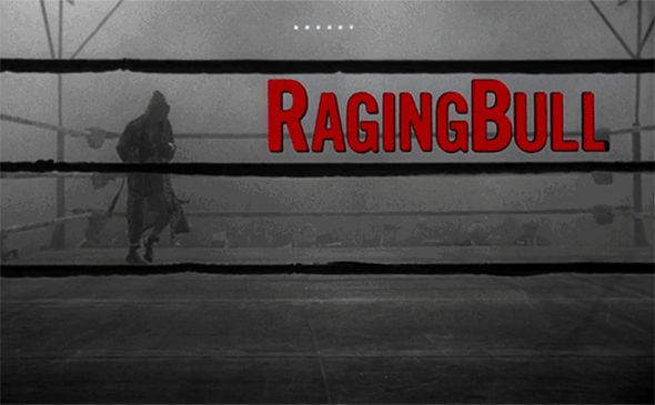
Raging Bull title card
So, Marty liked it a lot and as you see it now it's capital R, Raging, capital B, Bull, and the rest of the letters are there as big and little caps. The R and the B are bigger but there's no space between the words and I felt strongly that it had to be red. Marty looked at me quizzically because he knew that I knew that the film was shot in black and white. But he liked the idea a lot.
You’ve worked a lot with Martin Scorsese, haven’t you?
Dan: Yeah, I did 10 films with him. But the last several have not been with him. He’s either not filmed one or chose someone else. There’s a guy in New York who does some nice work at Big Film Design, Randy Balsmeyer. He’s a good designer…
When you started working on it, was the sequence already in slow motion? Was that decision already made?
Dan: Michael Chapman shot it at 48 frames per second, so it was in slow motion. I wound up copying the scenes that the titles were over. It was basically the character warming up in the ring and each shot was overcranked, but when I duped that I double-framed it again so it was now at 96 frames a second, so it was even slower than the original photography. I copied from a fine grain on to coloured stock and tested it. Often when you put black-and-white images on coloured stock it gets a warm or a cool cast. It's either kind of yellowish or it's kinda blueish. But I did a lot of what's called colour timing. We timed it through the whole process of colour timing until I got a dead black-and-white. It was not blueish or yellowish. It looked as good as real black and white.
Commentary excerpt with Cinematographer Michael Chapman from the Raging Bull Blu-ray
At the time, the film was a small release – it was maybe 50 prints around the country. So when we finally got it finished the end of the title sequence was on colour film: A black and white image on colour film with a coloured title. The rest of the titles were white and they were burned into the screen, between the ropes on the ring, and when that sequence ends it fades to black and cuts to another location.
At that point where we made a cut back to the black-and-white print – that was the rest of the film – I discovered something. Back then they did what is called a “positive” edit. They spliced every print together. So they had the title section on coloured stock with the soundtrack and then it was physically spliced by a film negative person at the lab onto the first frame of the rest of reel one and then the rest of the film is in black and white. But the black-and-white print was thinner than the colour print, so at the point that the colour print ended and the black-and-white began sometimes there would be a loss of focus because it would go through the gate of the projector. It would bounce because it would go from the thicker to the thinner stock, so we had to put a special sign at the head of the reel, before the leader, that advised the projectionist to ride the gate. If he knew where the title was going to end and the black-and-white would start, he would be right there to refocus if necessary.
It was handled in a very unique way through the process. I oversaw the whole thing for all 50 prints and everything else that had to be done to make sure that it was right.
It seems like the title sequence is a slightly different aspect ratio than the film itself, which is in 1.85:1.
Dan: Yeah, it was shot in 1.33...
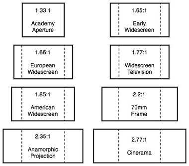
Examples of various film aspect ratios
(Source: The Columbia Film Language Glossary)
Was that an artistic decision or is there a technical reason for it?
Dan: It was an artistic decision that was driven by the technical. 1.33 was the old aspect ratio for films up until the time they went to widescreen – and they kind of went to widescreen gradually. Along the way they went from 1.33 to 1.66 to 1.77 to 1.85 and each of those aspect ratios made the height a little less. 1.33 is 4:3 – four units wide by three units high – which is the TV aspect. When TV came in and theatres wanted to attract viewers to see something that they couldn't see at home on the television they went to widescreen. So they started making widescreen lenses that would project it.
Right, anamorphic and formats like that.
This matting process is not to be confused with letterboxing, which is the practice of transferring film shot in a widescreen aspect ratio to standard-width video formats while preserving the film's original aspect ratio.
Dan: They started matting the top and the bottom, so if you pulled the mattes off it would still be 1.33 underneath. There would still be picture information above and below the matte.
Right. So with Raging Bull, the film itself is 1.85 but the titles are a different ratio – it’s pillarboxed.
Dan: In the original release the ratio was 1.66 because that was an older ratio that Marty liked better and the film was set in the 50s and 60s. There certainly were lots of widescreen films introduced at that time, but this was a black and white film, it was a less expensive film, it was more like a B-film, so it could be more low rent and [releasing it in] 1.66 was more appropriate for that. Now the Blu-ray and DVD versions are 1.85 because that's what [a modern] audience expects. So they might have matted or enlarged slightly to fill the 1.85 or the 16:9 frame but that's not the original aspect.
It was shot in 1.33 and then later we matted it to 1.66. That just gave a little more top and bottom to the frame. It was more to Marty's liking. He wanted that proportion to the screen.
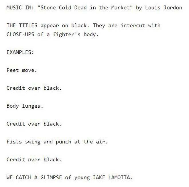
The opening title sequence as described in the Raging Bull screenplay
LIKE THIS FEATURE?


