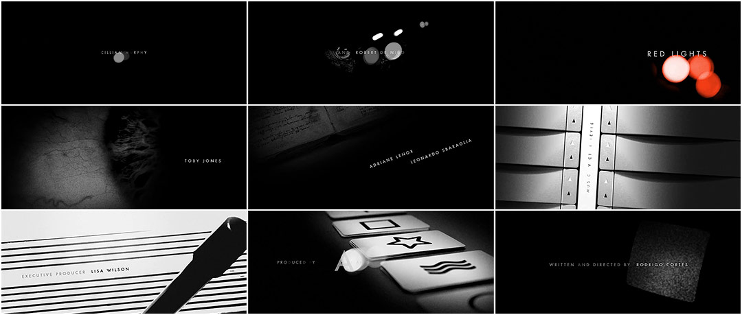
Blurred lights streak this way and that with swipes of white and grey, the type fading in and out in a flash, growing larger and smaller, and then comes more: hands reaching in the darkness, the glimpse of a tunnel, and the sinister sounds of a violin being hastily plucked. A dark cellar full of secrets emerges through shocks of x-rays, weathered photographs, ancient texts, equations, and newspapers. As the music crescendos, the storm of letters and lights is swallowed by television static and the thunder of a jet flying into view, its red lights in focus.
A discussion with JORGE CALVO, main title designer, about his recent work with Director Rodrigo Cortés.
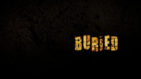
You worked with Rodrigo Cortés previously on his film Buried. What was the initial conversation like for Red Lights?
I was really excited! You don't get to work on projects involving Robert De Niro or Sigourney Weaver everyday, you know? Rodrigo sent me the script and I loved it so I went to see him at the editing suite – he edits his own films – to talk about it.
Basically, the film is about scientists who expose all kinds of frauds in the paranormal realm and he wanted the title sequence to dwell on that world, to show both sides.
At what point in the film's production did you come in?
By the time we sat down to talk about the titles, the production part was over and the editing had just begun.
How did the visuals come about? Did you sketch or make storyboards?
No, there was a lot of open experimentation. I knew I didn’t want something pretty and colorful. It was a “I’ll know what I want when I see it” kind of thing, so I started out by keeping all my options open.
Did you always know you needed to segue into the airplane scene or was that something that evolved later?
Oh, from the very beginning Rodrigo knew exactly when the sequence was going to start and finish, so I knew what I needed to structure the titles around.
And did you already have the music or did that come after?
I always work with the music first – it’s such an important part of the visual experience! If I don’t have music, I’ll make something up! And that’s exactly what I did this time. Víctor Reyes (the composer) was swamped, so Rodrigo and I decided to build a skeleton for the music and Rodrigo would write the music over that base. Trying to get it perfect wasn’t easy and we went back and forth a lot – nothing was quite right. So we went with what worked best, although it was not quite there yet, and got on with the visuals. By the time the sequence was almost done, Víctor tackled it and did something totally different. I was blown away when I first saw it with the visuals! I had worked for two or three months with one piece of music as the background and watching the visuals with music so different was really strange!
In the beginning I wasn’t crazy about it, but it quickly grew on me and now I think it was the right choice.
Color tests, with original music track
What were some of your influences? Were there some sequences you'd seen that sparked an idea?
There were a few things I had in mind, though it ended up looking nothing like them. I thought of Se7en as far as that idea of getting into somebody’s mind through what they do... only this wouldn’t be one person, but many (with some elements in common).
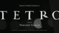
I’ve always been struck by the elegance and apparent simplicity of the title sequence to Tetro and explored that for a while. I guess playing with that is how I ended up doing it in black and white.
I also liked the titles for 30 Days of Night as far as the treatment of abandoned pictures and the way that they become an object in themselves without the sense of belonging and context about the subject. Like those old pictures you find at flea markets or secondhand shops – you don’t recognize who or what’s in them but they can strike a chord just the same.
Can you talk about the typography a bit? That’s Futura, right?
Yep! That’s Futura, alright... with slight twists here and there! It’s funny, but the type was inspired by Tetro even though that sequence uses a serif font. I tried out a serif but just didn’t like it. Once I placed Futura over some of the dark backgrounds and light-like effects, it just worked – it was love at first sight.
How did you assemble the images and scenes you wanted to incorporate? Did you have to shoot some specifically and find stock for others?
Our two prior projects (Concursante and Buried) were very conceptual, very graphic-oriented, Saul Bass-y projects, but this time Rodrigo wanted something more figurative – something to reflect the nature of the phenomena in the film. I did a lot of research and ended up shooting re-enactments that would be heavily treated – a base for the text and other elements. We shot “classics” like the Roswell alien surgery, newspaper articles, Russian experiments from the beginning of the 20th century... hours of all kinds of stuff!
Footage tests, with original music track
What tools did you use to put it all together?
The footage was shot with different cameras, moving and still – Mini DVs and DSLRs mostly. Later it was all put together with After Effects and lots of Photoshop to make mock-ups of newspapers, photographs, etc. Plus, a few light effects from Maya and Cinema 4D.
How long did the project take, from concept to execution?
The other projects with Rodrigo were very straightforward from the start in that I knew what I wanted and we were totally in sync. But for this one we wandered around a lot until we found our way. It took over four months, I think.
Finally, looking back at what you created for Red Lights, do you think your methods have changed since Buried, your previous collaboration?
Yes, this time we started with a very different approach by experimenting a lot and incorporating all the footage and everything. I was enjoying it a lot and finding interesting things outside of my normal comfort zone. It was Rodrigo who kept pulling us back to the more conceptual graphic stuff! It reminds me of that quote from The Godfather III: “Just when I thought I was out... they pull me back in.”

