For filmmaker and animator Sally Cruikshank, animation is an open door to fantasy-land.
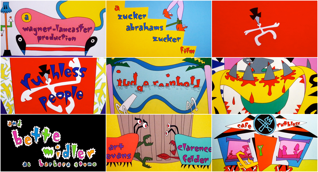
In the opening titles to the 1986 black comedy Ruthless People, Cruikshank lets loose a flamboyance of vivid and vicious characters, all grappling hands and anthropomorphized objects out to inflict injury upon the credits. The film is a raucous telling of a kidnapping gone awry, a murderous husband, and greed on all sides, and the titles take the film’s gleeful acrimony to animated extremes. Cruikshank takes her cue from the postmodern style of The Memphis Group, whose furniture, fabrics, ceramics, and glass and metal objects were en vogue in the 1980s and feature heavily in the film itself.
Mick Jagger’s recognizable drawl does an adequate job of grounding the opening but is otherwise forgettable. Cruikshank’s illustrations, on the other hand, take centre stage, their odd charm jumping out to take hold. The drawings are singular in their style – at once intricate and loose, naive and skilled – with personality bubbling out of every scene and every thing. The sequence requires multiple viewings to be truly appreciated, as new details leap out with each play. Did you notice the rug’s eye? The “J” in Jan de Bont’s credit growing hands and cowering? The shocked bottle of poison? The figures in the café at the end?
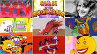
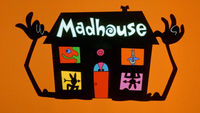
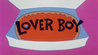
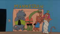
Ruthless People was the first of several title sequences Cruikshank would create for comedies in the late ’80s, including Mannequin, Loverboy, and Madhouse. Its bold peculiarity and clever sight gags set it apart immediately from its contemporaries.
Title Designer SALLY CRUIKSHANK speaks about her work on Ruthless People in this excerpt from our feature article Sally Cruikshank: A Career Retrospective.
Sally: Ruthless People was the first major film sequence I did. I mean, I’d done titles for my own films before, but that was all. I thought I wouldn’t be able to do it but I enjoyed it a lot. I struggled doing the titles on my own films.
As I recall, I went in to talk to them about the titles. They did a screening of the movie and I thought, “Oh, this is great.” They said, what we want to do is a cavalcade of ruthlessness through history. And I thought, “No!” I was so struck by the Memphis design in the movie.
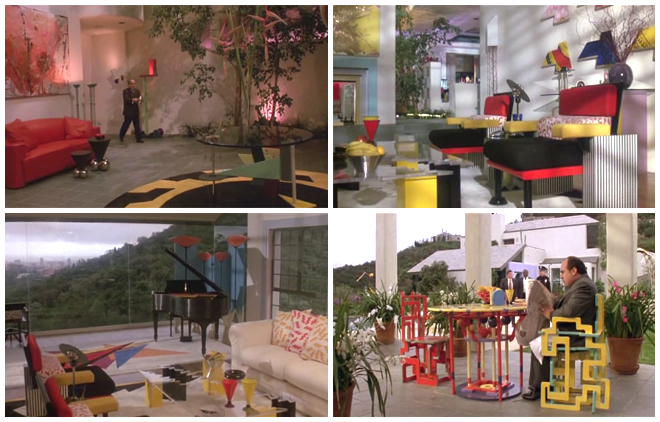
Image Set: Set design in Ruthless People featuring Memphis Group-inspired furniture and props. Art direction by Donald B. Woodruff, Set decoration by Anne D. McCulley.
So I said, you know what you should do is you should treat the piece so that every title is treated ruthlessly and include the design of this crazy furniture that the wife in the movie is buying — which is Memphis design — and then the production designer loaned me a book on Memphis design and I was off and running! It works particularly well, I think, because the directors were so gag-sharp. They would throw out concept after concept until they had exactly what we wanted. So we really refined each individual credit more than most directors would have done.
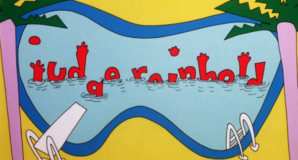
The credit for Judge Reinhold drowns in a swimming pool
How did you set about developing it? Did you storyboard with them?
Sally: Yeah, I storyboarded it and then I needed a production company so that’s where Playhouse Pictures came in. They were a long-established TV commercial company. I was looking at their history recently and even Saul Bass worked with them. I know you’ve done lots of pieces on Saul Bass, and back in the ’50s he did black and white commercials with many famous animators. They’re very friendly people. Their father, Ade Woolery, was the very first multiplane camera operator at Disney.
So, anyway, they had many contacts with animators which was needed. I designed it, I laid it out, and then I talked to Gerry Woolery about what I was looking for and he would instruct the animators. They would do the animation and bring it back, and we would criticize it, change it. That’s how it went.
But Disney was fussy, really fussy! They had so many legal restrictions on everything. Everybody’s title had to be proportionate sizes to everyone else’s by contract. There were just all these legalities.
What were you using to animate?
Sally: Well, it was pretty much the same for everybody in animation at that time. It was just pencil and paper in the storyboards, and just watercolour markers because I didn’t like the way the AD markers smelled. So the animation would all be done in pencil, then it would be photographed according to an exposure sheet, and then once approved, the ink and paint began on animation cels. That’s a long and tedious thing when all the cels are painted and cleaned and then they’re photographed, one by one, according to the exposure sheet. And that’s the end of the art process!
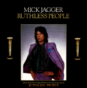
The "Ruthless People" single by Mick Jagger
And tell me about the music, that Mick Jagger track.
Sally: Oh, well Mick Jagger did not come in initially. Even though the song he sings on it is the title theme, “Ruthless People.” He stalled on it for a long time so we had to go ahead and animate it without a track, which was too bad. It would have been so perfect to hook up the music to the animation.
You may have read or heard this story, but… one time, long after, I was driving my car and I had NPR on. They were interviewing Mick Jagger for some promotional thing or book — I’ve never been able to track it down — and so I’m just driving along and I hear him say how he really hated those titles!
I thought, “Oh my God, well, I hated your song, too!”
It’s good that we’re getting that out, so he’ll know that, too.
Sally: Haha, yeah, definitely.
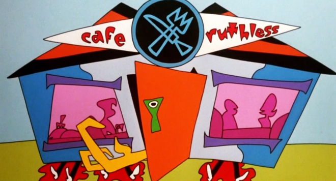
The final scene of the Ruthless People title sequence, beckoning viewers into Cafe Ruthless

