Away from the hustle, bustle, and endless distraction of our world, you stand alone at the edge of possibility. Take a deep breath. Leave the safety of the familiar and the mundane, leap headlong into the unknown. All systems go. Ready for egress. It’s out here that ideas live – tumbling through the vastness of memory and experience – where grand monuments drift by in the void, shattered and half-formed, bigger than life.
Cut the cord. The thin umbilical tethering you to your point of origin. Rolling, twisting, there is no choice but to continue. Drifting ever further into uncertainty, something finally grabs you: Is this it? What you’ve been looking for? But it slips through your fingers before you realize it – or was it you who slipped? Careening off in a new direction, the answer now looms large, looking you right in the eyes. A new focus and purpose captures you. Down and down you go, ideas long forgotten come into view, propelling you out into the light and an infinity of promise. Closer, closer, almost there. Touchdown.
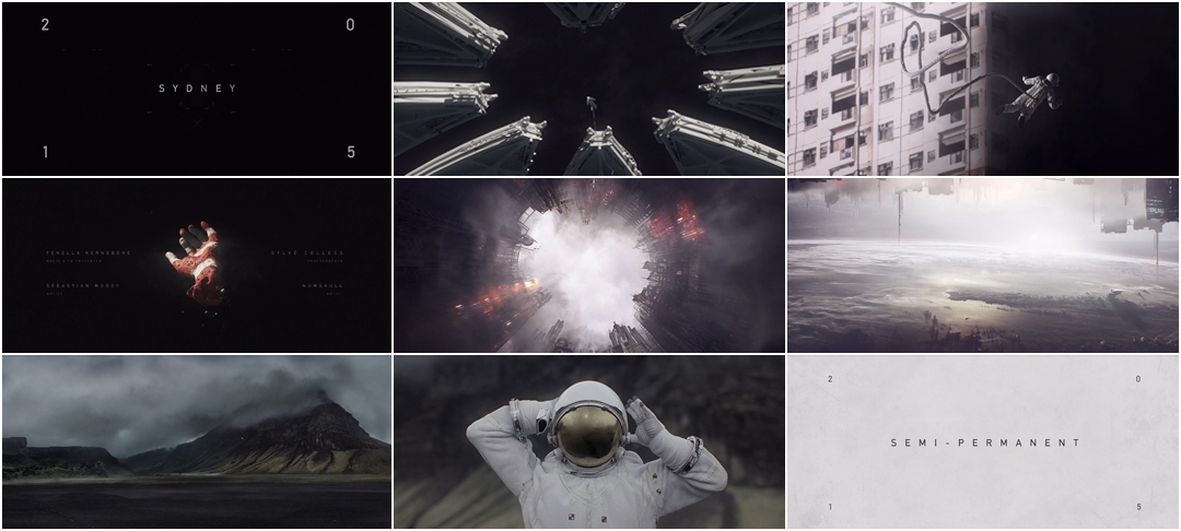
Title designer Raoul Marks’ extraordinary opener for Semi-Permanent Sydney 2015 visualizes the challenges that any creator faces when trying to do what they do: create. The sequence, which is essentially a short film, wears its influences proudly on its Ortho-Fabric sleeve – from the isolating paintings of artist Jeremy Geddes and the otherworldly imagery of Kubrick and Scott, to the Neo Tokyoite architecture of Katsuhiro Otomo and even Space Race-era issues of LIFE Magazine. Inspired or not, creation is a lonely endeavour, here perfectly encapsulated by the journey of a faceless astronaut hurtling through space, then free-falling from great heights. Will inspiration fuel your vision? What awaits you at the end of your voyage? Breathe it all in and find out.
A discussion with Title Designer RAOUL MARKS.
So, the last time we chatted was for Halt and Catch Fire. What have you been up to since then?
Halt and Catch Fire was almost exactly a year ago! After Halt, I headed to LA for the Emmy Awards, got married, spent a month around Japan, packed up and moved to Melbourne.
Thanks to the magic of fibre internet, I’ve been able to continue working closely with Patrick Clair, who is now with Elastic in LA. We’ve done a number of advertising gigs and main titles. We made the titles for Amazon's Man in the High Castle. We put together a main-on-end title sequence for Jaume Collet-Serra’s latest film Run All Night.
The closest I can get to a spiritual experience is when I’m at the cinema
For the last month or so we’ve been putting together the titles for the second season of True Detective. That was a whole new challenge as it needed to reflect the new cast and setting but also contain the DNA of the original titles. The first season’s titles were very well received so it can be quite complicated following your own footsteps.
I also took a month out from my normal schedule with Elastic to do the titles for Semi-Permanent 2015.
Which brings us nicely around to our chat today. Have you been to creative conferences like Semi-Permanent before?
I’ve been to two previous Semi-Permanent conferences and some other smaller meet-ups, and they’re always great. Full of interesting ideas and talented people from all walks of life. But part of me doesn’t always feel the need to rush over to these. It’s hard to articulate, but sometimes I like to be removed from that central design community. It can get overwhelming and start to overly frame your point of view of things. Still, they’re a great way to catch up with friends, have a few beers and get very indulgent with all things creative.
So how did you start with this project, developing the opening titles for 2015’s Semi-Permanent conference?
Murray Bell, the founder of Semi-Permanent, has got to be the most laid-back and friendly guy I’ve ever had the pleasure of working with. There were one or two preliminary calls and emails to go over the speakers list and that was about it. I think he knew the best result would come from letting me go for it. I imagine this is a pretty common scenario for a lot of creative conference titles. The work is usually done for free, so as a compromise the designer or studio get to take it where they want. Some very interesting, often indulgent, but beautiful visuals get made for conferences. It’s become an experimental stage where people get to try out the ideas too crazy or too oblique to get past a client. I think audiences often expect the titles to be something out of the ordinary.
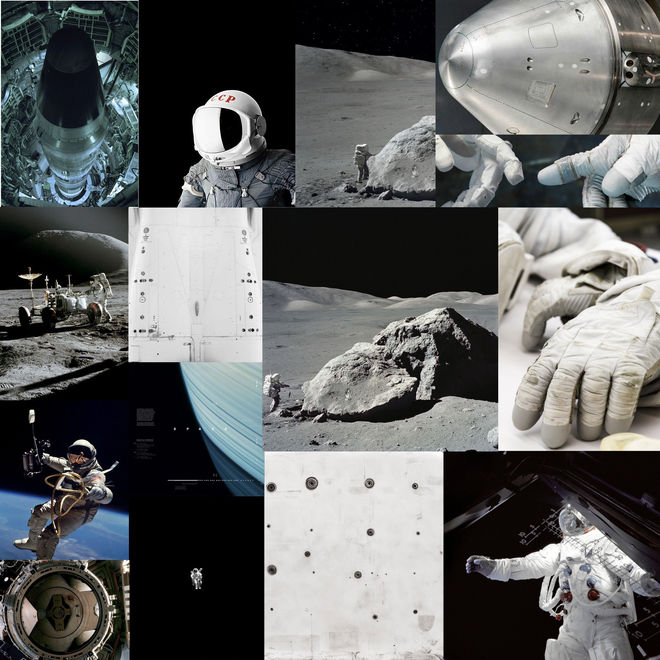
Image Set: Moodboards featuring 1. Apollo Tech, 2. Retro Future, 3. Texture and Tone
Some of your inspirations seem pretty clear, but maybe you could expand on that. What inspired you?
Yes, indeed – there were many inspirations for this one! This was almost an exorcism of all the film and sci-fi nerdism that has been building up in my head since I was a kid. I’d always wanted to pay homage to those formative films and felt if I could just get it all out, in one big expunging, I wouldn’t have to keep trying to sneak it into other projects!
I’m not a religious person but the closest I can get to a spiritual experience is when I’m at the cinema lost deeply in a director’s universe. The first film I remember feeling dumbfounded by was 2001: Space Odyssey. I know it’s been referenced ad nauseum but I think there are very good reasons for that. You can look at pretty much any film in that genre that came out since 2001’s release and see glaringly obvious strands of its DNA. I think Ridley Scott said something along the lines of, “After 2001, science fiction is dead.” He did make Alien subsequently though so it can’t have deterred him that much! So, 2001 was a big influence as well as a number of its successors.
I wanted to capture that existential quality of 2001, and do it in a surreal, open-ended manner. I also wanted to weave in my own, more personal experiences as a designer.
I’ve had several people get in touch with their thoughts about the titles. It seems space travel, however old-fashioned, still gets people talking. A reference that comes up a lot is the work of Jeremy Geddes. He paints beautiful and highly realistic images of 1970s-era astronauts floating through urban environments. A colleague showed me some of his paintings as I showed him the style boards.
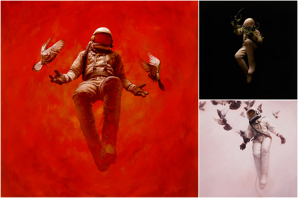
Image set: Astronaut paintings by Jeremy Geddes
I guess over time the astronaut as a visual metaphor has become somewhat of a trope. It has slowly morphed into a universal symbol for the existential. And it’s probably the best, or at least most widely understood, allegory we have for the absurdity and alienation associated with life in the modern world.
A lot of my influence for the city blocks came from the epic illustrations of Katsuhiro Otomo, the man behind Akira. I picked up a great book of his work called Genga when I was in Tokyo. The text is in Japanese so I can’t be sure, but I think it was a companion book to a major respective of his work held there recently. It has these wonderful black and white sketches of floating tower blocks folding in on themselves that were part of the manga version of Akira and other explorative work.
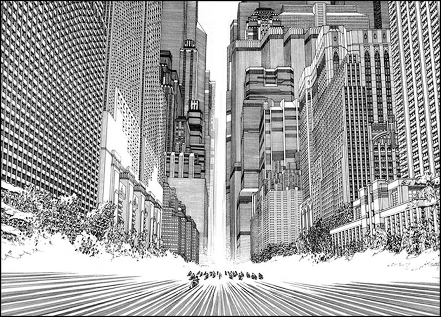
Image set: Illustrations by Katsuhiro Otomo
There was one really great set of images that inspired me. Thomas Kane was a Stanford scientist doing research in the 1960s into body dynamics in zero gravity. He was trying to figure out if we could twist through space in the same way a cat twists as it falls to the ground. He took these purely utilitarian photographs of an astronaut as he contorted up and down on a trampoline. But the outcome of these images, which were published in a 1968 issue of LIFE Magazine, are absolutely beautiful. Something about the grainy high contrast black and white film and this lone figure seemingly suspended in the void just seemed too great not to work from!

Image set: Thomas Kane's zero gravity body dynamics photo series and the astronaut's fall from the Semi-Permanent Sydney 2015 title sequence.
It was also very cool to be able to use the beautiful imagery of Radiohead’s artist Stanley Donwood in the optical nerve scene. Donwood had a retrospective exhibition at this year’s Semi-Permanent, and I’ve been a big fan of his work since OK Computer.

Artist Stanley Donwood's album cover for Thom Yorke's The Eraser (left) and Donwood's art as it appears in the sequence (right).
So how did you move from those references into creating something of your own?
I began with the rough idea in my head and started building the main asset – the astronaut. It evolved a little over the project but the astronaut was the one common element to all the shots and also the most complicated, so work started there.
After that, it was a matter of building the assets for the remaining shots. And playing with composition, lighting, and the timing of the animation. I wanted to keep a sense of perpetual motion so I spent a lot of time going back and re-doing scenes so there was a sense of flow between the shots. I like it when titles have a pace that flows through them. If something zips across in one shot, it works well when the subsequent shot has an echo of that momentum running through it.
After that, it was a matter of rendering out the full shots, doing the comp and grade, and amending where necessary. A few shots came and went but it ended up staying close to the original style boards.
I put a storyboard together about halfway through the project, but this was more just to see how the overall colour gamut felt when laid out as one.
Storyboards are pretty essential when you’re needing to visualize a concept for your colleagues or clients. But as this job was a solo project, I was less concerned with that. I felt that as long as I had a rough idea in my head of the trajectory, I could let things slip in and out as they came together.
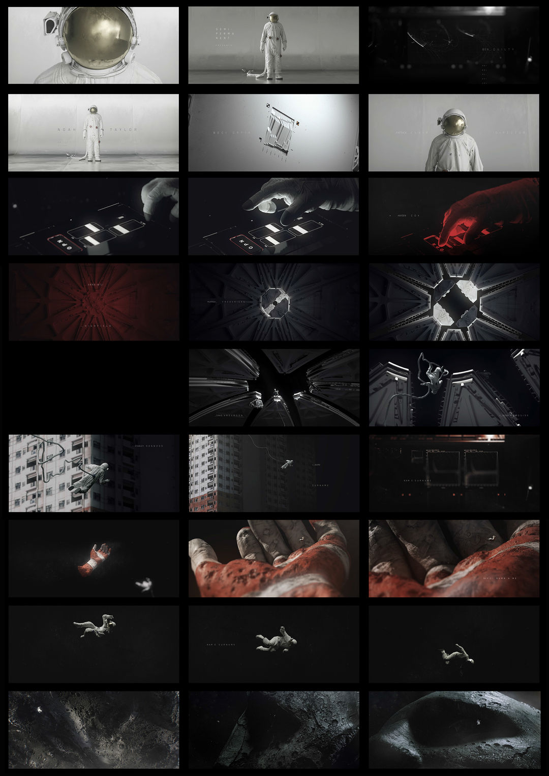
Semi-Permanent Sydney 2015 storyboards
Almost as an amusing challenge, I tried to get as many references into these titles as possible. It may be obvious but the opening few shots are all representative of birth. The astronaut hits a coded switch with the letters BRTH and it all goes red for a moment before the large cavernous doors slide open. The astronaut drifts out into the unknown and uncouples the umbilical cord. That shot of the bay doors opening is a direct steal from Stanley Kubrick’s famous lunar landing shot in 2001.

The lunar landing sequence from Kubrick's 1968 film 2001: A Space Odyssey (left) compared to the bay doors from Semi-Permanent Sydney 2015 titles (right).
Are there any little easter eggs in this sequence, some things you’ve included that folks might not notice at first?
I spent a lot of time looking back at classic sci-fi – seeing how much is borrowed from generation to generation. Ridley Scott’s films appear full of the imagery of Stanley Kubrick’s, and then James Cameron has appropriated the same motifs in his own films after Scott’s.
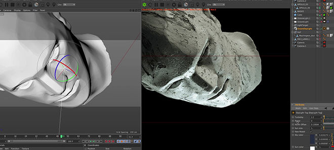
I’d intended the head in space to represent the astronaut’s consciousness but it’s also a reference to the creepy human resemblance standing guard over the temple room in the film Prometheus.
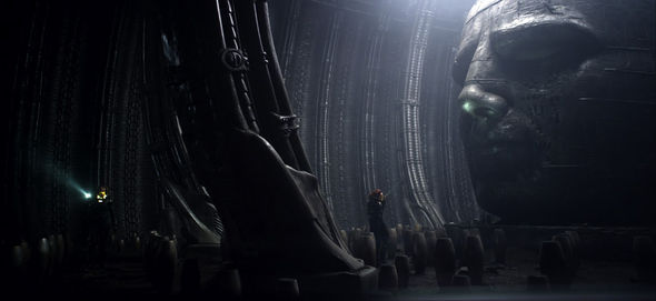
Prometheus (2012) film still
There are a bunch more visual clues in there but I don’t want to give them all away!
Which tools and software did you use to put it all together?
Cinema 4D was the central tool for this job. It is a very versatile piece of software and I was really glad how well it performed.
I usually use it in more of a motion graphics capacity but it really saved me on this one. The other major breakthrough for me was discovering Octane render for C4D. Without getting into too much detail, this job would have been impossible without it. It’s an unbiased renderer which means it renders light accurately and beautifully and it doesn’t flicker. Unbiased renderers have been available for a while now but typically are hamstrung by excessive render times. Octane gets around this by using the graphics card instead of the CPU. Because graphics cards have been fighting a modern day arms race over GPU power, they’ve become insanely powerful. It just took the clever chaps at Octane to take advantage of that power and to exploit it for the wider design and CGI community.
Let’s talk type. Tell us about the typeface and how you got there.
The type is set in Din Mittel. It’s a very classic font, based on the 1931 DIN 1451 that was designed for German traffic, administrative, and technical applications. Early on in my process I’d looked at some more expressive type but I felt the imagery was quite detailed and leaning into a more cinematic style. Having overly ornate and detailed type just felt too much. I needed to go there first to feel confident in the simplicity that I ended up with.
I like stories that suggest something a bit beyond the conceivable
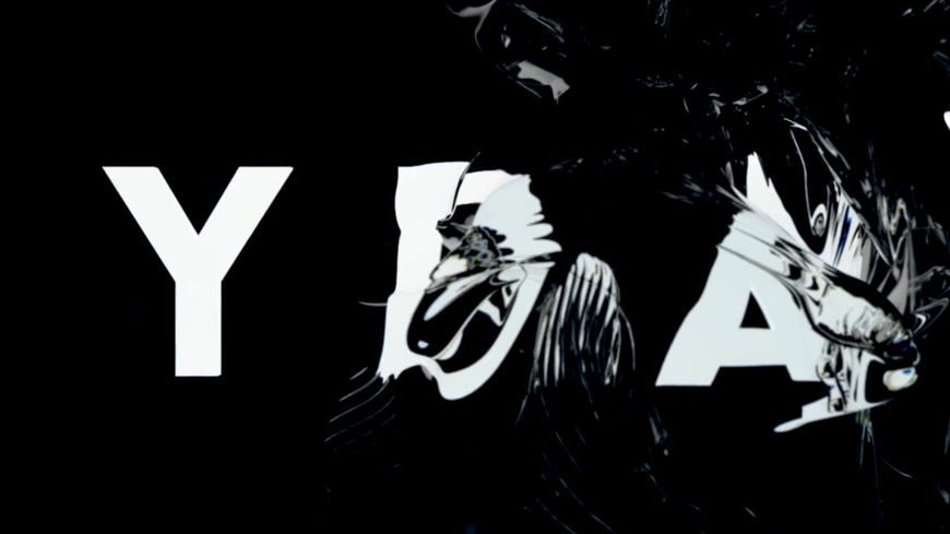
One thing I did spend a bit of time on was degrading the type edges. I find type laid straight in After Effects can feel super digital and I really like lettering that feels like it's burnt into the image. It’s a very subtle thing but type that has a minimal blur then a sharpen always seems to gel better with the image to me. I guess it’s a hang-up from the old days of analogue typography in film titles.
Now for the music. It’s rather rare for a designer to also create the music for the piece. How did you go about doing that?
I lived in London for a few years and got heavily into synthesisers and Ableton, along with every other graphic designer at the time it seemed. I started making music with a good friend of mine, Ed Cox, and we put out a few EPs together. It was great fun and it really got me into thinking about the role of sound in narrative. A long time ago someone said to me that the audio is at least – if not more than – 50% of the experience. I genuinely think it’s true.
I tried numerous existing tracks but I just couldn't find what I had in my mind. There’s a sensibility you notice when music matches the image. Thankfully Ableton have some great sample libraries to draw from. I sourced heavily from a few of my favourite sample sets to build a sound bed that I felt carried the tone I was trying to create.
And what tone was that? What feeling were you trying to create?
I wanted to convey a feeling of isolation and exploration. I guess I was trying to recapture that awe I experienced during my earlier film experiences. I like stories that suggest something a bit beyond the conceivable – that evoke an indefinable emotional reaction. I’m not suggesting that I achieved this, but creating even just a hint of that feeling in the viewer would make me very happy.
So, more generally here, why do you think conferences have title sequences? Titles have become a pretty big deal in this arena in the last decade. Why has it become such a grand endeavour?
Quite simply I think that they offer an opportunity for designers to have complete freedom to pursue their own ideas. They’re usually done for free so the whole client/designer relationship is turned on its head. And because of that, they have become a fertile area for designers to really have some fun with their craft. In a parallel universe we wouldn’t be making work for an income. We’d be making work for ourselves, so in some ways, doing work for design conferences seems to be the closest we can get to that in the real world.
What are some of your personal favourite title sequences, whether classic or contemporary?
Pandayoghurt and The Mill did these absolutely beautiful credits for the Young Director Awards in 2014. It’s a great example of how audio and visuals can really come together and stick.
Young Director Awards 2014 title sequence by Pandayoghurt and The Mill
What are some of the resources (books, media, institutions, people etc.) that have inspired you during your design career?
There’s this great guy on Vimeo called Kogonada who does some fascinating analysis of film techniques and styles. I always enjoy his films, in particular his ability to pinpoint the elements that make up a director’s aesthetic style.
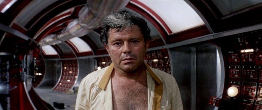
Auteur in Space video essay about Tarkovsky, Solaris, and the Unknown by Kogonada
Also, contemporary art. My wife, Annika, works as a curator so I’ve been being dragged to gallery shows all over the place since we met. I really enjoy seeing the different perspectives that artists bring to their work in that world. There is a great gallery in Sydney called White Rabbit, that highlights contemporary art coming out of Asia. I always leave full of ideas. On my last visit, they had a pile of concrete rubble and debris, undulating up and down like it was breathing. Had to check I wasn’t hallucinating at first – turns out it was on a waterbed!
Finally, did you always know you were going to keep the identity of the person in the suit a secret? Is there a version of this sequence that shows who’s in there?
That would be telling.
Semi-Permanent Sydney 2015 behind-the-scenes reel by Raoul Marks
Support for Art of the Title comes from


