“Who’s that girl?” asks the voice of rapper Eve as the first episode of She-Hulk: Attorney at Law comes to a rumbling close. Sliding her feet back into her prim black pumps and patting down her tattered clothes is Jennifer Walters, the titular attorney, and inside her are two wolves. The battle between these two selves, Jen and the towering She-Hulk, and the question of identity is at the heart of Marvel’s 2022 miniseries starring Canadian actor and Emmy winner Tatiana Maslany (Orphan Black).
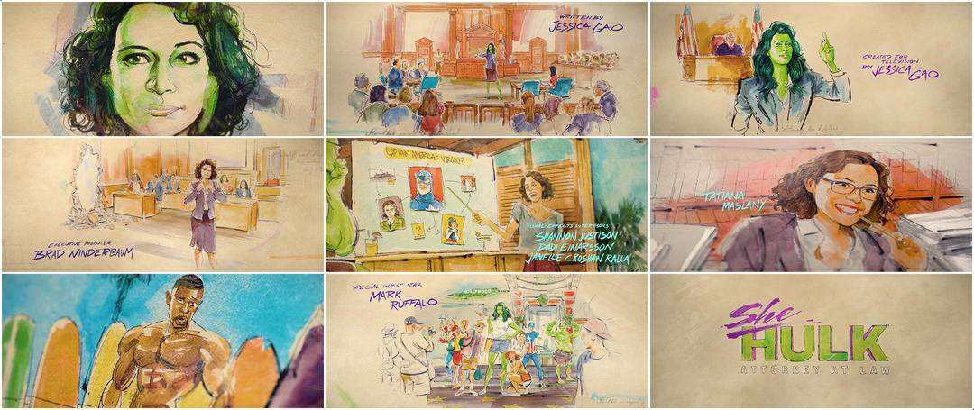
The main-on-end title sequence of the show, created by studio Aspect with illustrations by Toronto-based artist Kagan McLeod, takes the form of vibrant courtroom sketches that seem to paint themselves. The scenes aren’t moments from the show but rather a bonus, scenes that happen outside of the scripted episodes. The vivid drawings show Jen/She-Hulk and her cousin the Hulk, as played by guest star Mark Ruffalo, shopping for spandex and cheese puffs in bulk, discussing the relationship history of certain Avengers, and generally going about their larger-than-lives. As the Aspect team and McLeod discuss below, arriving at this illustration style and creating unique drawings for each episode’s ending proved to be no mean feat.
A discussion with Creative Director JON BERKOWITZ and Art Director/Animator NOLAN BORKENHAGEN of Aspect and Illustrator KAGAN McCLEOD.
How did this project come to you? What was the initial brief like?
Jon: The key player here was Jamie Gross, one of the lead editors on the series. We have a relationship with her, having worked with her previously. She edited two films with John Francis Daley and Jonathan Goldstein directing, the first one being the Vacation reboot, which we did the title sequence for.
Game Night (2018) main-on-end titles, designed by Aspect
Jon: They brought us back to do the title sequence for Game Night. Jamie was brought on to work on Clover.
What is Clover?
Jon: Clover is our codename for She-Hulk! Jamie threw our hat into the ring. We got the sense that there were other vendors pitching on it. It was explained that it was a little unusual for Marvel in that it was a comedy. There’s funny moments in every Marvel project but like, really a full-on comedy or procedural show was new for them, so they were looking for new ideas, possibly a new vendor.
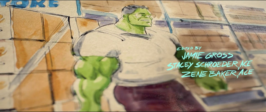
Still from the title sequence featuring the credit for "Edited by: Jamie Gross, Stacey Schroeder, ACE, and Zene Baker, ACE"
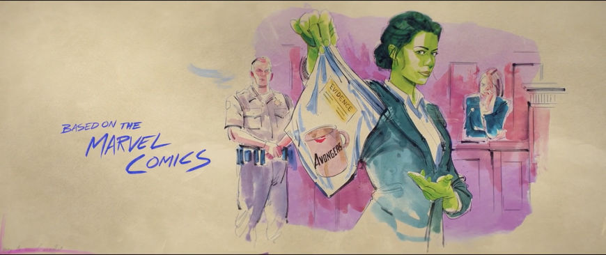
Still from the title sequence featuring the credit for “Based on the Marvel Comics” and Jen Walters holding counterfeit "Avongers" merchandise
Jon: The initial brief happened in November 2021. There had been some restructuring so what was the pilot ended up as episode four, basically. They knew they wanted a main-on-ends rather than a main title at the front. Everyone including us felt like the main theme to focus on was the struggle for identity. Who is the main character? Is it Jen or She-Hulk? This battle for dominance. There were so many ways for us to represent that visually. They wanted to stay away from a law-type show, they didn’t want it to be a parody of L.A. Law or something. They wanted the sequence to live in the pantheon of Marvel main-on-ends, so it needed to have a certain production value, a certain cinematic quality rather than feeling like a TV show.
We pitched several concepts: "Inside Jen's Mind", "Roommates", "The Masks We Wear", "Courtroom Sketch". Some of them dealing with split images or an image within an image.
"Inside Jen’s Mind" was a hallucinatory expression of identity and duality. For "Roommates", we got wacky and partnered with a British animator named Pedro Allevato who does really interesting vector-y 2D animations. We wrote and structured this but he helped design [a few frames] because we would’ve relied on him for the animation and the style of this. "The Masks We Wear" was a really out-there idea. Jen, like all of us, wears a mask out in public, her mask just happens to be a whole-body identity.
"Courtroom Sketch" was our first idea. It just popped to mind one day, I pitched it to the group and Nolan and I started fleshing it out. The idea was: Let’s tell the story of what happens outside of what you see in the show, as if a courtroom sketch artist is documenting Jen’s life.
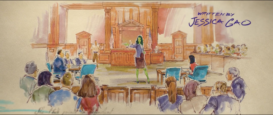
Still from the title sequence featuring the credit for “Written by Jessica Gao” and She-Hulk standing in a courtroom
They gravitated toward that one immediately. Two days later they called back and said, “You got it, you won, we want to do Courtroom Sketch.” We talked it through and fleshed out the idea. They didn’t want to recap anything that we’d seen in the show already. They wanted to show what happened when we weren’t watching. The story outside the story.
Who created the drawings for the Courtroom Sketch pitch?
Jon: We worked with another artist, James Yusufi, who we’ve used from time to time on pitches. I had seen some of James’s extraordinary Mandalorian fan art on Reddit years ago and reached out.
James designed these frames but the client felt like it was starting to veer into a concept art aesthetic as opposed to being firmly anchored in courtroom sketches. So we did start to gather references and we showed them different mood boards.
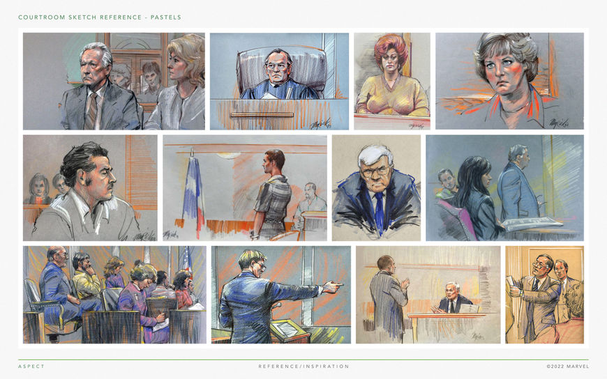
References for courtroom sketch style examples
Jon: There are many different expressions of courtroom sketches, right? Some are a bit more expressionistic, where the detail’s barely there. It still tells the story and it might capture the emotion of it and then there’s others like this top-left image, that are more detailed. So we had to dial in with the client. There was one artist, Gary Myrick. There was another named Mona Schafer Edwards. There was Art Lien, I think he’s a New York Times guy, he covers the Supreme Court. A New York-based illustrator named Marilyn Church. Bill Robles. Tom Gianni.
Kagan: Was there any time where you were considering hiring one of those people?
Jon: We considered it. We reached out to several of them before we found you! We needed somebody who understood the ask behind the ask, especially from a cinematic superhero standpoint. Nolan was scouring the internet—
Nolan: I was doing pulls for references and it became clear that we needed somebody that could capture scenes that they didn’t see live, someone who could envision something and also make it more stylized.
Jon: So it was at that point that we brought you [Kagan] in.
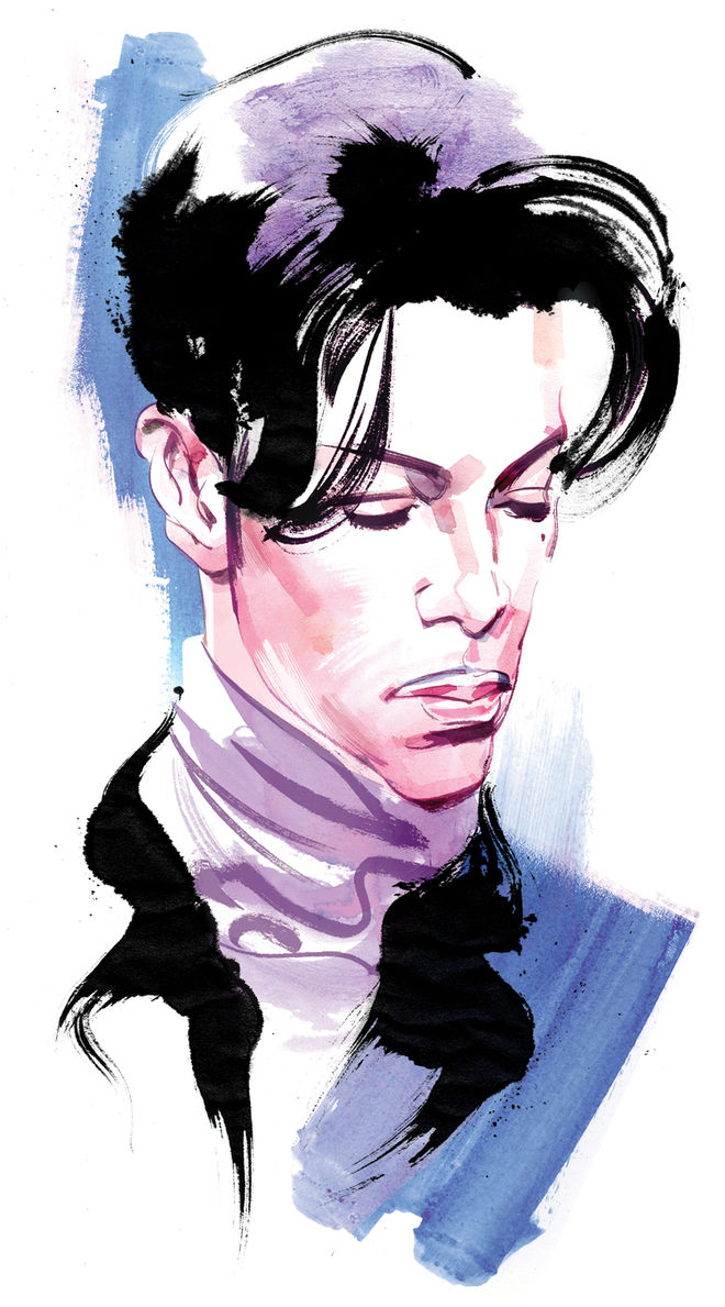
Portrait of Prince by Kagan McLeod
Kagan seems like a perfect combination because he’s got that courtroom experience but he’s also got a comics background.
Nolan: Exactly. His Prince portrait is what made me fall in love. It had that motion to it. They also wanted something a little more elevated and bright and colourful, you know, especially with the newer She-Hulk comics done by Jen Bartel, where there’s these very bright colours. Kagan’s stuff captures the likeness but then there’s a nice use of negative space which would work well with the paper and how it could be animated and be visually entertaining.
Kagan, what kind of courtroom trials have you created sketches for?
Kagan: I’ve done lots of courtroom sketching. The Jian Ghomeshi trial. The Russell Williams trial. The Toronto 18.
How was the process for these sketches different from your editorial work or your comics work?
Kagan: Increasingly, I’m starting to do more stuff that requires motion so technically you’re always figuring out the best way to build it. This was a tricky one because we wanted to have it come to life on the page without a hand. I also wanted to keep that traditional look so we spent a while figuring out how that would work.
Nolan: I took inspiration from speed drawings, or time lapse drawings, where it has this steppy or choppy animation but there’s a mix of flowing stuff. That’s where Kagan and I worked.
She-Hulk "Walk of Shame" scene animation process video
He would give me an ink pass, and then a thicker brush pass, and then the full watercolour and paint pass. I would take his artwork, break it up in Photoshop, and then bring it into Procreate and paint over it and then record that to bring back some of that hand animation.
Kagan, were you working digitally or analog when creating these passes?
Kagan: First, we tried to do two style iterations. One in pastel and one in ink. Just when I was getting comfortable with the pastel, we chose the ink one. Which is good, ‘cause I’m more comfortable with that. I was drawing a bit and then scanning and drawing more and then scanning, which didn’t really work. I tried doing the colours on one sheet and the lines on a different sheet and scanning them separately and combining in Photoshop, which kind of worked. But the volume was so high that it became easier to do the line work digitally, print it out, and then lightbox it and do the colours in watercolour, so it could be separate and animated.
Jon: In the end, there were 72 individual illustrations.
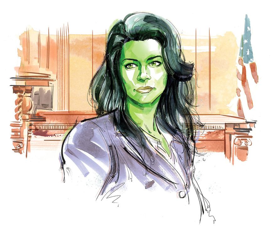
She-Hulk illustration by Kagan McLeod
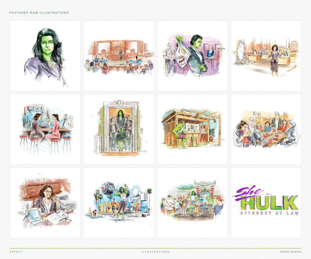
Illustrations and title artwork by Kagan McLeod featured in the main-on-end title sequence
Kagan: I’m so happy with how Nolan and the team animated it. The reveal and everything looks so cool. I handed them clean Photoshop files but the way they’ve done it in 3D to make it glisten and give it a paper texture – I’m really happy with the way they did that.
Nolan: We’d create these base animation reveals. When we were in the boarding phase, it became apparent that we would need to be able to move close and far away from these images. We want to get that production value when we’re up close so it made sense to bring it into 3D, create a real fine paper texture and then pump Kagan’s artwork back in it. Then we would take this animation matte, bring that in there, and that’s where we would do all of our camera moves and 3D so we weren’t limited on how we move around this artwork. We slowly would assemble these upcuts or moves where we’d start close, macro, and kind of reveal, and then pull back. It also helped how we decided to tell the story of how these were drawing on. There was a thought, Maybe we do the full thing where they sketch on? But the more we went through it, the more we realised that you want to see Kagan’s artwork right away. So we had light moments of corners coming on. After the renders would come out, I comped it all, played with the depth of field, made it feel more macro where needed, and then it was assembling it into a story. The blocking of it. It was pretty much Photoshop, Procreate, Cinema 4D, and then After Effects.
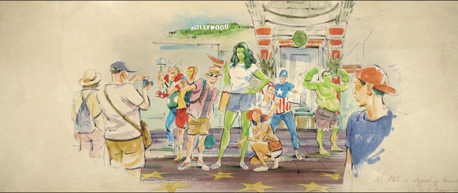
Still from the title sequence in which She-Hulk poses with cosplayers for a photo
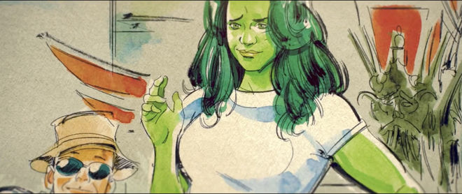
Still from the title sequence showing a close-up of She-Hulk posing with cosplayers
What other challenges did you experience on this project? Were there other moments that were tough to figure out?
Kagan: We had many rounds to nail down the look.
Jon: One camp wanted to establish early on that we are looking at a courtroom sketch. Some people felt like that meant pastels, let’s say, and there was another camp that wanted more expressiveness to it, more emotion. We really liked that, we were in that camp. It went on for about a month. Kagan kept re-illustrating these two signature illustrations – the wide, which we ended up calling “the jury moment” and then the image which evolved from a portrait of She-Hulk, which we called “objection”. Why it wasn’t firmly planted as a courtroom sketch was that it didn’t have a context. We tried to plant some kind of setting around it – the judge, a jury box, something that makes it clear it’s a courtroom sketch. That did about 80% of the heavy lifting. Kagan ended up finding a beautiful middleground that kept some of the expressiveness but added some of the pastel back in and we landed on the final style. At that point, everybody approved and we were off to the races.

Spreadsheet of written vignettes to use for the various end title sequences
Jon: The other challenge was the writing. We have a team of writers who are 90% of the time writing concepts for marketing work. They're hysterical, they’re wonderful. I do some writing, Nolan contributes ideas because he’s a Marvel geek extraordinaire. So we started putting together a list of 10 or 12 different beats that we could draw for each episode. We created a spreadsheet of vignettes. We would meet with Marvel for half an hour or so and Jessica Gao would pick her favourites. Inevitably somebody would pitch a new idea, we’d try to beat it, they’d try to beat that. That was so fun.
Part of our pitch was – instead of doing one title sequence, let’s do nine. Let’s change it up from episode to episode. Because of budget and time and the sheer number of illustrations each episode needed, it would have been impossible to do completely unique drawings for each episode. The compromise was: What if we do a base sequence where the beginning and the end are always the same, but we do a pod of three bespoke images in the middle? I think it was 32 base illustrations and 3 additional, times nine.
What we tried to do, and for the most part this is consistent, is keep the editorial footprints the same so that they didn’t have to re-sound design each episode.
So the timing stays consistent.
Jon: Right, so each shot in the bespoke section is a little different but the overall length of those three is always the same.
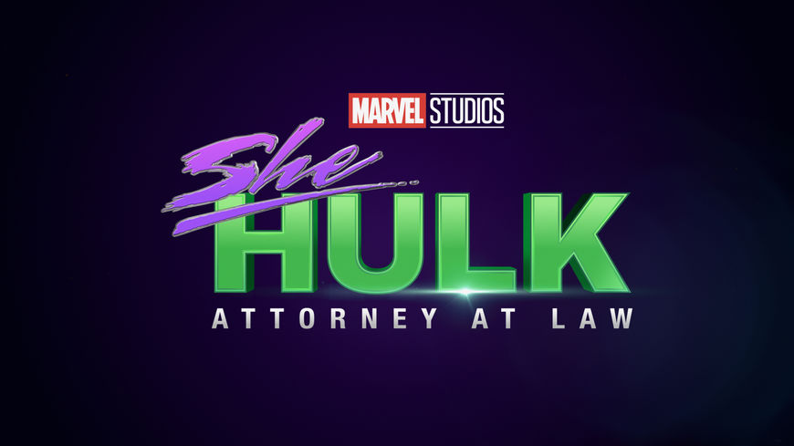
She-Hulk: Attorney at Law logo used in the trailer and other marketing materials
As far as the title logo goes, that came down from Marvel marketing, right?
Jon: Yeah, that was a function of the trailer needing to come out when it did. It was several months ahead. Lots of clients don’t care so much if the main title in the trailer is different from the show. In this case Marvel wanted them to be consistent. So we inherited the mark from Buddha Jones, which is an agency that had created the title for the trailer. We sent that to Kagan and he treated it in his style. Marvel was not expecting to like it. They were going to just use the trailer title at the end of our sequence. We tried to persuade them that it would be like apples and oranges but once they saw it, they were on board.
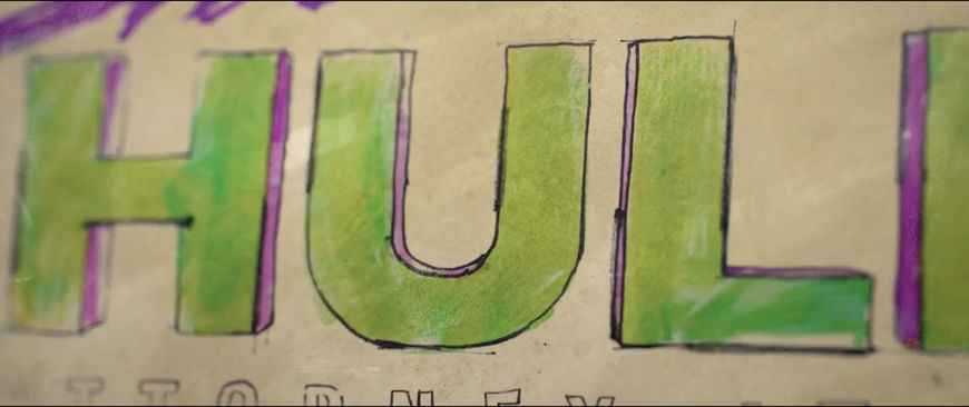
Main title card close-up
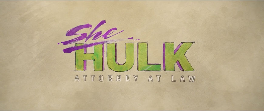
She-Hulk: Attorney at Law main title card
Kagan, did you do a number of stabs at this to translate it into the style of the sequence?
Kagan: Yeah, two or three, right Nolan?
Nolan: Right. Kagan and I came in with some calligraphy-type writing. We had pitched that in one of the motion tests to sell them on getting it into Kagan’s style, the courtroom sketch thing. I think it did help to eventually persuade them towards the finished piece.
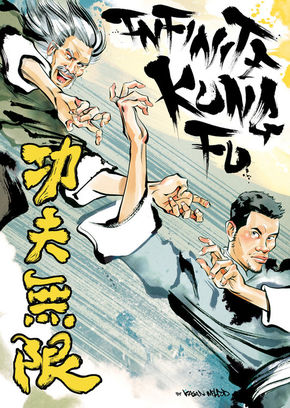
The rough calligraphy-type writing reminds me a lot of the lettering in your Kung Fu book.
Kagan: Yeah. It just comes out like that! [laughs]
Actually, going back and forth with the style, at some point I was starting to worry that it wouldn’t look like me. It wouldn’t come through, that it would become more of a job-job. I was super happy that so many people saw it and knew it was me right away, which is flattering. I’m glad that “Kagan-ness” came through.
What are your favourite moments from all the sequences that you put together?
Kagan: I love Nolan’s 3D close-up pans the best because you take a little bit of time and see some of the strokes. That’s what gets me the most stoked! [laughs] There’s one where Nolan had me add a SHIELD logo on one of Jen’s files, which people noticed, but the one with the shoes was probably the most fun because it was just supposed to be this guy’s sneaker collection and he has Iron Man-themed shoes. I went to town and made all these Marvel shoes assuming they would all have to be changed but we didn’t. That was the most talked about.
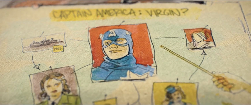
Still from the title sequence showing the "Virgin Board"
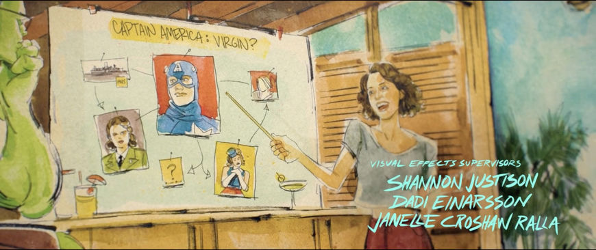
Still from the title sequence showing Jen presenting the "Virgin Board" to the Hulk
Nolan: That and the virgin board, which kind of took off, too.
Kagan: I know there’s a lot of fan fiction about Captain America and Bucky. I didn’t put that on the board, but we could’ve. [laughs]
Give the people what they want!
Jon: I love the opening portrait transition and I’m fond of the Venice Beach shot. The look of the guy behind her, watching her, it makes me laugh every time.
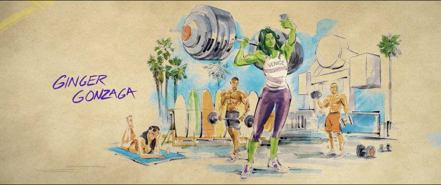
Still from the title sequence in which She-Hulk is lifting weights and taking a selfie at Venice Beach while a man in the background stares, his mouth agape
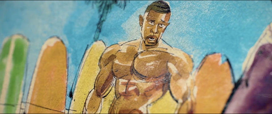
Still from the title sequence in a man stares, his mouth agape
Jon: Every time you watch it, you see some new great detail that Kagan put in and that Nolan focuses on.
Was this the first title sequence project you’ve worked on, Kagan?
Kagan: Yeah, yeah. First.
Nolan: First of many!
Kagan: I’ve done some motion work for documentaries and stuff, where they want to recreate scenes that they don’t have footage for. As magazine work kind of dwindles away, this might be an avenue for me to explore. There’s so many better artists who work on the show who didn’t get such a marquee gig so I’m very happy.

