There is an old hand-painted sign somewhere in your neighborhood. Plastered to the side of a building or rusting in an alleyway, peeling and long forgotten, these typographic remnants of another era are usually hawking a product or service that no longer even exists. You might walk or drive by these signs every day, but have you ever stopped to wonder just who painted those letters?
Faythe Levine and Sam Macon’s documentary Sign Painters answers that question, shining a light on the world of unsung artisans like Keith Knecht, Ira Coyne, Bob Behounek, Wayne Reuben, and Jeff Williams. Where hand-painted signage could once be seen on every street corner and every storefront in North America, it is now a fading urban craft facing an uncertain future.
Though their names may not have the same cultural currency as a Saul Bass or Maurice Binder, sign painters share an important artistic lineage with title designers. From the ranks of the legendary Pacific Title and Art Studio to Star Wars and Taxi Driver title designer Dan Perri (who as a teenager painted signs for bars and restaurants), the history of title design is full of sign painters. The very first title designers were, in many cases, painters and letterers hired to apply their eye-catching trade to the new medium of cinema. Early film credits and intertitles were meticulously crafted efforts featuring hand-drawn typography not unlike the kind seen on signage of the time. Both fields required a steady hand and a lot of patience; the only real difference between the two was the size of the canvas and the product being sold.
It is fitting then that the Sign Painters title sequence is able to unite these invisible and corresponding crafts in a way that is both memorable and meaningful.
A discussion with Sign Painters co-director and title designer SAM MACON.
Give us a little background on yourselves. Where did you start out?
Sam Macon: Faythe Levine and I met years ago in Milwaukee, Wisconsin, via the city’s vibrant art and music scene. We both worked in commercial production for a few years, and when I began directing music videos and short films she served as production designer.
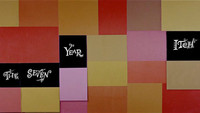
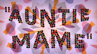
Handmade Nation (2009) main titles
I moved to Chicago and began directing more commercials and Faythe helmed her first documentary feature Handmade Nation, for which our producer Johan Mueller and I did the stop motion animated opening title sequence. Over a few years of ongoing collaboration on smaller projects, we decided we wanted to co-direct a feature doc. It was just a matter of time until we found the right topic.
How did you decide to make Sign Painters?
When Faythe initially proposed the idea of doing a film about sign painting, I said what many people have said to us over the past four years: “What do you mean, sign painting?” I immediately felt pretty stupid saying that, because even as an aesthetically tuned-in person, a person that has always appreciated great signage, interesting lettering, et cetera, I had never really put two and two together. I had never given much thought to the fact that there was an entire industry of talented tradesmen and women who actually made the signs I had admired for much of my life. My own ignorance was enough motivation for me to say, “Sounds great. Let’s do it!” We started shooting the film in early 2010 after a quick exploratory trip to the Pacific Northwest to meet with some of the painters that Faythe knew personally.
—Sam MaconWe learned early on in the process that a sign painter does his best work if you get out of the way and let them do their thing.
So what came next? How did you develop the film?
In all honesty, we didn’t engage in extensive pre-production. We didn’t outline or script it out at all. A lot of docs these days feel a little too driven by the filmmaker – too rigid, too thesis-based for my taste. I didn’t want the “truth” to be manhandled, so we consciously took a more journalistic approach. We really just jumped in and allowed the story to develop naturally.
Faythe, our cinematographer Travis Auclair, and I began by interviewing the handful of guys Faythe knew who had become working sign painters. From there we got names of people we had to talk to. We’d track those people down and they’d say, “You can’t make this movie without talking to so-and-so.” We’d track down so-and-so. As we learned more and more about the trade we started to construct our narrative and fill in blanks. At the end of three years of shooting we started cutting through 120+ hours of footage.
What were some of the obstacles you encountered during production?
The process of making an independently financed film – whether it’s documentary or narrative – is an exercise in overcoming obstacles. Many of which are familiar to any filmmaker.
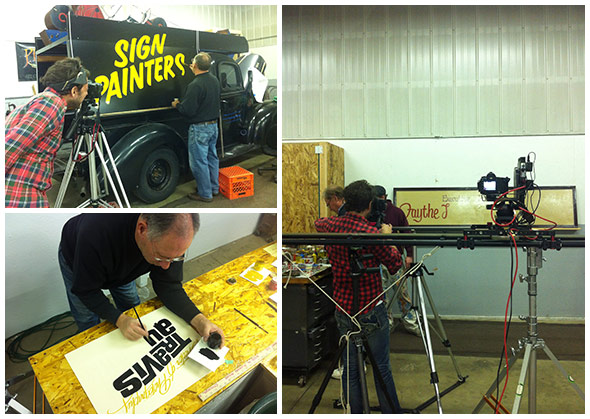
Behind-the-scenes photos of the title shoot by Faythe Levine
A unique obstacle we faced on Sign Painters was the technology gap between us and some of the painters we interviewed. It wasn’t the case with everyone, but there is certainly an anti-technology contingency within the community that made just finding some of them challenging. Once we tracked down people with zero internet presence, we’d have to cold call them and convince them to let three strangers with cameras into their home or shop.
Also, Radar Studios, the live-action production and post house that I'm with, offered ongoing support throughout the project and helped us with the final push to get the film finished.
Did you always know you wanted to do a title sequence?
Absolutely! We were talking about what the title sequence would be like long before there was a film to attach it to. We made a movie about people obsessed with letterforms, so obviously we knew the title sequence had to do their and our interest justice.
What do you think the title sequence gives to your film? What was your intent with it?
Sign painting went from being ubiquitous to damn near nonexistent due to computer-aided printing, so we knew a fair amount of the general public would need to be shown what it is we’re talking about. This title sequence performs the very specific function of illustrating exactly what we mean when we say the words “sign painters” or “sign painting.”
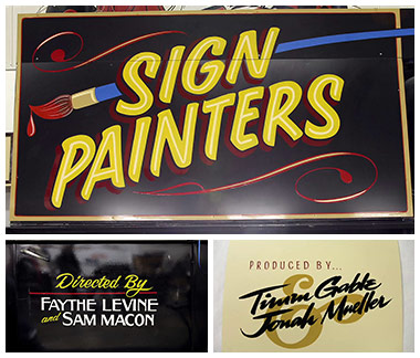
Main Title Cards
We wanted to show the process, the tools, the history, and the aesthetics quickly and dynamically so that people would have context going into the interviews. The film is an oral history, it’s very anecdotal – jargon is often used and not defined. We knew we wanted to make a film that did right by those who were familiar with the craft while still making it interesting to a general audience. By showing sign writers in action, even the most novice viewer would start off on the right foot.
How were the opening credits actually made?
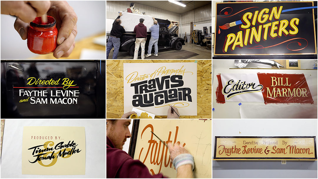
We shot the opening sequence over the course of two days at a really great sign painter named Jeff Williams’ shop just north of Chicago. The whole thing was shot using Canon 5 and 7Ds using a mélange of live action, time-lapse, and stop-motion techniques. For the moving time-lapse sequences we used a lightweight motion control system made by camBLOCK.
Each credit or title card was made as a stand-alone sign. We documented the creation of each one from beginning to end using a variety of techniques. While the signs were being designed, prepped, and painted we shot a lot of B-roll around the sign shop – focusing on tools of the trade, lettering books, and other ephemera.
From there, Mark P. Smith, one of our editors on the project, and I cut the sequence to a custom track composed by Erin D. Garcia. We constructed the sequence to essentially evolve out of the B-roll that anchors the cold opening. I liked the idea of having the titles woven into the film as opposed to set apart. I wanted to integrate it beyond the usual sort of, “Okay, folks! Opening titles time!”
Which sign painters are featured in it and why did you choose them specifically?
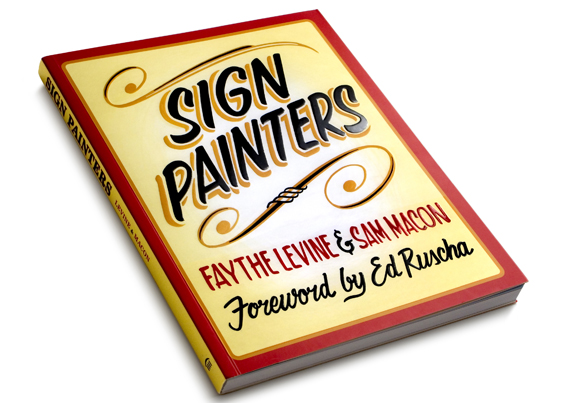
The Sign Painters companion book is available on Amazon
Just about everyone we interviewed for the film had the chops to make a great title sequence. But we knew we needed to shoot around Chicago so part of the decision was logistic. More importantly, we knew the sequence had to be representative of the overall trade. There are a lot of different styles and techniques within the world of sign painting so we wanted to work with painters who represented a range of experience, talents, and interests.
To strike that balance we worked with Ira Coyne, Bob Behounek, and Jeff Williams. Ira is one of Faythe’s friends who had inspired us to make the project. He painted the cover of our book, and has been a major force from the beginning, so we flew him out. Bob is essentially a living legend. Though he’s far too Midwestern-modest to admit it, his abilities are unrivaled. He’s a lettering machine. He would lay out and paint some of the titles before I could set up the camera! He also painted the city title cards that appear throughout the film. Jeff is a great painter and was incredibly gracious with his shop. He let us paint on his truck, for God sakes!
Did you give the painters free rein to design the title card and various credits?
Yes. We learned early on in the process that a sign painter does his best work if you get out of the way and let them do their thing.
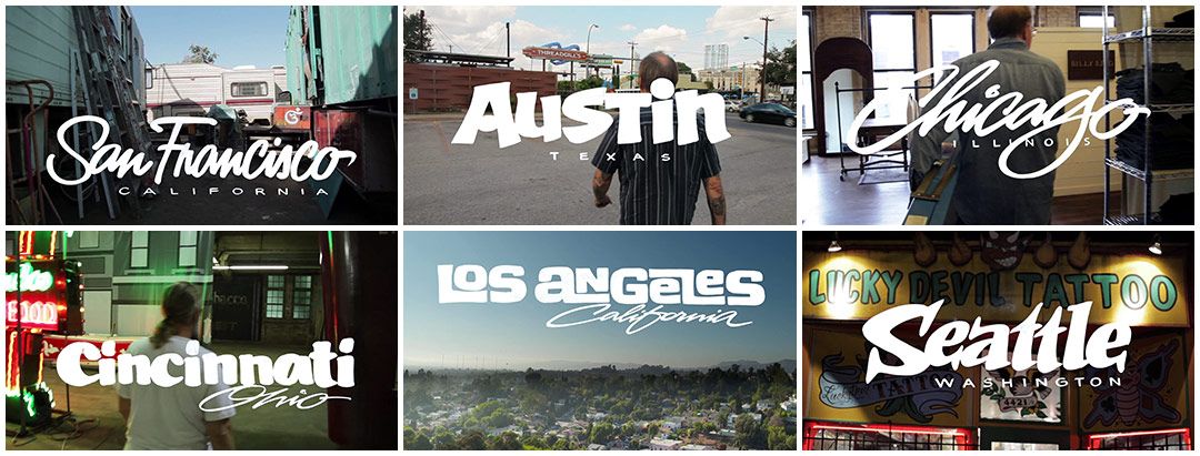
Location title cards used in the film
This film features a lot of interesting characters. What were some of your favourite interactions or moments during the making of this film?
Everyone we interviewed was amazing! Not only were they amazingly talented individuals, but the proclivity within the trade towards being a great storyteller really blew me away. There were multiple times at which Faythe, Travis, and I would just look at each other and smile because we couldn’t believe how rich and well-spoken these people were. Some of the best stories we heard had nothing to do with sign painting!
All of that said, meeting and interviewing Keith Knecht was a true honor. We interviewed him while he was in hospice and he spoke for four hours straight – without Faythe or I asking a question. He loved the craft and spoke so eloquently – poetically really – about something most people take for granted.
Sign Painters end credits
Tell us about the end credits. This is the only time you used an actual font, right?
All of the titles throughout the film are hand done except the end credits. There was just too much to do by hand given the timeframe and the amount of copy so we worked with our good friend Dave Kiehl’s company Harvest Motion to digitally create an end credit sequence.
All of the titles were done using House Industries’ Sign Painter font collection with their blessing. Dave incorporated the necessary titles into scans of a lettering textbook that had been in use for almost 100 years by the now-shuttered Butera School of Art in Boston.
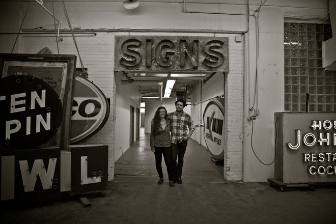
Directors Faythe Levine & Sam Macon, American Sign Museum, Cincinnati, OH
It’s rare for title sequences or parts of title sequences to exist as physical objects these days. Where are the paintings and the truck now?
It was really cool to essentially make a sign for each title card. The truck sadly has been painted over and it was sold at some point. Apparently, no one wanted Faythe’s and my name on the door of their 1940s-era truck! We hung on to some of them, gave Bill Marmor (our editor) his title banner and the others? Who knows? Oddly enough, just like digitally created or optically printed title sequences, they really just exist on “film.”
Sign Painters is now available at signpaintersfilm.com and on iTunes.
Support for Art of the Title comes from


