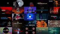
In the last interview before his passing in 1991, longtime Bond titles director Maurice Binder observed that Bond sequences were the likely precursors to the modern day music video, in that they blended experimental filmmaking and pop culture into a format perfectly suited for pop music. From the '60s onwards, the Bond theme song, and its title sequence by proxy, have become synonymous with rock n' roll's biggest (or sometimes, trendiest) acts, and in doing so lent credibility to the MTV-led music video explosion of the early-to-mid-'80s.
In only a few years' time, music videos had Bond title sequences beat at their own game, with the popularity of the format attracting first-string talent, new ideas and technologies. Fierce competition between record labels, increasingly eccentric musical acts and unprecedented album sales afforded directors heavy creative license and control over their product. Acknowledging the format's reach, Bond's production company EoN joined the circus, commissioning videos for their theme songs independent of the film's title sequence, often loaded with scenes from the film itself, thus doubling as trailers.
Ironically, their first such venture was a title sequence itself: For Your Eyes Only in 1981, directed by Binder, featuring Sheena Easton performing her theme song from within Bond's world. EoN’s first proper music video was Rita Coolidge's All Time High, the theme song for Octopussy (1983), beginning a trend that would become a cornerstone of the franchise's marketing campaign.
It was on Binder's final Bond film, License to Kill (1989) that EoN commissioned Daniel Kleinman to direct the video for Gladys Knight's theme song of the same name. A veteran music video director with over a hundred videos under his belt, Kleinman's experimental techniques and affection for technology seemed a perfect match for the job, and while he never met Binder while working on the video, his influence was very apparent, employing several telltale 007 title sequence tropes including window mattes, scale-independent compositions and sultry femme fatales.
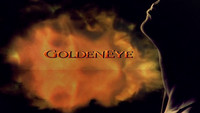
License to Kill’s theme song was a hit in the UK, and Kleinman’s video saw heavy rotation on MTV and elsewhere. Perhaps more importantly, it gave EoN a glimpse of what a post-Binder Bond sequence could look like; in 1995, Kleinman was nominated as the new Bond title director, beginning with the Brosnan-fronted franchise reboot Goldeneye.
"Licence to Kill" music video
Kleinman upheld the tradition of the Bond sequence as set down by Binder and Robert Brownjohn (1963's From Russia with Love and 1964's Goldfinger), but his background in shortform direction and modern post-production introduced the format to an entirely new bag of tricks. While only six years had lapsed between Binder's last and Kleinman's first sequences, it was a millennia in digital years; the tech revolution had overgrown Hollywood, leading to a steady flow of visual effects-heavy blockbusters inching ever further into Bond's turf. By fate or design, however, the hiatus proved an ideal time for the franchise to reinvent itself for the post-Cold War digital age, and Kleinman's fresh eye on the titles would further EoN’s cause.
As Bond titles are as much a product of their time as they are a visual statement about the film, Kleinman's Goldeneye sequence was very much aligned with the new direction of the franchise: modern, relevant, big. It was by all accounts a more ambitious effort than past sequences, taking full advantage of new production tools and adding a third dimension to the template, giving Binder's trademark scale differences a spatial relationship though parallax. Kleinman’s successive titles further evolved the format, trading chemicals for pixels as new technologies allowed.
Unlike the sequences of Binder and Brownjohn, which were largely founded in craft and euphemism, Kleinman's additionally incorporated a narrative element, albeit as abstract as their visual compositions. As such, his sequences often address the emotional currents of the film more directly and reflect its danger more literally. His settings are darker, his use of weapons largely stripped of their innuendos and presented as instruments of actual danger. Also unlike his predecessors, his sequences are increasingly framed by Bond's own conflicts and psyche, first apparent in his torturing in Die Another Day (2002), and again in Casino Royale (2005), in which gambling becomes a direct parallel to 007's trajectory as a freshman MI6 Agent.
Casino Royale (2006)
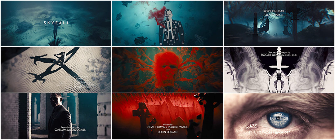
In Skyfall, Kleinman's sixth outing with the franchise, the viewer is completely immersed within the mind of Bond as he sinks to the bottom of a riverbed after being shot by friendly fire during the film's climactic cold opening. Set in the depths and ruins of his own private thoughts and memories, the sequence is a combination of many analogies: his past and current emotional state, his uncertain future, his many indistinguishable misdeeds and duties flashing before his eyes. It is the first Bond sequence, and the first Bond film, to dig into 007's psychological past, both using his childhood home as an emotional safehouse and a prison, giving his character greater depth and a vulnerability more in step with creator Ian Fleming's incarnation of the gallant, yet flawed, superspy.
While the content and construction of the Skyfall titles are novel, darkening the tone significantly from past sequences and employing a Z-oriented digital camera without brakes, it is nevertheless an apt continuation of the Bond title tradition, apparent both in the patience of its delivery and use of familiar visual tropes and typography. Kleinman even reintroduces the female form, missing for the first time ever in his previous sequence, Casino Royale. Adele's Academy Award / Golden Globe / BRIT Award-winning theme song channels early Bond crooners like Shirley Bassey and Nancy Sinatra, giving the sequence a dreamlike quality, acting both as a counterpoint to the abrasive subject matter and a complement to its murky underwater tones.
It is a persistent irony that Bond titles are expected to be both new and classic at once – a creative corner into which Binder and Brownjohn voluntarily painted themselves and, by extension, their successors. But this apparent double standard also fuels the core of the tradition, pairing artistry with technology through the unique spectrum of 007. If Binder and Brownjohn's contributions were the format itself and its general contents, then it has become Kleinman's corner to challenge their model from within, redefining its boundaries in keeping with the times, his own creative direction and Bond's ever-evolving on and off-screen persona. Skyfall is a deliberate and graceful balance of all the above, both indisputably Bond yet somehow not, just as it should be.
A discussion with Main Title Designer DANIEL KLEINMAN of Rattling Stick.
Bond title sequences obviously carry a huge legacy and they often present the themes and settings of the film they precede. What’s the starting point for a new Bond sequence? The script? A cut of the film?
The starting point for me is always the script; I am usually brought into the process before the film has started shooting or at least in very early stages of production. I read the script and get a sense of the main themes of the movie, perhaps start to have a few ideas, brainstorm with myself a bit, write lists, get excited, look for reference, and start sketching. Next I meet with the producers and the director of the film to get a clear idea of the vibe of the film and be aware of any input or requirements for the title sequence. Then, I explain how I see the tone of the titles perhaps with rough sketches and reference. I rarely see a cut of the film until quite late in the process but I do see some individual scenes particularly the ones that lead into and out of the title sequence. There is a back and forth process.
The opening scene of the film is a terrific segue for these titles. Talk about your initial concepts and discussions with Director Sam Mendes.
It's difficult to glean from the page just how spectacular some of the action scenes may be, but it's kind of a given that the opening reel of the movie is usually a tense and bravura action sequence, and Skyfall was no exception. It ended with Bond being shot and falling – perhaps fatally shot – into a river. The script left Bond sinking and that is where I pick up the story. It was a great chance to make a moody transition into the titles.
I read a study that showed that people who were familiar with a story before being told it enjoyed it more and perhaps, in a subtle way, the titles perform that function.
I spoke at length with Sam about the titles and my first drawings showed women's hands pulling Bond under. I felt this signified how badly injured he was and that it was a woman that had shot him, that the order to shoot was given by a woman, and that to an extent Bond's vulnerability as a character came from a woman’s betrayal. Sam immediately liked this, and he was keen that the sequence be a bit like Bond travelling into the underworld, a trip to Hades, an idea I really picked up on.
I went away and elaborated on that and came up with a board that had key images and ideas that Sam liked, but he wasn't keen on the flow of the narrative, he felt it had to be more first person, a kind of POV travelling forward. At first, I was a little disappointed that my first stab wasn't 100% loved, but I came to see what he meant and how it made sense in the context of the story. The titles became a sort of “life flashing before your eyes” experience. Also, that conceit gave me the chance to create some new visuals that suggested out-of-body experiences in which Bond sees himself and his own mortality. It helped the scene in a hall of mirrors, the camera as Bond sees his own reflection and shoots at it, a reference perhaps to his own self doubts and also the fact that I saw his nemesis in the film as being a Bond dopplegänger, the yin to Bond's yang, a dark reflection of 007.
Was the song by Adele already written when you started? How did the union of audio and visual happen?
I hadn't heard the track when I first started having ideas. I went to Pinewood sometime after the film had commenced shooting and Sam had a rough demo of the track he played for me. The demo helped me lock down some of the images and sync them occasionally and loosely to the lyrics, but it took considerable time to get a final mix and even longer to get an edit of the track. It was cut down from five minutes to just below four minutes. The track was a tightly kept secret and I didn't share it with anyone – not even my own team – so they were in the dark as to the tone, mood, and speed of it until quite late in the process. The final marriage of finished track and edit to the visuals happened only a couple of weeks before the sequence had to be finished.
"Graveyard" VFX breakdown
This might be the most complex sequence you've done so far. Can you describe the production process?
In many ways it is the most complex sequence but in others it was one of the easier ones for me to create! The reason for this is that the technology has improved immensely since the era of Goldeneye. The images can be created more swiftly, processed and changed, tweaked and massaged, something I was never able to do in the past due to the mind-numbing slowness of the digital compositing machinery. It could take days to render just a few seconds and then it was impossible to watch it back at full resolution in real time and difficult to see it in sync with the music. The layers of imagery may have been simpler in the past but the process was much less user-friendly.
To start the process, I work out storyboards and do storyboard animatics. This time, I also made a CG animatic to experiment with some of the ideas, then I shoot the elements I require and edit them myself at home into an order with my preferred takes, a bit like an offline. Next, the post-production house Framestore start to create the scenes and effects. I go in regularly to discuss how they are doing and watch the roughs slowly get closer to how I imagined them. The team at Framestore are very creative and I'm happy to get input from them. This post process is the longest part of it, it's very labour intensive, with lots of different techniques and processes. Many a long, late night was had by the team, not many weekends off and much sleep missed.
The titles set up a lot of the events and images that appear later in the film, instilling a sense of déja vu in the viewer. How conscious were you of this and how much did you want to exploit this effect?
The déja vu effect is a happy consequence of me trying to put elements into the titles that are relevant to the story of the film, that suggest a narrative and foretell scenes and action that are yet to occur without giving too much away. I think it sets a mood but is impressionistic rather than literal. I don't want to defuse surprises or story elements that come later in the film. Also, as the audience hasn't yet seen the film some images won't mean that much, but by being suggestive rather than concrete, they stick in the mind, giving a clue as to what is to come without spoiling it.
I also want to create a sequence that rewards repeated viewings. Many people over the years will watch the film multiple times and of course the aficionados and fans will dissect the whole movie, so it's great if on second viewing an image takes on even more poignance or relevance. It’s nice to have a couple of “Oh, I get it now” moments as long as they don't detract or confuse on the first viewing. I do think this leads to a déja vu resonance when the relevant scene in the film comes along, somehow enhancing it. I read a study that showed that people who were familiar with a story before being told it enjoyed it more and perhaps, in a subtle way, the titles perform that function.
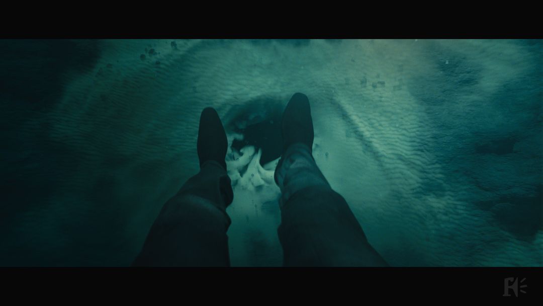
Hi-res still selects from final sequence
How has CGI changed the Bond title sequence?
I'm not a fan of CGI for its own sake, which may seem surprising seeing as I've used it a lot in the past with greater or lesser success, but I do like to use it to make an idea work. I start with the idea and the image and then work out how to create it, so CGI is certainly a very powerful visual tool which broadens the possibilities for one's imagination and, perhaps even more importantly, it allows a lot of fine tuning. Some of the images – the sinking gun, for instance – are CGI. I could have filmed the gun for real – and in the past probably would have done – but creating it in CGI means I can make it fall at any speed, twist and turn how I want, land as I want, and in effect be controlled to greater extent than actual, locked-in film footage of a gun. So some of the elements that don't look CGI are CGI and are created that way so I can really micro-manage the images. This again is something new because in the past CGI was slow, expensive, and at times much cruder than the aspirations I had for it. It's really come of age now.
Talk about shooting the live-action elements of the sequence. Daniel Craig’s 007 is featured more prominently in this sequence than in your last outing.
I needed to have Daniel Craig in the sequence for two reasons. Firstly, the broad idea of the piece is that it's his point of view and the camera and therefore the audience are seeing the action of the titles through his eyes. I needed to be able to explain that so it didn't just seem like a simple journey. The way I did it was to start the sequence by seeing Bond sinking, and then, as he goes into a kind of tunnel – which is subliminally relevant to later elements in the story – he falls forward and sees himself falling away, a psychological effect of an out-of-body experience, something many people report when they are on operating tables or close to death. I hoped that this would underline the idea that the journey was Bond's own. As other clues, I put in the hall of mirrors, where he – the camera and therefore us – looks up and sees himself. The second reason for having Daniel Craig in the titles was to explore the theme of the dopplegänger as villain. Silva is an ex-agent very similar to Bond, who has had similar experiences and a special relationship with M and, in many ways, is the dark flipside of Bond. By having Bond shoot at his own shadow I was alluding to this. Again, it's pretty loosely told but it's there for those that wish to see it.
Of course, there are elements that return again and again, and that is one of the joys of the sequence. It has to be both new and old, paying respect to the heritage but also being fresh and true to the new script.
Could you talk a bit about Bond’s gun barrel entrance? The traditional kickoff to a Bond title sequence is noticeably absent in Skyfall. It makes sense for the character at that point in the movie (and the sequence does make an appearance at the end when 007 is back in fighting form), but was it tough to abandon such an iconic element of the series?
The position of the gun barrel entrance wasn't finalised until after the movie had finished shooting and there was a rough cut. I tried a few experiments of how the gun barrel would transition into the first shot of the film as is the tradition but Sam quite reasonably felt there was a double action. The first scene of the movie is Bond dramatically stepping into shot from the dark, in a corridor holding a gun. If this had come from the gun barrel when Bond steps into the shot holding a gun it might well defuse the drama of the first shot of the movie and seem repetitive. So it was his decision to place the gun barrel at the end of the film. The added benefit of this was that the film ends with Bond sort of returning to being the Bond we know of old – he's back and ready for action, no longer the disillusioned and weary character he has played in the movie. So, the gun barrel gives a “He's back!” kind of rush and allows the audience to cheer. I thought it a really good decision and I'm fairly sure the gun barrel will resume its former place in later films.
Do you feel married to the characteristic female silhouettes of past Bond sequences? With each new film there seems to be a departure from this.
Personally I love them, they are a lingua franca for Bond, a worldwide recognisable icon symbolising adventure, glamour, and the exotic. They were a device introduced by Maurice Binder and I'd happily keep using them as shorthand for 007's world. However, they are not always appropriate! I prefer making the idea of the titles work and then working in the classic images and themes of Bond but not forcing them if they don't fit. Also each sequence doesn't have to be the same; it just needs to be true to the spirit and heritage of Bond. Like the barrel, I'm sure the silhouettes will return whether I do more sequences or not.
"Skullbed" and "Blood, Heart, Skull" VFX breakdowns
What were some of your stylistic influences?
I have very eclectic tastes! I trained as an artist and designer, so I love painting and film. I collected comics as a boy and was drawn to Aubrey Beardsley, Gustave Doré, Eduardo Paolozzi, Peter Blake, Saul Bass, Windsor McKay, Jack Kirby, Steve Ditko, Magritte, Bosh, Géricault, George Grosz, Hokusai, Francis Bacon, Lucian Freud, Holbein, Dürer, Arthur Rackham, Heath and Charles Robinson – actually the list is fairly endless!
Can you talk about some challenges you encountered – either creatively, technically, or with personnel?
Really, it was a very smooth process. There was a bit of a stumble over Daniel Craig's eyes at the end of the sequence, which were meant to be a reprise of his young eyes from earlier on, witnessing something we know not what, yet. The problem was that although I filmed Daniel himself, many people didn't recognise the eyes as his! I think he is not often filmed that close and he has very distinctive features that if not seen altogether can cause a bit of confusion. So I had to artificially widen the shot to see a bit more nose, ears, and mouth to make sure everyone knew who it was.
What was the schedule like – how long did it take from the first meeting to the finished product?
We met and talked before Christmas 2011 and then delivered finals September 2012, so it was a long process although I didn’t work on it every day of course. There are moments of waiting for things to happen, “Go” buttons to be pressed, and things to be arranged – also long nights of intense work!
What was the hardware and software you used to put it together?
I used Final Cut Pro to edit the footage shot on an Alexa. Framestore composite on Flame and Inferno.
"Chinese Dragons" VFX breakdown
Were there any concepts or pitches for earlier Bond sequences that ended up being integrated into subsequent films? Or do you consider each new film a fresh start – a clean break from its predecessors?
I always think of it as a fresh start. I take the script as the match and start burning the midnight oil to craft the sequence to work with that particular concept or story. Of course, there are elements that return again and again, and that is one of the joys of the sequence. It has to be both new and old, paying respect to the heritage but also being fresh and true to the new script.
What are some of your favorite Bond title sequences?
I've always admired the sequence in You Only Live Twice as the mixture of colours, Japanese imagery, and music seemed to really meld well. Some of Maurice Binder's stranger flights of fancy I also have a soft spot for, like The Spy Who Loved Me with the naked girl in a Russian hat – so we could tell she was a spy! The stroking of the Golden Gun in Man With the Golden Gun always makes me chuckle.
What are some of your favorite title sequences in general, whether film or television?
As a child I loved the opening to The Man From Uncle. The way Napoleon Solo stands behind the bulletproof glass being shot at perhaps subliminally influenced my mirror scene in Skyfall. Get Smart was a good one. Man with the Golden Arm was a great visual. Oddly, I've never really taken a great deal of notice of title sequences. I didn't set out to do them and I don't do any other than Bond, which I do for fun. I'm really an advertising director and therefore shoot a lot of disparate types of things. I suppose I don't think of myself as a title sequence director.

