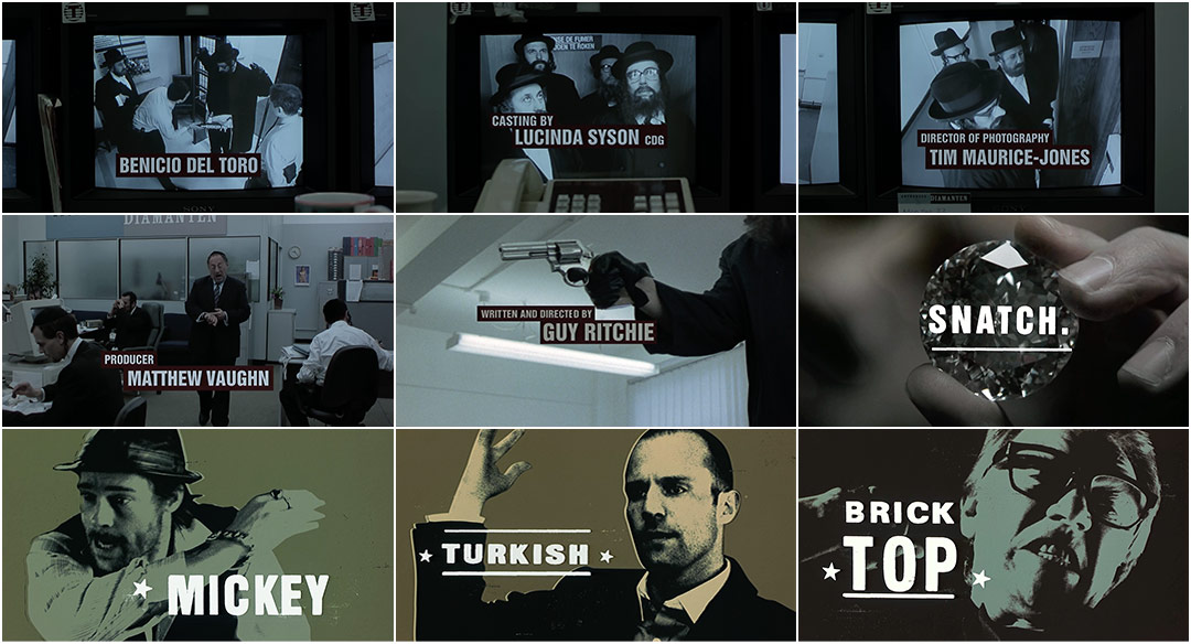
The cold open of Guy Ritchie’s hard-nosed crime comedy Snatch is slightly misleading.
A smooth-talking narrator (Jason Statham) quickly convinces viewers that this is a movie about a bloke named after a plane crash and a lad who claims to be the namesake of one of history's greatest firearms – modest boxing promoters simply trying to stay out of trouble. But as the opening jewel heist-cum-title sequence gets underway, the audience learns that Turkish and Tommy are but minor players in a topsy-turvy tale of the criminal underworld, a microcosm of thieves, gangsters, and lowlifes. There’s Sol and Mickey, Vinny and Avi, Franky Four Fingers, Boris the Blade, Bullet-Tooth Tony, and Brick Top. Oh, and a diamond the size of a fist, of course.
Setting the board for an intercontinental con, the title sequence introduces the cast as the unlikeliest of robberies goes down and the characters are presented through a series of rip-roaring vignettes and posterized freeze-frames. If the sequence seems clichéd now, that’s because it was a genre-defining piece of cinema. Cool as hell circa 2000, the opening minutes of Snatch almost single-handedly reinvigorated the British gangster movie.
Title designers STUART HILTON and IAN CROSS, of the studio FAQ, discuss their work on the opening title sequence for Snatch.
Give us a little background on yourselves.
Ian: Stu and I became friends in ’96 when we shared a studio in Brixton. It was through Stu that I joined Picasso Pictures production company, and after a few years, we decided to pitch on a job together. It was for Guinness, programme sponsorship for the Rugby World Cup, for which we won several awards including a D&AD Silver Award. It was that year that we did Snatch. We’ve worked together ever since!
Stuart: At the time we did Snatch we actually hadn’t decided to call ourselves FAQ yet so we’re credited as Ian Cross and Stuart Hilton. We were doing commercial work that was later to be termed ‘motion graphics’ – ads, title sequences, end devices, etc. Lots of animated and agitated text flying about. This was an interesting project for us in that we'd secretly wanted to keep the text still rather than move it about all the time, as in our commercial work, and this was an opportunity to do just that. They came to us because we knew how to animate but we didn’t want to!
So how did this title sequence project come to you and how did you develop it?
*Moving Picture Company is a creative studio specializing in VFX for over 25 years with offices all over the world.
Stuart: The job came through MPC* who were doing the post-production for the film. We were then with Picasso Pictures who were then owned by MPC and they were given the task of doing the titles. They had no designers at that time, so we were drafted in to oversee it and design it. In those days everything was done in expensive edit suites!
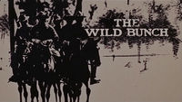
There were initial notions that it would in some way be animated and that The Wild Bunch titles were an influence. I can't remember where that came from – Guy Ritchie, the editor Jon Harris, or us.
The Wild Bunch (1969) — main titles
The film had a boxing element so we thought that would be an appropriate theme. We had a great book of old boxing posters with great, bold graphic Ali fight ones and beautiful hand-drawn fonts and details with that ace, cheap, two-colour print quality. We started to think that it would be great to have individual posters for each character.
What was that boxing poster book you referenced?
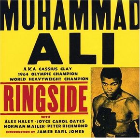
Muhammad Ali: Ringside by John Miller and Aaron Kenedi book cover
Ian: It was a book called Muhammad Ali: Ringside published by Virgin. It's a great book, I still have it. At that time, we would get the production company to buy us beautiful books, sometimes expensive books for pitches. It was part of the pleasure of pitches! Stu and I would trawl Charing Cross art book shops for all sorts of stuff as inspiration. But now you can find a trillion examples of the type, fonts, images on the Internet, at a click, from anywhere. Now I sound like an old man.
Stuart: Books are not just for old men.
So how did you proceed?
Stuart: The brief was fairly clear and we just knew that our boxing poster idea was going to work nicely.
We met Guy and his entourage. Jason Statham was there. We presented Guy with a few different ideas and he chose the route that you see.
And I remember overhearing a conversation between Guy and Norman Cook [AKA Fatboy Slim] in one edit where Guy was talking about some woman he just started seeing. Turns out it was someone called Madonna!
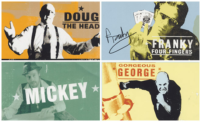
Initial poster frame concepts
Haha. So, he chose the boxing poster idea. What next?
Stuart: With the freeze-frame concept in place, we were given the rough edit and we sat with an editor and made the freezes work with the music.
Ian: We were given the music to work with. It never changed throughout the production while we were involved, which was fine, we loved it!
Stuart: We had a couple of creative meetings with Guy, and he came to a few edits. With the freezes fixed, we suggested a subtle snappy punching-in on each one as it appears using a corresponding very short mix into the 'poster'. We tried a few different ways to freeze. In the end, it was the simplest way that worked: a 2- or 3-frame mix.
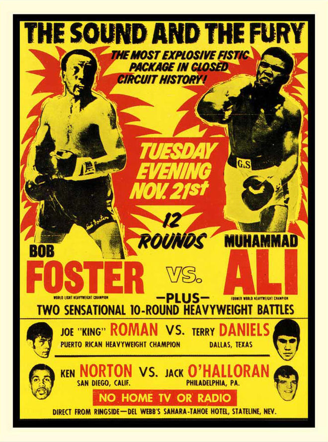
Foster vs. Ali poster, 1972
How did you decide on the colours and the typesetting of the characters’ names?
Ian: They were influenced by the boxing stuff, the fight billing posters, where several fights were listed in one night.
—Stuart HiltonThey really liked the idea of the out of focus 'fake' title but there were mysterious objections from somewhere.
Stuart: We chose colours based on the boxing posters, and desaturated them slightly to add an aged feel. The grading was attended by Matthew Vaughn mostly. We wanted to design the frames and have them printed but there wasn't time or budget, so we ended up adding the subtle paper texture, the slightly offset colours, and the little tears and creases in Photoshop.
We took a lot of care and consideration over where every little glitch should be. Especially with the typography, which was based on small range of fairly heavy bold gothic fonts and then re-drawn by hand so you get that imperfection and tinkered with in Photoshop. We kerned it all by eye so, again, we could introduce imperfections.
Ian: The original stuff we did had more of that flavour, but eventually got stripped down to just the line and a star.
Stuart: Right, there were lots more lines and stars originally but we reduced those down to just a few carefully ‘misplaced’ ones where the name layout seemed to require it.
And the opening sequence with the text overlaid on the scene? Tell us about that.
Stuart: In that opening sequence where the text is tracked in the footage, it was meant to look like the text was on the security monitors. The tracking of the titles onto those screens would be a lot tighter and stable these days.
We wanted to have one rogue, made up title, where it would be out of focus like the image on the monitor. They really liked the idea of the out of focus 'fake' title but there were mysterious objections from somewhere. Pity, really! Was a fun idea. They added a couple of very last minute titles after we'd been off the job and used the wrong font – very annoying.
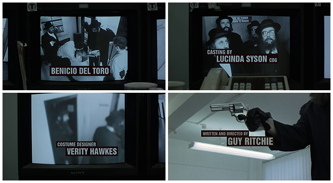
Opening sequence monitor screen credits
Were you inspired by The Pink Panther and its title sequence? Both this and The Pink Panther’s sequence feature a close-up on a big ol’ diamond.
Stuart: The diamond was something the editor had already and we didn’t do anything to it in the end. The Pink Panther had no specific influence other than it obviously being such a totally classic graphic title sequence that works brilliantly with the music and sets up the tone of the film beautifully. We wanted our titles to feel very bold, striking, and memorable but be absolutely still as opposed to ‘animated’ like all our other work at the time.
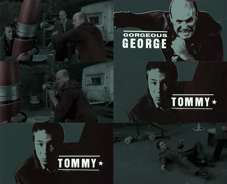
Character freeze-frame example
What element(s) of this sequence are you both most happy with?
Ian: I think I'm happy with the freeze-frame section of the titles. We pushed for it being simpler than the original idea, that the freeze frames didn't move, that they have paper texture and were distressed slightly, grungy.
We also pushed hard for the colours as there was pressure to make them brighter. It made sense that they be a bit distressed-looking, bit grungy, because the film had that edge. We took a while experimenting with the transition between the live action and the graphic image and in the end chose the simplest route which was a two-frame mix. Hardly noticeable, but we agonised over it!
Stuart: Definitely the posters are my favourite bits. They just work exactly as we wanted and they didn’t interfere with the layouts or colours or anything. I like Sol best. And Turkish.

Sol and Turkish character poster frames
What do you think this title sequence gives to the film?
Ian: It sets the tone. It sets up the idea of connections. It was a film of characters, so it made sense to make a point of announcing them at the front in a memorable way.
At the time, we just wanted to make something that looked nice and people would think was cool. I remember seeing the posters for Trainspotting and not liking them at all, and thinking we could do a better job than that.
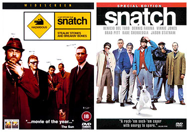
Snatch DVD cover art examples from the UK and US
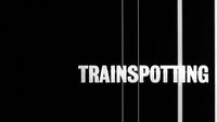
Stuart: I remember really liking Tomato's Trainspotting titles! Those scratched-on film lines were quite elegant and minimal but they bore no relation to the posters and promo material generally. Just like on Snatch.
Ian: For Snatch, we made what I thought were great character posters. In fact, there was talk of making these into bill posters to promote the film, which we got really excited about, because I thought, well, they'll be better than those Trainspotting posters! In the end, the marketing department decided to go with a different route, a lot like Trainspotting. Ha. I hated them, too.
Stuart: I hated the DVD packaging for Snatch. It makes me slightly sick. It always surprises me that there isn’t more visual connection between the titles and the marketing material.
Ian: But I think the title design and concept still holds up and is still referenced now.

