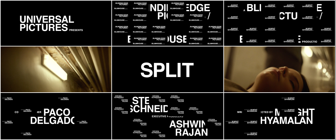
The opening to M. Night Shyamalan’s Split is a sinister and sophisticated introduction to a twisted character, a glimpse into a fractured mind, all sharp angles and darkness.
With nods to the iconic and minimal main titles to Alien, designed by R/Greenberg Associates, and Psycho, designed by Saul Bass, the sequence builds upon a rich title design tradition. It’s driven by three simple ingredients: a black screen, white typography, and the typeface Helvetica. Title sequences that focus exclusively on typography are rare, particularly in the current context of CGI-heavy work.
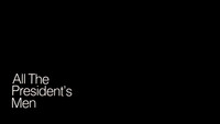
Designed by Creative Director Aaron Becker and a small team at LA-based studio Filmograph, the opening sees each on-screen credit sliced up, segmented into a 24-frame grid and layered, like some kind of grim sister to the titles of The Seven Year Itch. The combination of black screens and Helvetica in white has not been used this effectively since Dan Perri’s work for All The President’s Men in 1976. Paired with the percussive and moaning score from West Dylan Thordson, the effect is eerie and unnerving, underlining the characters’ terrifying and blurry half-consciousness. The sound oscillates between low growls and far-off, bleary screeches, like heavy creatures moving in dark corners – nightmares on the edge of reality.
To cap off the experience of the film, Filmograph also created an end sequence to suit. The splitting process hinted at in the opening is brought full circle, with the end credit crawl running down-screen not once but 25 times simultaneously. At the close of the film, the personalities of the main character are revealed, each square in the 24-frame grid repeating the crawl and echoing his many identities. The sequences are stark, chilling, and innovative while performing their primary purpose: setting up M. Night Shyamalan’s film and letting it shine in the dark.
A discussion with Creative Director AARON BECKER and Executive Producer SETH KLEINBERG of Filmograph.
So, last time we talked with Filmograph was about your work on Mission: Impossible – Rogue Nation. What have you been up to since then?
Aaron: Since that project, summer of 2015, we’ve been working on more title sequences, entertainment branding for production studios, commercial work, and even a few short film concepts. Last summer, in 2016, we moved into a larger facility in our Echo Park office building, which has allowed us to work on more challenging projects with larger teams, which has been really fun.
Seth: Yeah, the new, larger space has allowed us to work on not only more projects at once, but also larger team-oriented projects, such as The Power Rangers, which we just completed for Lionsgate. Other recent notable work would be John Wick 2, Get Out, Middle School, and The Conjuring 2. We’ve also completed the titles for Gerald’s Game for Netflix, but that has yet to be released.
How did this project – the titles for Split – come to you?
Aaron: A couple years back, during post-production on The Visit, we got a call from M. Night Shyamalan’s production company, Blinding Edge Pictures, and they told us they were looking for a new logo design and animation for the front of their films. For that project, we collaborated with designer Ilya Abulkhanov, who co-creative directed it with us. That led to the Split opportunity.
Blinding Edge Pictures ident
Seth: Yeah, and we developed a good rapport with their team. I think other than the title and the director, Aaron and I were told nothing about the film, other than they wanted us to see it at the first family and friends screening in NY.
Aaron: That was about a year before the film was to be released. It was probably 75% of the way finished. The one thing we knew we needed to do was make sure that what we created felt comparable to James McAvoy’s tour-de-force performance.
Seth: We were able to get a little face time with [Producer] Ashwin Rajan and M. Night and pick their brains. Everyone agreed that foreshadowing Kevin’s personalities would be a fun puzzle for the audience, but how we would get there was still needing to be discovered.
What kind of direction did you get from Shyamalan? What did he have in mind to segue from that startling opening and into the main body of the film?
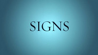
Aaron: Initially, we thought we were designing an isolated, traditional title sequence at the head of the film. We had seen his previous films, of course, and there was the mention of sequences such as Signs, as being a simply executed, understated approach.
Signs (2002) main titles, designed by Picture Mill
Aaron: M. Night wanted the sequence to resonate in a big way, but not to overshadow. We didn’t want to go down a road of an all live-action title sequence, for example, because his directorial style is so distinct and so it was understood that we would be exploring concepts that evoked a metaphor, or that alluded to the many faces of our main character, so we began thinking of how to express that with typography only.
The many personalities of James McAvoy was, by far, the most interesting concept to latch on to. M. Night and Ashwin Rajan made it clear that they were looking for different ideas that would speak to this, and so we went with trying to come up with a multitude of visual solutions that would express this single idea.
Seth: Aaron in the early stages had thought about showcasing the multiple personalities by tweening between different typefaces.
—Seth KleinbergAaron in the early stages had thought about showcasing the multiple personalities by tweening between different typefaces.
Early motion test – version 1
Early motion test – version 2
Early motion test – version 3
Seth: It felt like a challenge and a fun puzzle to solve. We kept on going back and forth about how could we show multiple personalities but in a very subtle way, without hitting the viewer over the head with it and spelling it out.
—Aaron BeckerWe were literally splitting credits in half, which to us was a very cool way of saying that there are multiple sides to this character.
Early motion test version 1 – "Halving"
It’s pretty rare to have a film with opening titles that are pure typography.
Aaron: That’s true. Every once in awhile, we have the opportunity to remind the audience how powerful it can be to have bold typography as the anchor for a sequence. In the first full presentation we sent M. Night, we discussed a couple concepts that were in close contention: the “Halving” concept and “Twenty-Four: The Horde”.
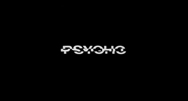
Those early type tests – "Halving" especially – are reminiscent of Saul Bass's work for Psycho, with the lines extending and the movement. Can you talk about that a bit?
Aaron: For the "Halving" concept specifically, we were looking at how the power of a single graphic line could express emotion. Naturally, it's difficult to avoid the comparison to Psycho, and we were concerned with the similarities, but also felt like it was worth exploring, mainly because of what we were doing with the typography and names themselves. We were literally splitting credits in half, which to us was a very cool way of saying that there are multiple sides to this character. We also thought that by having the ascenders and descenders elongate, we were doing something fresh that is also connected to the heritage of title design in tone.
Aaron: Ultimately, he and the producers responded to the structured simplicity of the grid-like concept, because they felt like it was the best and most logical expression of the main character’s many personalities. It didn’t rely on animation, but instead used a grid of 24 names as an editorial-style transition, something we all agreed had the feeling of “movement”, and was just beautiful to look at.
Seth: The way in which we chose to remove and add “blocks,” each representing one personality, coming and going, was also a way of illustrating the constant swapping in his mind. This also carried into the end crawl, with identical versions of the foreground crawl running 24 times in sync, behind it.
Split (2017) end credits crawl, designed by Filmograph
How did you land on Helvetica? Did you try out other typefaces as well?
Aaron: We actually only used Helvetica for this one! I thought about a lot of other fonts and although I had my own nerdy reservations about using Helvetica, no other typeface was going to look this good, this big. We also wanted to toe the line between the feeling we were evoking – too menacing of a font would be inappropriate and could come off as heavy handed. Choosing to shift the alignment of the names in unique compositions, connect letterforms and create ligature-like moments, was something we thought could be compelling.
Seth: When Aaron showed me the "SPLIT" in Helvetica, we knew it would be awesome to see it as large as possible. We made sure it was just barely within title safety, so that it was huge on screen, and helped with the impact.
Which tools and software did you use to put it all together?
Seth: We used the standard suite of tools from Adobe – Illustrator, Photoshop, and After Effects.
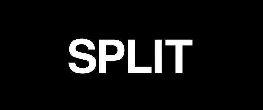
Split title card
How did you work with the music by West Dylan Thordson? Did you have that at the beginning, or did that come together later on?
Aaron: We started with tonal reference for the music, to which we did the motion tests. The edit evolved quite a bit, as their team began to intercut our sequence with footage. They had the very good idea of going back and forth between our titles and the staging scene for the girl being held captive. It played very well, and we began to get more excited about the scoring opportunities. West Dylan Thordson treated our intercut cards with the perfect amount of ominous oddity – a simple thump here, a percussive accent there. We love the strange strings, the ambient noise, the chamber-like echoes, and the implied growls, which sound distorted and off-speed.
In terms of title sequences that are driven by typography or are very minimal, what are your personal favourites?
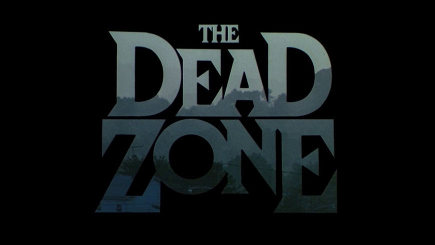
Aaron: Perhaps my two favourite typographic title sequences are The Dead Zone and Alien, for their ingenuity, simplicity, concept and timelessness.
The Dead Zone (1983) main titles, designed by Richard Greenberg
Aaron: Rosemary’s Baby and The Shining are ones I keep going back to, and Fargo has always stuck in my mind for its beautifully original kerning.
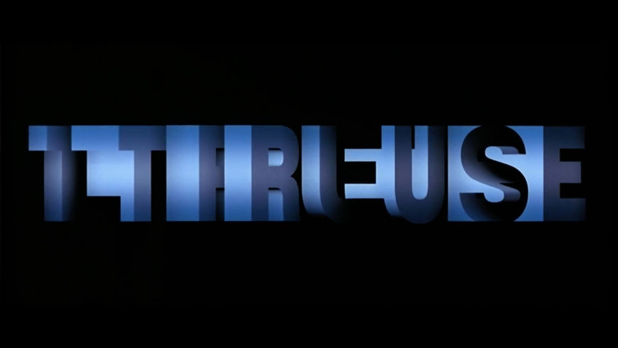
Seth: Dang, Aaron picked all the good ones! I would also mention True Lies, for the way it combined letterforms. I really also liked Stranger Things and Black Mirror.
True Lies (1994) main titles, designed by R/Greenberg Associates
Aaron: I actually really like Black Mirror, too. In the current vernacular, I think Stranger Things does what a lot of type-only title sequences should do in terms of evoking an emotion. The reference Imaginary Forces used for that one is something I appreciated, being a Stephen King fan and seeing the time period they were trying to elicit.

