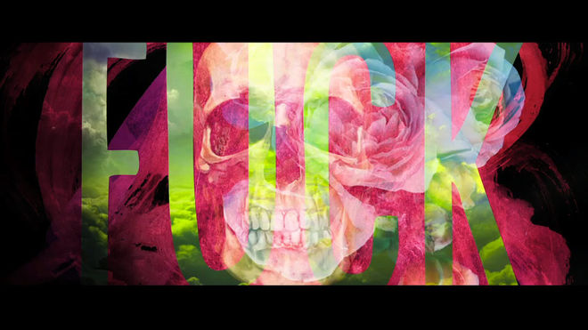
Earlier this year, Harmony Korine’s Spring Breakers gave us a manic shot of microwaved soda pop. Flashes of beach-side boozing, bikini tops, bongs, blow, and Britney Spears are whirlpooled with a mutated underbelly of bullets, power, and apathetic glee. The film is a hypnotic reflection of 21st Century teenage America, in which the nation’s youth flock South East for their sandy sunshine exodus, away from boredom, face-first into mindless excess.
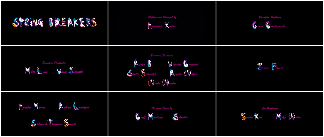
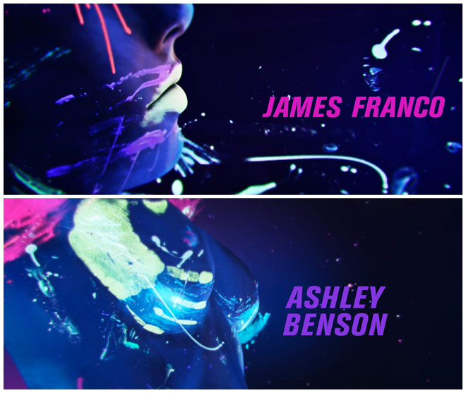
Ushering you into this South Beach Babylon is Gentleman Scholar’s opening and main-on-end title sequence. Flickers of iconography that, on first viewing, seem like glowing chotchkes hanging in the windows of bars down Highway 41. While there are fairy wings and nautical colours, closer inspection reveals an unintelligible mash – bits of neon signs mixed into a sugary cocktail, deformed Lisa Frank clippings glowing in the darkness. The last thing you see after getting hammered in a tiki bar on your indefinite vacay. Your coma from caring.
Spring break forever, y’all.
A discussion with Creative Directors WILL JOHNSON and WILL CAMPBELL of Gentleman Scholar.
Give us a little background on Gentleman Scholar.
We are a multimedia production studio based in Los Angeles, founded in 2010 by William Campbell and myself. We handle everything from live-action to design and animation for commercials, music videos, interactive content and more. Over the last few years we've worked with dozens of brands and artists from all over the world.
And for Spring Breakers, what was the first meeting with Harmony Korine like and how was your working relationship?
Our first meeting with Harmony was so low key that it really took us by surprise. We had worked with him on a piece for Proenza Schouler a year or so before Spring Breakers came up, but hadn't had a lot of dialogue with him. When we finally met to go over ideas, he was hyped up. He loved the work. The way he holds court is very simple. He keeps everything free-flowing but he’s always super direct about which way the piece needs to go. He has such a great way of getting the best creative out of people – in the way he subtly challenges you to try something different and uncomfortable. Once we got to a place that Harmony knew would work, he trusted us to try weirder and different things that ultimately led to the final piece.
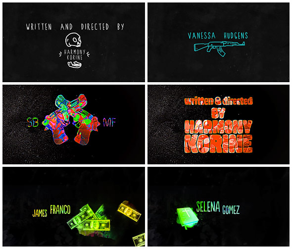
Title card variations
Tell us about the original concept for the title sequence and how that developed.
When we first talked to Adam Robinson, the editor on the movie, and were introduced to the ideas that Harmony had been exploring, we immediately glommed onto a concept having to do with tourism and that puka-shelled, sunburnt, spring-breaker in all of us. Harmony wanted high energy, something fast paced, but also something that resonated with the ideas in the movie.
As we started sketching things out, we realized we were in a tourist mecca: Santa Monica, California. We walked around buying snow globes, street paintings, caricatures and signage, jewelry – the works! We tried to find ways of dissecting all of those things and creating something that complemented the piece. Really, where we settled had just the right amount of cheesiness and glamour, and was something we really loved. We were thrilled that Harmony felt the same way.
Where did you get your inspiration for the ornate lettering?
All from the Santa Monica pier. What better place in California to draw inspiration for that type of street art-infused signage, other than maybe Venice? We had some of the shapes and letters created using the same look as the tropical calligraphy you see in malls and street art from around the world. Ultimately, we wanted to complement the fierceness of the cuts and compositions with something that had some subtle energy but felt a bit calmer.

Main title type concepts
What did you find most challenging about working on this sequence?
The most challenging thing was settling on the voice, or tone, we wanted to portray. There are so many personalities on display in the film – in the characters, yes, but also in how it's cut and the overall look. Being forced to pare down so many ideas that we were all vibing on is no small feat.
How big was the production team, which tools and software did you use to put it all together, and how long did it take to create?
We have a pretty tight-knit team for projects like this, ranging anywhere from three to five or so people. Really, the team is always in flux with regards to who's on the design side and who's on the animation side.
We used mainly Photoshop and After Effects, as well as some Maya on some of the cutting-room-floor stuff. All in all, it took our team a little less than a month to bring the whole thing to life from design to finish. There was a bit of studio back-and-forth that lasted a few months after the Venice Film Festival, but very minor things.
And then in general, what are some of your personal favorite title sequences, whether classic or contemporary?
That's always such a good question! It's tough to answer without mentioning the Se7en titles or anything Saul Bass touched. I think a couple that resonated a bit were the Gentleman Broncos titles mostly out of our love for sci-fi and the integration into the art; Up In The Air, for its super clean type and simple animations; and Touch of Evil for its brilliant use of choreography and refined camera work.
What excites you inside and outside of design?
Inside of design we love anything with a challenge. Whether the challenge is type-based, environment-based, or relies on a technological accomplishment, we welcome all comers. We're always taking projects on as a means to find the best solution for the work. Very seldomly do we have moments of square-peg round-hole; rather, it's a development of ideas that creates a cohesive, well-designed aesthetic, and hopefully helps define and develop styles that push all facets of design moving forward.
Opening titles
Outside of design we just like to make things. We often look at things as if they are tinker toys, all waiting to be perfectly placed together to build something that helps fuel our creativity. It comes in all shapes and sizes too, whether it's telling a story in words or visuals or building an experiential projection-based rig that changes colors as you dance. Really, just turn up the music and add toys and we can't help ourselves.
Finally, what's your idea of a sweet spring break vacation?
Somewhere that involves water. Frozen, melted, hot or cold, we're in. Also, preferably with some kind of drink in hand.
