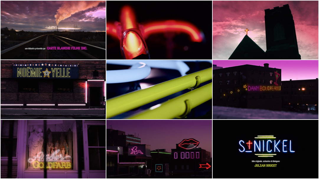
The opening of St-Nickel exposes a Sudbury, Ontario that most have never seen. As the sun goes down a different kind of city wakes up. It’s the time of day when baristas and business people co-exist with barflies and bikers for the briefest of moments, when the red lights of the local peeler bar and the rusty hues of the northern sky become one and the same. Neon signs enlighten the city about its new state of being, leading many into temptation and other kinds of worship with that ceaseless, ever-present buzz.
Described by its creator as Parks and Recreation by way of Shameless with a distinctly Ontarois spin, St-Nickel is a TV dramedy about an exotic dancer and a famous virgin trying to get by in a French-speaking corner of Sudbury. The series puts the city’s significant Franco-Ontarian population centre stage, focusing on the families caught in the middle of the clash between the city’s rough and tumble past and its uncertain-but-promising future. With a wink and a kick in the ass, St-Nickel reveals that there’s far more to this old mining town than just the almighty five-cent coin.
A discussion with directors JAY BOND and GARRY TUTTE.
Jay, we last spoke in 2013 for Hard Rock Medical. What have you been working on since then?
Jay: Primarily editing. I worked back to back on several drama and reality shows during that time. As for main titles, I had the chance to pitch on a couple of bigger projects. One of them came as a referral from Erin Sarofsky, which was very cool. It was for the Stephen King event series 11.22.63. I didn’t land the job but it was a great experience pitching on it. It’s not everyday you get to bid on a gig for J.J. Abrams and Stephen King!
But in terms of main title design it’s still pretty quiet here in Canada. We’ve had this conversation before, but whether it’s a question of budget or something that producers just don’t think of or what. I don’t know. I’ve had the chance to bid on some bigger projects from south of the border – sadly they didn’t come through – but thankfully it’s still been busy, so no complaints!
Garry, you and Jay have worked on a number of projects together. How do you know one another and what’s your working relationship?
Garry: We go back about a million years. [laughs] Early days in Ottawa, post-graduation, I was working for a company here in town and running their post facility. We had a bunch of Avids at the time, which used to be great editing systems, and then Jay came on board and we worked together there. Then I moved to Toronto about 12 years ago. I’ve found that it’s the people you work with early, the ones that you establish a good rapport with especially, that you tend to stick with over the years.
Jay: We’ve always had styles that mesh each other well. Garry worked on Hard Rock Medical and did the visual effects and graphic interstitials on Météo+ as well.
Météo+ (2008) opening title sequence, designed by Oily Film Company Inc.
Garry: When I moved to Toronto I ended up on a ten year mograph tangent. It still integrated well with the editing but it was heavily graphics-based. So when we collaborated, Jay would have a lot of the ideas and handle the editorial component. He’d come to me and be like, “Hey, I want to do this thing like this…” and then we would jam on how we could make it work with an edit and with graphics titles.
Let’s talk about your latest collaboration: St-Nickel. The show’s writer, Julian Doucet, described the show as being about family – and strippers and bikers, and yuppies and hippies, and gay psychics. How was the project first pitched to you?
Jay: It was pretty much along those lines. It was described as the evolution of this gentrifying district in Sudbury, Ontario. In terms of the plot of the show, they’re trying to get the seedy element – the bikers, the strippers, and that type of thing – and replace it with condos.
It’s about the two parallels: the evolution of the district and the evolution of this family. They’re both equally dysfunctional – the family has a lot of issues and so does the district – and no one knows what they want. There’s also some fantasy elements with the main character having these visions of the Virgin Mary.
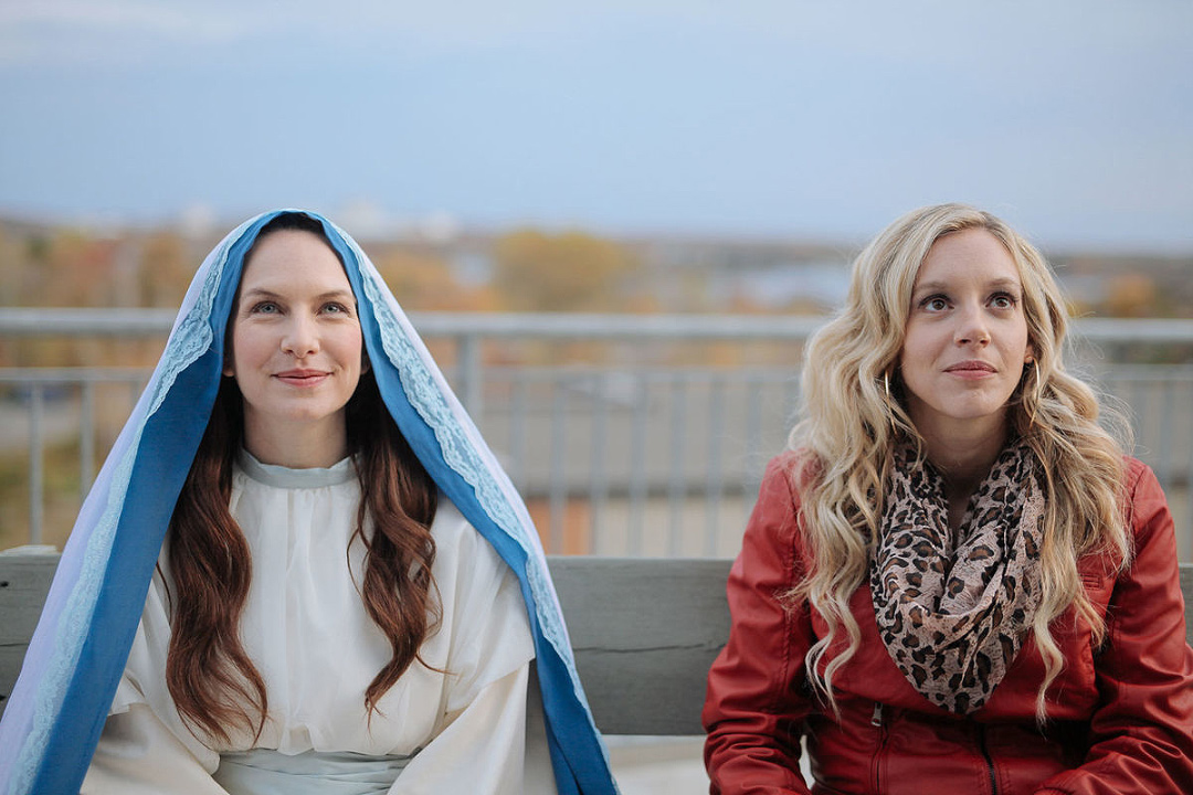
The Virgin Mary (Marie-Josée Colburn) and exotic dancer Nicole (Noémie Yelle) in a publicity still from St-Nickel.
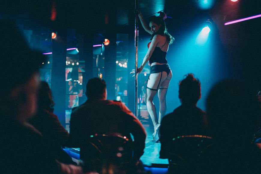
Crystelle (Amber Goldfarb) dances at the St-Nickel bar
There’s definitely a sort of magic to the opening. So what were some of the initial concepts for the sequence?
Jay: The director had some visions as a starting point. The first thing we heard from him was this image of seeing the Virgin Mary on a bus. It was very fantastical, but it was about showing her journey to work, if you will. I’m not really sure what her work was, but you just saw her travelling through the city. Hard Rock had three elements: the graphics, the medical aspects, and the landscape. In this one there was always this idea of some kind of landscape showing the gentrification of the city. Garry had the idea of the throughline of the neon travelling through the town. It was a nice way to show the gentrification of the community and have it be a little fantastical as well.
Garry: It’s always fun with these openings to try to get out from in front of the computer and go do something practical. The idea was having this neon thread – the St-Nickel sign and this piece of neon – weaving its way through the city, lighting up these signs.
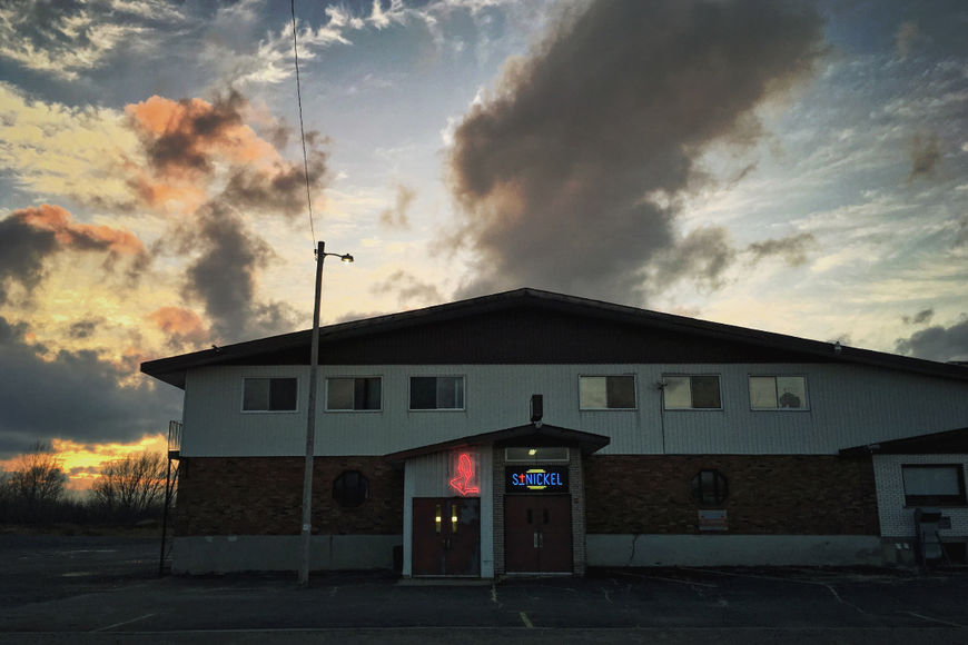
The St-Nickel neon sign as it appeared on location in Sudbury, Ontario.
Garry: The underlying concept is that it would lead us from the back alleys and streets of Sudbury all the way out to this strip club, igniting the sign and kicking off the show. Then we started talking about getting some neon made, rigging it up in places around the city, and shooting it practically. It was really just an excuse to get stuff made out of neon. [laughs]
Jay: A lot of those outside shots were based on still photos I’d taken from spending time up in Sudbury. So we went around to all those locations knowing what kind of shots you could get, but this time obviously with motion. It provided us with a sort of visual roadmap of what was available to us.
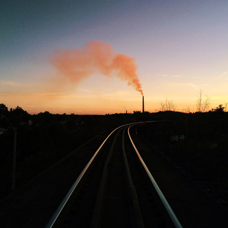
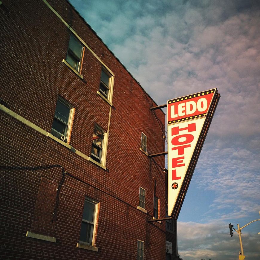
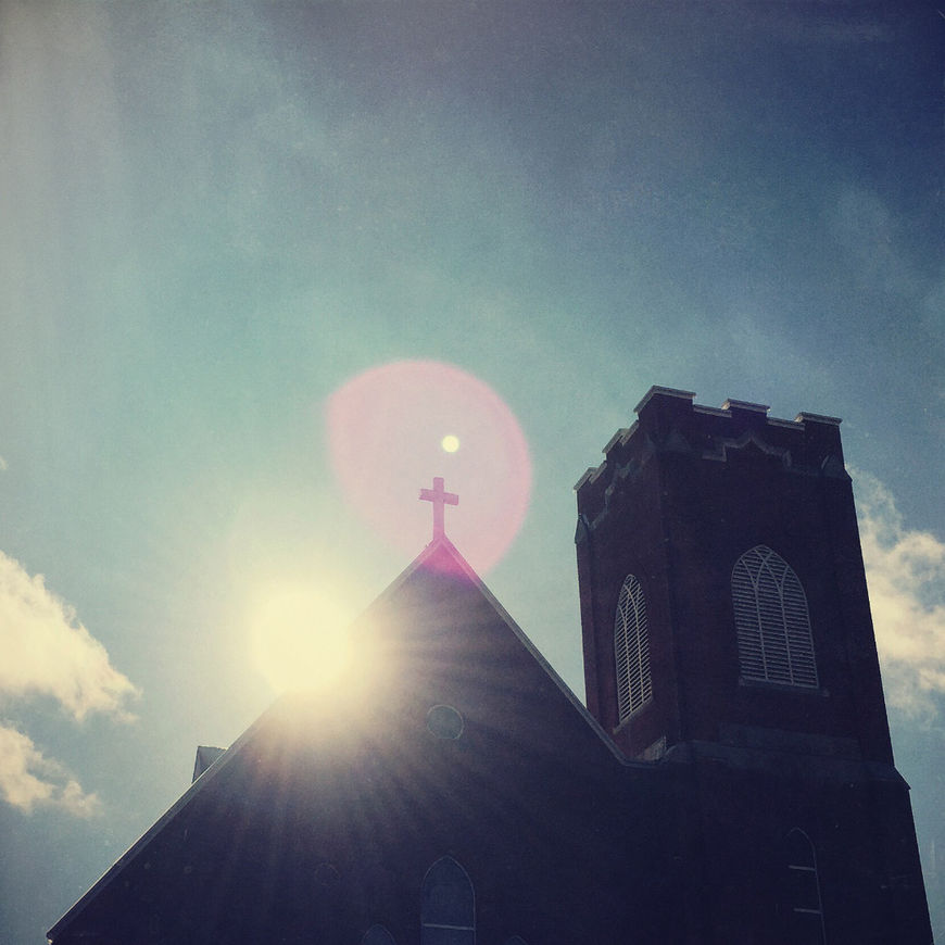
Photos of Sudbury taken by Jay Bond
Garry: Part of the initial concept was to build an over-the-top neon colour grade to give the whole city and skyline this really vibrant look. Obviously the final product is graded, but because of all the chemicals floating up in the air in that region from the nickel plant, what you see is really not that far off from what the skies are actually like up there.
So tell us about working with the neon. Where did you start with that?
Jay: The neon through line concept was pretty well embraced and we didn’t have to explore it much further than that. The jumping off point for that concept was that we knew that the art department was having a sign made for the show, the St-Nickel sign for the bar’s facade. We thought that sign would be a good component to shoot in macro.
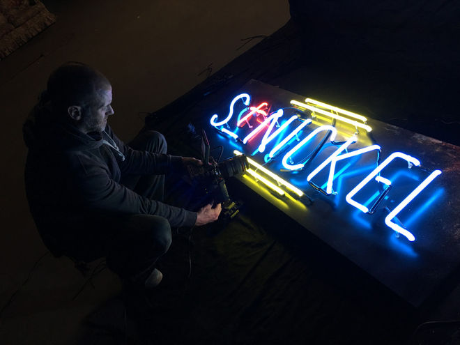
Image set: Shooting the St-Nickel neon sign
Jay: Once Garry came up with the following the neon concept and we determined that it would be best to do it practically. We sought out a real piece of neon here in Ottawa. A guy pretty much just made an L-shaped piece that we could fire up with a transformer hooked up to a generator. We had no background in neon, so we had to do some research into what the gasses do when you shot them macro. We needed to know what we were going to get when we pointed a camera at it.
We got that real piece of glass neon and then ordered a piece of longer plastic tubing, kind of like an LED neon – it was pretty cool but it didn’t camera quite as well. It was good to have those practical components to take into the field. It worked and it didn’t. There’s only one shot of practical neon in the final piece. We shot all of it though.
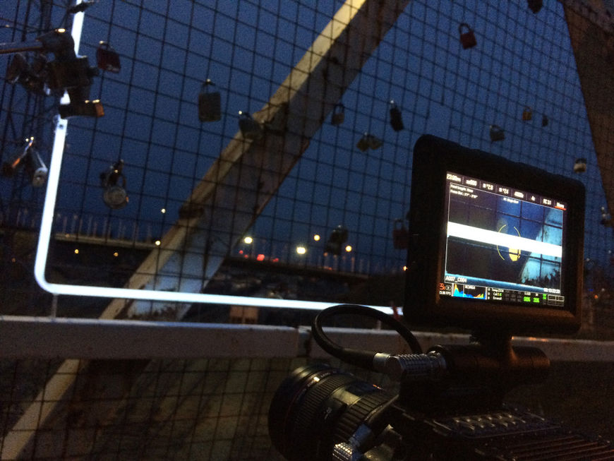
Shooting the L-shaped neon on-location in Sudbury
Wow. Really? So tell me about shooting in Sudbury.
Garry: We rented a minivan with a generator and a big old tube of neon and a camera kit and we just drove around Sudbury at dusk shooting the crap out of the city.
[laughs] You must have got a few weird looks from people.
Garry: The residents didn’t react quite as strongly as you might think. “Hey guys, what’s up?” as you’re rigging a piece of neon coming out of a sewer grate with generator wires everywhere. [laughs]
Jay: It’s a really busy town for other productions, so they’re pretty used to it. You’re fine as long as you have the permits and reach out ahead of time.
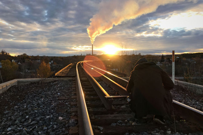
Garry: It was tricky too because we were trying to go for that dusk vibe, the time of day when the city is switching over from daytime to nighttime. That transition to “strip club o’clock” and the time when the evening people are starting to crawl and lurk out. The neon was our character for that – the neon creeping out of the streets and working its way across the city.
Sudbury had a bit of a reputation as a rough town at one point – and there seems to be some of that in the show. What was your experience shooting up there at night?
Jay: When was the last time you were up there? In my experience Sudbury has some of the nicest people anywhere. Everyone is either an artist or a musician – there’s just so many cool and wickedly talented people in that city. It’s definitely changed a lot. There was no fear of doing it at all. The community is super embracing of folks coming there to do stuff like this.
Garry: Here’s the truth of the matter: when you’re a couple of dudes in a van with a generator and a big piece of neon lurking in the streets and alleys, you’re the sketchy ones! [laughs]
When you’re a couple of dudes in a van with a generator and a big piece of neon lurking in the streets and alleys, you’re the sketchy ones!
So let’s talk about practical versus digital. You said you ended up replacing a lot of the neon in post. Why was that the case?
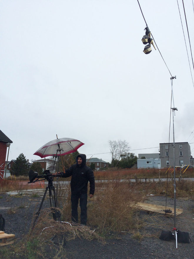
Garry: We used the practical neon in various locations, but the trick is that there’s this sweet spot, this hour of magic where you can have neon lit up and the lighting just right for it to glow without it being nighttime. We wanted that nice balance of dusk and neon. We were up there for about five days shooting, but between the rain and the time it took to rig everything up and get various shots it was tough. One or two made it in there in the end, but a lot of that was just to establish a couple of good close-ups so that when we could sell it through when we started to cut in the computer generated stuff.
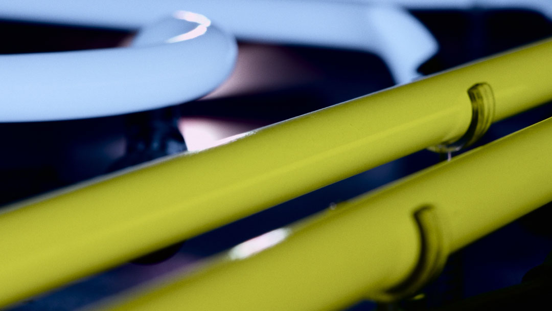
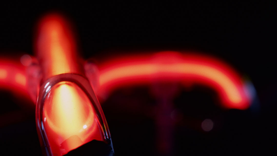
Practical neon elements from the St-Nickel title sequence
Garry: The idea in my mind was always to get the practical to sell through to the CG. So we got the macro shots of the real sign, a couple of medium neon shots to establish what it is, and then we start cutting to the bigger stuff. The close-up on the neon would have been hard to CG. “Can we do it practically? I don’t know. Let’s try!”
Now let’s talk about designing the neon signage. Whether it was practical or digital, what do you have to keep in mind when designing a neon sign?
Garry: It’s actually a lot easier to flub in CG than you think. Unless you’re looking at it in close-up – which you wouldn’t be since we used the practicals for those – in a wide it just looks like a glowing line. Other than it casting a light on the brick or the background of the signage, there’s not much to it in terms of what it looks like from a distance.
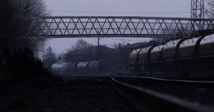
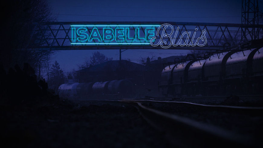
St-Nickel bridge shot before and after
Garry: The real trick is the fonts. Obviously there are a limited number of existing fonts that you see neon in, largely because they have to be these flowing fonts that have connectivity. It was a lot of fun to dig into all the neon signage that can be found on the internet for research. The challenge was making them look like reasonably credible signage, adapting them to fit on a bridge or in a store window. Designing them to fit that and give them a greater support system to make it look like they’re actually rigged there. Part of it was going for realism but another part was that it’s pretty surreal anyways. We were slapping neon wherever we could!
Do you have a particular element or shot that you’re most happy with?
Garry: I love the one on the side of the train car and the one in front of the shop full of Mary statues.
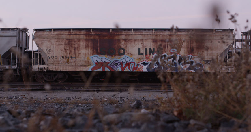
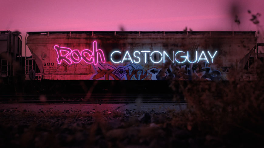
St-Nickel train shot before and after
Jay: Same here! Those two in terms of the cast names for sure. There’s such a connection with religion in the show – the macro shots of the sign turned out really well, but then that little hit of the cross before going to black.
Garry: Then there’s the one shot that’s not actually Sudbury…
Jay: Oh right!
Garry: We were looking for a little store full of Mary idols because of the director’s original idea of wanting to include the Virgin Mary. We couldn’t find much of that in Sudbury, but we had a little Virgin Mary statue and tried to stage something. In the end somebody mentioned this place on Parliament Street in Toronto that there’s this incredible shop that sells Mary statues.
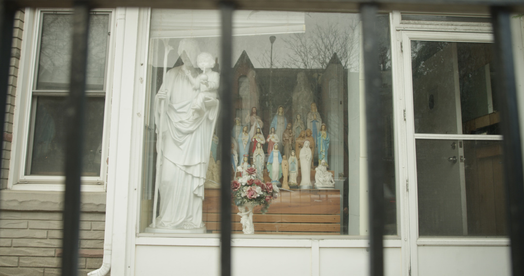
Unaltered shot of the Virgin Mary storefront in Toronto
Garry: So I went to check it out and it’s this very Sudbury-looking building. It’s just this dude and his brother who make scads of Mary statues of every different shape and size. The guy had thousands of them! He was into it and happy to have the promo.
So how big was the production team on this?
Garry: Jay and I worked on the cut and I did the neon sign design and rough comping. Then we reached out to Julian van Mil at Studio Feather in Toronto. He does great Nuke and Cinema 4D work, so we got him involved to take the artwork and rough comps we had and finalize them into something a little more believable while we finalized the edit and the little details.
Jay: Julian also did the graphic components for Les Bleus de Ramville.
Garry: Yeah, he’s a longtime collaborator. We actually share a studio space.
Jay, we’ve asked you this question before, but could you guys both tell me about some title sequences that have caught your eye recently or any classic favourites?
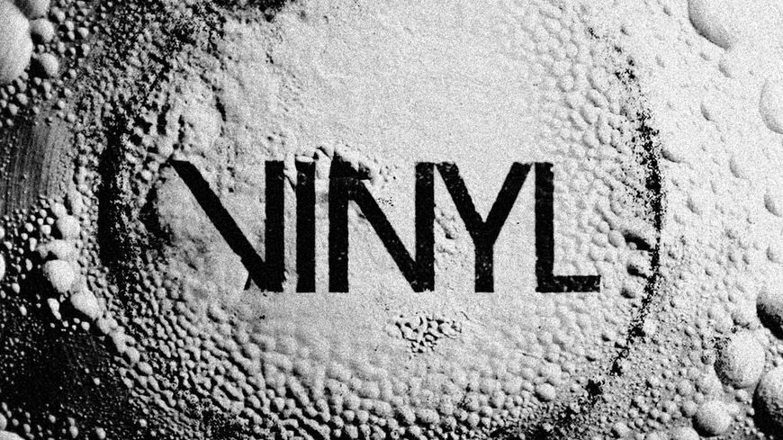
Jay: I’m still a little set in my ways. I still love stuff that’s rooted in reality – which tend to be like the ones that I’ve done – sequences that have that blend of practical and VFX. You always start in some sort of real environment and then branch out from there. A recent example of that would be Vinyl. That’s pretty awesome for that – the macro work in it, the music, and the edit is pretty sweet too!
Vinyl (2016) opening title sequence, designed by Imaginary Forces
Jay: I also love Narcos with that fusion of the graphic elements and the macro, but it’s rooted in live-action photography. Those two stood out for me recently.
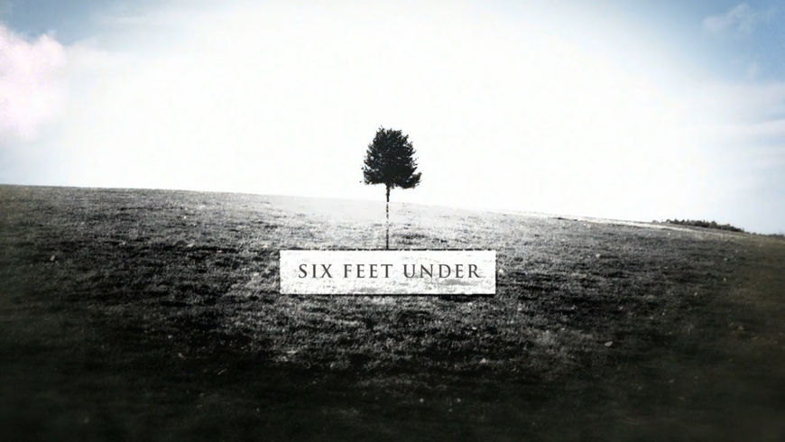
Garry: I don't know. I'd say Six Feet Under. Great cinematography but not a whole lot of VFX. It definitely had some post treatment, but it’s got that blend we like.
Six Feet Under (2001) opening title sequence, designed by Danny Yount
What have you seen or read or watched recently that’s been an inspiration for you?
Garry: We hit up the F5 Fest in New York last year. It sprung out of Motionographer, but they’ve really started to get a variety of talks going on. It wasn’t just designers talking about their openings – although there was a fair bit of that – but there were talks with actors and a lot of interactive stuff creeping in. What are people doing with animation in VR? That just sends your mind in a million different directions. How great would it be to do a VR opening? It’s already happening.
Jay: Not to mention that conference is always in New York, so you’re in the most inspirational city in the world. It’s pretty awesome!
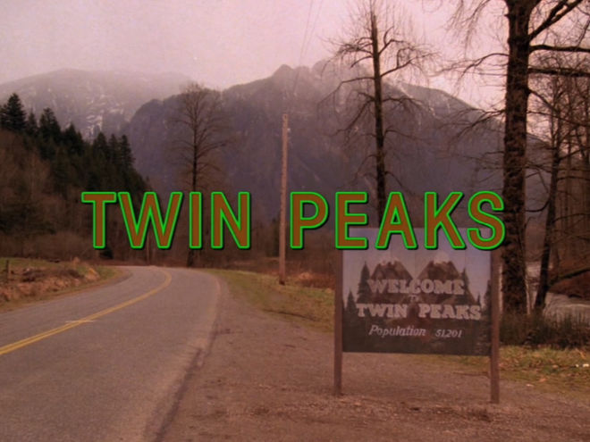
I’ve been rewatching Twin Peaks. It’s always been on my radar because I was a huge fan of it since back in the day, but with the continued series coming out soon it’s definitely on everyone’s radar now. Something about David Lynch’s stuff and pacing is just really inspiring to me – the exaggerated lulls and time between the odd stuff enhances the odd stuff. I’d love to figure out a way to implement that myself. Twin Peaks and Lynch are pretty inspiring to me right now.
Twin Peaks (1990) opening title sequence
Jay: I’d be very curious to know if he’s actually redoing the opening. Did he ever have that out of 4:3? Even on the Blu-ray restoration it was just 4:3. I’m curious if he’s somehow reusing that or if he’s commissioning a new one.
Garry: If you could just put it out there how inspired Jay and I are by David Lynch then we can give you an exclusive! [laughs]
Jay: If he’s redoing that it would be a dream job!

