How do you boldly go where many have gone before?
After six television series, thirteen feature films, and countless other pieces of media, Star Trek’s fabled final frontier is now well-trodden ground. For Star Trek: Discovery, the seventh TV series in the long-running Trek franchise and the first to take to the airwaves – or rather streaming services – since the conclusion of the last television series in 2005, that was the question.
Set roughly 10 years prior to the events of the original 1960s Star Trek series, Discovery follows Starfleet science officer Michael Burnham (Sonequa Martin-Green) during the events of the Federation-Klingon War of 2256, a devastating conflict that she inadvertently helped to provoke. For those keeping track, this new prequel series is set in the so-called Prime timeline that all previous Trek TV shows have occupied to date and not the alternate timeline established by J.J. Abrams’ 2009 film Star Trek and its sequels.
Although Discovery occupies a setting that will be familiar to longtime fans of the franchise, the new series shares the sleek aesthetic and kineticism of the Abrams films, the primary difference being fewer lens flares. It’s a hybrid Star Trek series – a fascinating mix of new and old – and a new type of Trek necessitated a new kind of introduction. Star Trek: Discovery’s title sequence fits the bill. It acts as both an annotated history of the future, or at least the future depicted by Trek, and a window into the life experience of the troubled but talented Starfleet officer who serves as the show’s protagonist.
Star Trek: Discovery (2016) international trailer
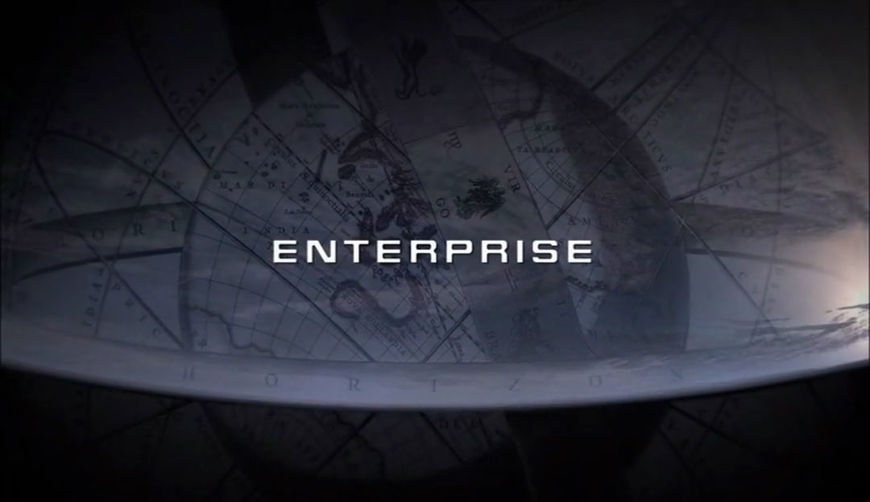
“The Discovery main title makes wonderful use of graphic iconography of Star Trek, immersing the viewer in Gene Roddenberry's universe in much the same way that Montgomery/Cobb's brilliant main title for Star Trek: Enterprise retold the history of exploration and flight, leading up to the first starship Enterprise,” said Michael Okuda, Star Trek’s longtime lead graphic designer and a technical consultant with screen credit on more Trek productions than anyone except creator Gene Roddenberry. Okuda was not involved in Discovery or its title sequence, but anyone who works on the franchise in a design capacity owes a debt to his work from Star Trek: The Next Generation onward. As one of the keepers of Trek’s design flame, so to speak, he’s is uncommonly qualified to weigh in. “These titles captured the spirit of Star Trek in unexpected, but satisfying styles.”
The task of capturing the spirit of Trek for Discovery’s opening fell to venerable design studio Prologue. They faced the same conundrum the series’ showrunners did: how do you add something new and exciting to a 50-year-old franchise while still honouring what came before? The main title that Prologue ultimately produced for this latest iteration of the popular sci-fi franchise is a brilliant piece of design, one that answers that question by presenting the story of the discoveries that would ultimately lead humanity to the stars.
THE BEST OF BOTH WORLDS
The first step for the team at Prologue on their journey to create Discovery’s main titles was to reexamine the core ideas that formed the foundation of Star Trek – and, in the case of Spanish-born Creative Director and Designer Ana Criado, step one was to get better acquainted with the series.

Star Trek: Discovery (2016) Creative Director and Designer Ana Criado
Like many, Criado was familiar with Star Trek but had never seen an episode in its entirety. The Discovery main titles were her first real opportunity to explore the final frontier in a more meaningful way. “Ever since I was a kid, I have always been fascinated by the aesthetics of Star Trek, specifically that of the technology they use in the show,” said Criado. “When we got this project, I finally had the chance to look closely and investigate the way that all of this tech had been designed on The Original Series and beyond.”
Having not grown up watching Trek, Criado was completely free from decades worth of continuity baggage coming into the project. However, for the rest of the team the storied franchise loomed large, particularly for Prologue co-founder and Creative Director Kyle Cooper and Writer/Historian Kurt Mattila, who both grew up watching The Original Series and later Star Trek: The Next Generation. “Both of them impacted me in different ways, but especially the former,” said Cooper. “I always loved that right off the bat, with The Original Series, you got that mission statement: ‘To boldly go where no man has gone before...’ You didn’t have to worry about continuity or missing episodes. Any new viewer could turn on any episode of Star Trek and immediately have all of the themes established for them during that one simple sequence.”
—Kyle CooperAny new viewer could turn on any episode of Star Trek and immediately have all of the themes established for them during that one simple sequence.
Star Trek: The Original Series (1966) season 1 title sequence
Mattila, an avowed Next Generation fan and a creative director and title designer in his own right, joined the team as a consultant of sorts, becoming Prologue’s resident Trek guru for the project. Part of his job was to ensure that Discovery’s opening title sequence adhered to the established universe, characters, and canon as much as possible. “My role was basically ‘How do we take this great idea and make it relevant to Star Trek?’ said Mattila. “It was like Sarek, I was like the ambassador to this portion of things.”
THE CAGE
“Space: the final frontier...” Whether spoken by William Shatner’s Captain Kirk or later Patrick Stewart’s Captain Picard those iconic words have transcended the Star Trek franchise and title sequences, becoming so ingrained in Western pop culture that they’re arguably more famous than the shows themselves – and, for that matter, similar phrases uttered by real-life space explorers.
Star Trek: The Next Generation (1987) season 3 title sequence
As a result of Trek’s large cultural footprint, the series’ various openings are some of the most well known title sequences ever created for television or film. This placed an enormous burden on the designers and directors tasked with creating the titles for the latest iteration of the series. When Prologue landed the project, the team’s reaction was, as one might imagine, a mix of trepidation and excitement. “I was very happy… and then I realized the timeline we were supposed to keep to and the massive responsibility of appeasing millions of Star Trek fans all around the world,” recalled Criado. “Whatever we created needed to be both tremendous and memorable.”
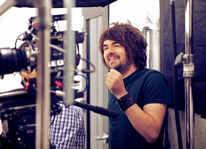
Prologue's Star Trek guru Kurt Mattila
Like Criado, Mattila also felt a huge burden – both as a designer and a fan – but, after the initial shock wore off, he began to view the project as an opportunity to check something off of his bucket list. “When I got back up off the floor and sat back into my chair it was kind of like ‘Uh… What?!” said Mattila with a laugh. “In the world of science fiction, doing the opening crawl to Star Wars or a Star Trek title sequence – if you can hit one of those two or be a part of the team that does one of those, that’s pretty good!”
Set years before the time of Kirk, Spock, and McCoy – between Star Trek: Enterprise and The Original Series – Star Trek: Discovery is uncharted territory for seasoned fans and newcomers alike. Despite his own strong attachments to the franchise, Cooper saw the new show’s unexplored setting as a chance to try something different with the main title sequence. “It’s interesting because while there is a long history, this particular series takes place relatively close to the beginning of it,” said Cooper of Discovery. “Being a prequel became almost an advantage because it let us start from such a different place creatively – we didn’t have to worry about establishing everything that had happened in Star Trek because most of it hadn’t happened yet.”
FIRST CONTACT
With that relatively clean slate as their starting point, the team from Prologue met with Discovery’s producers and writers to begin developing the concept for the new main title sequence. “What was very apparent on this project when we got involved was that the bread was still cooling,” said Mattila. “They weren’t quite sure what the sequence needed to be.”
While the show’s staff were initially uncertain about the direction Discovery’s opening should take, according to Criado that first meeting established the parameters for what they didn’t want the sequence to be. “They wanted it to look kind of vintage and distinct from previous title sequences,” she said. Mattila recalled the specific mandate set forth by the showrunners: “We don’t want where we were, we want to go past it… Boldly go where no Star Trek has gone before!”

Star Trek: Discovery (2016) Executive Producer Alex Kurtzman
Both Criado and Mattila characterize those early discussions with the producers as a very collaborative process that laid the groundwork for what the title sequence would become, but despite a few promising starts during this phase more work was needed to hammer out the final concept. “We all – including series co-creator Alex Kurtzman – had ideas and they were grounded in Star Trek,” Mattila said. “We had this whole piece that was like an ode to beaming. You would have all these beautiful moments and characters that kind of get beamed to one side of the lens to the next and that kind of becomes the bed for the sequence.”
Although Discovery’s title sequence did not end up becoming the homage to the vaunted transporter device that Mattila described, the technology-focused concept struck a chord with the team. The primary challenge early on, according to Cooper, was finding a way to capture the “mystery and hopefulness” inherent in Trek while acknowledging the history of the franchise in some way. Trek tech turned out to be the answer.
With the majority of Star Trek’s canonical future still ahead of it, the discussions shifted from transporters to other innovations that helped get Starfleet – and in turn the crew of the USS Discovery – to this point in time, specifically the technological advancements that made humanity’s voyages of exploration possible to begin with. “The phrase that came out that we all latched on to – Kyle, Ana, and me – is that this is the second renaissance of man,” Mattila said. And with that idea in mind the concept for the title sequence began to take shape. “Our concept was to show how the starship Discovery and its crew came to be a part of this new adventure,” said Criado. “To do so, we decided to take things back to the drawing board, literally.”
A MATTER OF PERSPECTIVE
When faced with the challenge of adding something new to a constantly evolving, decade-spanning media franchise like Star Trek – a work of fiction with legions of fans who have very specific ideas about what does and does not qualify as Trek – a pair of fresh eyes is an invaluable asset. For the Discovery main titles, Criado was that perspective and much more. Her status as a non-Trekkie combined with a design sensibility almost completely at odds with everything one might consider traditionally Star Trek helped the team and Discovery’s showrunners reassess the tropes central to the franchise.
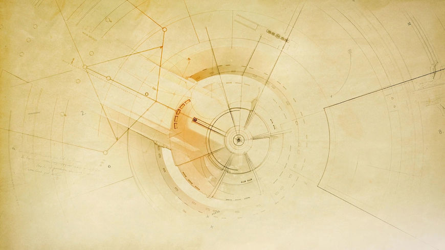
—Kyle CooperIt was as if the graphics themselves tipped their hat to the show’s history.
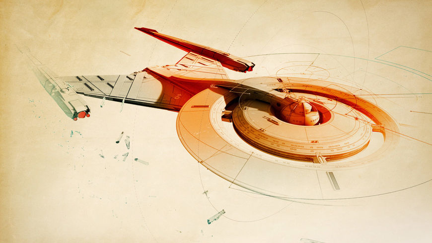
Examples of the “Blueprint” concept in the Star Trek: Discovery main titles.
“It was as if the graphics themselves tipped their hat to the show’s history and the ephemeral process that went into the design and creation of all of the equipment blueprints and devices over the years,” said Cooper of Criado’s approach to Discovery, noting that her early concept boards presented the material in a completely unorthodox manner. “There was no inky black void of space, no fleets of ships whirring around. It was a bit like the first Marvel logo flipbook animation we worked on, where you felt the analogue history of the brand.”
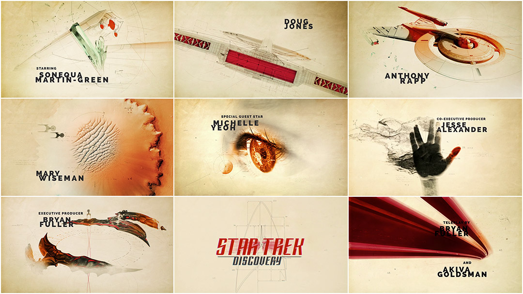
Criado’s blueprint concept allowed the team to work through the idea of the “second renaissance” in a very direct way. Through this concept the main titles could metaphorically hit on every major scientific breakthrough and exploratory milestone that had happened in Trek canon up until the beginning of the show, and at the same time transfigure the tenets central to Kirk’s famous mission statement into something the viewer could actually see. “We recognized that this was a very strong concept straight away, and poured all of our efforts and resources into realizing it,” said Criado. From there designing the sequence became a process of posing questions and figuring out what the answer might look like. “How does a bidimensional sketch transform into a complicated starship? What were the original designs for a phaser, a communicator, etc.?”
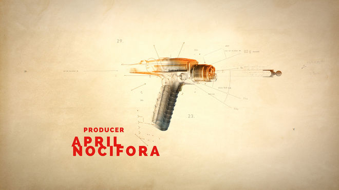
The iconic phaser weapon as it appears in the Star Trek: Discovery main titles.
As the concept continued to develop, Prologue’s Trek expert (Trekspert?) Mattila found himself having to keep his inner geek in check. “In the opening bit where the blueprints of the ship come on and you see all these crystals go by, those are dilithium crystals – that’s the stuff that powers the warp drive,” explains Mattila. “Ana didn’t know that those crystals go in the ship, but she made this beautiful field of crystals and we were all like ‘That’s awesome!’” It was here that Criado’s unfamiliarity with Trek collided head on with Mattila’s depth of knowledge on the subject. “I felt myself turning into a nerd, but then it was like ‘It’s a metaphor, just go with it!’” he said. “That’s what I’ve learned from Kyle over the years: the best thing you can do as a creative director or an art director is not stand in way of something that’s naturally evolving.”
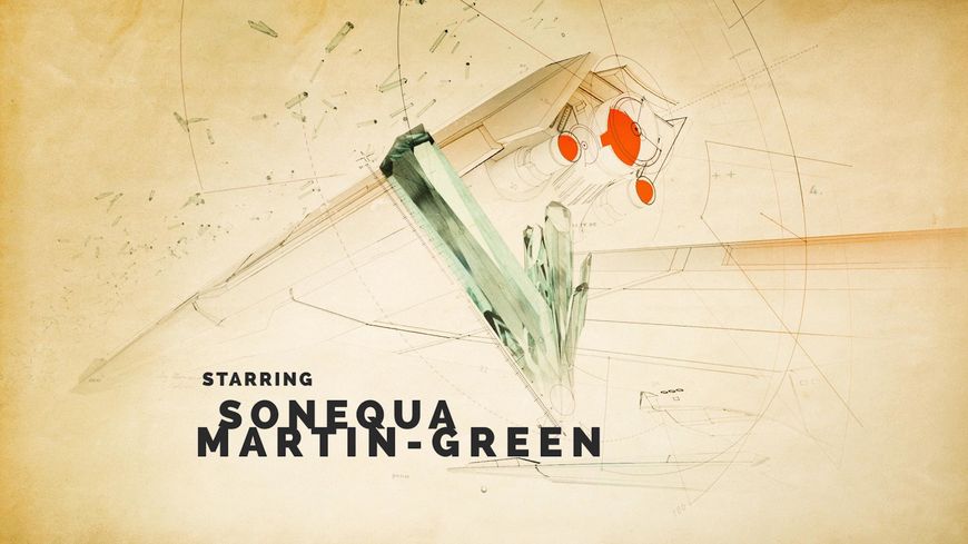
Dilithium crystals in the Star Trek: Discovery main titles.
Over the next few months, from the beginning of pre-production in March 2017 through to early June, Discovery’s title sequence slowly but surely started to take shape. A shower of dilithium would represent the warp drive, humanity’s first contact with an alien species would be represented by the well-known Vulcan salute, the discovery of the Klingons would be symbolized by the bat'leth sword, and so on. The team also highlighted the creation of various pieces of key Star Trek technology, such as the communicator, the phaser, and the transporter, often using the devices and their functions as transitional elements between the vignettes.
THE DIE IS CAST
As the broad strokes of Discovery’s main titles came together, the team was simultaneously trying to figure out the context that the sequence would be presented in. “One of our main discussions was establishing a point of view – whose perspective was this opening going to be from?” said Cooper. “Unlike past series, Discovery is really rooted in one specific character and her journey instead of an ensemble, which called for a different approach to the title sequence.” The team soon realized that a traditional introductory mission statement accompanied by a series of vignettes wouldn’t work here because at its core Discovery wasn’t a traditional Star Trek series.

Commander Michael Burnham (Sonequa Martin-Green) from Star Trek: Discovery
“This is actually not about a captain,” said Mattila, noting that the main character of every previous Trek series had either been a starship or space station captain. “From moment one we’re entering this universe from a new perspective, you’re following the path of Michael Burnham, who’s a first officer.” There was also the somewhat pressing issue that Discovery’s commander, Lorca (Jason Isaacs), was not exactly the selfless, by the book Starfleet captain viewers were accustomed to. “Reading the scripts you quickly realized ‘Wow. Well, we can’t really have the captain say any of this!’” he said. “The captain turns out to be kind of an asshole, so you don’t want him giving the mission statement. So what do you do?”
The fix, according to Criado, was to turn their history of mankind’s fictional future into what amounted to a history lesson of sorts. “We wanted to illustrate the learning process of [Michael Burnham], and bring [the viewer] into this complicated world the same way... one piece at a time.” That decision transformed Discovery’s main titles from a visually arresting historical compendium into a fascinating window into Burnham’s character – an ambitious young officer with more education than actual experience. “She doesn’t have a captain’s log but maybe she has a first officer's log,” said Mattila. “[Burnham] is a great student of Starfleet history, so it would stand to reason that she would be gathering these blueprints and studying those.”
The suggestion that what was being seen on screen were more than just blueprints, that the viewer was looking at essentially study notes with scribbles in the margins, allowed the team to further expand the notion of a renaissance, specifically, the Renaissance.
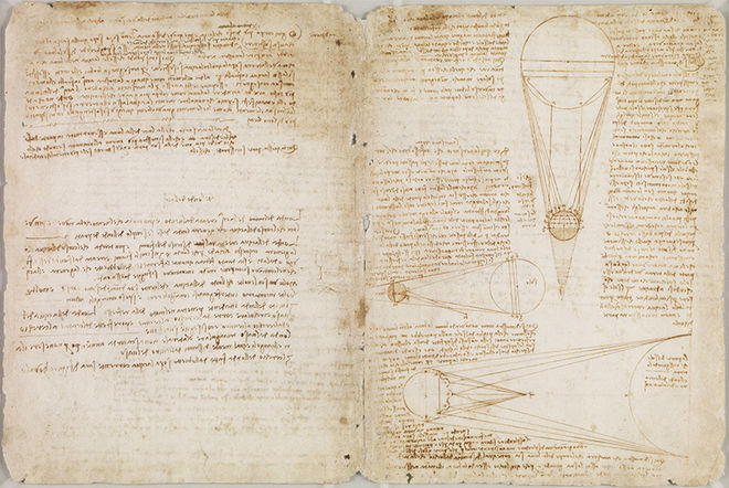
Pages from the Codex Leicester, one of Leonardo da Vinci's notebooks.
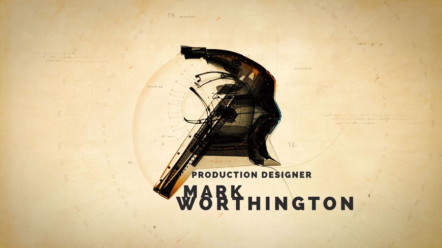
The combination of handwriting, diagrams, and colours referenced the sketches of artist and inventor Leonardo da Vinci, while the shot of the two spacesuits reaching out to one another, much like Michelangelo’s “The Creation of Adam” fresco, hammered the point home.
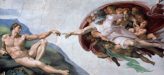
Michelangelo's The Creation of Adam from the ceiling of the Sistine Chapel in the Vatican, Rome, c. 1512
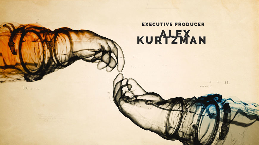
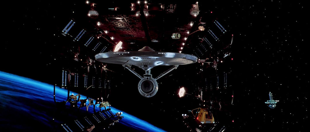
Although at this point in the process it might seem as though Discovery’s main titles didn’t share much visual DNA with the other Trek openers, an iconic sequence from the first act of 1979’s Star Trek: The Motion Picture, a favourite of both Cooper and Mattila, did factor into an early cut of the sequence. “I always liked the scaffolding in [The Motion Picture], where they first see the Enterprise,” Mattila said. “There was an earlier version [of the main title] where the blueprint lines were like the scaffolding that sort of broke apart as the ship formed.”
The USS Enterprise reveal sequence from Star Trek: The Motion Picture (1979)
“The biggest challenge was making sure the look didn’t seem like an animatic.” Mattila said there was concern that the wireframes in the sequence might have suggested something that was half-built or unfinished. That was not the idea the team was trying to convey with the blueprint concept, but it ultimately fit quite nicely with Discovery’s narrative. “That’s the story of Michael career – at the start of the show she’s not done, she’s finding her way in Starfleet.”
FIRST FLIGHT
With the concept and designs locked in, production on Star Trek: Discovery’s title sequence began in early June 2017. It was at this point in the process that Editor Rachel Fowler became actively involved in the project. “I actually didn’t grow up watching the Star Trek television series or films,” she said. “The second we started working on this project, I jam-packed the entire Star Trek canon into my brain in about three days.” Once Fowler had finished that cram session, her initial task was to assemble a rough cut of the sequence – a timing animatic – using the frames the team had developed. This animatic would not only help the team establish an overall cadence for the sequence but allow them to determine the placement of each credit. “We knew the sequence had to be 90 seconds and that we had to fit 35 credits in that duration,” Fowler said. “Each credit needed to be a certain hold duration – either 36 frames or 48 frames. From there, you try to break down the sequence into chunks like a jigsaw puzzle.”
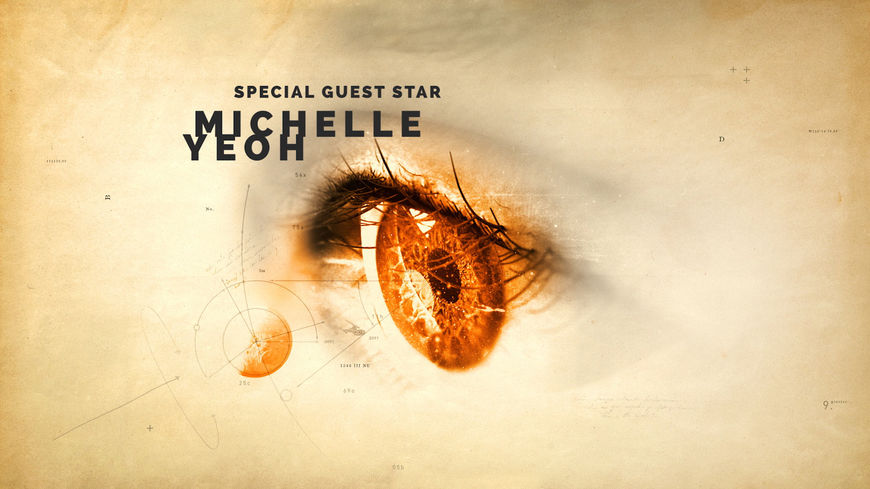
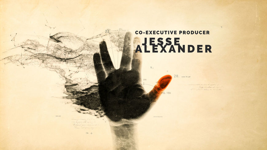
Stills from the Star Trek: Discovery main titles.
That puzzle turned out to be more of a challenge than anyone expected due to the sheer number of credits that needed to be included in the sequence. “35 credits is a very high credit number for an opening title sequence for TV, so it was a daunting task,” Fowler explained. “You want to avoid wall-to-wall credits and you don’t want to have repetitive animations of cards, so you have to be careful about the rhythm of where those cards fall and how they animate on and off.” According to Criado, determining the various credit placements while trying to preserve the flow of the sequence became something of a team effort.“We needed to work very closely with each other,” she said. “I mean literally close, physically, as we figured out the choreography of our designs together.”
Appropriately the thread that helped the team tie the entire Discovery title sequence together was an element central to every Star Trek opening: the titular starship. “Let’s do the opposite of what Next Generation did,” explained Mattila. “Instead of the closeups of the ships passing by the lens – let’s still represent the ships and not throw out the history of these sequences completely – but let’s make it really small in the background.”
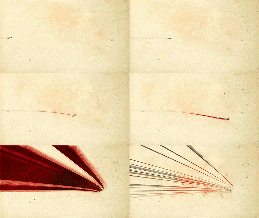
Where previous Trek main titles, like The Next Generation, Star Trek: Deep Space Nine or Star Trek: Voyager, made the USS Enterprise or other titular craft seem like the massive vessels they were, here the team opted for a different tack. The USS Discovery is dwarfed by the universe it inhabits, sometimes nothing more than a speck amongst the galaxy and the figurative history of the Federation – until the end when it’s given the customary flyby. “It’s this little line that guides you from moment of discovery to moment of discovery, and then at the very end we let it come towards lens and fly past us.”
And with that last and most iconic element in place, Discovery’s title sequence started to take on its final form. Fowler again likened this stage of the process to building a puzzle. “When putting together a puzzle, I’ll usually do the corner pieces first, and then move to the middle,” she said. “It’s the same kind of breakdown for my brain when it comes to editing, except you also have to take the musical score into account.”
THE ENTERPRISE INCIDENT
When it came to Discovery’s music, the team, especially Mattila, hoped the showrunners would take a cue from the previous Star Trek series, Enterprise, and choose the piece of music very carefully. To this day, the Enterprise title track “Where My Heart Will Take Me” – a cover of Rod Stewart’s 1998 Adult Contemporary chart topper “Faith of the Heart” – remains deeply unpopular with many Trek fans and even sparked protests and petitions shortly after the show premiered in 2001.
—Kurt MattilaWe knew this piece was going to live or die if the wrong music was there.
Star Trek: Enterprise (2001) main titles, designed by Montgomery/Cobb
“We knew this piece was going to live or die if the wrong music was there,” said Mattila, referencing the Enterprise title sequence debacle. “[Enterprise], on paper, is a great idea: the history of aviation and exploration from the Wright Brothers to the first Enterprise. Great concept, let’s look at it – ‘Who the heck put this song on here?!’”
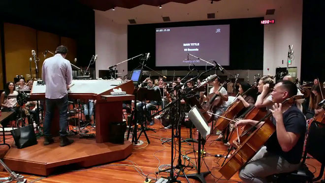
Fortunately for Prologue (and for many Star Trek fans), composer Jeff Russo had been hired by the production to give Discovery’s opening a more traditional, orchestral sound reminiscent of older Trek themes. Russo also provided the team with a temp track early in the process which allowed them to time out the sequence so that specific credits would correspond to certain musical hits.
Star Trek: Discovery (2016) main title recording session
“Jeff gives us this track that was one of these weird, wonderful, serendipitous things,” said Mattila. “It had this percussive energy that really felt like machines, it felt like stuff being designed and being worked on.” According to Mattila, the fact that Russo’s score and their early animatic aligned so well was a happy accident and nothing more, as the composer hadn’t actually seen any of Prologue’s work at that point. “He did not score to the edit. He gave us 90 seconds of music and just anticipated things happening,” said Mattila. “When I saw things line up I got really excited... I was just like ‘Wow guys, the spirit of Gene Roddenberry is working here!’”
Not everything worked as well as the team had hoped though. “The biggest hurdle we faced was at the end of the sequence,” said Fowler. “There was an obvious moment at the end of the music bed where the score crescendos before entering into Russo’s beautiful homage to the [original Star Trek theme]. This had to be where our logo would sit.” What was to be the opening’s denouement was complicated by the fact that the team still needed to include five more credits after the main title card. “We had no time in the score to do this without the credits feeling rushed.”
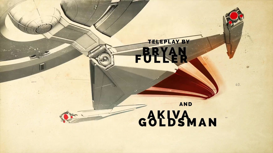
Image set: Title cards that appear after the Star Trek: Discovery logo
The solution? Prologue was afforded the comparatively rare opportunity to work directly with the composer to adjust the timing of the music. “We ended up collaborating with Jeff to see if we could slide the crescendo a few beats earlier so that the final five credits could breathe,” Fowler said. But as she and the team quickly discovered, that slight change created a cascade effect that threw off other elements in the title sequence. “It moved around some other beats that we had locked in,” she explained. “At this late stage, we couldn’t open up our animation comps to hit at the new moments, so we ended up adjusting our credits to follow the new rhythms of the melody.”
ENDGAME
Star Trek: Discovery’s main titles are a modern television title sequence in every sense, more concerned with establishing the tone and themes through music and strong visuals than with effects-driven flybys or a high-minded mission statement. And yet despite the absence of those recognizable tropes, the essence of Star Trek is still communicated to the viewer. It will feel familiar for longtime fans and fresh and exciting for newcomers. Discovery’s title sequence honours the rich history of the franchise – both literally and metaphorically – and sends the new TV series on a voyage distinctly its own.
Star Trek: Discovery (2016) title sequence (textless version)
For the crew at Prologue, working on this sequence was its own journey of discovery. ”We were [all] surprised with how well it all flowed together when we finally assembled the sequence,” said Criado, who described the project as both fun and challenging. “I was a bit surprised by how much we were all able to accomplish working together.” Mattila, too, seemed very happy with the end result, in particular Criado’s inspired interpretation of the material. “I didn’t want to stand in the way of the progress and the process,” he said. “I was there to help fill in the blanks.”
Cooper believes Criado and Mattila’s two vastly different takes on the source material helped the Discovery title sequence become what it needed to be. “There was something kind of retro about Ana’s point of view… I felt like it went against the obvious ways of presenting this material,” he said. “[Kurt] had nothing but baggage and perspective. So that became a useful balance for us to maintain.”
Editor Rachel Fowler, who was also a Trek neophyte at the outset but came away a fan, takes a more pragmatic view of the project: “At the end of the day, if the puzzle is put together, you aren’t missing any pieces, and the final image makes sense, you can consider it a job well done.”
Studio: Prologue
Creative Director/Designer: Ana Criado
Creative Director/Producer: Kyle Cooper
Design: Ana Criado, Christian Antolin and Fernando Domínguez Cózar
Animation and Art Direction: Francisco Sánchez de Cañete, Nader Husseini
Editor: Rachel Fowler
Writer/Historian: Kurt Mattila
3D Support: Rodrigo Lescano
Music: Jeff Russo

