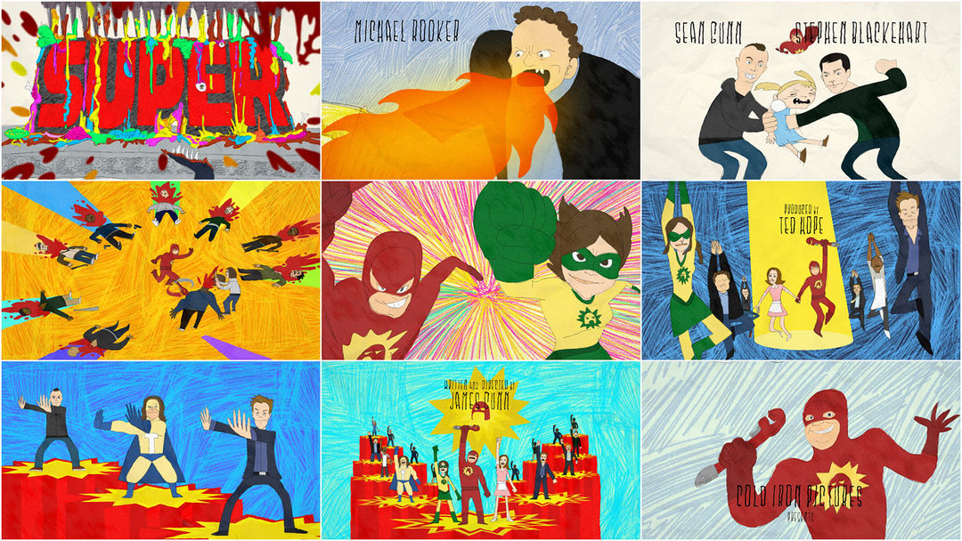
Pop comic colors straight from the idle margins of a high school student's sketchbook splash high contrast iconography from James Gunn's Super across the screen, providing a startling impact in comparison to the film's themes – winding the viewer up before sinking them into the mundane and sometimes pathetic life of Frank D'Arbo.
A discussion with director/designer/animators SHAD PETOSKY, MIKE OWENS, and VICTOR COURTRIGHT at PUNY.
Give us a little background on PUNY.
SP: I co-founded a studio called Big Time Attic, out of the attic of my house, to do comic books and digital comic stuff when that was sort of new. My background was in programming and we were getting all of this Flash game and programming work because we could draw AND program. So eventually with fellow Big Time Attic-ers Vincent Stall, Tim Sievert, and Julia Vickerman we spun of PUNY as an interactive design studio. We called it PUNY because we were going to focus on small screens, all the mobile game and paid content platforms being talked about pre-smartphones.
Two months after we started the studio Jesse Ledoux asked us to help him animate a guest spot for a new pre-school TV show that was music and designer oriented called Yo Gabba Gabba! We had done some animation in Flash for games and web stuff like Target e-cards, mostly for an agency called Ham In The Fridge, so we took it on. The Gabba guys liked our short so we convinced them to let us do all the principle animation, Julia would work on-site and send back extra work to Minneapolis. Pretty soon we were doing storyboards, website, games, social media, and live show animations for them... and the show premiered and was a hit... which opened a lot of doors.
How did you get involved with the project?
SP: A classic “It almost didn’t happen!” Julia had met James Gunn in LA through mutual friends Mia Matsuma and Steve Agee. James told her that he was doing sort of a superhero movie and needed some artwork and animation. We made a reel of comic stuff we did, like the Aquabats SuperShow Pilot, and got the job. He put us in touch with producer Ted Hope and we were ready to go. Then they decided they were shooting in Louisiana for the production tax incentives and wanted to keep things local. We were a bit crushed, especially since just weeks before I was in the Minnesota State Capital building lobbying for incentives to help us compete with other states..
They shot the entire film and were in post-production when James and Ted got in touch with Julia and told her that something hadn’t worked out with the title sequence and they wanted to know if we could try to pick it again. The eight months we had when we first took it on was now down to an impossible four weeks but we still couldn’t pass it up.
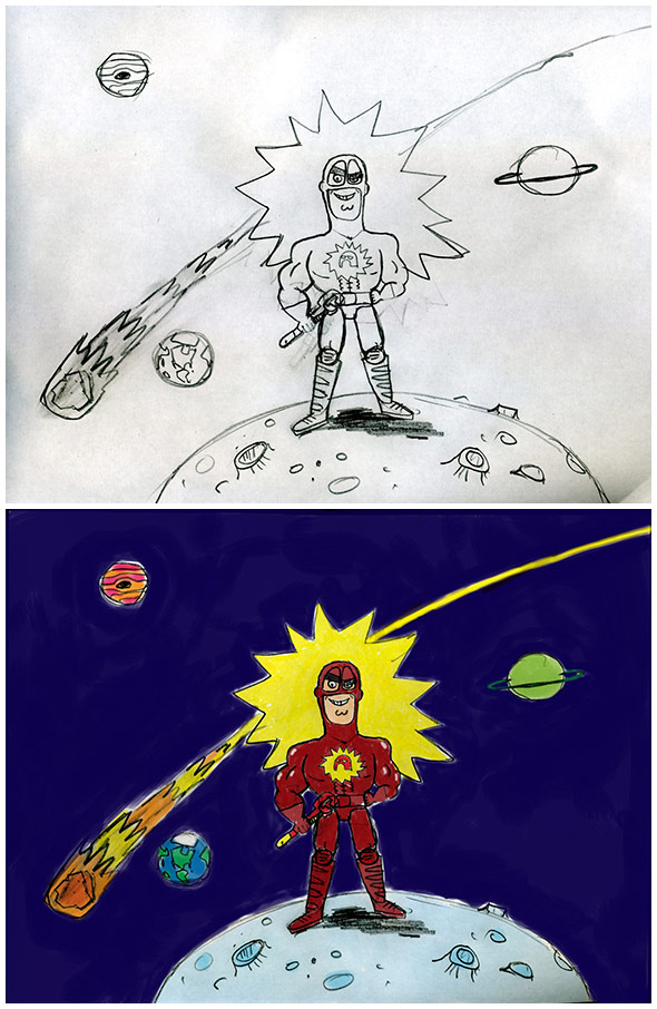
Original sketches
Talk about your first meeting with director James Gunn.
SP: I want this to be glamorous, but we were in Minnesota and James was on a speaker phone from post production in LA. A cheap speaker phone on our $25 University of Minnesota salvaged conference room table. He was great, I had read some of the stuff that had quoted him as having these exhausting experiences on film, but even after the rigorous schedule of shooting the whole film he was completely enthusiastic. On such a short timeline we had to get down to business; we had a ton of questions about what the title sequence was supposed to be and he knew exactly what he wanted. We barely had to ask him anything on our prepared list of questions and when we did he answered it as fast as we had asked. He had the whole thing in his head, it wasn’t an “I’ll like it when I see it” situation at all. He knew what he wanted but we still felt like we had a lot of freedom. In hindsight I’m not sure how that worked...
How did you mold the visuals to the music?
SP: We had done a lot of musical work for Yo Gabba Gabba! by this point and always tried to find ways to give it more impact. We actually programmed some software that takes a song, detects its wave form, and lays down a color guide for animators. It works as a visualizer but we don’t use it because for it to really work... it’s still human talent. Go John Henry... er Mike Owens.
MO: I always approach animation musically. A lesson I learned from Tom & Jerry cartoons. The music scores in those cartoons were composed after the animation was complete. The director would time out the story and the action on bar sheets, which are essentially the bars used in music notation, to determine the tempo in frames per beat. Working at 24 frames per second, marking a beat every 8 frames sets up a faster tempo than a beat every 16 frames, 16 frames per beat is faster than 32, etc. Once tempo is established, there is a rhythmic outline for how the action is paced. This template can be used to determine when a foot hits the ground in a walk cycle or when a character strikes a pose or reacts to another character. You have an exact frame to place an accent. You can build tension by holding back on the accent, letting beats pass then hitting it on the off beat to startle the audience. Or you can change up the tempo to change the tone within the story. A character may be dragging along at 32 frames per beat, feeling lethargic, tired, depressed when suddenly he unexpectedly finds a $100 bill on the sidewalk. Suddenly there is a bounce in his step as he happily struts down the sidewalk at 8 frames per beat.
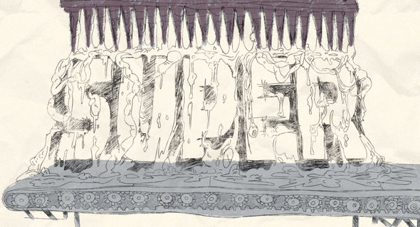
Super main title drawing
For Super, the music track already existed, a song James loved, so the slate wasn't completely blank. But I still determined the frames per beat and animated a visual beat as a guide (a red X for each beat). Once I have this visual beat as a reference I can start establishing the broad actions and mood of the story that James wanted to tell in this sequence. Crimson Bolt flies up through the clouds for 16 beats, holds heroic pose for 4 beats, 1 beat of anticipation to start flying again, and 4 beats to fly forward until his chest logo fills the screen, etc. When working with a locked music track, there will be obvious breaks and strong beats that help determine big changes in action and story. I used the high energy tempo and strong beats in the Super sequence to introduce the character roles, the intense/comic violence and the synchronised dance steps. I drew from my musical theater experience and watched a lot of musicals when this project began to help choreograph the dance moves, something I've always wanted to do in my animation career.
SP: We have amazing photos of Mike in musical theater. He’s downplaying the difficulty in what he did though because unlike a music video where it’s just about story and hitting the beats, this had the job of displaying title credits. The credits have to stay up for a certain period of time whether the beat has moved on or not and there are contractual rules and standards about how long people’s names stay up in comparison to other names. So if you hold on one name, you have to extend all of the other names to the same number of key frames. If we ever do a title sequence again, I hope it’s something SLOOOOOWWWW.
Was the sequence deliberately planned to hint at the dark, violent nature of the film?
MO: Yes. James provided an out line of key moments he wanted to see in the intro. Crimson Bolt bursting out of Mr. Range's stomach with an armful of the bunnies he just ate, decapitating the circle of bad guys with his pipe wrench, and of course the spikes that obliterate Kevin Bacon. I had not seen much of the film when we started this project, but I read the script and had conversations with James, expressing his desire for ridiculous, graphic violence. The dance sequence was such a great contrast to the violence. It set up expectations but after seeing the finished film, I realized that what we did in animation was merely a "hint" at the dark violent nature of the film. The film was fantastically more brutal than imagined!
SP: It’s also more than hint in that it gives a lot of scenes of the film away, like a twisted version of 70s/80s animated film titles. That seems kind of nuts but totally works. There is a disconnect from the song and dance number of the titles and the live action. You don’t assume that you’re seeing things that will happen later.

Character designs
How does the team at Puny work together?
VC: Our work-flow process at PUNY is very organic.
SP: Ughhh organic, that makes us sound sloppy.
VC: We like to leave room for fresh minds to jump in and provide outside perspective rather than keep it quarantined in specific fields. Yes, we have titles such as director, character designer and animator, but we aren't afraid to break those boxes. Even computer programmers and designers get involved. The review process in each stage receives its share of feedback from the entire team, who gather around a monitor in “stand up meetings” and help shape the final product into something that everyone is happy with and proud of.
SP: We’ve all worked with each other for a long time on a bunch of different things so we mostly have it down. The Minneapolis team is all in one room and the LA team is all in one room. There aren’t any walls or cubicles so we can just sort of lean over or shout to each other or video chat between studios. We’ve done a lot of low budget stuff so we’ve figured out a lot of shortcuts. Like we never do character model sheets or whatever, if we never see character’s feet, we don’t bother designing the feet. We use a production spreadsheet on Google Docs that allows everyone to edit and post the status of the scene that they are on. People jump in and out of different roles. It’s all about communication so we strive for good communication. Like if someone asks you something you are supposed to repeat it back to them. Things like that work but maybe make us sound crazy to the outside world. This sort of stuff allows us to do a lot of work without a producer. Producers are essential to many projects, like client games or a TV pilot, but there wasn’t one on this.
Original Flash-based animatic
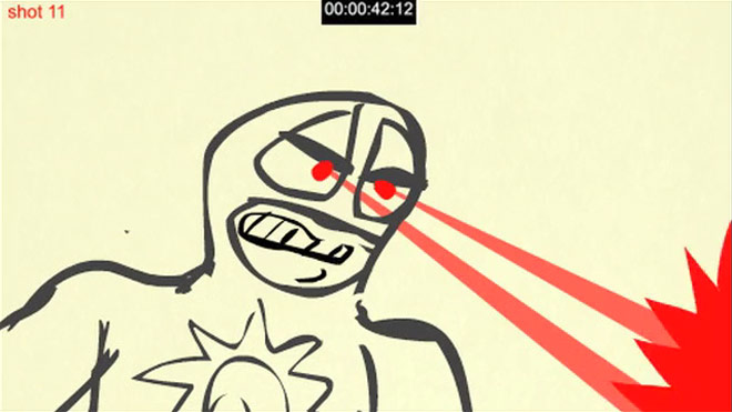
For this, Mike did the animatic, a moving storyboard, to the song in Flash. This has to be pretty tight and fully approved. Then we break down all the scenes into shots. Julia did most of the character design and posing, and wanted it crude like Danielle Griffith’s work on Frank’s drawings in the film. From there animators take shots and animate each shot completely. Eyo Peters, Nick Bachman, and Yuichiro Tanabe were the main team of animators. Vincent Stall and Dave Hagen did design and stylistic background elements. We do a review of each animation at a half way point to see it’s on track. Because of the deadline each shot had a time limit for completion so that we didn't’ over-animate. That’s actually one of the hardest things, consistent animation. Often you’ll have one animator knocking out shots in a rudimentary way and then another doing really full stuff...when it’s put together it’s very inconsistent...like listening to a song slow down and speed up. Shot deadlines help.
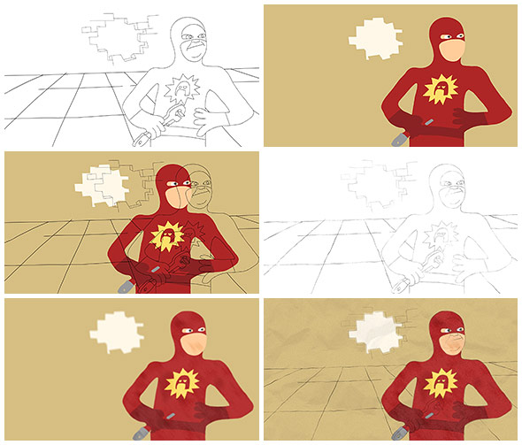
Process shots
The animation is all hand-drawn but on computer tablets. In this case we animated a line layer and a separate color layer to add some After Effects filters to give it an on-paper look. We had to make some decisions early on about how we were going to use paper, do we pan across pages taped together...or use paper cut out clouds and rocks? It started looking a bit too crafty so we stuck to a mostly locked shot with different paper textures. Most of the color was done in Flash with an After-Effects noise added but to get the crayon or colored pencil look of some of the backgrounds we used custom brushes in Photoshop. Victor composited it all together using After Effects. We logged 1625 hours on Super all together.
What element(s) of this sequence are you most happy with?
VC: I am really happy with the way we created the overall look of Frank’s drawings coming to life. A successful collaboration of design and technique that supported the bigger story. Watching the sequence develop from gestural digital sketches to high energy crayon drawings was very satisfying.
One specific moment I was happy with was making Kevin Bacon leap frog over my friend and co-worker Nick Bachman. Oh yeah, in Disney Movies there are all of these rumors about animators sneaking dirty things into the animation, on a James Gunn film that wouldn’t matter so we snuck ourselves in.
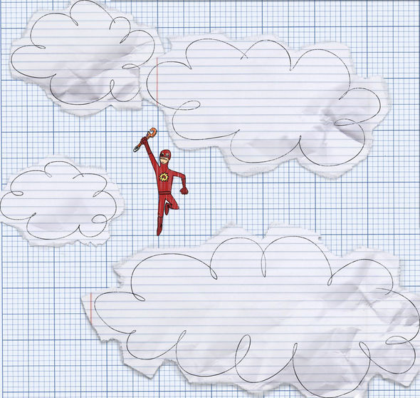
Paper styleframe
SP: I love how “un-precious” it is. As primarily a design studio I thought I wanted this to be super stylistic, perfect typography...but it couldn’t be that. Instead it’s broken and wonky and has actually influenced a lot of current work. When we get too caught up in the precision of something and it starts feeling dull, we often say “break that..do it like Super.” I’ve seen it so many times that we’re not sure what it looks like at this point...so now it’s all about other people’s reaction. I sat next to Greg Ingram at the LA premiere, he’s a bad ass dude who plays one of the main thugs but he was just gushing about how much he like the cartoon drawings of himself and he really wanted one to hang in his house. Edgar Wright wrote how much he liked it, I had dinner with Ellen Page, a hug from Liv Tyler...all the sort of stuff that doesn’t happen to a kid from Montana. We got to work on a MOVIE. I loved every bit of it and walk on air whenever I think about it. I also like when Michael Rooker gets fried by laser eyes.
What or who inspires you these days?
VC: Everyone here seems to come from a vastly different artistic spawning pool, but we love to pull styles from every direction into bizarre amalgamations of form, design, color and motion. We are always trying to take the technology available and create a look that is unique and professional. I like Masaaki Yuasa, Tatsuyuki Tanaka, Jon Vermilyea, Takeshi Koike.
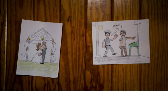
Frank's drawings from the film
SP: Yeah, there is absolutely no reason we should all get along, eighteen people with eighteen different answers, but it meshes together somehow. Jon Vermilyea is someone we all like. Gary Panter was a huge influence in the creation of the studio with his Rozz Tox Manifesto... practically our employee handbook. Since we have formally trained graphic designers, comedians, cartoonists, computer science-y programmers, the inspiration is coming from all over the place.Visualization generative artists like Jer Thorp, James Patterson, Jered Tarbell. Cartoonists and artists like Johnny Ryan, Jordan Crane, Lisa Hanawalt. Mark Todd and Ester Pearl Watson.
Minneapolis has a great design culture that we’re surrounded by and absorb Eight Hour Day, Aesthetic Apparatus, Burlesque of North America, and Charles S. Anderson. Interface designers like SevnthSin. Great creative brains like roboticist Heather Knight or Golan Levin. Rob Delaney, PeeWee, Jesse Ledoux, photographer Robyn Von Swank, Dude and Chick. We’re lucky that going into the fourth season we’re still inspired by Yo Gabba Gabba! every day... all of the crew, great bands and guest artists. If you walk around the set you’re truly in a magical world. There is just so much cool stuff going on. Believe it or not, there is also a lot of amazing stuff on the Internet.
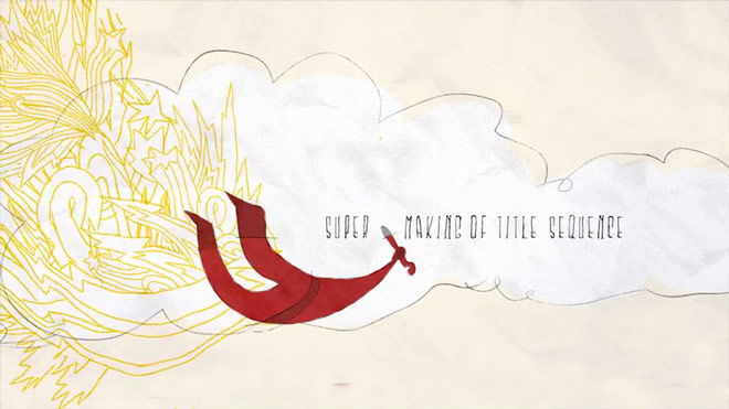
Super - Making of the Title Sequence
LIKE THIS FEATURE?
