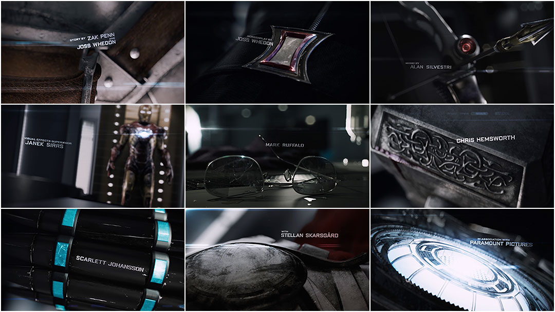
Thor, Black Widow, Hawkeye, Iron Man, The Hulk, and Cap – an assembly of Earth’s mightiest heroes. It was only through battle that these disparate champions could be forged, kicking and screaming, into the motliest of crews and as we tumble and glide along tarnished shields, torn fabric, and broken glass, the heroes' damaged armor tells the story. In the main-on-end titles to Joss Whedon's master stroke of a film, Method Design subtly recounts the aftermath of the dawn of The Avengers.
A discussion with Creative Director STEVE VIOLA of Method Design.
Where did the original concept for the sequence come from?
When we first sat down to brainstorm, we got great guidance from Marvel on what they were looking for which allowed us to focus on specific areas. They wanted a photorealistic look, so from the start we didn't explore a lot of graphic ideas. We also knew that Joss really wanted to focus on core themes from the film like "real stakes" and "group chemistry."
As we honed in on our primary concepts, we had about seven that covered Joss' key themes while incorporating others, from the Tesseract to New York City. The chosen concept actually went through a few iterations before it was ready to show. Originally, we were going with an abstract fly-through of the Helicarrier where we would come across some of the heroes’ items, but it wasn't post-battle and it was just as much about the Helicarrier as the characters – which is how I originally pitched it to our concept artist, Chris Sanchez. I wanted something that dropped us into the high-tech world of S.H.I.E.L.D and stepped back from the actual characters so we could get a feel for them through their areas in the flying S.H.I.E.L.D. base.
So Chris began working, the frames looked great, and it was starting to take shape. Then we needed to figure out the details. The biggest question was whether or not the sequence should be "post-battle." There were also a lot of things we still weren't clear on since we hadn't seen the entire film! Like whether or not all the heroes' suits and weapons were in one location like a locker room. It really took shape in a brainstorm I had with Chris and our associate creative director Mike Sausa. We finally agreed it shouldn’t be about the Helicarrier, but simply about the heroes and what they went through – the Helicarrier was just a location. The idea was to approach it almost like a documentary filmmaker examining the damage and cost of war... “real stakes.”
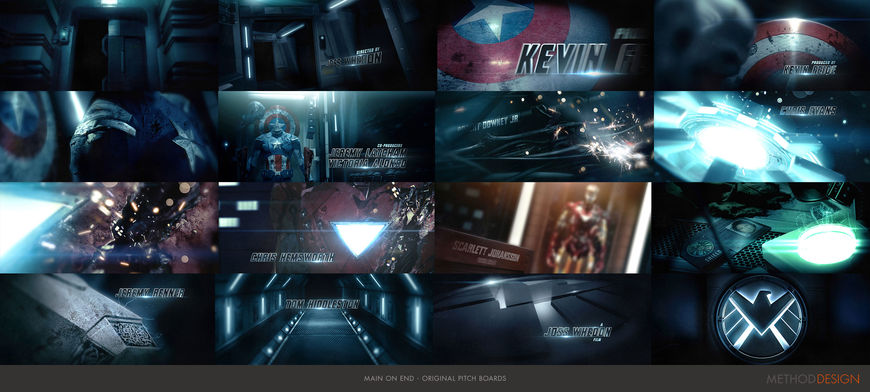
"Battle Scars" pitch board
Were there any other concepts for the sequence that made it to an early stage of pre-production? Storyboards, animatics, etc.?
For the first pitch, we had seven different concepts – all had boards and a few had motion tests. At the time, we thought the New York concept, with its motion test, would be the frontrunner. Ultimately, though it wasn't the top concept, I think it helped sell some of our ideas of pacing, movement, and the portrayal of post-battle destruction. Once we were awarded the job, we went right into production on the "Battle Scars" concept.
The one other concept that went forward was our Tesseract concept, which became the driving force behind the logo treatments at the beginning of the film.
We were striving not to just make this a visual effects sequence, but to engage and capture the audience even after the film.
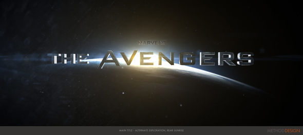
Main title - alternate and final
Once you had the concept, what were your first steps?
Well, it was great because Joss saw the initial pitch boards and knew that "Battle Scars" was what he wanted. We didn't have to explore variations or other options – we were able to get right into pre-production.
Of course, the first set of boards from the pitch had to be reworked to remove some elements and add others. We worked for a couple of weeks to flesh out the rest of the sequence and the in-between frames and by January we had a full sequence boarded. We worked up some transitions to connect characters, which Joss and Marvel really liked, so we added a few more. As we moved into animation, we added storyboard frames using just sketches until we had the right sequence.
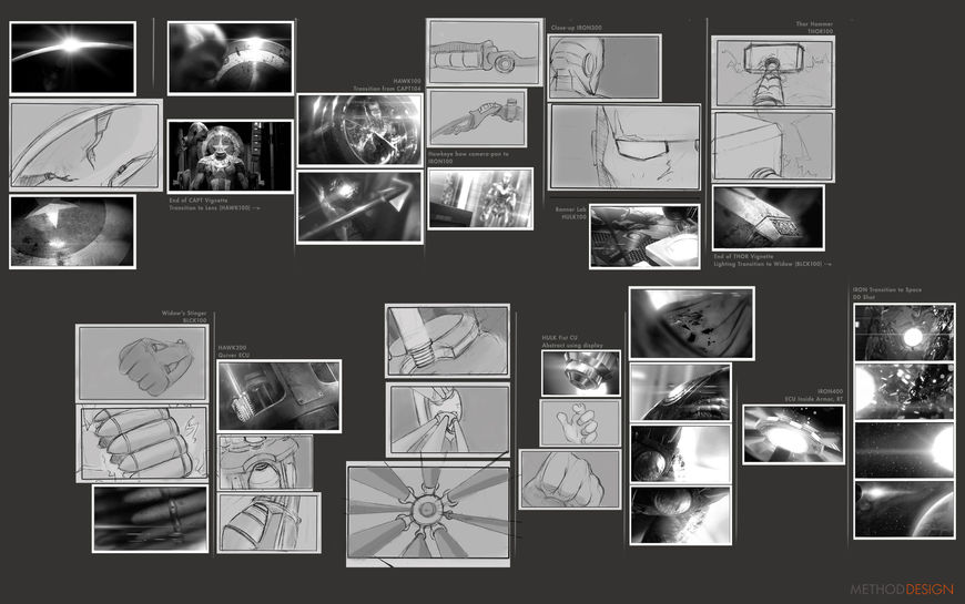
Final sequence board
Next, we experimented with the camera animation and figured out how we wanted to build the moves. In order to make everything feel more visceral and realistic we used a handheld camera. We did a lot of tests shooting with various rigs then using 3D tracking to extrapolate the cameras. Some of them worked, but ultimately, as with most photography, the macro shots didn't hold up well as handhelds. As we were beginning to run out of time for R & D, we scrapped the handheld idea and went with more basic 3D rigs in Maya. This decision was reinforced by Joss' desire to have a smoother, more calming sequence as a follow-up to the massive battle.
And like the film itself, the title sequence is an ensemble of sorts, too. Each character must be given their due and have a moment with their on-screen credit.
Yeah, that was interesting to work through. Some characters didn't have much to go on without using their actual bodies, and getting each credit on the respective objects proved difficult without making it feel disjointed. Characters such as the Hulk and Black Widow really didn't have many assets to go on. There was a lot of discussion about whether we wanted to represent anyone else, such as Loki. Ultimately, Marvel and Joss agreed that we should stick to the key members of S.H.I.E.L.D. We added Nick Fury's holster later on. Black Widow's stinger was added early – before we even saw what it looked like in the film – but her belt was the last item we added. The Hulk was by far the trickiest since he has no suit, armor, or weapons. We decided to focus more on Bruce Banner's iconic elements: his glasses, his laboratory, and his clothes.

Test comps
We were striving not to just make this a visual effects sequence, but to engage and capture the audience even after the film. We tried to lead the viewer from one area to another, guide the eye through a scene with dramatic and artful imagery. To go beyond visual effects, it needed to be the characters and the drama that would make the sequence compelling.
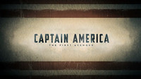
Talk about your evolving relationship with Marvel. How did your process on The Avengers with Joss Whedon compare to your work with Joe Johnston on Captain America?
Having worked with Marvel and Joe on Captain America raised the stakes when we were pitching on The Avengers. The process on Captain America was such a great, smooth, collaborative, and creative experience, so we really wanted another chance to work with Marvel. We didn't think that previous relationship guaranteed our shot at the titles for a second, and from day one we pushed as hard as we could. We also knew that with a different director, it was a whole other ball game.
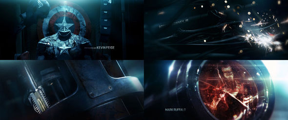
Revised "Battle Scars" board
The Avengers really pushed the limits of our technical capabilities and infrastructure; now we feel like we can handle almost anything!
As soon as we started on the pitch, we recognized that it was a vastly different piece. Though Captain was all built in 3D and produced in stereoscopic just like Avengers, it was all based around graphic imagery from propaganda posters – not photorealistic. This was quite a different task, and I think it largely stems from the different directors. Joe loved the World War II era and all the propaganda art and he really pushed us towards a graphic piece that preserved the look and feel of that. Joss really wanted a photorealistic approach that featured an up-close look at the "real stakes" and "battle scars" of the heroes’ struggles.
There were some similarities as both directors preferred a certain level of simplicity with the typography so as not to distract or overwhelm the visuals. You'll also notice that both sequences have slightly dimensionalized type that lives in-scene with the rest of the imagery, rather than being comped over picture. As a whole, we've found Marvel to prefer that the audience be immersed in the sequence, which is a really great thing to strive for when creating these sequences. It's the feeling that, whether it’s propaganda art or realistic armor, the audience feels like they are moving through it and can reach out and touch it.
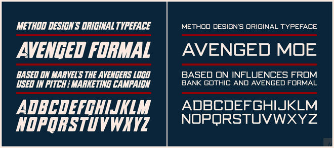
Typeface samples
Were the main-on-end titles in The Avengers designed to act as an entertaining and dynamic bridge (as opposed to just a black crawl) between the film and the after-credit bumper that everyone sticks around for?
It acted as a great tie-in. The idea to connect the two happened early on, though the use of Iron Man's chest repulsor transmitter as the link evolved through several iterations. I think details like these really illustrate how finely tuned Marvel is to their audience. Not only have they moved the teases from after the crawl to after the main-on-ends, but now they seamlessly link to one another. Motionographer did a review of it that I thoroughly enjoyed:
"...quiet and gorgeous – a total opposite to the film itself (which is anything but quiet), and as such, it gives the audience a perfect finish to the experience. Like an elegant dessert after a sumptuous main course."
What were some of the challenges that came with using stereoscopic effects in a sequence like this? How early in the process did the 3D figure in?
It was especially challenging from a stereoscopic standpoint. Just like all our other projects, we are always thinking about the 3D when we know it’s part of the final piece. From the first animation, we had our stereo rigs and depth budgets established on every shot. But that didn't help much when it came to seamless transitions through different scenes, connecting with a camera animation from Digital Domain for the last shot, retinal rivalry from all the close-ups on metallic objects, and the render times of having both eyes on macro-photography for a two-minute sequence. After running through multiple rounds of optimizations, our render times per frame on many of the shots exceeded six hours – for one eye! Though we had expanded our resources for the job, it was a bottleneck we weren't expecting and couldn't predict until the first renders started coming out.
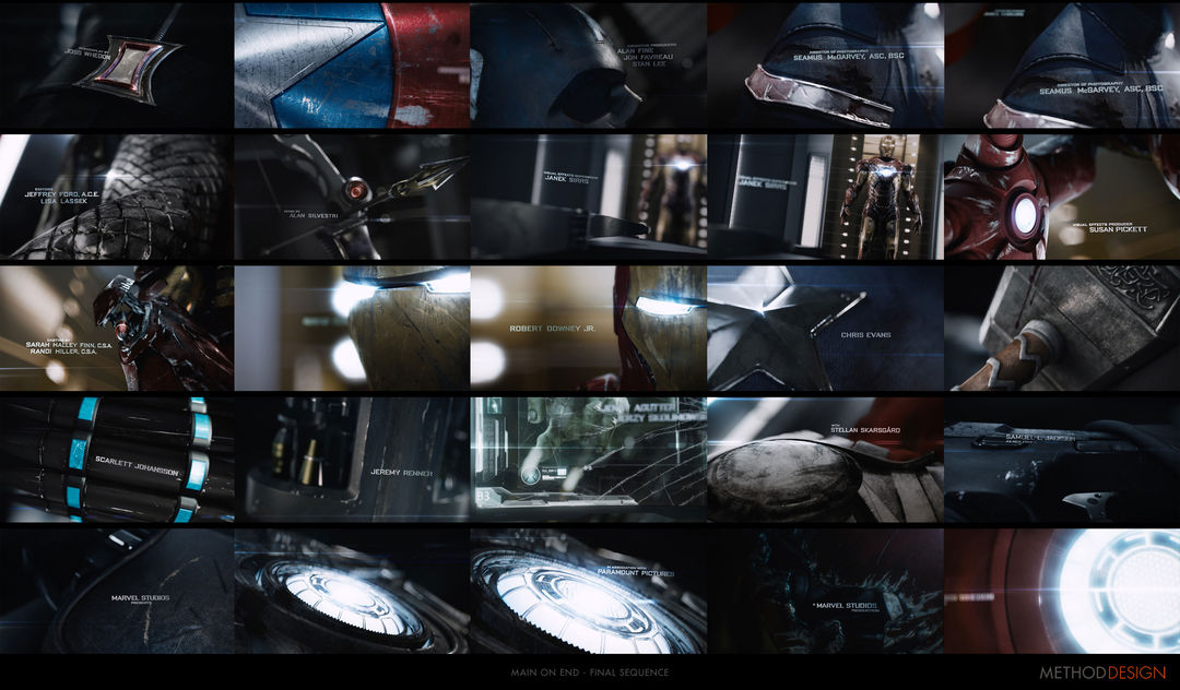
Main on end - final matrix
Ultimately, we were able to use a great resource in our visual effects group to finish the final piece in stereoscopic. By the end, the sheer magnitude of the project was far beyond our expectations, but we learned a lot. The Avengers really pushed the limits of our technical capabilities and infrastructure; now we feel like we can handle almost anything!
Is there anything in the sequence that you're particularly fond of that viewers probably won't notice?
It’s funny because that was the hardest part about this sequence: in macro photography, everyone sees everything. We scrutinized every detail, every texture, every glint and flare – because you can see everything! Each thread or particle that's not right pulls the audience right out of the reality of the sequence. We worked painstakingly hard to make it as engaging, emotional, and realistic as possible. We're very proud of the final product and thrilled by the audience reactions around the world!
Main Title

