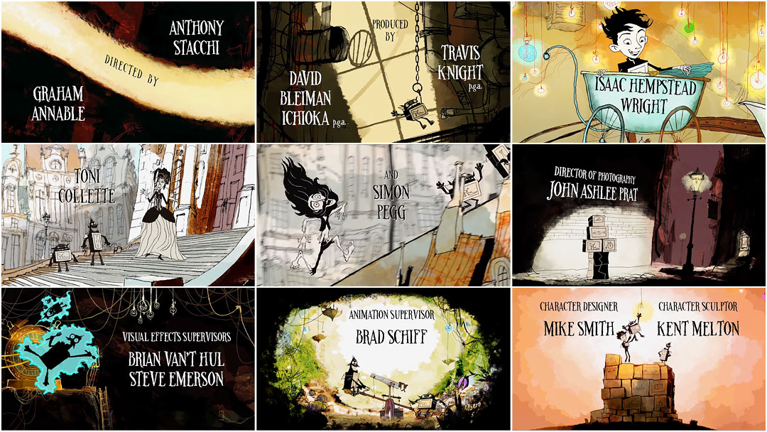
Dive down into the strange underbelly of Cheesebridge with the boxtrolls, a lovable set of foldable stop-motion monsters, here rendered in warm strokes of sketchy animation produced as a collaboration between commercial studio HouseSpecial and animation house LAIKA.
In LAIKA’s latest stop-motion feature, the process gets a technological makeover to become an incredibly beautiful and seamless piece of moving art. The film is a wonder of uncanny, intricate movement and wonderfully detailed environments, each character’s face a vibrant smudge of emotion, each object a finely crafted piece worthy of closer inspection. But just as with the studio’s previous offering, ParaNorman, the film’s title sequence is a horse of an entirely different colour.
Here, in a style reminiscent of the title sequence to Lemony Snicket’s A Series of Unfortunate Events and the drawings of illustrator Ronald Searle, HouseSpecial moves the aesthetic of the title sequence away from the film, rendering the monsters as black swaths of ink tumbling through a watercolour city. The lanky serif typeface, designed by LAIKA’s Josh Holtsclaw, lends the sequence a handwrought elegance. Paired with the friendly “Little Boxes” by Portland band Loch Lomond, the end credits sequence presents a cozy summation of the film, reminding viewers of key moments and jokes.
The first two and a half minutes of the end credits sequence is made up of these animated drawings, but what follows is different again: a secret extra scene, or stinger. In the stinger, a minute-long bonus scene, Mr. Trout and Mr. Pickles discuss the connection between their world and ours, a meta conversation that lapses into a behind-the-scenes look as a life-sized crew member enters and exits the shot to animate them.
The timelapse stop-motion stinger from the end credits featuring Mr. Trout and Mr. Pickles and their animator
It is this combination of technical mastery and willingness to invite viewers into the process that makes LAIKA and HouseSpecial’s collaborations so delightful. We admire the artistry on multiple levels; we are wowed by its surface beauty, losing ourselves to the narrative dance and the depth of texture, when suddenly we are given a glimpse behind the curtain. In a world of increasing gloss and digital manipulation, a peek at something so meticulously crafted goes a long, long way.
A discussion with title sequence director AARON SORENSON of HouseSpecial.
So, you had previously directed the end credits of ParaNorman. What was the first meeting like for this new sequence, for The Boxtrolls?
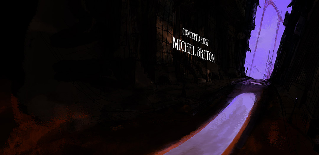
When the HouseSpecial team met with directors Anthony Stacchi and Graham Annable at LAIKA, the concept was already fleshed out. Travis Knight, LAIKA’s CEO, wanted to repeat the success of the ParaNorman end credits, so he asked HouseSpecial to help out again. They had some rough concepts and wanted us to collaborate with Michel Breton, the production designer, and Mike Smith, the character designer. I brought my experience from directing the ParaNorman end credits and translated it into a plan to create the piece. The creative drive was to honor the brilliant design of Michel Breton – to bring his concept art to life in 2D animation.
A series of backgrounds, emotive elements, and artwork for distortion pans
How far along was the film at this point?
It was maybe half-finished, in terms of animation. There were no real visual effects shots, but it was easy to see how the technique was getting more and more sophisticated.
So how did you begin? What was your process like?
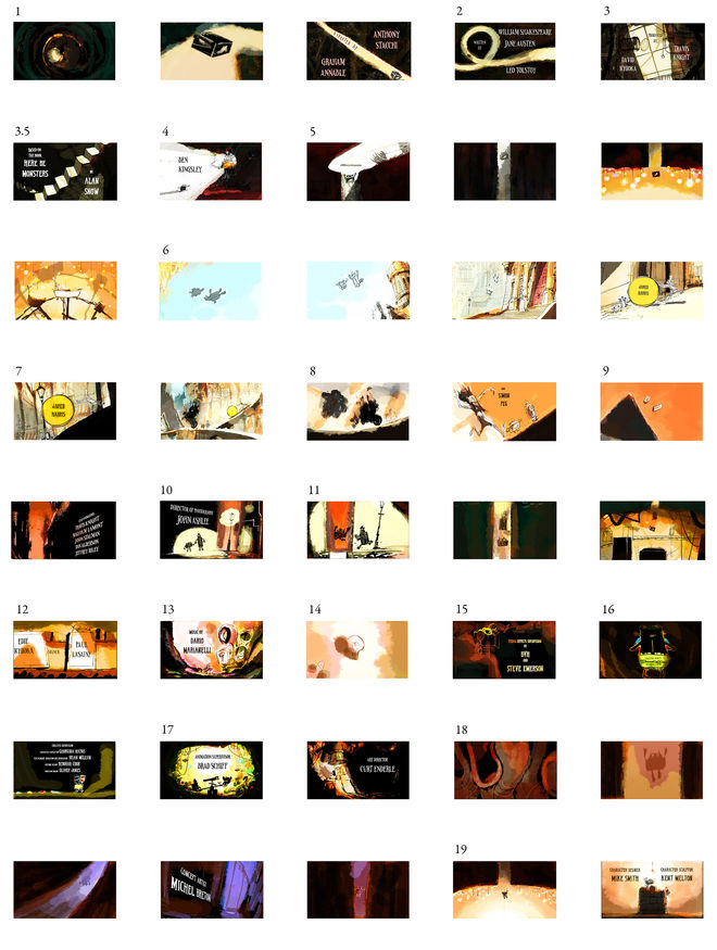
Color study and animation log sheets
In this case it was about problem-solving for the transitions and the scale of the artwork, plus figuring out where to hide the transitions between animators. Some of the scenes were 300 – 400 frames with massive camera moves in and out of very detailed artwork. We needed to transition easily from each mini-story to create a fluid narrative.
To map everything out visually, we rebuilt the storyboards in After Effects. This helped us calculate pan length, layer order, and resolution. HouseSpecial’s Erich Richter, the lead After Effects artist, figured out the “math” of the animation. Once we had exact dimensions, I gave them to Michel with notes for designs needed.
We also did an animation test to work out the style in motion. I animated a scene of [the character] Shoe shooting out of a pipe and falling down some stairs. We did all the animation on paper partly because it felt good, and the line style was so organic. It was easier to get that traditionally than digitally.
Did you storyboard? What was your process like with that?
Mike Smith storyboarded the credits. His boards are quite amazing – expressive, dynamic and effortless.
The layout planning was tricky. The storyboards called for lots of big camera moves that forced line art to scale up and down fluidly – a definite a head scratcher at times.
For instance, in the shot where Knickers has on the yellow panties…
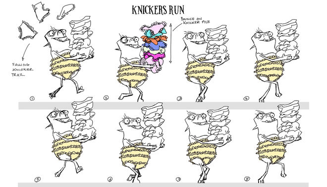
Character and spot key sketches, walk cycles, and credit composition sketches
...we had to animate the character as large as we could and then create an even larger panty element that sat on top of the character, which was tracked back in space to transition into a smaller pair of panties all while more panties flew off. I feel like I said “panties” a lot right there.
Tell us about the typeface. How was that designed?
We were given a typeface designed by LAIKA's Josh Holtsclaw. It was a challenge to track the type through scenes and maintain legibility. The solution was to make the tracking very simple and keep the motion linear, with words screened in the background.

Comparison between the design composite (left) and the final shot
There was sensitivity from the beginning about readability and giving equal weight to the credits visually. One thing my career has taught me is that the more you try to get fancy with elements, the harder everything is to balance. If the style of the artwork were simpler we could have pushed the text design further in terms of movement and layout, but it's difficult to combine complex backgrounds with ornately treated text and not lose legibility or design integrity.

Design composite (left) and final shot with credits laid out
In both this title sequence and your previous work on ParaNorman, there is a sequence in which you give a behind-the-scenes look at how the characters and environments are made. Why are these behind-the-scenes looks so important to you?
Travis Knight is a big proponent of allowing the audience to see the artistry behind the film. I really didn't have anything to do with either of those clips but I've read in numerous reviews how much the audience enjoys them. It's a funny thing to pull back the curtain on your technique and reveal your secrets.
The Nature of Creation featurette, a behind-the-scenes look at the making of The Boxtrolls
Do you think it’s becoming something of a tradition now for animated features to have elaborate end credits?
It seems to be. Anything to keep people in their seats to see the names of the people who worked on the film is a good thing.
When did the music come in? Did you always know what the end song was going to be?
Malvina Reynolds’ "Little Boxes," performed by Portland band Loch Lomond, was always the song choice to my knowledge. I think the only thing that changed was the arrangement. It's kind of perfect.
What tools and equipment did you use?
Paper, pencil, Toon Boom Harmony, After Effects.
How big was your team and how did you all work together?
There were four lead animators, five assistant animators, three Harmony animators, two ink and paint artists, and two compositors, but some of us wore multiple hats.
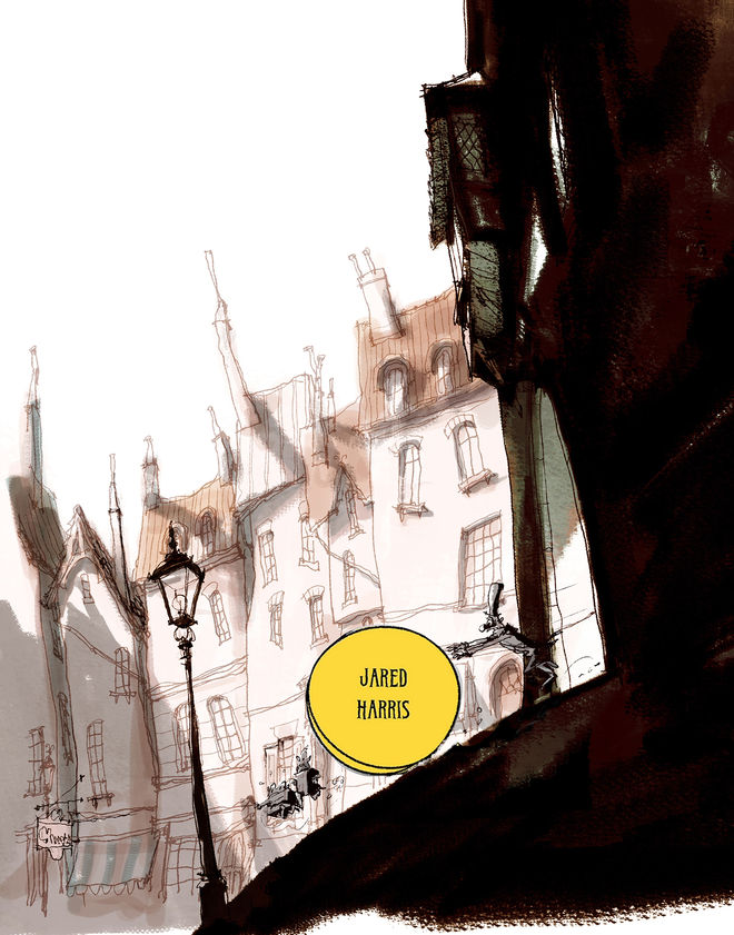
Layout composite with Jared Harris's credit rolling down a hill in a wheel of cheese
What was different for you this time, compared to the production of ParaNorman’s end credit sequence?
The difference with The Boxtrolls was that it was more about pure character animation and less about how to achieve a look. With ParaNorman we spent a lot of time composing these perfect still frames that we then animated. The Boxtrolls was more about movement and energy and the expressive quality of the line.
What do you think this title sequence gives to the film?
I think it's a nice way to celebrate the characters and the inspirational art that went into making the film in a light, playful way.
What are some of your favorite animated films?
I mostly watch classic hand-drawn films with my kids, who enjoy 2D films and stop-motion more than most CG films. I think their favoritism has to do with the pacing of the classic films and how short they are. 101 Dalmatians (1961) is my favorite feature. I just watched Bambi again with them and rediscovered an amazing lack of dialogue, plus the film is only 70 minutes long!
What are you working on next? What’s coming up for you?
I'm mostly directing commercials including ongoing campaigns with Honey Nut Cheerios, Shaw Communications in Canada, and some new, secret work.
I also have a short film in pre-production at HouseSpecial. It will be stop motion with a sort of 2.5D look and a decidedly adult theme. I'll say no more.
Out now — The Boxtrolls: Slide ‘n’ Sneak game for Android and iOS.
Support for Art of the Title comes from


